Showing posts with label Central St Martins. Show all posts

Tuesday 20 June 2023

CSM Show Signage

Many of you may have visited the Central St Martins graduate shows at Granary Square but how many of you noticed the brightly coloured wayfinding...?
The signage and the map is all printed on our Colorset 100% Recycled range. The signing is all printed on our Colorset Deep Orange and Indigo 270gsm and the Riso printed map is printed on Deep Orange 120gsm
Design is by Thomas Black, Fred Cochran, Benjamin Khan, Irene Liakhovenko, Dolores Swann and  Kim Trainor, all final year BA Graphic Communication Design students. Thanks to lecturer Martin McGrath for sending me the images.

Riso printing is in house at CSM and the large format printing is by Displayways.

Posted by Justin Hobson 20.06.2023

Monday 11 November 2019

CSM Shifts

Since 2018, Boyle&Perks has been working with Central Saint Martins to create a visual language for the College. Designed to fit within the parameters of the existing branding for UAL, the resulting scheme uses typography, a colour palette and visual system to bring both cohesion but also the flexibility to represent the diverse creative community within the College walls.

A few weeks ago I received the below item in the post...
What a wonderful surprise! Enclosed are a couple of posters produced to demonstrate the new visual language, one in red
...and one in black
The posters are A2 (420x594mm) size and are simply, but beautifully, hot foil blocked on our Colorset Lemon 120gsm. They really do look amazing.

The following article explains about the development of the new visual language...

“The last thing we wanted to do was create another typeface,” confesses Elaine Perks, “then we went full circle because we came to the realisation that it was the only way to create something distinct within the constraints of the overarching UAL branding. It was the opportunity to create something that is anarchic, unpredictable and characterful within that system.” To achieve this unpredictability, the designers alighted on randomised typefaces that shift so the same word appears differently each time it’s written out. Colophon Foundry had just completed a randomised project so Boyle&Perks challenged them to create a typeface that could encompass Central Saint Martins’ past, present and future all at once. “They wanted a design that would be dynamic, changing every time you used it, but to celebrate these pillars of Central Saint Martins: the past (the incredibly rich heritage and history), the present (the students there now) and the future (which is obviously very ambiguous). That’s what we thought was really challenging, these three moments that are quantifiable, in some sense, but open to interpretation,” says Edd Harrington of Colophon Foundry.

You can read more about the project here:
https://www.arts.ac.uk/colleges/central-saint-martins/stories/changing-typeface

The hot foiling was done by Dorset based printer, Dayfold and below is an image showing the magnesium hot foil blocking die...
...and for interest, you can see the way the new visual identity is being utilised in the picture below:
My grateful thanks to Bill and Elaine for sending me the the wonderful hot foiled posters and it's great to see the fulfillment of a project which has taken well over a year to complete and which has received universal approval in the design world with DesignWeek describing the identity as “boisterous, anarchic and unpredictable”

https://www.arts.ac.uk/colleges/central-saint-martins
http://boyleperks.com/
https://www.colophon-foundry.org/
https://www.dayfold.com/
Posted by Justin Hobson 11.11.2019

Wednesday 15 May 2019

CSM Guide 2019

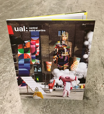
I've written many posts on this blog which includes the phrase "...just the cover makes the difference!" The cover on this prospectus is simply perfect. It is printed on our Astralux, One sided 170gsm, with an amazing image which is a photo composition of 28 works by CSM students,  all laid out with the wonderful King's Cross building as the backdrop.
Click on images to enlarge
The size of the publication is 270x200mm, portrait. The cover has 100mm flaps, which you can see in the birds eye picture below...
The below image shows the opening spread, which shows the 92pp text, which is stepped and printed on a combination of recycled uncoated, gloss art and yellow tinted paper.
Above you can see the way the image wraps around the cover over to the flap - and this is where the real magic happens, because Astralux being a 'Cast Coated' paper it has a high gloss surface one side and is uncoated on the reverse, so you get the juxtaposition of the high gloss coated with the toothy uncoated reverse (printed yellow) as I hope you will be able to see in the image below...
The image below shows the cover in it's entirety, spread out
Click on images to enlarge
The job is PUR bound - a very neat job.
It is a superbly designed piece of literature which has to engage with young creative minds, demonstrate that CSM is a world class arts and design college whilst also satisfying the CSM Alumni! No easy task. Design is by Boyle & Perks.

The excellent print is by Pureprint. It is printed offset Litho throughout in CMYK plus the bright yellow printed as a pantone special.

https://www.arts.ac.uk/colleges/central-saint-martins
http://boyleperks.com/
https://www.pureprint.com/
http://www.favini.co.uk/
Posted by Justin Hobson 15.05.2019

Monday 3 September 2018

Jobs from the past - Number 107

Regular followers of this blog will know that my first post of every month is a "job from the past" so that I can show some of the really good work from years gone by and here's one from 2009...

Italian Textiles
This project is a collaboration between the Italian Trade Commission and Central St Martins with the aim of promoting the use of Italian fabrics by fashion students. The students were invited to inspiration from a specific period in British fashion history - the 1960's - when the majority of men, irrespective of their social position, wore a tailored suit as normal day wear.

Size of the brochure is 210x148mm (A5) portrait and is singer sewn. The cover is printed on a 350gsm cover material from that other "Hull based" paper merchant! The 28pp text is printed on our Colorset White (100% Recycled) 120gsm 
Colorset has a rough, tactile "toothy" surface but it still prints extremely well, as you can see from the images with fabrics and fleshtones below...

Click on images to enlarge
The excellent printing is by London based printer, Push, who are based in Bermondsey. The singer sewn binding is superbly executed....
Creative direction is by Rob Meyers at RBPM Studio. Photography is by Pelle Crepin.

Posted by Justin Hobson 03.09.2018

Friday 23 June 2017

Central St Martins - Degree Show 2017

On Tuesday evening I was invited to the private view of the Central St Martins Degree Shows at King's Cross. It was a very hot London evening and given the current security situation in the country, there was security and bag checking, so it took me half an hour in the queue to get in, but that's entirely understandable.
The show was exceptionally well attended, laid out on the ground, first and second floors and including the large atrium area.
I spent most of the time at the BA Graphic Design course on the second floor.
Even though there had been a log queue outside, there was an equally long queue for the Camden Town Brewery stand, who was one of the sponsors as well as that other "Hull based" paper company!
As always, the work is well displayed and laid out - but then they are lucky to have one of the best exhibition spaces in the country and their disposal!
Thanks to all staff and people I know at CSM for the kind invitation and a chance to see the work of the new graduates.

http://2017.csmgraphicdesign.com/
http://www.arts.ac.uk/csm/whats-on-at-csm/degree-shows-2017/show-two/graphic-communication-design/
Posted by Justin Hobson 23.06.2017

Friday 24 June 2016

Central St Martins - Degree Show 2016

Yesterday evening I was invited to the private view of the Central St Martins Degree Shows at King's Cross. It was a very humid London evening but the show was well attended, laid out on the ground, first and second floors.
I spent most of the time at the BA Graphic Design course where I was shown around by Helen Ingham, from the letterpress workshop.
It was a very busy show with lots of thought-provoking work on display. Interesting (for me) to see just how many final projects still involve paper and printing. There was a superb project by Michal Kuzmierkiewicz, beautifully illustrated, exploring the roots of his family's exodus from Poland to Britain after WW2 (unfortunately I didn't get a pic of that project.) 
Below is the work of Odira Morewabone on Matatuism, a subcultural exploration of the urban youth culture in Nairobi in creating these artworks used on local taxis.
And below is the work of Anna Finch on the Jewellery Design course who has incorporated paper into her work. Through extensive experimentation, including pulping, carving, cutting, laminating, heating and sanding, Anna has been able to create some extraordinary pieces.
This piece is made using paper that she has processed, inlaid with pearl and silver.
Thanks to all staff and people I know at CSM for the kind invitation and a chance to see the work of the new graduates.
http://www.arts.ac.uk/csm/#
Posted by Justin Hobson 24.06.2016

Friday 10 April 2015

CSM Short Courses Literature

This is the printed literature produced to promote the Central St Martins short courses. These courses provide a way for students from all backgrounds to experience the Central Saint Martins style of study, which encourages pushing boundaries and challenging accepted norms. The courses are either in evenings, intensive holiday courses or online.

The publications consist of three items, a broadsheet, an A3 poster and A6 size cards.
Click on images to enlarge
The 12pp broadsheet is 594x630mm, folding to A4 size. It has the image one side and the listings on the reverse.
It is printed on our StarFine White 130gsm which is an uncoated paper with a good bulk and prints beautifully - as you can see from the image that is used there is a dense area of black on the bottom right hand side which looks good and solid, a nice dense black. The cards are printed on StarFine White, 300gsm.
Design is by Atelier Dreibholz. Paulus Dreibholz operates between his studios in London and Vienna working with clients throughout Europe, whilst also lecturing at University of Applied Arts in Vienna amongst others.

Print is by Principal Colour based in Paddock Wood in Kent.

http://www.csm.arts.ac.uk/
http://www.dreibholz.com/
http://www.principalcolour.co.uk/
Posted by Justin Hobson 10.04.2015

Thursday 11 December 2014

THOMASTAIT SS15

This is the invitation to the Thomas Tait preview show for his Spring|Summer 2015 collection held in London this September. This is his first show since last year, when he won the inaugural LVMH Prize for Young Fashion Designers. Thomas Tait is originally from Montreal but now lives and works in London and graduated from the Central Saint Martins Womenswear MA course four years ago.

For his new show, he has collaborated with Paris based visual artist Georges Rousse, who uses derelict buildings as his medium and paints on walls. Working with the artist, Thomas Tait has transformed his show into a living art space and this is reflected in this beautifully produced invitation.
The invitation itself is actually a 12pp loose bound (no binding) production. Size is 270 x 180mm and is printed on our Omnia 200gsm ...and it looks and feels just beautiful. It perfectly shows the images of the derelict spaces - lots of detail and excellent reproduction and great solids - no patchiness or mottle. It is totally in sympathy with the rough concrete interiors - tactile and engaging.
Centre spread.
The images above and below show how it is unbound and how well it works - it holds together beautifully ...and that is because it is the correct choice of weight of material - Omnia is very bulky and 200gsm works perfectly. If it were on the 280 or 320gsm it would be far too 'clunky' and would not hold itself together as a single piece of literature.
Below image showing the outside back cover where the event details are printed on the solid yellow.
You can read more about the event and collection here:

Field Projects, a London based studio, is responsible for the superb art direction and design. Creative Director on the project is Tom Watt. Unfortunately I don't know who the photographer is because they also deserve a credit!

Print production is by FE Burman, who are based is south London and they have made an excellent job printing on the Omnia.

Posted by Justin Hobson 11.12.2014