Regular followers of this blog will know that my first post of every month is a "job from the past" so that I can show some of the really good work from years gone by and here's one from 2012.
Alexander Brodsky Catalogue
Oct/Nov 2012

Founded by Nonna Materkova in 2009, Calvert 22 is focused on supporting and sharing the contemporary culture and creativity of the new east – eastern Europe, the Balkans, Russia and Central Asia – enriching perceptions of the region and furthering international understanding.
Through a regular programme of exhibitions, publications and debates Calvert 22 has established itself as a significant presence in the international contemporary art scene as it continues to support both established and emerging artists.
 |
| Photo courtesy of Russell Warren Fisher |
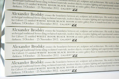
This is the catalogue produced for the first UK showing of Russia’s leading avant-garde architect, Alexander Brodsky. White Room / Black Room saw Brodsky transform an entire floor of the gallery into two rooms filled with light and darkness, making for a fully immersive experience. Viewers entered through a small door and the space was divided into two contrasting rooms first encountering a seemingly endless corridor of white light and then a more confined darker chamber, hidden from view and filled with blackness.
The exhibition catalogue was designed to reflect this Black Room and White Room with a book divided in two halves, half with the text in white and half with the text in black. The publication is what I would describe as a 'double-ender' - the cover and text read one way and then you turn it over and it reads the other way. The image below, shows the way the cover works:
 |
| Click on images to enlarge |
To further reflect the black and white theme, the pages of the catalogue at either end are unprinted pages which are 'Ram Punched' with a shape to represent the seemingly endless corridor of white light.
...and then a shape to represent the darker chamber:
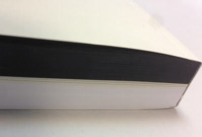
The size of the book is 243x168mm, portrait and contains a total of 322 pages, which gives the book a chunky 21mm spine. The 322 page pagination includes equal thicknesses of black and white text paper and a 32pp centre section, without ram punching, on which the story about the exhibition is told.
 |
| Click on images to enlarge |
The cover and middle section of text is printed on our Redeem 100% Recycled (315gsm and 100gsm). It is printed offset litho in just one colour. The 130pp of black, uses our Colorset Nero 120gsm and the below image shows how the black/white divide works
 |
| Click on images to enlarge |
Catalogue design is by Russell Warren-Fisher, who runs his studio in Corsham just outside Bath. You can see other exhibition catalogues he has created
here. Russell also created the brand identity and logotype for Calvert 22.
Print is by Emtone in Bath and as you can see, it was a seriously tricksy bit of finishing with a perfect 10mm thick cut
You can read more about the exhibition here:
http://calvert22.org/exhibitions/white-room-black-room-alexander-brodsky
http://calvert22.org/
http://www.rwfhq.com/
http://www.emtone.co.uk/
Posted by Justin Hobson 01.09.2016
 Founded by Nonna Materkova in 2009, Calvert 22 is focused on supporting and sharing the contemporary culture and creativity of the new east – eastern Europe, the Balkans, Russia and Central Asia – enriching perceptions of the region and furthering international understanding.
Through a regular programme of exhibitions, publications and debates Calvert 22 has established itself as a significant presence in the international contemporary art scene as it continues to support both established and emerging artists.
Founded by Nonna Materkova in 2009, Calvert 22 is focused on supporting and sharing the contemporary culture and creativity of the new east – eastern Europe, the Balkans, Russia and Central Asia – enriching perceptions of the region and furthering international understanding.
Through a regular programme of exhibitions, publications and debates Calvert 22 has established itself as a significant presence in the international contemporary art scene as it continues to support both established and emerging artists. 


