Showing posts with label Push Print. Show all posts

Thursday 2 June 2022

Jobs from the past - Number 151

Regular followers of this blog will know that my first post of every month is a "job from the past" so that I can show some of the really good work from years gone by...

...and being the platinum jubilee weekend, it seems like a good time to write about this project!

Lightness of Being 2008 - Chris Levine

Chris Levine is a Canadian born light artist who studied at Chelsea School of Art and Central St Martins and this is the invitation and show catalogue for his 2008 show held at the Old Truman Brewery in March 2008.
The centrepiece of the show is Chris’s (now, well known) work "Equanimity", the historic hologram portrait of Queen Elizabeth II (above) commissioned by the Island of Jersey to commemorate 800 years of allegiance to the crown and reputedly the only "portrait" of Her Majesty with her eyes closed. Equanimity 9, is pictured below:
The catalogue and invitation are pictured below. Catalogue is left, invite on the right. The invitation and cover of the catalogue are both printed on Astralux [1 sided] 250gsm which is a "cast coated" board (high gloss one side, uncoated reverse). Gloss coated side is printed in a fluoro pink solid. The invitation is printed CMYK on the outside (uncoated) with the coated (fluoro) on inside...
If you click on the image above, to enlarge, you'll see that the catalogue cover - which is an 8pp cover with the flaps reverse folded so they are on the outside - has a fantastic embossing - which shows the Equanimity image in relief. It just looks fantastic.
Size of both the invitation and the catalogue are A5, portrait. The catalogue is perfect bound with a 36pp text printed on our Neptune Unique FSC 160gsm.Text is printed four colour plus fluoro pink throughout.
Catalogue, invitation and graphics are by Why Not Asscociates. Print is by Push. Sadly neither companies are still trading.

This is simply the most innovative use of Astralux as a cover material that I have seen - the way the invitation and catalogue cover switch inside and outside and switch processes is superb and compliments the subject - as it should!
https://chrislevine.com/
Posted by Justin Hobson 02.06.2022

Monday 11 April 2022

ZRS Architekten

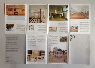
ZRS Architekten are a Berlin based architecture and engineering practice specialising in the use of natural building materials, especially Earth, Timber and Bamboo. Formerly, Ziegert, Roswag, Seiler Architekten engineers, London based designer, Dan Cottrell created a new visual identity for ZRS, uniting their previously separate offerings and positioning them as a modern, forward-thinking and holistic company. The new logotype, stationery, publications and website were developed to coincide with the company's 15th birthday.
This 16pp broadsheet is one of the publications produced for their anniversary, showing a selection of their projects. 

The finished size is 176x125mm folding out to 500x352mm.
The front side shows individual projects, allowing the space on the inside to be used for a large scale image (below) - showing the interior of Firmengebäude Flexim, Berlin.
The publication is printed offset litho on our Offenbach Bible 60gsm ...and it looks and feels absolutely gorgeous - it flops and folds in a delightful way when handling the publication as I hope these images demonstrate.
The 'birds eye' image, below shows the concertina fold...
Visual Identity and design is by Dan Cottrell.
The reproduction on our Offenbach Bible 60gsm is exceptional. Printing is by Push.

https://zrs-berlin.de/
www.dcottrell.com
Posted by Justin Hobson 11.04.2022

Tuesday 26 October 2021

ASOS BLACK / PUMA

This is the launch literature for the first collaborative ASOS BLACK x PUMA collection. The collection is designed by John Mooney and the garments include t-shirts, technical jackets, tailored shirting together with backpacks and accessories.

Photographer, Jamie Morgan was commissioned to work on a series of portraits for use in both press, online and print literature. The models featured are young street artists pulled together from around the UK.
This project has an unusual format. Size is A5 (210x148mm) portrait and content is 24pp but it forms one long concertina (12 panels). On each end a piece of 1500micron Greyboard is mounted, forming the front and back covers. The front cover is silkscreened in black only. The long concertina, which is over 1.7 metres long, is formed by one join, hidden on the reverse of the concertina.
To engage with the street artist look and feel, a recycled, "urban" type paper was required although this is a little at odds with the Jamie Morgan's amazing images! The paper selected is our Redeem 100% Recycled in 240gsm which is a natural looking recycled product, but as you can see from these images, it prints amazingly! ...although that's in no small part due to the quality of original and the printer. The 240gsm weight, creased perfectly, allowing the pages to flow well without being too stiff and rigid.
Design and production is by Asos. Project manager is Ash Durrant, the Creative manager is Vassili Kouznetsov and the senior designer on the project is Jenna Murray. Print and finishing is by Push Print.
https://www.asos.com/
Posted by Justin Hobson 26.10.2021

Monday 2 August 2021

Jobs from the past - Number 141

Regular followers of this blog will know that my first post of every month is a "job from the past" so that I can show some of the really good projects from years gone by. 

Picpus Issue 02 - Spring 2010
Picpus is a free magazine edited by Charles Asprey and Simon Grant. It carries articles from the art world, with a particular interest in historical curiosities, overlooked artists, arts and politics and is distributed through a selection of specialised art bookshops, galleries and libraries.
The format of Picpus is a folded down broadsheet, measuring 594x420mm (A1 size) which folds down to a 32pp A6 (105x148mm) finished size.
Folding out to...
Picpus is printed quarterly and there have been 25 issues published. You can read this issue and other isues HERE.

Below shows the broadsheet folded out...
...and the reverse side:
Picpus is printed on Redeem 100% Recycled 80gsm and is printed offset litho, in just one colour (black) on both sides. Design is by Alfonso Iacurci and is printed by Push Print based in London.
The above image shows the open top, which is sealed using a small, perforated label, which holds it neatly together until opening.

Posted by Justin Hobson 02.08.2021

Thursday 11 March 2021

Passage

 The Wapping Project is the creation of the Women's Playhouse Trust which was set up in 1981.

Throughout the 80s and the early 90s WPT’s artistic policy was defined by the playwrights it commissioned, produced and published, predominantly at the Royal Court Theatre, London. In 1993 it began to mount work in one of London’s most beautiful, derelict buildings in the East End, the Wapping Hydraulic Power Station; it is at this point that it became known as The Wapping Project, and established a worldwide reputation. It was always described by its founder and director, Jules Wright, as an idea consistently in transition. I have written about projects from this period on this blog before.

This publication titled 'Passage' follows two previous works 'Passage 2013' and 'Passage 1996' It features three pieces of poetry responding to the theme passageby Agnieszka Studzinska, Alia Syed and Heather Phillipson.
Click on images to enlarge
Size is 210x148mm (A5) portrait and is saddle stitched. The 4pp cover is hot foil blocked with a large solid panel in red foil (and on back cover). The 48pp text is printed on our Offenbach Bible 60gsm, which works beautifully. The publication is mainly text but the striking design uses the 'show through' to create amazing overlaying patterns.
Click on images to enlarge
Printed offset litho in two colours, the 48pp text flops and flows beautifully in the hand...
Click on images to enlarge
There are some images to support the text, which are all printed as monotones...
...and there is one double page spread, which is a full out image, which looks fantastic.
Using the Offenbach Bible 60gsm means that the total thickness of the 48pp is only 2mm!
Superb detail is the black coloured wire stitching (staples) a small touch, which makes all the difference. Published in an edition of 600.
Design is by Atelier Dyakova and the creative director is Sonya Dyakova. Printing is by Push and the printing on our Offenbach Bible 60gsm and the finishing is superb. 

Posted by Justin Hobson 11.03.2021 

Monday 5 October 2020

Jobs from the past - Number 131

Regular followers of this blog will know that my first post of every month is a "job from the past" so that I can show some of the really good work from years gone by and this publication is from 2014. 

67 Tufton Street SW1
Situated in the Smith Square conservation area, this Queen Anne style building was originally a Post Office and subsequently the UK Government’s Cabinet Office and a fine example of London’s architectural legacy. This office building was sympathetically restored and re-modelled to a plan by EPR Architects resulting in 22 luxury apartments.
This is the sales brochure produced to show the development, the surrounding area and the wonderful interiors. 
The size is 290 x 225mm, portrait, having a 4pp cover using a Buckram embossed chocolate brown cover board and is 'swiss bound'. The 56pp text is printed offset litho on our Omnia 150gsm. It is printed CMYK plus a metallic gold special and the result is absolutely superb.
The special pantone gold looks amazing ...really metallic and because Omnia is not smooth, it gives the feeling of something that is really metallic rather than something that is smooth and shiny.
Click on images to enlarge
The striking commissioned photography has reproduced brilliantly on the Omnia whilst not losing the tactility and natural uncoated feel that was required. The look and feel is a confident, beautifully crafted piece of literature, certainly not some "glossy property brochure"!
The swiss binding, still means that this brochure is made up using 'section sewn' signatures and above you can see the threads running across the inside spreads.
Click on images to enlarge
The metallic gold is used both as section dividers but also for the floorplan pages. The quality of reproduction of the interiors is wonderfully impressive with metallic fittings looking metallic and a photographic quality to the images.. 
The above and below images show the floorplans of the penthouse apartments.
The below image shows the Swiss binding. For those that are unfamiliar with this type of binding, it is essentially a section sewn or perfect bound binding method which has a "lip" of about 15/20mm of book-cloth wrapped around the spine. The cloth covered spine is stuck flat on the reverse of the text block with a strip of glue into a 4pp cover with a "freestanding" spine which means that the cover (which can often be very springy with normal adhesive binding) sits totally flat.
Branding for the development and the design of this amazing brochure is by London design agency The Ideas Factory under the leadership of Mark Wilkins. Designer on the brochure was Yafet Bisrat. Print production is by Push and it is superb. Both the "ink on paper" and the finishing/binding is amazing.

Posted by Justin Hobson 05.10.2020