Wednesday 9 February 2011

Zoe Williams Stationery

This is a lovely suite of stationery designed for writer and journalist Zoe Williams. The 'Z W' logo, is cleverly constructed from punctuation marks.
The stationery is hot foil blocked in gloss black foil only and has been beautifully done by IST Printing Services - based in Ayrshire - they do some lovely stuff - well worth having a look at their site: http://www.istprintingservices.co.uk/
Due to the colour pallette chosen, this stationery incorporates our lovely Colorset (100% Recycled) and a different (and much more expensive!) coloured paper stock from another paper merchant based in Hull (...guess who, guess what?) but they compliment themselves perfectly!

The clever and thoughtful design is by Maddison Graphic based in Ely.

http://www.maddisongraphic.com/
http://www.istprintingservices.co.uk/
Posted by Justin Hobson 09.02.2011

Monday 7 February 2011

Big Questions...

At the end of last year, King’s College London launched a worldwide development campaign with a sub-brand developed by Johnson Banks called "World questions King's answers".

Rather than the traditional donations campaign, this project poses a series of questions that the world faces, such as How do we cope with an ever-ageing population? What will it take to eradicate poverty? Why can’t we find better treatments for cancer?

The campaign aims to raise funds for new posts and programmes, build new facilities and create new student opportunities across the campuses. Johnson Banks developed a multi-channel campaign, including a booklet, leaflets and gift forms (and they also did a very nice badge!) 
The main booklet is A6 portrait (105x148mm) with a 4pp cover and 16pp text, saddle stitched. Because of the vibrant colours chosen, the material chosen for the job is Omnia (280gsm and 120gsm) which meant that a vibrant punchy result was achieved...
The printed literature demonstrates a well executed project, excellent print and reproduction and finishing on what on the face of it looks to be quite a simple job. But what you might not have spotted is that those white borders around the edge of the solids is only 5mm - you only have to be 1mm out on the finishing on this A6 size piece, for this job to look poor and the copies sent to me are all spot on. Print is by Cantate in Battersea and thanks to Jason Maclaren at Cantate for sending me file copies.

http://www.kcl.ac.uk/
http://www.johnsonbanks.co.uk/
http://www.cantate.biz/
Posted by Justin Hobson 07.02.2011

Friday 4 February 2011

Alex Parrott's 2009

This month The Design Conspiracy in London has been celebrating it's tenth birthday.

To celebrate, they asked 10 people they have collaborated with over the years; clients, artists, illustrators and photographers to interpret a given year in whatever way they wished. The only constraints were the size, must be 10" x 10" and must feature the year numerically or typographically, the rest was up to them! The pieces are now displayed in their gallery space at Stukeley Street.

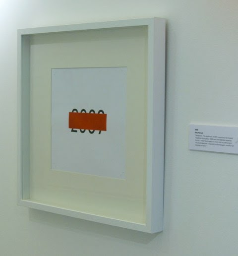
Independent and freelance designer, Alex Parrott (who's appeared on this blog before) was one of the 10 collaborators asked to produce a piece of work for the year 2009.

Alex's piece is called:  2009 / Redaction

"The exposure of MP's expenses dominated headlines throughout 2009 and the redacted expense forms which fascinated me from both a political and visual perspective, inspired this extravagant metallic foil blocked artwork"

Below is the piece that Alex produced which is hot foiled blocked in a red solid over a black 2009.
Alex had this individual piece produced by foiling company Paw Print on our Avebury Recycled Wove 170gsm. The material (which also has a cotton content) was chosen because of it's neutral white shade and good compressibility (which means the foil sits nicely into the paper).

Alex kindly sent some pictures showing the foiler, Tony Hooper, actually foiling the paper and I thought it would be worth posting these as many people reading this won't actually have an idea what someone working at a hand operated foiling machine looks like:
The exhibition runs from 3rd February - 28th February, Monday - Friday – 10am - 6.30pm at 12 Stukeley Street, London WC2.

http://www.thedesignconspiracy.com/
pawprint@btconnect.com
http://www.alexparrott.co.uk/
Posted by Justin Hobson 04.02.2011

Thursday 3 February 2011

KPMG Survey - Good news for print!

Print has a place in the world of new media, as most people still prefer to read offline, according to a survey by KPMG.
According to the latest survey, which spoke to 2,241 people, 86% of consumers prefer to consume media offline, with the most popular reason a preference for reading physical copies.

The survey also showed that the web still has a way to go to achieve print's respectability, and more importantly its ability to make money from a cover price. Only 24% of respondents that had read magazine said they hadn't paid for it and while 26% of newspaper readers did not pay. In comparison, 80% of online magazine readers and 92% of online newspaper readers did not pay.

David Elms, head of media at KPMG, said: "Despite the increase in the use of digital media, certain activities such as outdoor events, watching television and reading books and magazines remain hugely popular. This highlights that old and new media will co-exist and evolve together over time."

However, the continuing move into the digital world was more than apparent as compared to the previous six month survey, there had been a small increase in the proportion reading digital books. The survey backed up claims that printers need to learn to work alongside new media, as 60% claimed that they consumed more media than before.

So maybe print won't be KING but at least it has a place!
You can read the full survey here:
http://rd.kpmg.co.uk/docs/Anytime_Anywhere_-__The_Rising_Demand_of_Media_on_the_Move.pdf

Posted by Justin Hobson 03.02.2011

Tuesday 1 February 2011

Jobs from the past - Number 16

Followers of this blog will know that my first post of every month is a "job from the past" so that I can show some of the really good work from years gone by...

RCA Fashion MA - 2004
This is the show catalogue for the graduating students and is a really lovely piece of literature.
It is an extremely conventional A4 size but that's where conventional starts and stops. The cover uses a plain utilitarian board (our Tridon Greyboard 750mics) which is unprinted save for the type which is hot foil blocked in gloss clear foil. The cover boards are mounted on a false cover which reveals a strip of exposed green bookcloth along the spine. This is commonly (but not universally) called 'Sussex Bound'. The text of the whole book is 'French Folded' - this is where the folded edges are on the foredge of the book, as in the picture below:
The material used for the text is our Offenbach Bible in 60gsm and this piece is a triumph of print (especially fleshtone reproduction) and print finishing. It has 100pp or printed sides (which I would normally describe as 100 x 4pp french folded sections) - this actually makes 200pp but because the other side is unprinted and the ends are bound, each 4pp = 2pp. It's a bit tricky but if you think about it, it makes sense. French folding with a material like Offenbach Bible feels fantastic because the weight of the material lets the pages flop and flow beautifully.
Design and concept was by Larissa Nowicki. Photography by Helga Steppan. The superb repro, printing and finishing was by a company called Trichrom, which sadly doesn't exist anymore. However David Holyday, who produced much of this work for the RCA including this job is still producing print on a consultancy basis. [d.holyday@googlemail.com]

http://www.rca.ac.uk/
Posted by Justin Hobson 01.02.2011

Friday 28 January 2011

Brighton 2010

I am attempting (in vain!) to clear some of the lovely things I've been sent in 2010 and not had a chance to write up on the blog yet.

This is an exceptionally well put together catalogue produced by the graduating students of 2010 from Brighton University - Illustration and Graphic Design.
Size is 165x220mm Portrait (economical out of B1) with a 4pp cover and a 144pp text and is section sewn. Cover is on Colorset Nero, 270gsm, hot foil blocked in a irridescent silver foil. Text is printed CMYK on Redeem 100% Recycled 100gsm. It shows an incredibly diverse range of work - and it does it really well - both illustration and photographic images working really well on the Redeem. It was printed by the eponymous Push.

And thanks to Joe Spiteri, Pete Dungey, Tom van de Velde and Millie Scarlett Davies who designed, art directed and produced the publication and did all the hardwork on behalf of everyone else on the course to put together this superb catalogue ...and thanks for the kind dedication as well:
Posted by Justin Hobson 28.01.2011

Thursday 27 January 2011

Thank you for a thank you!

Earlier today I popped in to deliver some sample sheets that were needed for an urgent presentation to &Smith and was thanked in return by being given some very swanky bottles of a very posh brew!

They kindly put together a pack of beer which had been specially brewed for Coworth Park, a luxury hotel (part of the Dorchester collection) that &Smith did all the branding for ...including the labels on these lovely bottles of beer!

I haven't tried them yet (saving that for the weekend) but it was lovely to receive them from Rachel and Co as a thank you.

Interestingly, the beer is actually brewed at the Red Rat Craft Brewery in Suffolk and as I hadn't heard of them, I had a quick look on google and discovered that it is owned by brewer Kevin McHenry and Tony Hadley of Spandau Ballet fame!

And many congratulations to Anna on getting engaged at the New Year.

http://www.coworthpark.com/
http://www.redratcraftbrewery.co.uk/
http://www.andsmithdesign.com/
Posted by Justin Hobson 27.01.2011