Tuesday 19 June 2012

Munich `72

In the same month that the Olympic flame is passing through Kent, the University of the Creative Arts (UCA) Canterbury campus presents a symposium and exhibition on the design heritage of the Munich Olympics in 1972. The project draws upon Ian McLaren’s collection of relevant material having been a senior member of the design team. The exhibition provides a first hand account of the evolution of the designs and subsequent commercialisation of aspects of the work produced for Munich’72. An accompanying symposium will combine contributions from figures who worked with Aicher alongside respected practicing designers.

The 1972 Munich Olympics is often remembered more for the terrible events when members of the Israeli Olympic team were taken hostage and eventually killed by the Palestinian terrorist group Black September. Needless to say, these murders greatly overshadowed the games.

However, the design work led by Otl Aicher was groundbreaking and provided a real legacy which endures and we still see around us today, in particular the pictorial symbols. Here's an extract from the Munich72.org website:

"The colour palette was one of the most significant aspects of the identity. It was based upon the heraldic colours of Bavaria, light blue and white (as used by BMW and the Hofbräuhaus brewery). Aicher chose these, together with the light green of the Bavarian alpine landscape, as the principal elements to provide a light palette (which required bespoke ink formulations). The lightness of colour was reflected in the adoption of a light typeface (Univers 55). The colours in the German national flag were expressly excluded"


The symposium will feature contributions from figures who worked with Aicher, alongside contemporary designers (such as Mason Wells, Lucienne Roberts and Tony Brook, who have a particular interest in the work produced for the '72 Games

The Symposium is next Friday on 29th June at the university's Cragg Lecture Theatre. Seats for this 'free entry' symposium require booking and are limited to 120. Please make your booking asap to ensure your place. Ticket information: Elizabeth Baxter ebaxter@ucreative.ac.uk.

The Exhibition runs from 29 June to 31 July 2012 at UCA Canterbury campus, Herbert Read Gallery. For latest updates: www.facebook.com/M72DesignLegacy

Visual  concept for exhibition and symposium by Baseline Magazine: Hans Dieter Reichert and Johnathon Hunt.

...and thanks to Hans Dieter Reichert, editor at Baseline magazine and one of the organisers, for inviting me the event.

Posted by Justin Hobson 19.06.2012

Thursday 14 June 2012

make

Make is one of the UK's foremost architectural firms who have a host of awards and many iconic buildings to their credit.The practice was founded by Ken Shuttleworth in 2004 and now has studios based in London, Birmingham, Beijing, Hong Kong and offices in the Middle East.

Unusually, Make is a 100 per cent employee-owned organisation with each member of staff sharing in the profits each year which is interesting in a world which appears to be increasingly dominated by "celebrity" architects.

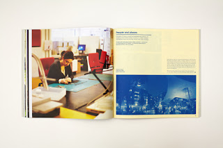
Each year, they produce an Annual which reviews and shows their work of the previous year and this year, I was fortunate enough to be involved with their eighth annual document, showing their work from 2011 and this publication really does show their work, beautifully.

Size of the annual is 275mm square. It is "swiss bound" - if you don't know what that is, see the pic below. Basically the text is perfect bound with a strip of cloth binding tape. The text is attached to the inside back cover parallel with the spine, leaving the spine and cover free to open flat.

Inside spread showing "Swiss binding"
Thomas Clarkson Community College
7th Birthday Party
Fitzrovia development
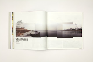
China sction - Weihai Pavilion
Camden Street Kiosk
Haringey Heartlands section
The Gateway Building
Private London residence
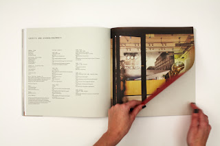
Credits pages

There are several interesting features about this job which are worthy of note. In total there are 140 text pages. The publication is divided into seven sections and there is a different paper used for each section. Most people who know me (reasonably well), know that I have a "three paper rule" so that no job should use more than three different materials ...unless there is a very good reason. This (in my opinion) is because if materials and weights change too much, the whole thing can lose flow and it can ultimately upset the reader. This piece uses six different materials (not all ours) and it really works!

The cover is on our Flora Betulla 350gsm which is printed CMYK and foiled in a matt white foil (the number 8). The other materials used of ours are Flora Betulla, 130gsm, Omnia 120gsm and most impressively of all, our Offenbach Bible 60gsm for the 24pp CHINA section which looks (and feels) amazing.

For the sake of balance, the other materials used (from other people!) are Heaven 42, 135gsm (from Scheufelen), Cyclus Offset 115gsm (ArjoWiggins) and Carnival Yellow 80gsm (Mohawk?)

It was designed and produced by Denise Ryan and Emily Chicken at Make and thank you for sending me a copy and your lovely note:
 
Printing and binding is by Graspo, based in Zlín, Czech  Republic.

www.makearchitects.com
http://www.graspo.com
Posted by Justin Hobson 14.06.2012

Wednesday 13 June 2012

OPEN SET

I've been sent details of an interesting event happening in August in the Netherlands. Students at the St.Joost academy are organizing a Dutch graphic design summer school OPEN SET.

The event is totally organized by students and they've pulled together some fantastic speakers from the world of Dutch Graphic Design, including:

Petr van Blokland
Hugues Boekraad
Max Bruinsma
Thomas Castro (Studio LUST)
Liza Enebeis (Studio DUMBAR)
Max Kisman
Jan van Toorn

The event will take place at House of Visual Culture in Breda (the event is supported by the Graphic Design Festival Breda) and takes place from 13th till 25th of August (the deadline for application is 25th of June!)

For more information about the event please visit the official website: www.openset.nl.

Thank you to Irina Shapiro (who is one of the student organisers and a fan of this blog!) for letting me know about the event - (also, I didn't know that the lovely Liza Enebeis who I used to work with at Pentagram many years ago is now at Studio DUMBAR).

www.openset.nl
Posted by Justin Hobson 13.06.2012

Tuesday 12 June 2012

Pentagram is 40

Pentagram was founded 40 years ago today. On 12th June 1972,  Alan Fletcher, Colin Forbes, Theo Crosby, Kenneth Grange and Mervyn Kurlansky formed a new company called Pentagram in London. There are now 19 Pentagram partners working from five offices around the world and it is a thriving, multi-disciplinary, design business.

Over the years, I've been fortunate to have worked on some really beautiful projects with the Pentagram London office, a few of which appear on this blog. I've met and worked with some amazing people, including the late Alan Fletcher and been introduced to many designers who started their careers at Pentagram ( ...far too many to list!). I find the company an inspiration.

Happy 40th Birthday to Pentagram.

www.pentagram.com
Posted by Justin Hobson 12.06.2012

Monday 11 June 2012

Hincredible Hinglish

...nothing to do with our paper but I thought this was of interest!

I was sent a link about this project undertaken by Incredible India which is the Indian government tourist office.

They commissioned a typeface which is specifically designed so that you can tell the phoenetic sound of a Hindi character by looking at the corresponding Roman character superimposed on it. Hindi is written in the Devanagri script which has many more characters that the English alphabet, therefore this font cannot tell you how to read words as they are spelt in Hindi but it's aim is to demystify individual letters in its script and make India more approachable.

Interesting stuff ( ...I thought):


Personally I think this is lots of fun and a great experiment in typography.
Have a look for yourself:
http://www.thehinglishproject.com
Posted by Justin Hobson 11.06.2012

Friday 8 June 2012

Book - Wrap

Here's an interesting little project that I was able to help out with.

 This is Real Art has just published their first book under their new TiRA publishing imprint.

Shibuya by Adam Hinton is a limited edition photo book (500 copies) documenting Japanese commuters at the world's busiest station and intersection: Tokyo's Shibuya. A sequence of 29 portraits revealing both the misery and pressures involved in the daily commute. Case bound in soft grey cloth, the cover has a simple foil embossed graphic from the Japanese 'walk/don't walk' sign, along with the books title in katakana lettering.

Anyway, they wanted something lovely to wrap the book in and after I sent samples, decided that our Offenbach Bible in 40gsm had the right physical properties for folding whilst also having the right feel to go with a publication about Japan, which is a very paper conscious society.

The poster/wrap is printed with a halftone (monotone) image in Pantone 1795 on Offenbach Bible 40gsm. The image forms the inside of the wrap. The plain paper side (outside) which is left white is then stamped with a custom made rubber stamp.


Printing on the Offenbach Bible 40gsm (which isn't every printer's cup of tea!), was beautifully done by Robert Young at R.Young & Son, based in Croydon.
Paul Belford is Creative Director at This is Real Art and Martin Brown is Head of Design.

http://www.thisisrealart.com/products/view/3/adam-hinton/shibuya
http://www.thisisrealart.com

Posted by Justin Hobson 08.06.2012

Wednesday 6 June 2012

Jobs from the past - Number 32

Regular followers of this blog will know that my first post of every month is a "job from the past" so that I can show some of the really good work from years gone by...

The Fourth Estate Catalogue 
July-December 2003

The Fourth Estate is a publishers that many people will be familiar with. Founded by Victoria Barnsley in 1984, Fourth Estate built a reputation as one of the most innovative and eclectic imprints in the industry, with a reputation for publishing a wide variety of critically-acclaimed and beautifully-produced titles including many prize winning authors (Booker, Orange etc).

One of the things that made the Fourth Estate stand out from the crowd was their catalogues - they were simply amazing pieces of design and print! I was lucky enough to work on a few different catalogues in the late 90's and early 2000's. Every single one was different and brilliant. Good designers were comissioned, Bogue & Hopgood, Instinct, Rose Design, Frost, Neville Brody, Tom Hingston to name a few. In line with their reputation for publishing unconventional yet innovative titles, the design of the catalogue was equally eclectic.

This is one of the last catalogues I was involved with, designed by Tom Hingston Studio.
Here's the comment from Tom Hingston's website: "For our design of the Fourth Estate July-December 2003 catalogue we took inspiration from the aesthetic of an authors manuscript. This gave us the opportunity to explore the use of type as image, to illustrate each title in a way we felt appropriate for a books catalogue"
The size of the book is 150x215mm, portrait. It is casebound (hardback). The book is divided into two sections, new releases 1-32pp and the remainder 33-56pp. The papers used are both lightweight. The first section is of the catalogue is printed on Redeem 100% Recycled FTP 90gsm and the second section on Myriad Colours Yellow, 80gsm. End papers are on Episode IV 115gsm. The cover is covered with self coloured bookcloth and foiled (beautifully) in black foil.

Detail


Design director is Tom Hingston, designer on the project was Manuela Wyss.
The job was printed in two colours by Wisbech based printers Balding & Mansell, who are now sadly defunct.

Victoria Barnsley, founder of Fourth Estate, joined Harper Collins as CEO and Publisher in 2000 when it acquired her company ( ...she did well!). These distinctive publications continued to be commissioned and produced for a few years after becoming part of a larger group. Sadly (and I guess it was just a matter of time) the Fourth Estate became a section within the homogenised Harper Collins catalogue and the individual publications ceased.


Posted by Justin Hobson 06.06.2012