Friday 30 November 2012

Hans Hartung Exhibition Catalogue


This is an exceptional exhibition catalogue for the artist Hans Hartung which features an essay by Odile Burluraux alongside the work. Published by the Timothy Taylor Gallery.

It is a casebound (hardback) book which is 260 x 200mm, portrait format and is section sewn. It features endpapers and two different materials for the text.
The casebound cover is printed on Neptune Unique FSC 135gsm, offset litho and is matt laminated, mounted onto the case, hot foil blocked in silver metallic foil and debossed. The unprinted, black endpapers are on our Notturno 170gsm.
Text is made up using 16pp of Neptune Unique 135gsm (uncoated) which is printed in the special PMS yellow and black. The artwork is reproduced on a 48pp text section printed on printers "house" coated silk 170gsm.
Design is by Matt Bucknall. Print and the excellent binding is by Chapter Press.

Posted by Justin Hobson 30.11..2012

Wednesday 28 November 2012

Alfred Dunhill - AW 2012


On this piece of literature - just the cover makes the difference!
 
This piece of literature is one that my colleague Gillian Thomas worked on, together with London design studio, Small. This job particularly uses the cover material to increase the quality and feel of the whole project.

It is the first issue of a new publication from luxury brand Alfred Dunhill produced as part lookbook part magazine, titled "To the Ends of the Earth". It features images of David Adjaye, Jamie Hewlett, James Marsh and John Hurt, the photography is by David Sims. The four images feature on four individual covers, the print run being divided between each.
The size of the job is 230x302mm portrait, perfect bound. It has a 4pp cover and 120pp text. Our Omnia 200gsm was chosen for the cover to give it a more tactile engaging feel, whilst reproducing these mono images with great quality. The cover alone gives the publication a luxury feel and keeps it a million miles away from the naff "glossy" magaziney type covers which is often produced for this type of publication.  
The text paper is on a coated recycled (Cyclusprint - which works well and fitted the budget) but the cover has already set the tone and feel.
Design is by Studio Small, creative directors on the project are David Hitner and Guy Marshall. Print production is by Nirvana CPH.

An excellent example of using a material for a part of a project which can just lift the whole look and feel and make a piece of literature really special.

www.dunhill.co.uk
http://www.studiosmall.com/
http://www.nirvanacph.com/
Posted by Justin Hobson 28.11.2012

Tuesday 27 November 2012

Monotype Exhibition Review

On Friday, I went to the Monotype - Pencil to Pixel exhibition at Metropolitan Wharf. It featured material from Monotype’s historic archive of original artwork, type drawings, equipment and publications.
However, I was personally a little disappointed...
 
Don't get me wrong, it was a beautifully designed exhibition. It did indeed feature original type drawings, artefacts, publications and assorted ephemera. It was held in a posh space with some very nice glass topped display cases and slick exhibition graphics. It was very, very interesting but I guess I was just expecting something more ...physical.
It's not that I was expecting some heavy metal letterpress typefest but I think that there was just a lack of sheer physicality! It may have conveyed the the day to day workings of a drawing office in an academic sense but I feel it missed the part that the manufacturing process played in the practicalities of type design in a historical context.

Luckily for me, the tour that I was on was conducted by Dan Rhatigan from Monotype (below) who was an excellent guide - very interesting and he made the exhibition come alive.
There was archive film about Linotype machines and many past issues of the Monotype Recorder - (although I can't recall reference to Beatrice Warde, surely the most well known editor, although I may have missed this) and they were all safely in glass cabinets.

It contained much about the design of particular typefaces - all interesting stuff but I just thought that as an "archive" show, it was a little lacking in the explanation and possibly demonstration about just how physical and industrial the world of type and print was, back in the 20th century - all a bit too smart and shiny for me! (...and possibly a bit more pixel than pencil).

Pretty good but not brilliant ( ...in my opinion!)

Pencil to Pixel is supported by: SEA Design | D&AD | The University of Reading | Eye Magazine | The Drum| Pureprint Group | That other paper company based in Hull!
 
Posted by Justin Hobson 27.11.2012

Friday 23 November 2012

Futureproof

Jacobson Space is a fine art dealership specializing in modern and contemporary international art in all mediums. Futureproof is an exhibition showing a selection of the very best post-war art for collectors. Artists included in this show are Bram Bogart, Larry Bell, Anthony Caro, Helen Frankenthaler, Lucian Freud, Donald Judd, Louis le Broqcuy, Robert Motherwell, Bridget Riley, Pierre Soulages, Frank Stella, William Tillyer and Marc Vaux.

Reflecting the theme of technology and the fast-maturing space age of the time that these works reflect, the invitation for the private view is a panorama of the final frontier!
The A5 (148x210mm) invitations have been hot foil blocked in white matt foil on our Notturno 700gsm, giving a nice rigid feel.
Art direction and design is by Fraser Muggeridge Studio. Foil blocking is by Anglia Foil blocking.

The exhibition is on from 15th November - 21st December 2012.

www.jacobsonltd.com
www.pleasedonotbend.co.uk
www.angliafoilblocking.com
Posted by Justin Hobson 23.11.2012

Thursday 22 November 2012

BN International - Lunch on the river


Today, I was lucky enough to attend the BN International annual event, which this year was a luncheon cruise on the river Thames. It was hosted by BNI, FJ Ratchford and Société d Enduction et de Flockage (SEF).
 
Now for those of you not familiar with the names of these compan-ies, they are mainly involved with materials for bookbinding, covering and all things mounted. Product names that you may have heard of but which may not realise are from these suppliers are Balacron, Reflections Bookcloth, Windsor and Colorado rayon cloths and of course, our own Flockage!

Most of the invited throng were customers involved in the covering industry, bookbinders, boxmakers, printers etc. Here I am talking to Roy Eve, organiser of the event and BNI head honcho in the UK.

...and never one to miss a comedic photo opportunity, below is a photograph taken by Francis Atterbury from Hurtwood Press.
www.hurtwoodpress.com©2012 Frank Atterbury
The fine weather contributed to making this an excellent event, so thanks to the hosts for an excellent day and to Nigel Jibson (www.nrjincentives.co.uk) who organised the event.

www.ratchford.co.uk
www.sef-france.fr
Posted by Justin Hobson 22.11.2012

Wednesday 21 November 2012

Bentply

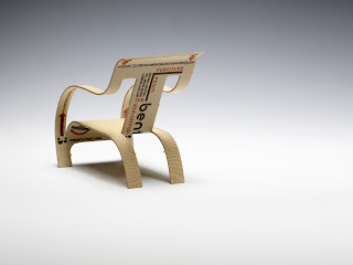
Bentply is a London based shop established by Bruna Naufal in 1989 specialising in 20th century, modernist furniture. This post is about a unique business card produced for Bentply, which also works as a promotional piece - it simply makes up into a cut-out miniature of the iconic 1934 bent plywood chair designed by Gerald Summers.

Now this is a project which began well over a year ago for me, when I was contacted by the designer Richard C. Evans, who explained what he was trying to achieve and was researching into materials and processes. I sent samples and we discussed various print finishing techniques that might make the idea work.
Now this project has already been featured on some design blogs, but as is common with other blogs, not much detail is written about the actual project (...they just show pretty pictures!)

After testing, Richard decided on our Flora Tabacco 240gsm which had the correct "woody" look and feel. As this wasn't a big budget project, Richard struggled to find a printer in the UK who could produce the project within the budget. Eventually he came across a letterpress printer called Elegante Press based in Lithuania. Now unlike some other paper companies, we're not afraid to pack paper up in a strong box and send it overseas! ...so that's exactly what we did. Elegante Press then triplexed the 240gsm board (echoing the properties of plywood) making 720gsm. The card is then letterpress printed in 2 colours and kiss-cut - just beautiful! Size of the card is 57mm x 136mm.
...and here's a close up pic:
I don't know what more I can add. A brilliant idea, perfectly excecuted and on the right material for the job!

www.bentply.com
www.elegantepress.com/
http://richardcevans.com/
Posted by Justin Hobson 21.11.2012

Tuesday 20 November 2012

Monotype - Pencil to Pixel

I've only just found out about this amazing exhibition which is on this week. Titled ‘Pencil to Pixel’ the exhibition is only on this week (19th-23rd November) and features Monotype’s historic archive of original artwork, type drawings, equipment and publications - in fact, nearly everything to do with type design through the 20th century.
 
The exhibition is on display at Metropolitan Wharf in Wapping. On display is a selection of rarely seen drawings, artefacts, and publications ...and it's free!
 
Posted by Justin Hobson 20.11.2012