Thursday 8 June 2017

OK by Supermundane

I've just received a beautifully produced silkscreen print from Gary Parselle at The Private Press.

This print is one of the series called Editions which is Gary's own collection of exclusive, hand-pulled limited edition screen prints, featuring a carefully chosen selection of artworks by leading contemporary artists. Working collaboratively with the artists, Gary aims to use this series to showcase the possibilities of creative screen printing using interesting inks, papers and techniques.
This print is by Supermundane: “I’m a big fan of screen printing and how physical a process it is. I’ve had the pleasure of working with The Private Press on a few projects in the past so I was excited to be asked to be involved in this new project. My print is part of my on going ‘You Made This’ project which explores our fears and desires. This time I’ve hidden the term OK in there that represents the word and a mouth and body of sorts at the same time."
The print is silkscreen printed in three colours onto our Colorset (100% Recycled) White 270gsm board. The yellow and blue inks overlap and combine to make green in select areas.

The below image shows before and after on the drying rack! On the left - yellow and blue, on the right - overprinting black.
The size of the prints is A2 (420x594mm) and is a limited edition of just 50, signed and numbered by the artist. My thanks to Gary for sending me this print and his lovely note...
The Private Press is a small Brighton-based screen printing company, established in the summer of 2013. The studio was established by Gary Parselle, who has more than 10 years of screen printing experience. Before setting up the Brighton studio, Gary worked extensively in some of London's most renowned graphic design and advertising agencies where he specialised in print production and this is where I met him (...at Interbrand I think). This is the reason that Gary has an in-depth knowledge of print, paper and finishing techniques.

The Private Press specialises in high quality, hand pulled screen prints for artists, illustrators and graphic designers. Below are the other prints from the 'Editions' series...
https://www.theprivatepress.org/
https://www.theprivatepress.org/editions
https://www.theprivatepress.org/editions-supermundane
http://supermundane.com/
Posted by Justin Hobson 08.06.2017

Monday 5 June 2017

Jobs from the past - Number 92

Regular followers of this blog will know that my first post of every month is a "job from the past" so that I can show some of the really good work from years gone by.

Tuna - Published in 2000
Why is this tin of Tuna appearing on this blog, which is usually about printing? - I hear you ask. Well it might look like an ordinary tin of Tuna, but it's anything but.
Click on images to enlarge
Image showing the bottom of the tin:
This project might look like a humble tin of Tuna, but it is in fact a book published by photographer Marcus Lyon. Photographed in Tsukiji Market, Tokyo in 1999, it tracks a day in the life of the single largest covered market in the world. Tsukiji market in Tokyo is the home of the world famous Tuna auction where much of the world’s blue fin Tuna is sold.
The book has tin plates fixed front and back and is silver edged, which makes for the perfect tin facsimile - it really does look and feel like a tin. To get the rounded shape, the bound book blocks were 'ram-punched' to achieve the rounded corners.
You can see from the images above and below just how good the silver edging looks. The print production was handled by Phil Le Monde at Gavin Martin and I recall Phil telling me at the time that they had tried traditional gilding with silver gilt but it wasn't robust, especially on the spine, so they ended up clamping each book and spraying the edges using silver spray paint for cars!
The below image shows close up detail of the edge, showing the individual pages, but unless you get close and personal, you really can't tell it's a book.
The size of this tin of Tuna is 100x140mm portrait with a depth of 22mm. Including the cover (which have the tin plates affixed) the whole publication is 42pp. The 'pages are made up by 'back to back' laminating sheets together, which then form a 'hinge' which forms the spine - which, as a result, is no thicker than the top, bottom or foredge of the rest of the book. Below image shows the 'spine' which also demonstrates just how well the silver paint has survived.
The below image shows the way the sheets are back to back laminated to form the pages.
...and now for the paper bit! It was printed on a coated paper range of ours called Aerographic Twin 380gsm, which was a two sided coated board range we used to stock made by Tullis Russsell, who sadly went bust in 2015. The bulky board laminated together makes each page 900micron thick.
The publication is printed CMYK throughout, the images having all been printed in mono. The result is an amazingly evocative set of images of the market throughout the day...
Click on images to enlarge
I had no idea that Tuna fish were so large
The timeline and credits for the publication are listed on the inside back cover, as is the limited edition number - this was an edition of 100. Now it turns out that my 'file copy' is un-numbered which either makes it worthless or worth more!
This project was recently shown as part of an exhibition in San Francisco in 2015 at RayKo Photo Centre. As part of the exhibition, they made this video which shows the project page by page: https://www.youtube.com/watch?v=_9O5KulyVmE

The project was designed by The Partners and the lead creative designer on the project was Greg Quinton. The team credited in the book is as follows: Kaz Naito, Julia Pae, Matthew Stuart, Dana Robertson, Greg Quinton, Tony de Ste Croix, Christina Boyes, Kumiko Yamamura, Louise Irving, Kevin Leighton, Hannah Davies and Kirsten Young.

Print and most importantly the amazing production is by Gavin Martin Colournet with Phil Le Monde handling the project.

The project was the subject of much coverage in the design press and appeared in many awards. It was highly commended in the Design Week Awards 2002, New York Art Directors Club Gold, 2002 and it was published in the D&AD book 2001.

A truly amazing project - I hope you enjoyed reading about it as much as I enjoyed writing about it.

http://www.marcuslyon.com/
http://www.the-partners.com/
http://www.gavinmartincolournet.co.uk/
Published by Justin Hobson 05.06.2017 

Wednesday 31 May 2017

Land's End to John O’Groats on a printing bike!

Nick Hand is a graphic designer based in the west of England and has appeared on this blog previously with his work for Howies and the Do Lectures. More recently he's turned his hand to being a letterpress printer and established an open access letterpress project in Bristol called The Letterpress Collective in 2013.

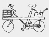
In 2014, Nick commissioned his workshop neighbour, bicycle maker Robin Mather to build a printing bike capable of carrying an Adana 8x5 printing press, together with inks, paper and type. Following a successful Kickstarter campaign, Nick travelled from Bristol to Mainz, which is where Johannes Gutenberg invented printing with moveable type in 1440. Along the way he collaborated with artists, writers and poets, printing along the way.
The printing bike has now hit the road again!

Following yet another successful Kickstarter campaign, earlier this month, Nick set off from Land’s End winding his way up the spine of Britain to John O’Groats seeking out the makers in towns known for making one particular thing. He plans to visit towns such as St Ives, Yeovil, Cheddar, Walsall, Stoke-on-Trent, Northampton, Nottingham, Halifax, Harris and Dufftown. In celebration of each craft and town, he will print a set of cards on the Adana 8×5 press mounted on the back of the bicycle.
My best wishes to Nick and I hope the weather is fair, both for both cycling and printing. According to his twitter feed @nickhand Nick is in Wolverhampton today.

You can read more about the adventure here: http://theletterpresscollective.org/blog

www.theletterpresscollective.org
http://www.departmentofsmallworks.co.uk/
Posted by Justin Hobson 31.05.2017

Tuesday 30 May 2017

Paul's pocketbook portfolio

This is an interesting concept - rather than a big flashy studio brochure , Paul Grogan has deliberately produced a "pocketbook portfolio". The size is A6 105x148mm) landscape and is saddle stitched. The 4pp cover is on our Colorset 120gsm and 36pp text is on 90gsm, which means that it sits nice and flat.
The cover is printed on Colorset Flint 120gsm, printed digitally in white ink - very effective.
Click on images to enlarge
The text is printed in colour, also digitally printed on our Marazion Ultra 90gsm. This is a lightweight paper with a matt coating but which has an amazing bulk, tactile feel and excellent opacity for 90gsm. It feels just right for this project, because it just flops over wonderfully and sits nice and flat.
Click on images to enlarge
As you can see from the image below, it really does sit nice and flat, the overall thickness is under 2mm thick, so it really can fit in a pocket.
An excellent example of a cost effective, simple piece of promotional collateral.
 
Paul Grogan lives and works in the Manchester area. Digital printing and finishing is by Galloways Printers based in Poynton using their Heidelberg Linoprint press, which is toner based digital.
 
Posted by Justin Hobson 30.05.2017

Wednesday 24 May 2017

Olivia von Halle - The Marrakech Collection

Olivia von Halle is a British luxury nightwear brand that launched at London Fashion Week in September 2011. The brand can be found in nearly 100 stores in 20 countries including Harrods, Selfridges, Neiman Marcus, Saks Fifth Avenue and online with Net-a-Porter.com.

Focusing on beautifully cut silk pyjamas in stunning exclusive prints, Olivia von Halle has quickly made a name for itself in the world of high-end nightwear. In 2013 the company was awarded the ‘Blue Butterfly Trust Mark’, which is given to brands and companies that have a positive impact on people and the planet.
This is the look-book for the Pre-Spring 2017 Collection. The publication is sub A4 - 290x205mm, portrait. It is a 16pp self cover format printed on Omnia 150gsm
Unlike many of the fashion look-books featured on this blog, which are printed offset litho, this has been digitally printed on an HP Indigo press. The colours are strong and punchy and the whole publication has a matt, tactile look and feel - in fact I can honestly say, every bit as good as litho!
Click on images to enlarge
Although Omnia was never originally developed for digital, we now keep it as a stock item with "sapphire treatment". This treatment is often applied to more unusual papers and provides a "key" so that the inks (which are different to litho inks) work on the paper surface. The great thing is the job just doesn't look and feel like a digital job. Below is a detail shot showing the excellent fleshtone reproduction.
 The self cover format means that it flows well with the pages turning nicely.
 A nice touch is the use of the white wire for the saddle stitches, in fact so white, you can't see them!
Graphic design is by Michael Knight, who runs his studio in East London called A New Mark. Print and finishing is by Gavin Martin Colournet.

http://oliviavonhalle.com/
http://www.anewmark.com/
http://www.gavinmartincolournet.co.uk/
Posted by Justin Hobson 24.05.2017

Monday 22 May 2017

The 3rd St Bride Foundation Wayzgoose

Yesterday, I had a table at the St Bride Foundation WAYZGOOSE. This is a term (unfamiliar to most people) that used to refer to an annual holiday in a printworks and was often an awayday to the coast or some other sort of day out, more often than not, paid for by the firm.

In this instance the St Bride Wayzgoose is a kind of letterpress 'bring and buy' sale.
Over twenty five different tables displaying and selling everything from lead type to tabletop presses and printed examples of work.
Here is the table that I was allocated, where, as previous years, I adopted a "throw it all on the table" approach! I took lots of offcuts and discontinued paper and board items. All paper, cards sold by weight - 25 pence per 100 grams.
I'm pictured with the very helpful Andrew Long, a final year student at Central St Martin's who kindly helped me unload the van and set up the stall - he's looking for placements and work - I recommend him, he's a hard worker - you can find him at and.long@me.com
I served at my 'paper stall' from 11am to 4pm  ...and by the end of the day I had raised £210, all donated to the St Bride Foundation.

My neighbours on the table next to me were Caslon. Many readers will be familiar with the typeface, Caslon, first cast by William Caslon in the 16th century. The firm is still run by the Caslon family and today, they supply machinery, inks, powders and the ever popular Adana printing press.
They letterpress printed some cards on our exuberant So ..Silk, Beauty Pink 350gsm and they look amazing.
My thanks to Mick Clayton for inviting me and to all the staff and friends at St Bride.

http://www.sbf.org.uk/
http://www.caslon.co.uk/html/_adana_letterpress___.html
Posted by Justin Hobson 22.05.2017