Wednesday 16 May 2018

Jimmy Choo - Cruise 2017

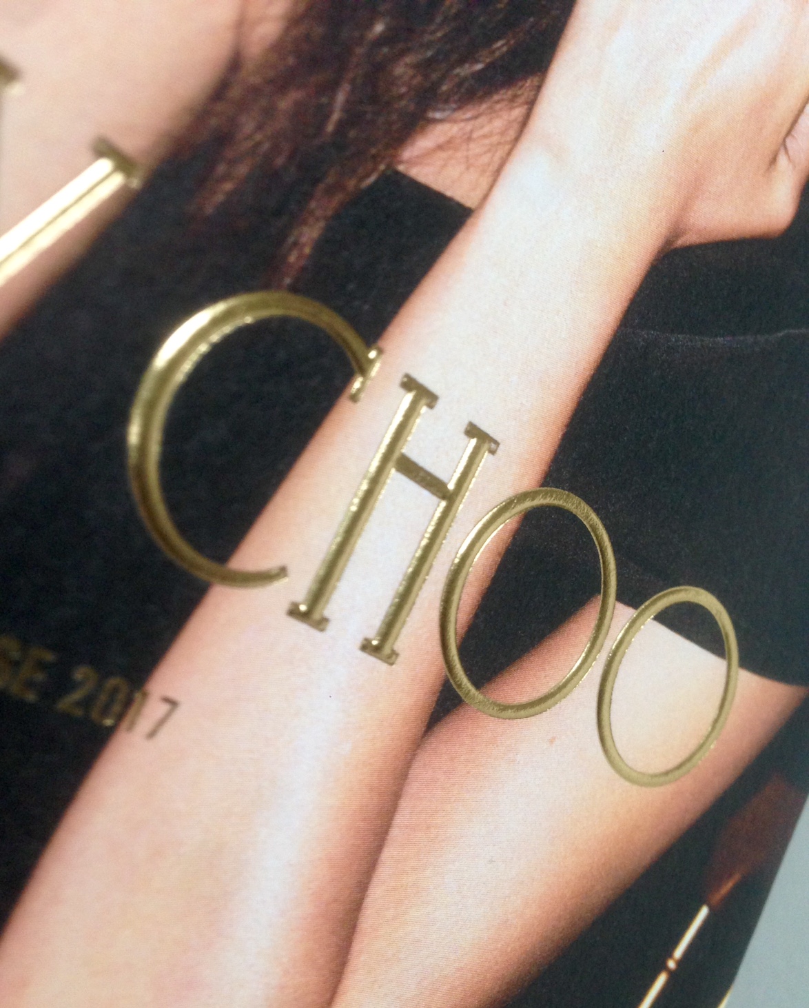
Founded in 1996, Jimmy Choo is now an iconic luxury fashion brand defined by an empowered sense of glamour and a confident sense of style. This is the beautiful new brochure for the 2017 Cruise collection...
The size is 210x148mm (A5) portrait and is saddle stitched. The publication has a 8pp cover with a 28pp text.

The 8pp cover is printed on our Omnia 280gsm. Both the cover and text are printed CMYK plus a metallic gold pantone as a special. The front cover has a raised, embossed foil for the Jimmy Choo brandmark - which I hope I have managed to capture in the image below. Omnia is a very bulky sheet, so it embosses superbly, taking a deep embossing superbly.
Click on images to enlarge
It is printed offset litho in four colour process throughout. As always (...this is the plug for the paper!) the images look superb on the Omnia; the fleshtones in particular look absolutely stunning and the reproduction of the jewels and metallic images is great - keeping all the detail in those heavy areas of CMYK together with uncoated paper tactility which would be lost on other papers.
Click on images to enlarge
The detail on the handbags in the below image is stunning...
The size and combination of weights is just right and the book flows superbly in the hand. The text is printed on Omnia 150gsm.
The book is section sewn, with a nice flat spine which is also hot foil blocked.
Art direction and design is by the design studio at Jimmy Choo. The peerless print and print production is by Gavin Martin Colournet.

Posted by Justin Hobson 16.05.2018

Friday 11 May 2018

Abram Games - Shakespeare Kickstarter

Earlier this year, I wrote a piece about a publication featuring the work of Abram Games, which you can read again here.

Abram Games is acknowledged as being one of the 20th Century's greatest image makers, his work is now a fascinating record of social history. For over 60 years he produced some of Britain’s most memorable images including the war years as Official War Poster Artist producing over one hundred posters. He was the designer of the Festival of Britain emblem and his clients included the United Nations, London Transport, British Airways, Shell, the Financial Times, Guinness and of course book jackets for Penguin books. He also created the first animated BBC on-screen ident in 1953.

One of the spreads in my article included this poster that he produced for the Royal Shakespeare Theatre centenary appeal in 1975, featured on the left hand spread below:
The poster was hailed a huge success by the RSC and as far as Abram's family knew at the time, he considered the job completed. But thanks to an exciting discovery we now know that Abram’s intentions for the much-admired image went far further than a poster. After his death in 1996, Abram's daughter and archivist, Naomi Games, happened upon a mock-up he had made of a flickbook based on the poster image. As she turned the pages of the book Shakespeare's face gradually appeared, one play at a time. From the designs she could see that her father had even experimented with getting Shakespeare to wink!

...so please join in the Kickstarter campaign and help make this piece of print a reality:
https://www.kickstarter.com/projects/2109961696/abram-games-the-shakespeare-project

Posted by Justin Hobson 11.05.2018

Tuesday 8 May 2018

Linda Kitson - Drawings and Projects

This is the catalogue for last years' exhibition at the House of Illustration. Linda Kitson’s line drawings have recorded seminal moments in British history. This exhibition and catalogue charts a lifetime of putting pen to paper including her drawings on the front line of the Falklands War, as the first woman artist commissioned to accompany troops into combat. The reportage works on show lead up to her most recent, innovative ventures on the iPad. The exhibition was curated by Quentin Blake, who has known Kitson since she was first a student at the Royal College of Art.   
The size of the catalogue is 240mm square. There is a 4pp cover and 48pp text all printed on our Omnia. An important factor for the publication was to capture the narrative and the sensitivity of the work, whilst ensuring there is no compromise on the reproduction of the artwork. Omnia was chosen as it would faithfully reproduce the artworks whilst still lending the tactility of the original uncoated materials used.
Click on images to enlarge
Cover is printed on 320gsm and the 48pp text is printed on Omnia 150gsm.
Omnia performed brilliantly throughout the publication, ensuring that the fine detail in many of the illustrations was reproduced superbly. In stark contrast is the last spread which is one of Linda Kitson's iPad pieces, which quite literally jumps off the page!
The book is section sewn with a nice square spine..
The catalogue has been beautifully printed and finished by Jigsaw Colour.
You can read more about Linda's exhibition here:
https://www.houseofillustration.org.uk/whats-on/past-exhibitions/linda-kitson-drawings-and-projects

www.jigsawcolour.co.uk
Posted by Justin Hobson 08.05.2018

Wednesday 2 May 2018

Jobs from the past - Number 103

Regular followers of this blog will know that my first post of every month is a "job from the past" so that I can show some of the really good work from years gone by and here's one from 1996.

Vaughan Oliver and v23
Graphic Works 1988-1996
 
This is a broadsheet/poster produced for an exhibition of Vaughan Oliver's work shown at the University of Northumbria in 1996. Vaughan Oliver, under the studio name of v23, is the designer who was responsible for the graphic output of record label 4AD between 1982 and 1998. This included work for many bands  and artists including Mojave 3, Lush, Cocteau Twins, Dead Can Dance, This Mortal Coil, Pale Saints and Throwing Muses. He also worked for other artists, outside of 4AD. 
Size of the publication is 420mmx148mm, folding out to 840x592mm and is concertina folded, a great format to show a huge amount of work.
Concertina folding....
The below image shows the outside, fully folded out flat. The image is printed in just once colour (black) offset litho printed as a halftone ...don't forget, back in 1996 one colour print was still considerably cheaper than four colour. As you can see a good, well printed halftone image, with the correct manual reprographic treatment can look amazing, as this image does.
Click on images to enlarge
On the inside, there's a real treat, 49 graphic images, the majority of which are record sleeves plus calendar and brochure artworks.
Click on images to enlarge.
This side is printed offset litho in CMYK plus something that was quite unusual at the time, which is an overprint using a metallic, tinted varnish, which is not opaque and the v23 monogram is printed over every image, as you can see in the below detail images...
This project was produced on a sheet that we had only just introduced in 1994 called Redeem 100% Recycled, which I hope you'll have heard of by now! Back then it was new but had exactly the right look and feel to for this very industrial, utilitarian feel to work with the images. It is printed on Redeem 100% Recycled 130gsm.

It's a large format job which has a huge impact, yet it folds down to a manageable size and was economical to produce - a really great use of material, print and format.

The job was printed by a company called Penshurst Press based in Tunbridge Wells. Sadly the company is no longer around. Alan Flack who was the "minder" that actually physically printed this job left Penshurst Press with Martin Darby to form their own printing company called Principal Colour and they are still based in Paddock Wood in Kent.
 
Posted by Justin Hobson 02.05.2018

Friday 27 April 2018

Multiplicity Bristol

Yesterday evening, we were pleased to be the sponsor of  Multiplicity in Bristol. Hosted by Foilco, this is the fifth multiplicity event held at various cities around the UK. Just over 200 creatives came together at the exhibition space at The Paintworks in Bristol to hear three great speakers.
The three Multiplicity speakers were as follows...

Stu Tallis from Taxi Studio
www.taxistudio.co.uk

Graham Wood, founder of Tomato
www.cargocollective.com/grahamwoodwork

Mark Paton & Kate Marlow, co-founders of Here Design
www.heredesign.co.uk

They were introduced by Matt Hornby, Sales Director at Foilco, pictured below.
The event was a total sell out and the money raised from the nominal ticket price was all donated to local Bristol charity, Studio Upstairs. The event was also supported by the West of England Design Forum (WEDF).
Graham Wood, below,  with his "magic" talk...
During the talk by Stu at Taxi Studio, a new initiative was introduced - they launched WEDF UP ... a design community advancing women's aspirations in the West of England. It was apt for Taxi to launch this campaign as at Taxi, they have more female staff than male. It was two of their (female) staff came on stage to make the announcement. A really interesting campaign, you can read more about it here.
During the day, the Foilco team ran a series of hot foiling workshops for both students and creatives. The below picture shows the workshop set up (and the Fenner Paper stand too!)
 There were posters and giveaways, all produced on Fenner Paper - Colorset and our SUMO 1mm.
This is the fifth event hosted by Foilco at cities around the country. Multiplicity is curated by Dave Sedgewick at Studio DBD and he does a wonderful job, picking great venues and getting fab speakers.

...and now a plug for Foilco! This company has been serving the graphic arts industry for over 25 years, offering the largest range of hot stamping foils in all sectors. With a wealth of expertise on all types of applications, they have a wide range of colours and grades offering endless creative possibilities to designers the world over. This is their sample selection - if you are a graphic designer, you really should have one of these sample packs, which you can get by emailing sales@foilco.co.uk
Posted by Justin Hobson 27.04.2018

Wednesday 25 April 2018

AA Public Programme - Spring 2018

The Architectural Association School of Architecture in London, commonly referred to as the AA, is the oldest independent school of architecture in the UK and one of the most prestigious and competitive in the world. Its wide-ranging programme of exhibitions, lectures, symposia and publications have given it a central position in global discussions and developments within contemporary architectural culture.

This is the leaflet produced to promote their public programme.
Size of the leaflet is 105x222mm, folding out to 630x444mm. It is printed in just one colour both sides, offset litho.
Click on images to enlarge
It is printed on our Redeem 100% Recycled 60gsm, which is a neutral white recycled paper with a utilitarian feel that really works well for this project with it's simplicity and wonderful illustration by Constanze Hein, Book Book. A beautifully simple piece of literature which just used all the elements correctly and sets this piece miles away from what most organisations do ... which is a 4 colour leaflet on a bit of silk coated paper!
The Redeem 100% Recycled flops and folds well in the hand...
Click on images to enlarge
You can see from the detail below, the natural white of the Redeem 100% Recycled, similar in shade to newsprint:
Print and finishing is by Push Print based in London. Printed offset litho in just one colour. Graphic design is by Jan Blessing at the AA Studio.
A superb example of a really well considered publication where the design, materials and processes are just right for the content.
http://www.aaschool.ac.uk/
http://www.push-print.com/
Posted by Justin Hobson 25.04.2018

Friday 20 April 2018

Elefantenhaut

Originally launched in 1950’s, Elefantenhaut is a speciality paper with a distinctive veining effect typical of papers produced in Germany at the time.
The name of the product directly translates to “Elephant Hide” which indicates the toughness and durability that this paper possesses - but I should point out that no Elephants were harmed in the production of this paper!

Elefantenhaut is a graphic paper manufactured using a special production process which results in a paper which is resistant to scratches, abrasion and dirt and can also be wiped clean. The paper has long fibres and is very strong making it the perfect covering material for books and boxes.
We now have this new swatches which shows the seven different colours that the range is available in. The detail image below shows the distinctive veining effect.
Elefantenhaut is ideal for menus, certificates, envelopes and all applications where a durable, natural product is required.

These fine papers are manufactured at the Reflex Paper mill in the town of Düren in Germany, which was founded in 1857 and the mill also produces transparent papers, label papers and artists papers. Elefantenhaut is made from Chlorine Free pulp (ECF) and carry the Forest Stewardship Council (FSC) certification

If you would like one of the new swatches, please email me: justin@fennerpaper.co.uk

Posted by Justin Hobson 20.04.2018