Tuesday 17 July 2018

ISTD Student Awards 2018

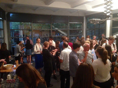
Last Friday, I was invited to  the International Society of Typographic Designers (ISTD) Student awards, hosted by Pentagram at their wonderful studio in Notting Hill. Pentagram partner, Sascha Lobe, presented the certificates to the successful students and tutors.

It was a beautiful summer evening, only slightly marred by a tropical deluge! This is the 90th anniversary year of the ISTD, so a special year for all concerned.
This presentation evening is for the main Student Assessment scheme held in the UK and Ireland. Students from Universities and Institutions around the UK and Ireland answered a number of briefs written by the ISTD's Education team. This is an international education scheme and the assessments for other regions of the globe are on-going.
As with all ISTD events it was a very warm and friendly occasion with beer, wine and nibbles all laid on, for well over a hundred guests. The evening began with an introduction by Jonathan Doney, the Chair of ISTD (below) who gave a brief re-cap of the society's history, founded 90 years ago by Vincent Steer Jonathan reminded us that the Student awards programme has been running continuously for 43 years! ...with programmes in six regions around the world.
The most recent Pentagram partner, Sascha Lobe gave a brief talk and presented all the certificates (printed on our StarFine) and also an excellent goody bag (sponsored by Cass Art). There were students from universities from all over the country and further afield, with one student from Canada!
Sascha Lobe, Pentagram partner
My thanks to the ISTD board for inviting me and as I have said many times on this blog before, it's very important to support organisations such as the ISTD and events such as this. A big thank you to all those members of the ISTD board and education committee who freely give their time for the benefit of others.

Thanks must also go to Pentagram and to Sascha Lobe. It is wonderful that a respected agency such as Pentagram freely gives their resources for such an event, it is inspirational for the students and is a great way for the partnership to give something back to education.
 
You can read more about it on the Pentagram newsfeed:
https://www.pentagram.com/news/istd-student-awards-2018

Posted by Justin Hobson 17.07.2018

Thursday 12 July 2018

Searching for Eve...

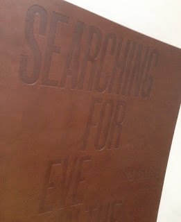
This is an catalogue for an exhibition of work by Maryam Eisler titled "Searching For Eve in the American West".

Eisler photographed female models within the desert surrounds. As the academic, editor and writer Anthony Downey has written in his essay in the exhibition’s accompanying catalogue, this approach ‘answered the need to understand the discombobulating landscape through the reassuring presence of human figures. In its isolated and sparsely inhabited environs, the region is perhaps almost too much to experience on one’s own.’ Eisler is not the first photographer to be inspired by this wild landscape – others include Ansel Adams and Edward Weston. Indeed, a statement made by Weston might equally apply to Eisler’s inspiration: ‘The camera should be used for a recording of life, for rendering the very substance and quintessence of the things itself, whether it be polished steel or palpitating flesh.'

Now this is already a pretty special project having won the category for the best catalogue design at the British Book Design and Production Awards last year
The size of the catalogue is 395x260mm, portrait. The binding is a hybrid mixture of "swiss binding" and singer sewing, so the text is bound and glued to the inside back cover, enabling the text to sit nice and flat.
 
Detail showing the cloth tape along the spine: 
Introduction by Maryam Eisler, followed by an Essay by Anthony Downey:
The 44pp text is printed on our Omnia 150gsm which gives it that dead matt, tactile feel but with great reproduction. All printed offset litho throughout. The piece has a fantastic feel - solid flat areas of colour work amazingly well - it is difficult for me to say too much more about it - see the images below, they speak for the job...
A wonderful collection of solid colours, all printed as specials
The images are printed in two blacks (as duotones) plus a yellow special integrated with the image, the result of which is superb, as I hope you can tell from the images....
...and here we go for a bit of a plug!  - As you can see from the above images above, there is lots of colour and images with dark areas - loads of ink going down and it looks great on the Omnia, reproducing flat colours superbly whilst retaining that all important detail in the dark areas (in my opinion- but I would say that wouldn't I?)
Centre Spread with the singer sewn binding:
Detail of singer sewn threads:

Catalogue design is by Roger Fawcett-Tang of Struktur Design. It is beautifully printed and finished by Boss Print who are based in Acton, West London ...interestingly they are one of the few printers I know of who have "singer sewing" in house!

As I mentioned it won the award for best catalogue at the BBD&PA awards, which you can read about here:

 
https://www.maryameisler.com/
http://www.struktur.co.uk/
https://www.bossprint.com/
Posted by Justin Hobson 12.07.2018


Monday 9 July 2018

Carpenters Wharf

Just the cover makes the difference!
I've written on this blog about many projects where the cover "makes the difference" and this is just one of those projects. Carpenters Wharf is a canalside development by the Anderson Group in Hackney Wick and this is the sales brochure.
 
The cover is printed on our Colorset (100% Recycled) board in the Nero (black) shade in 350gsm. The cover is silkscreened in opaque white on the outside and inside covers: 
 Detail of the silkscreen:
The below image shows the inside spread. The 60pp text is on a combination of coated and uncoated paper. 
Another really lovely feature is the three hole sewing using white thread...
Design is by Jack Renwick Studio. Print and lovely finishing is by Gavin Martin Colournet.

http://carpenterswharf.com/
http://www.jackrenwickstudio.com/
https://www.gavinmartincolournet.co.uk/
Posted by Justin Hobson 09.07.2018

Monday 2 July 2018

Jobs from the past - Number 105

Regular followers of this blog will know that my first post of every month is a "job from the past" so that I can show some of the really good work from years gone by and here's one from seventeen years ago...

Jo Malone Express 2001
Jo Malone and husband Gary opened their first store in Walton Street, London in 1994. Since then Jo Malone London has become a name internationally synonymous with all that is most coveted in British style. In 1999, the company was acquired by the Est̩e Lauder group ensuring investment and a truly global outlook. In November 2001, Jo Malone Express Рa bespoke delivery service for sending gifts worldwide was introduced. and this was one of the pieces of collateral used to promote the service.
Click on images to enlarge
Size is 210mm, square and is saddle stitched. There is a 4pp cover with pocket on inside back cover and a 22pp text (the extra 2pp is due to the throw out). Printed offset litho throughout.

Opening spread...
The material chosen is our Neptune Unique SoftWhite, which is an uncoated off-white, smooth (yet tactile) text and cover paper - the printed result is simply fantastic. The cover is 300gsm and the text weight is 155gsm
Click on images to enlarge
There is a 'throw out' which is how it makes 22pp, as you can see below
6pp text, flat...
The remarkable thing about this project is that it has an exceptionally contemporary look and feel. It certainly doesn't feel like a job from 17 years ago!
Click on images to enlarge
Creative Direction and Design is by Claire Lloyd. According to my notes, it was printed by First Impressions (Howden Litho) based in Camberwell. Established and run by Murray Wolfe-Arbiter, First Impressions was a highly regarded London based printer throughout the 1990's. Sadly like many other printing companies of that era, they went bust in August 2004. The file copies I still have are labelled with their stickers. 
Jo Malone continued to use Neptune Unique SoftWhite for mailing and collateral for many years as a more competitive alternative to some of the expensively priced American text and cover papers. Below are some other pieces of collateral produced in the mid 2000's using Neptune Unique SoftWhite for the cards and bespoke envelopes. These were produced by Pegasus Colour (now CPI Colour)
https://www.jomalone.co.uk/
http://www.clairelloyd.com/
Posted by Justin Hobson 02.07.2018

Friday 29 June 2018

ISTD 90th Anniversary

Yesterday evening I was lucky enough to be invited to the 90th anniversary celebration International Society of Typographic Designers (ISTD) awards held at the wonderful De La Warr pavilion in Bexhill on Sea, East Sussex. It was a wonderful evening at this amazing location.
The De La Warr pavilion is a modernist building by the architects Erich Mendelsohn and Serge Chermayeff which opened in 1936. The enlightened town council opened this new space which was to provide culture and entertainment for the masses – a true people‘s palace.

The evening started with drinks on the rooftop terrace, which was delightful as it was a beautiful evening.
The anniversary dinner was held in the dining area on the second floor, where over a hundred members and guests gathered, including some members coming from as far as Canada.
The wonderful restaurant area has the most amazing panoramic windows looking out to sea, a really perfect backdrop.
The evening began with an introduction by Jonathan Doney, the Chair of ISTD who gave a brief re-cap of the society's history, founded 90 years ago by Vincent Steer who brought together six other like-minded colleagues, for the first meeting of the British Typographers Guild, held at an Italian restaurant in Holborn, London. Jonathan reminded us of the work of the ISTD, including the Student awards which has been running for 45 years and now with programmes in six countries!
After dinner, Andy Altmann, one of the co-founders of Why Not Associates gave a very amusing talk about the influences on his career from the humble Ladybird books, his scrapbooks, to Eric Gill and Why Not's early life as a studio in Soho, shortly after leaving the RCA.
A very special moment in the evening was the award made to Freda Sack (pictured below). Freda was made an Honorary Fellow of the ISTD in recognition of her significant contribution to the Society and the typographic industry. Freda has been a member for over 30 years and has held pretty much every position on the board. Freda managed to achieve this while also running her own successful business.
It was an excellent evening which demonstrated real warmth and friendliness which the world of typography appears to engender. 

 It is so important for the design industry that we nurture and retain organisations such as the ISTD and we must take every opportunity to try and encourage membership, thus ensuring their continued viability. ...and if you aren't a member, have a look http://www.istd.org.uk/- it costs less than £10 per month - which is excellent value! 

Congratulations to the ISTD Board and the events team for arranging an excellent 90th Anniversary -- a huge amount of time and work goes into these events and it is fair that they should be recognised and applauded. 

Posted by Justin Hobson 29.06.2018

Monday 25 June 2018

Begg & Co AW17

Begg & Co have been making beautiful scarves, wraps and stoles in Scotland since 1866. The small coastal town of Ayr has been at the heart of the brand for well over a century, when founder Alex Begg opened his first mill and began working with skilled local weavers. Begg’s original ethos is maintained thanks to the modern-day team of dedicated craftspeople, who continue to source the best quality yarns in order to create timeless, versatile products that are heavenly to touch and a delight to own.

This is the lookbook for last year's Autumn Winter collection showing both Men and Women's collection. The finished size of the publication is 266x145mm and forms a 24pp broadsheet, folding out to 798x580mm.
The above image shows the front and back covers. The format is a "parallel gatefold" as you can see from the image below...
The first spread is below
folding out to the next spread....
The whole publication is all printed offset litho on our Offenbach Bible 60gsm ...and it looks and feels absolutely gorgeous - it flops and folds in a delightful way when handling the publication as I hope these images demonstrate. The below image shows the way it concertina's from top to bottom (vertical folds) before folding horizontally
One side...
and the other side...
Creative direction and design is by Studio Small. Photography is by Josh Hight.
 
Printing is by Push and the reproduction on our Offenbach Bible 60gsm is truly scrumptious!
 
Posted by Justin Hobson 25.06.2018