Thursday 23 January 2020

Bricks & Mortar

Bricks and Mortar is a project by third year graphic design students at the University of the West of England (UWE). The project culminated in an exhibition at The Vestibules (Bristol City Hall) on Monday 18th November showcasing the student work followed by a discussion about the housing crisis...
"The scale of Bristol’s housing crisis has been revealed in a detailed new report that presents the latest facts and figures, including the housing market, rental prices, council housing and homelessness in the city. Number after brutal number sets out the harsh reality for thousands of Bristolians, as well as the complexity of the problem facing city leaders: More than 11,000 languish on a waiting list for a council house. Average house prices approach £300,000. Average rents exceed £1,000 a month. Around 120 people sleep rough every night. The list goes on. Many of these issues go unnoticed; nothing can be solved if the issues remain invisible. Our challenge is to highlight the problems to passers-by, in ways that are hard to ignore."
The team of UWE student organisers for this project are: Emilia Bermejo-Ford, Marta Celio, Ella Staines and Olivia Bellingham. The UWE tutors are Jennifer Conway and  Jessie Young known as Jen and Jessie of Conway and Young.

These promotional flyers for the project are digitally printed on our Crush, Corn 120gsm. Size is A4 folded to A6.
If you aren't familiar with Crush, it is one of our ranges made by FAVINI in Italy and is made using 15% residues from the industrial processing of agricultural food processing. As a result, the paper does have inclusions and a "rustic" feel, which you might just be able to see from the image detail below:
This is an excellent example of using an interesting material to raise the production values on a little project and has made all the difference.

http://bricksandmortar.site/empty_houses.html
http://www.conwayandyoung.com/
Posted by Justin Hobson 23.01.2020

Monday 20 January 2020

Lollard Street

Lollard Street in Kennington epitomises Homes For Lambeth’s commitment to more and better homes for Londoners. The development consists of 12 private apartments and 7 townhouses, overlooking Lambeth Walk Open Space.

This is the superbly produced sales brochure for the development. The size is 380x280mm portrait, which is a size with lovely proportions.
It is 16pp self cover, saddle stitched, printed on Shiro Echo, White 160gsm and in this oversized format, it flows superbly with the large format pages working perfectly on the 160gsm weight.
The brochure is printed offset litho and the quality is superb. The colour work is excellent but the black solids (above and below) are exceptional...
Click on images to enlarge
Shiro Echo is our 100% Recycled range and also carries the FSC Recycled classification. Shiro Echo is available in two shades; there is a white shade (which is a natural/off white) and similar to the old shade of Cyclus and a Bright White shade which is similar to the old Cocoon range.
Click on images to enlarge
Simply saddle stitched but beautifully finished with the right paper in the correct weight is what makes this piece a job of real quality.
Branding, art direction and brochure design is by London based Ignite and you can read more about this project here.

The excellent print, repro and finishing is by Gavin Martin Colournet, based in Greenwich.

http://ignitetv.com/
https://www.lollardstreet.com/
http://www.gavinmartincolournet.co.uk/
Posted by Justin Hobson 20.01.2020

Friday 17 January 2020

Lightboxes and Lettering

Yesterday, on a cold wet evening I went to the opening of a new exhibition at the Nunnery Gallery in Bow. Lightboxes and Lettering is the culmination of a project about the heritage of the printing industry in East London. Made possible by money raised by National Lottery players, the project focuses on the pre-digital era of printing in Hackney, Tower Hamlets and Waltham Forest and the experiences of people involved in the industry. The project explores how the printing industry has changed with the arrival of digital technologies, and how newer processes have transformed the everyday lives of print workers.

Printing – including lithography, silkscreen, and letterpress – has been an important industry in east London for many years. Access to small presses allowed political and community groups to easily print their books, pamphlets and leaflets, and many of these smaller firms were in east London. In recent years, the industry has changed a great deal, with the number of print workshops now much reduced and those in operation working in very different ways to how they would have done just a few decades ago.
The project maps former businesses, records the experiences of current and former employees, and shows collected printed matter, images of print workshops and details of technical processes.
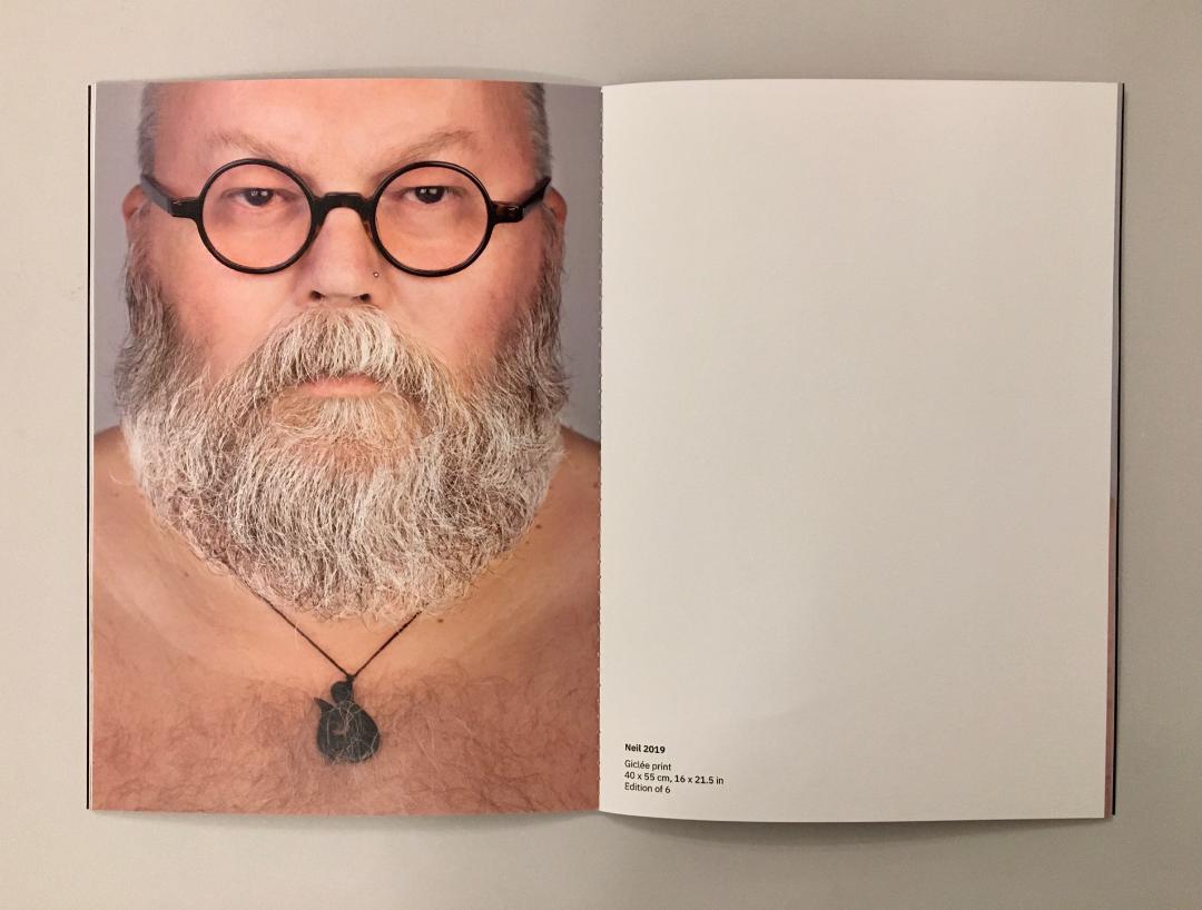
This is a well researched exhibition and the project is documented in a catalogue (below) printed on Colorset, Shiro Echo and a map printed on our Offenbach Bible. It is printed by Aldgate Press, one of the East London printers featured in the exhibition and designed by Sandra Zellmer.  I'll write about the catalogue another time.
Congratulations to Lucy Harrison and Rosa Ainley from Rendezvous Projects who put the project and the exhibition together. The exhibition runs until 29th March and is at the Nunnery Gallery in Bow Road E3. It is an excellent exhibition and well worth a visit.

http://www.lightboxeslettering.com/
https://bowarts.org/nunnery
Posted by Justin Hobson 17.01.2020

Tuesday 14 January 2020

HOMOgeneous

HOMOgeneous is a series of new portraits by photographer Christian Trippe. This series of photographs seeks to explore the similarities and differences in gay men of a certain age, identifying individuality in a subculture existing within the more mainstream gay culture.

All of the selected models identify themselves as gay or pansexual males and have been photographed without clothes to remove any distraction, however small personal elements to every image remain. The men have been photographed in high resolution giving an extraordinary level of detail. The resulting close-up portraits teeter between intimacy and confrontation.
Christian Trippe was born in Vienna and grew up in Germany. After completing his studies in graphic design and photography, he moved to London where he has lived and worked for the last 13 years. During this time, Christian has been developing his own art and photography projects.

This book accompanied the exhibition held last October at New Art Projects in London E8.
Size of the publication is 255x180mm, portrait and is singer sewn. The 4pp cover is printed on Omnia 280gsm and the 28pp text is on Omnia 150gsm
Click on images to enlarge
The above image shows the centre spread with the singer sewing in the centrefold and on the spine on the outside in the image below. 
Click on images to enlarge
Unlike many of the look-books featured on this blog, which are printed offset litho, this has been digitally printed on an HP Indigo press. The colours are strong and punchy and the whole publication has a matt, tactile look and feel.
Although Omnia was never originally developed for digital, we now keep it as a stock item with "sapphire treatment". This treatment is often applied to more unusual papers and provides a "key" so that the inks (which are different to litho inks) work on the paper surface. The great thing is the job just doesn't look and feel like a digital job. Below is a detail shot showing the excellent fleshtone reproduction.
Design of the catalogue is by Christian Trippe. The digital print by Screaming Colour.

https://www.christiantrippe.com/
http://newartprojects.com/events/new-photographs-christian-trippe/
http://www.screamingcolour.com/
Posted by Justin Hobson 14.01.2019

Friday 10 January 2020

New product Launch - Refit

Some exciting news to start 2020...
Launched at Luxepack in Monaco last year, this new paper range is the latest development from the laboratories of the Favini paper mill and we are pleased to be their exclusive UK stockist.

REFIT is a new paper made with residues from the production of textile and wool production. These fibres partially replace tree fibres and is a real example of industrial symbiosis that enhances industrial by-products, to support the fight against waste within an ethical supply chain. The waste used in this paper is from carding, spinning and weaving processes which were destined for landfill, are used to produce the new REFIT material with a high aesthetic and an expressive value for print and premium packaging.
Here's some more information from the mill... "The residues of wool and cotton are visible on the surface and give a distinctive appearance. From a tactile point of view, the wool contained in REFIT WOOL tantalizes the fingertips with a distinctive roughness of the product, whilst the cotton gives a soft touch to REFIT COTTON. The content of the new REFIT paper includes more than 15% fibre derived from textile by-products, 40% post-consumer recycled cellulose that is certified FSC® and 45% virgin cellulose fibres also FSC® certified. For the production of the REFIT paper the textile by-products used are of Italian origin, coming from spinning and weaving. The use of industrial by-products limits the use of virgin raw materials and promotes the creative reuse of waste, according to the circular economy philosophy. The range consists of five colours: Blue and Black for the REFIT WOOL line, and White, Pearl and Grey for the REFIT COTTON variant. The available basis weights range from 120 to 360 gsm and includes coordinated envelopes, offering a comprehensive solution for packaging and printed communication"
Click on images to enlarge
Above you can see the visible fibres.

REFIT is the new paper conceived and produced by Favini, a company with impressive experience in creative reuse since the 1990’s with its Shiro Alga Carta. The portfolio of innovative and unique ecological papers was expanded in 2012 with Crush, later in 2015 with Remake and now extends to REFIT

https://www.favini.com/en/press-release/refit-the-paper-that-tips-the-wink-to-fashion-and-sustainability/
Posted by Justin Hobson 10.01.2020

Monday 6 January 2020

Honest Menus

When Tom and Phil set up Honest Burgers in Brixton in 2011, they had a single goal: do fresh, high-quality British burgers and do them well. Since then, they've stayed true to that goal and even opened their own butchery. Honest Burgers now have 36 restaurants throughout the UK, plus a field kitchen for festivals and events. Honest Burgers produce beautifully designed print items - not lavish, just functional, well considered and produced - and sometimes quirky! ...like the wonderful Meat & Potatoes publication that I wrote about here.

Below are the printed menus used at their restaurants. Size is 240x160mm and they are printed offset litho in one colour. They are drilled with two holes which are used to hold them onto boards with fixings. There are separate menus for burgers and drinks... 
The menus are printed on our Crush range from Favini. The burger menu (above) is printed on Crush Kiwi 120gsm and the drinks menu (below) is printed on Crush Citrus 120gsm. If you are not aware of the range, it is very unusual! The paper is made partly using the residues from agro-industrial food processing which are "end of life" products replacing up to 15% of conventional tree pulp and are combined with 40% post-consumer recycled waste and the remainder is FSC virgin fibre. The range is produced with 100% green energy.
...the sheet is not a "clean" paper, it has identifiable pieces of residue visibly in the paper, as you can see from the detail image below...
The menus are printed offset litho and design is by Connie Barton at Studio Connie. Yet another example of a well considered piece of print where the simplicity of design, materials and processes are just right.

https://www.honestburgers.co.uk/
https://www.studioconnie.com/
Posted by Justin Hobson 06.01.2019

Friday 3 January 2020

Jobs from the past - Number 123

Happy new year to all my regular readers.

Followers of this blog will know that my first post of every month is a "job from the past" so that I can show some of the really good work from years gone by and this publication is way back from the 1990's
Art & Architecture - Pentagram 1994
This small publication was produced by Pentagram for the society called Art & Architecture to outline the aims of the society, what it involved and about membership - don't forget, this was the days before the internet, so in many ways you could describe this as a 'homepage'!
It is a 16pp self cover, saddle stitched and is A6 (148x105mm) portrait.
Images are printed in Duotone (beautifully) on our uncoated Neptune Unique 140gsm. Printed offset litho in black, grey and a fluorescent orange (this was back in the days when doing a three colour job was cheaper than CMYK!) The photography is by Phil Sayer.
Design is by Pentagram - John Rushworh's team. Unfortunately my notes aren't totally complete - so if you have more information about the project, please let me know and I can amend this post.

The job was printed by a company called Penshurst Press based in Tunbridge Wells. Sadly the company is no longer around. Alan Flack with Martin Darby who handled this project, formed their own printing company called Principal Colour and they are still based in Paddock Wood in Kent.
I have tried to track down the society and sadly I am unable to find anything about it online and I can only assume that it has since collapsed. If anyone has anything to add, please let me know...

https://www.pentagram.com/
http://www.philipsayerpartnership.com/
http://www.principalcolour.co.uk/ 
 Posted by Justin Hobson 03.01.2020