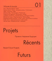
 This is an amazing book produced for international architects Wilmotte & Associés. The firm was set up in Paris in 1975 by Jean-Michel Wilmotte and their practice now spans the globe. The content is self explanatory under the title, Recent Future Projects.
 The size of the book is 280x235mm, portrait and is casebound. The 232pp text is made up using "French-folded" sections (this is where the folded edges are on the foredge of the book) on Offenbach Bible 60gsm which gives it a sensational light feel and flows beautifully in the hand. This is complimented by the lighter than usual boards used to make the case which means it has a nice flexible feel. The book has a 20mm spine.
The print result on the Offenbach Bible is simply stunning. The fluorescent orange used on the cover and on 8 dividers in the book which are printed on a coated paper prints equally well on the Offenbach Bible 60gsm! The images, whether CGI's or the very detailed mono photography looks amazing.
The text sections all "French Folded".- this is where the folded edges are on the foredge of the book, as in the picture below:
Of course 'french - folding' uses more paper - in fact double the amount! - so this job is actually in conventional terms a 232pp text, which is actually 116x 4pp French folded sections, so in actuality its 464pp!
The book is printed by a London printer, Push. The print and binding is superb on this book. It is printed CMYK throughout but many of the images have a mono reproduction with an integrated silver - which is hard to show in these pictures....
The above detail image shows the silver printed on Offenbach Bible and it really does look like a metallic silver, not just a grey shade which is what can happen on uncoated papers.
It's hard enough to get the consistency of look and feel in one publication for mono images but to add into the equation printing silver on uncoated (and in 60gsm) is quite something! - not to mention fluorescent orange also on Offenbach Bible 60gsm!
Design is by Studio Fernando Gutiérrez based in London. Creative Director is Fernando Gutiérrez. This is an amazing book and a truly amazing piece of print and finishing. Other architectural firms can only aspire to create literature as good as this
http://www.wilmotte.fr/
http://www.fernandogutierrez.co.uk/
http://www.push-print.com/


 I just received an e-mail update from them and they have sold all the copies in less than a couple of months - so well done to them - hopefully this demonstrates that good quality print is not a dead medium and is still very much alive - can't wait until the next one!
 Now most people assume that if the word sewn is used in the context of paper, that you're referring to some binding method - well not in this case! Sandy actually stitches into the paper to create these amazing artworks. The pictures speak for themselves. I think they're incredible - and now for the paper plug - they're all on our recycled Colorset 120gsm!


