Friday, 28 June 2013

The Glastonbury Free Press


This weekend and for one weekend only ...the Glastonbury Free Press has been set up and is printing a new local newspaper for the Festival. It is being printed on site, using letterpress on a 1954 Original Heidelberg cylinder press.

...and if you'd like to read about how they managed to get a 5 tonne press and linecaster onto a muddy field and make it work, have a read of their blog here:
http://www.glastonburyfestivals.co.uk/areas/glastonbury-free-press/free-press-blog

There's also a design and print your own poster with letterpress artists, a healthy selection of woodblock type and a proofing press.

It's just complete madness but an amazing idea and I wish I was there to see it. I hope it stays dry for the hot metal maniacs in the field.

http://www.glastonburyfestivals.co.uk/areas/glastonbury-free-press
Posted by Justin Hobson 28.06.2013


Wednesday, 26 June 2013

Inside|Outside 2013


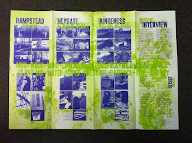
Inside|Outside is an interesting project run by the printmaking team at the London College of Communication (LCC). The project involved 3 workshops, 3 locations and 3 processes. "A challenge to revisit the whole process of printmaking, considering parameters such as sustainability, environment, resources and waste. An experience outside the comfort of the studio to let the natural elements changing staff and students' way of thinking."

You can read more about the project lead by Pathway Leader Jack Blake and Printmaking Technician Barbara Salvadori and the LCC students at insideoutsideprintmaking.blogspot.co.uk

The end of project publication is printed by London based co-operative Calverts, chosen as they have excellent sustainable credentials and use all vegetable inks and their energy use is from renewable sources. They selected Favini SHIRO Alga Carta, Avorio 90gsm, chosen because it was in keeping with the sustainable nature of the project, because it is manufactured partly using algae harvested from the Venice lagoon, combined with FSC certified fibres. Algae blooms at the end of Summer in the Venice lagoon as the warm water combines with pollution and must be harvested to maintain the lagoon's eco-balance.
The format is an A5 broadsheet which folds out to A2. Printed in two colours, offset Litho.
Photography and design is by Jack Blake and Barbara Salvadori. Print was handled by Arthur Stitt at Calverts. A most interesting project and publication.

www.insideoutsideprintmaking.blogspot.co.uk
www.calverts.coop
http://www.favini.com/graphic_specialities/en/shiro-prd-21.php
Posted by Justin Hobson 26.06.2013

Monday, 24 June 2013

The Future of Paper Books

I've just been sent an invitation to the latest de.Frost* talk on the 14th July.  This is the fourteenth in the series of de.Frost* talks which are hosted by Frost* Design at their studio. Julie Gibbs is the Publishing Director of the Lantern imprint at Penguin, which publishes, high quality, illustrated books in the fields of cookery, gardening, interiors, photography, shopping, travel and biography. Julie has been in publishing for her entire career, and at Penguin for the last nineteen years.
At de.Frost* Julie will be discussing the value of paper books in our lives and what their future might be. She has also invited members of the audience to bring along a favourite illustrated book and perhaps say why it means something to them.

I would absolutely love to go along to this talk, it would be a fascinating and passionate insight into where the publisher sees the future, but sadly I can't go. ...why not? I hear you ask ...well sadly (for me) the Frost* studio is in Surry Hills in Sydney and although I did visit back in 2009, it's too far, even for me, to go for this talk.

Anyway thanks to Frost* for the invite and I look forward to hearing about the evening.

http://www.frostdesign.com.au/
Posted by Justin 24.06.2013

Thursday, 20 June 2013

Coming Up for Air

A couple of months ago Melanie Smith, a graphics post grad student at the LCC, got in touch asking about lightweight and thin papers. Mel had a copy of our Size, Format, Stock and was aware of Offenbach Bible and wanted a material with an almost gossamer like appearance. One of the issues was that she only wanted to produce a limited number of copies. the publication called "Coming up for Air" is about some of the quiet (and green) areas in the city of London.

We discussed papers, format, bindings etc. and I suggested a few options. Anyway, here is the end result, which I think looks absolutely stunning.
The size of the publication is A3 (420x297mm) portrait. It is a 44pp, self cover and is printed on our Offenbach Bible 60gsm. One thing you probably won't be able to guess, or even believe, is that it's digitally printed! The job was printed and finished by MTA digital, who are based in south east London, on their HP Indigo digital press which made printing only a few copies viable - even on a material such as this, which many litho printers are scared of! ...just look at the print result.
Mel really wanted an A3 format, but because of the limitation of the SRA3 sheet size on the digital press, binding options were limited! ...which is why I suggested the singer sewing - which goes through the whole text and is probably better described as "side sewn" - see picture below
This is an excellent example of what can be achieved with a little time and effort. In many ways digital print still suffers from a poor reputation, especially when it looks like a poor colour photocopy on nasty high white supersmooth "digital" paper! This is a great example which shows that using the HP Indigo press, combined with a material that is right for the design together with binding/finishing which lends itself both to the subject and the format, a superb job can be achieved.
 
Design is by Melanie Smith. Print and finishing handled by John Sinnott and Aaron Carpenter at MTA Digital.

http://thetypothecary.wordpress.com
www.mtadigital.co.uk
Posted by Justin Hobson 20.06.2013

Monday, 17 June 2013

AMC² Issue4

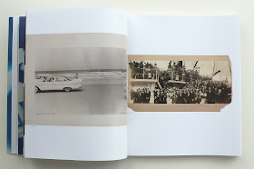
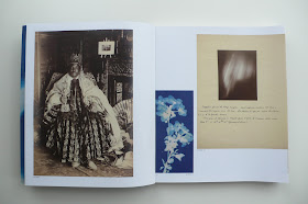
This is a truly beautiful book, which is just a delight to hold and leaf through.
Archive of Modern Conflict is an independent publisher based in London and this is issue 4 of  their series of journals. (their books on photography and art have won or been shortlisted for many prizes)
 
AMC² issue4 comprises photographs from Collected Shadows, an exhibition curated by the AMC for Paris Photo 2012. The works span a period from the early 1850s to the present day and are by photographers both known and unknown, amongst them Bertha Jaques, Gustave Le Gray, Robert Frank, Willi Ruge, Paul-Émile Miot, Johann Böhm, Ferdinand Quénisset, Mario Giacomelli, Eugene Atget, Josef Sudek and many others, while subjects include earth, fire, air, water and ether as well as divinity, astronomy, meteorology, flight and dance (these words from AMC books)
The size is 230x200mm, portrait and is perfect bound. The publication has an 8pp cover on StarFine White 200gsm. The text is made up using "French-folded" sections on Marazion Ultra 90gsm which gives it a sensational light feel and flows beautifully in the hand. The book has a 14mm spine.
The book has 140pp or printed pages (which I would normally describe as 70 x 4pp French-folded sections) - this actually makes 280pp but because the other side is unprinted and the ends are bound, each 4pp = 2pp. It's a bit tricky but if you think about it, it makes sense. French folding with a material like Marazion Ultra 90gsm feels fantastic because the weight of the material lets the pages flop and flow beautifully. The 8pp cover (pictured below) on Starfine 200gsm contributes to the soft feel. 
The picture below shows the foredge with the "french-folded" text
The book is printed by a Belgian printer, Die Keure, who are based in Bruges. They are one of the most renowned European book printers and they print for many of the high end publishers in Europe. The print and binding is superb on this book. It is printed CMYK throughout but most of the images have a mono/sepia reproductions and it's hard to get the consistency of look and feel in one publication from multiple image sources but this is an admirable result.
 
The designer is Melanie Mues, who I have worked with for many years. It was great to have the opportunity to work on a book project together, especially one as exquisite as this. 

http://www.amcbooks.com/amc2-journal-issue-4
http://www.amc2.org/amc2-issue-4
www.muesdesign.com
www.diekeure.be
Posted by Justin Hobson 17.06.2013

Wednesday, 12 June 2013

UAL Awards Ceremonies

Just the cover makes the difference...
Here's a job that's definitely worth a look at because it uses paper (in this case the board used for the cover) to increase the quality and feel of the whole project.
This is the 2012 Awards Ceremonies brochure for the University of the Arts London which includes Camberwell College of Arts, Central St Martins, Chelsea College of Art and Design, the LCC, the London College of Fashion and Wimbledon College of Art. The size is 240x170mm, Portrait, perfect bound with a 120pp text.   
As you can see, the job is printed in just two colours with the lead colour being a pale metallic. Now usually metallics require a coated material, otherwise they don't look metallic! However Omnia 280gsm was chosen because it had the right "uncoated" feel and would reproduce the metallic as well as a coated paper. Note the hot foil blocking in metallic silver foil on the front cover.

This is an excellent example of using a material, such as Omnia, for a part of a project which can just lift the whole of a publication and make it feel special. The material for the main catalogue was a printers "house recycled uncoated offset" - which was a choice dictated by cost.
spread showing inside text pages

Art Direction is by Pentagram. Design is by Turnbull Grey with Chris Turnbull (UAL alumni) as creative director. It was produced in conjunction with Simon Goode at the Department of Communications and Development at the University of the Arts and thanks to Simon for sending me copies.

It was printed by Tradewinds who are based in Peckham in South London.
 
Posted by Justin Hobson 12.06.2013


Monday, 10 June 2013

EYEsight...

Eye 85 has just been launched and here's a fun idea from the publishers...
 
"To celebrate the launch of Eye no. 85, throughout June we are tracking sightings of the magazine as it makes its way around the globe. To enter the competition, take a photo of Issue 85 when it reaches your corner of the world (on your doormat, in the studio, on display in a bookstore, etc.), and upload it to our Facebook page (remembering to tag the location). Whoever takes the most interesting photo (as judged by Eye’s editor and art director) will win a year’s subscription to the magazine for themselves or a friend. The winner will be announced on 1 July 2013"

...and here are some of the photos so far...
by Phraxin

...and as you might have noticed, these particular pictures also include our Size Format Stock booklet that we sent out in partnership with Eye.
Eye85 and ‘Size, Format, Stock’ booklet by Shaun O’Beirne.
EYE85 and insert by Kalimat

Have a look at the other pics from around the world on facebook:
 
Size Format Stock is the booklet that I wrote in collaboration with Studio8. Originally written with the students that I give occasional talks to in mind, it has since become a firm favourite with the mature graphic designer! It is A5 portrait saddle stitched with a 4pp cover on Colorset 120gsm and a 16pp text printed on Offenbach Bible 60gsm. It is now in it's third edition and I've printed and distributed over 20,000 copies. If you would like a copy, drop me an email and I'll pop one in the post.
 
Posted by Justin Hobson 10.06.2013

Thursday, 6 June 2013

Howard Tangye - The Artist

Here's a project that I've been working on with design studio Stinsensqueeze. This is a project that has just gone live on Kickstarter.

If you're not familiar with it, Kickstarter is the largest funding platform for creative projects in the world. Every month, tens of thousands of people pledge millions of pounds to projects from all creative fields.

This project is a book titled WITHIN and features the work of artist Howard Tangye. Howard is best known for his work, as a designer, illustrator and teacher in the world of fashion. As head of womenswear at Central Saint Martins, he has taught designers such as John Galliano, Hussein Chalayan, Stella McCartney, Christopher Kane, Richard Nicoll, and Julie Verhoeven amongst others.

Until recently his work as an artist was less well known. His distinctive style depicting the clothed figure is finally gaining wider recognition and in 2012, a selection of 56 of his drawings and watercolours, were donated to the V&A

Richard Nicoll
 
Howard Tangye with Stina and Louise from Stinsesqueeze (www.stsq.org)
Stina and Louise first met Howard when studying at Central Saint Martins in 2010 and admired his work ever since. Since that first meeting they've built up a 3 year continuous collaboration, culminating in this project. Howard has previously declined working with several established publishers since he chooses to distinguish his work as a fashion teacher, from his personal work as an artist. The introduction is written by Abraham Thomas, Curator of Design at the V&A, together with an essay by Marie McLoughlin, dress historian at the University of Brighton.
 
An important factor for all the collaborators is to capture his narrative and the sensitivity of his work, whilst ensuring there is no compromise on the reproduction of the artwork and the production of the book. They spoke to me about the paper side of things and decided on a combination of our Omnia White and Natural 150gsm which would faithfully reproduce the artworks whilst still lending the tactility of the original materials used. They partnered with London based printer Jigsaw Colour www.jigsawcolour.co.uk who has extensive experience in fine art printing.  In order to get funding by Kickstarter, Paul Martin at Jigsaw Colour produced a fully working pre-production dummy (which is beautiful)

Please have a look at the following KICKSTARTER page - watch the short video - and even  better, pledge some money!
http://www.kickstarter.com/projects/311248544/within-howard-tangye?ref=live

Posted by Justin Hobson 06.06.2012

Monday, 3 June 2013

Jobs from the past - Number 44

Regular followers of this blog will know that my first post of every month is a "job from the past" so that I can show some of the really good work from years gone by and here's one from 2006.

Borderline Annual Report 2006

Borderline is a small, independent charity that has been helping homeless Scots in London for over 20 years by understanding their particular problems and needs. They offer resettlement options in Scotland and London, referrals to specialist agencies and advice on welfare benefits.

This is their annual report, which by definition, needs to contain certain financial information but is used also as a vital piece of communication with their benefactors and donors.
Design company OSBORNE ROSS designed the annual report and here's some information from a press release written at the time:
Andrew Ross, Creative Director, said "using the theme of 'Looking back, looking forward', clients were asked to write down what had happened to them in the past year and to describe what the future holds, now they have the charity's help"
These notes were combined with photography by Nick Turner, providing a powerful and immediate explanation of the charity's work.
The publication is 210x210mm, square, saddle stitched and is a self-cover (for those of you not familiar with this term, it means that the cover and text are on the same weight of paper). It was printed in CMYK on Neptune Unique FSC 170gsm which is a high white, smooth, uncoated text and cover paper. It was printed offset litho by Magnet Harlequin (www.bva.org.uk)

This report won the award for the best annual report in the 2007 Third Sector Excellence Awards. This award programme is organized by publisher Haymarket, to recognize organizations working in the charity and public sector. http://www.thirdsectorexcellenceawards.com/
 
 ...and here's the page showing it as the winning category of the third sector awards:
 
Art direction and design is by Osborne Ross. Photography by Nick Turner.
 
Posted by Justin Hobson 03.05.2013