Friday, 27 September 2013

CRUSH Launch at the St Brides Foundation

Yesterday, we held an open evening with Favini at the St Bride Foundation to launch our new paper range called CRUSH.

Over a hundred guests joined us at St Brides for Italian beer and olives! After a brief introduction by Chris Brown of Favini, there was a presentation by Michele Posocco, product manager from Favini who demonstrated how waste residues from food processing is used in paper making.
In the splendid surroundings of the Bridewell Hall, Michele squeezed oranges and liquidised pulp and the dried micronized fruit residue to show how the patented process works.
The reasoning behind holding this event at St Brides was to make this a very "hands on" experience. The letterpress workshop was open all evening with printers Helen Ingham www.hi-artz.co.uk, Richard Lawrence www.richardlawrenceprinter.co.uk and wood engraver Peter Smith www.peterssmith.weebly.com in attendance.
Wood engraving by Peter Smith printed on an Adana press.
As well as printing, guests were treated to a demonstration of lino-cutting and were "press ganged" into having a go themselves ...just look at the concentration on those faces!
Under the tuition of Richard Lawrence, each person was given a small section of a 16th century engraving The Manufacture of Oil, by Jost Amman. The picture was divided into 20 equal squares, individually cut over the course of the evening and then re-assembled.

Jost Amman 16th century
The final lino-cut, ready for printing
...and here is the fruit of everyone's hard work! a 21st re-interpretation using 19th century equipment! Printed on Crush 250gsm.
Throughout the evening, the chief executive of the St Bride Foundation, Glyn Farrow and his team conducted short tours of the foundation and famous library, showing just a few of the many treasures that the foundation has in it's possession.
I should like to extend warm thanks to our partners at Favini, to all the staff and friends at the St Bride Foundation. Special thanks to Peter Smith, Richard Lawrence and Helen Ingham in the workshop who made the evening such a special occasion.

...and I mustn't forget to say thank you to Andrea at a Taste of Sicily for the amazing Castelvetrano olives. www.tasteofsicily.co.uk

www.favini.com
Posted by Justin Hobson 27.09.2013

Thursday, 26 September 2013

Modern Poetry in Translation 2013

Modern Poetry in Translation (MPT) is a magazine, originally founded by Ted Hughes and Daniel Weissbort. The first issue, published in 1965 was a 12pp broadsheet printed on a Bible paper and cost 2s 6d! MPT presented poems by a wide range of authors, particularly from Eastern Europe introducing them into a wider circulation in English in the West. The original designer of the publication was Richard Hollis, continuing until 2004.
 
Strange Tracks is the first issue under the new editorship of Sasha Dugdale -  MPT has had very few changes in editorship: this is only the third in fifty years! With the new issue and editorship has come a radical change of image. The editor began working with Katy Mawhood at Reading University’s Department of Typography to produce a magazine that both referred back to the iconic designs by Richard Hollis in the 1960s and 1970s, and is contemporary and fresh in look and feel. The cover of each issue is illustrated by an international artist, with the cover of this edition by Perienne Christian.
Strange Tracks features new poems from Argentina, Venezuela, China and Italy, poems about the casualties of the Mexican drug wars by Luis Felipe Fabre and Valérie Rouzeau’s Apollinaire Prize-winning poems in Susan Wicks’ translations.  
The magazine is 215x140mm, portrait. The 122pp text is all printed on our Offenbach Bible 60gsm and printed in 2 colour, red and black throughout. Images are reproduced as halftones. The publication is section sewn.
Design is by Katy Mawhood, you may like to read her thoughts on the design of MPT. in which she explains her rationale behind the design and production.
Print is by Wakefield based Charlesworth Press.

This is a really lovely piece of literature which feels good in the hand and is definitely one of those publications which invites the reader in.

www.mptmagazine.com
www.charlesworth.com
http://www.squarepeg.co/
Posted by Justin Hobson 26.09.2013

Monday, 23 September 2013

Britain in a bowl

This is a piece about an interesting project that we were involved with last week and that was also part of London Design Festival.

Here's some background information about the project:

This year, The New Craftsmen commissioned potter Billy Lloyd to design an exclusive range of tableware, to be manufactured in Stoke, the heart and home of British ceramics. The Billy collection begins with a deep, flat-bottomed earthenware bowl in white with ridged exterior; multifunctional in purpose, and characteristically considered in design. To mark the launch of the bowl this September, The New Craftsmen and Billy Lloyd have teamed up with 5 leading food creatives in order to bring to life the bowl’s function and purpose, and illustrate the vibrant synergy between cookery and pottery; one that relies on a human touch with craftsmanship at the core. Foodies  Jeremy Lee of Quo Vadis, Abdul Yaseen of Cinnamon Kitchen, Skye Gyngell of Heckfield Place, Kerstin Rodgers aka MissMarmiteLover, and James Ramsden of The Secret Larder have each devised a mouth-watering recipe which will be sold together with our first edition of 50 batch production bowls, designed by Billy Lloyd and made in Stoke. “The provenance of food has become incredibly important to people over the last few years, and careful and sustainable sourcing is a well understood concept”, says Natalie Melton, of The New Craftsmen. “Collaborating with chefs who care deeply about good sourcing seemed a natural fit for the launch of this bowl. What we love about Billy’s work is its honesty and integrity; and he has carried that into this industry collaboration, bringing a keen attention to detail and a careful approach to collaborating with the best in Stoke. Good ingredients, skill, attention to detail, and an appetite for pleasure are at the root of everything we do. Britain in a Bowl epitomizes this and we are delighted with the outcome.”

Last Tuesday, at The New Craftsmen Garage in Adams Row (which is actually a garage in Mayfair!) the launch of the week long  ’Britain In A Bowl’ campaign started.

You may be wondering what this has to do with paper! ...so here it is: Five recipe cards were printed with the ingredients, which were designed to look like and work as placemats. These mats and the introduction sheets were all produced on our new CRUSH range of papers.
The size of all the pieces is 180mm square. The recipe cards are printed on Crush, corn 350gsm and the title pages are printed on Crush Olive 120gsm. 
 
These beautifully produced items are silkscreen printed - 2colours for the recipe cards and on colour for the title pages. They are printed by London silkscreen printers Bob Eight Pop ...and a fine job they have made of them. Silkscreen often has a reputation of being a rough and ready type of printing but the coverage is beautifully even and the small type is crisp and sharp.
Design is by Julian Roberts at Irving & Co. The lovely illustrations are by John Broadley.
www.billylloyd.co.uk
www.thenewcraftsmen.com
www.irvingandco.com
http://johnbroadley.blogspot.co.uk/
www.bobeightpop.com
http://www.favini.com/graphic_specialities/en/crush-prd-26.php
Posted by Justin Hobson 23.09.2013

Wednesday, 18 September 2013

St Brides - Crush Launch Event

If you see the post below from last week, our new paper called CRUSH by Favini is being launched at an event at the St Brides foundation next week.

You, yes you - the reader of this blog are WELCOME to come along. It should be and interesting and educative evening. It is ticketed (because we are limited on numbers) but it's for people who are interested in printing and paper and is in no way meant to be a "cliquey" event!

The letterpress workshop will be open and printers Richard Lawrence and Helen Ingham will be on hand, demonstrating and giving people the opportunity to print themselves. There will also be guided tours of the foundation and printing library.
The event is next week on Thursday 26th September 2013. Doors open from 6pm,the presentation is at 6.45pm and the letterpress workshop is open until 9.00pm.

Tickets are still available on Eventbrite by:
http://www.eventbrite.co.uk/event/8242955903

You can read more about it here:
http://justinsamazingworldatfennerpaper.blogspot.co.uk/2013/09/crush-new-paper-launch.html
Posted by Justin Hobson 18.09.2013

Monday, 16 September 2013

Out of the Ordinary

Out of the Ordinary is a one-off sale at Christie’s South Kensington that was held on the 5th September. Each lot has been selected as either visually striking or with an intriguing story to tell. Unusually for an auction of this type there was an extended viewing period from 5th August such was the diversity of the lots.£1,000 to £200,000

Spanning all eras from the prehistoric natural world to the surreal realm of science fiction, the intriguing items are a juxtaposition of such diverse lots as a Triceratops skull with a Rolls Royce turbine fan to  Cygan, a giant robot made in 1957, a set of eight of Francis Bacon’s paint brushes and an enormous caviar dish, reputed to be the largest in the world.
 
This is the beautifully produced private view invitation which features a collection of mid Victorian, scientific equipment (condensing lenses). The size of the invite is A5 portrait, printed CMYK, offset litho on the front of the invitation plus a double hit Gloss UV varnish positioned over the round lenses - very effective. The richness of the gold has been achieved out of CMYK without metallic integration. 

The reverse of invite (below) is also printed CMYK with the addition of hot foil blocking in vibrant green foil for the words "Out of".
In order to make this invitation feel somewhat "Out of the Ordinary", the invitation is triplexed - three layers of board making a "sandwich". Colorset White 350gsm has been used for the outer board and the "jam" in the sandwich is Colorset Lime 350gsm, which compliments the green foil on the reverse. A total of 1050gsm (plus a bit of glue)
Design is by the in house team at Christie's. The superb print, varnishing and triplex finishing is by Identity, based in Paddock Wood, Kent. A truly excellent example of a beautifully finished piece of print. Nobody receiving this invitation would be disappointed!


http://www.identityprint.co.uk/
Posted by Justin Hobson 16.09.2013 

Thursday, 12 September 2013

CRUSH - new paper launch

We are launching a new paper range from FAVINI in Italy. This new range is called CRUSH, the name reflecting the fact that it's made partly using the residue from the industrial processing of crushed citrus fruit, coffee, nuts, olives, kiwi and corn. These agro-industrial "end of life" products replace up to 15% of conventional tree pulp.

CRUSH was launched in Italy last year and was awarded the green award at the Luxe Pack exhibition in Monaco: http://sustainablereview.net/favini-crush-paper-wins-luxe-pack-award/

This video produced by Favini, will give you an insight as to how the residue from the citrus fruit processing industry is utilised:

http://www.youtube.com/watch?v=5lm08bvpDUs

The new paper range comes in weights from 100gsm up to 350gsm and the shades are natural, earthy tones and the feel of the paper is natural and tactile.

To launch this new range, we are jointly hosting with FAVINI, a launch evening at the St Brides Foundation in London. During the evening Michele Posocco, product manager from the mill in Italy, will explain the concept behind the range and demonstrate how CRUSH is produced.

The letterpress workshop will be open and printers Richard Lawrence www.richardlawrenceprinter.co.uk and Helen Ingham www.hi-artz.co.uk will be on hand, demonstrating and giving people the opportunity to print themselves. There will also be guided tours of the foundation and the world famous printing library - if you haven't been around this historic building, it is well worth a visit.

The launch is on Thursday 26th September 2013. Doors open from 6pm,the presentation is at 6.45pm and the letterpress workshop is open until 9.00pm. If you would like a ticket to the launch evening, you can book one on Eventbrite by following the following link:
http://www.eventbrite.co.uk/event/8242955903

www.favini.com
Posted by Justin Hobson 12.09.2013

Tuesday, 10 September 2013

164 Bishopsgate EC2


Designed by dn&co in London, this is a beautifully produced brochure for an exquisite building. Originally built as Bishopsgate fire station in the 19th century, the Victorian Façade is Grade II listed and has been completely refurbished to provide quality office space.  dn&co were commissioned to create the branding for the building, the result of which is this simple Roman numeral device. The brochure shows the property in an understated way which conveys the quality of the architecture and materials used.
Size of the brochure is 270x210mm, portrait, saddle stitched. It has a 6pp cover on Omnia 280gsm and a 12pp text on Omnia 150gsm. The 6pp cover is formed with a flap (190mm wide) folding forwards onto the front cover, as the picture below shows:
...open the flap on the front cover reveals an image of the front of the building:
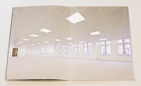
The text pages, show local area, interior shots and floorplans:
Centre Spread
The spread on the inside back cover (above) shows a picture of the firestation as it was at the turn of the century.

...and here we go for a bit of a plug about the paper!  - As you can see from the above images, there is solid blue plus CMYK, heavy coverage - lots of ink going down and it looks great on the Omnia - I'm not going to use this as a platform to slag off other products, but there are one or two other papers on the market which people regard as being similar to Omnia - but there is no way that they print solids or dark images as well as Omnia and retain detail in the dark areas (that's my opinion, but I would say that wouldn't I?)

Design is by London design agency dn&co who specialise in property branding. Creative Director is Ben Dale.
 
The excellent print production is by Push. Print and finishing is superb and I say this because sometimes 6pp or 8pp covers cause a problem, which means that they aren't quite square or the text/cover doesn't fit just so. This job is spot on.

Post by Justin Hobson 10.09.2013

Thursday, 5 September 2013

ASOS BLACK x PUMA

This is the launch literature for the first collaborative ASOS BLACK x PUMA collection, last year. The collection is designed by John Mooney and the garments include t-shirts, technical jackets, tailored shirting together with backpacks and accessories.

Photographer, Jamie Morgan was commissioned to work on a series of portraits for use in both press, online and print literature. The models features are all young street artists pulled together from around the UK.
This project has an unusual format. Size is A5 (210x148mm) portrait and content is 24pp but it forms one long concertina (12 panels). On each end a piece of 1500micron Greyboard is mounted, forming the front and back covers. The front cover is silkscreened in black only. The long concertina, which is over 1.7 metres long, is formed by one join, hidden on the reverse of the concertina.
To engage with the street artist look and feel, a recycled, "urban" type paper was required although this is a little at odds with the Jamie Morgan's amazing images! The paper selected is our Redeem 100% Recycled in 240gsm which is a natural looking recycled product, but as you can see from these images, it prints amazingly! ...although that's in no small part due to the quality of original and the printer. The 240gsm weight, creased perfectly, allowing the pages to flow well without being too stiff and rigid.
Design and production is by Asos. Project manager is Ash Durrant, the Creative manager is Vassili Kouznetsov and the senior designer on the project is Jenna Murray.

Print and finishing is by Push, which as I think the images in this post demonstrate, is superb. 

www.asos.com
www.push-print.com
Posted by Justin Hobson 05.09.2013