Tuesday, 30 September 2014

Freytag Anderson - Recent projects & insights

Here's a simple but very effective piece of self promotion by Glasgow based studio Freytag Anderson. The mailing arrives in a cellophane bag, with it's contents clearly visible. 

The contents include a 20pp newspaper 380x289mm, which actually is a newspaper, printed on newsprint by Newspaper Club. If you aren't familiar with Newspaper Club, it is a great resource - artwork is uploaded digitally and publications are grouped together and printed at the same time on a large newspaper press. A very economical way of producing print - although there are limitations, such as the small matter of the paper - it's newsprint or newsprint! ...so don't even bother about asking for anything else! There are digital versions available as well for shorter runs. All in all they are a great resource. Newspaper Club are based in Glasgow although they operate globally. You can see them here: http://www.newspaperclub.com/
The A5 portrait, 4pp wrap is printed on Colorset Indigo 270gsm. It is printed using white ink on an HP Indigo press, which is a digital printing press. Some, but not all presses are equiped with the facility for printing white ink.
The white ink is very effective. What is interesting is that because of the way an HP Indigo press works, it can keep on laying pass on pass of white on top, so the density of white ink is contollable and as you can see from this example, it is an excellent result. It was printed by Pureprint.
The combination of a cost effective newspaper and a digitally (but highly innovative) printed piece, provides an economical solution to mass production of printed literature.

The publication is produced by Freytag Anderson. You may remember that back in June I wrote about them on this blog as they had been awarded with four Drum awards including Scottish Design Agency of the Year 2014:
http://justinsamazingworldatfennerpaper.blogspot.co.uk/2014/06/award-success-for-freytag-anderson.html.

www.freytaganderson.com
http://www.newspaperclub.com/
www.pureprint.com
Posted by Justin Hobson 30.09.2014

Thursday, 25 September 2014

YCN Professional Awards

Yesterday evening I was lucky to be at the YCN Professional Awards party at Shoreditch House...
YCN, which originally launched as the Young Creative Network in 2001 with their renowned student awards has evolved and is now a membership group under the title You Can Now (YCN). The student awards are still alive and well but YCN introduced the Professional Awards which reflected the membership's work and achievements. This year there were 21 awards given.

I was kindly invited by Design by St, who won the 'Design for Print award' for the 26 Characters project, printed using Colorset 120gsm and Offenbach Bible 60gsm and printed by Push. I wrote about this project earlier in the year: http://justinsamazingworldatfennerpaper.blogspot.co.uk/2014/05/26-characters.html
L-R above are Stef Bushell, Tom Pollard, Steve Fenn from Design by St and Laura Hunter. Steve is holding the very heavy, shiny, golden and impressive award, pictured below.

http://owenrichards.co.uk/
You can read more about the individual award winners here: http://www.ycn.org/awards/news/906-our-ycn-awards-winners-for-2014
Danny Kirk from Push with Tom Pollard - and below is Danny's face reflected in the award ...a true reflection of his role in the project!
Thanks to Design by St for inviting me, to YCN and Nick Defty for being such excellent and generous hosts and Shoreditch House for providing such an excellent venue.
 
https://www.shoreditchhouse.com/
Posted by Justin Hobson 25.09.2014

Monday, 22 September 2014

BOLD|CRAZY

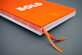
This is one of the very best pieces of design and print to have appeared on this blog ...possibly, ever!  BOLD|CRAZY is an internal piece of literature produced for Heineken. Essentially this is a handbook about communication, people and the interconnectivity of social media - about being Bold and less Crazy!

The size of the book is 270x195mm, portrait. It has 152pp on our Omnia, White 120gsm together with 68pp of smaller inserts which are 195x 142mm on Concorde Pure Brilliance 115gsm.
The book is packed full of information and research into the way that brands have handled themselves in certain social media situations - some good and some bad - examples of case studies from which to learn. The way the copywriting works with the design is fantastic and this is a really engaging piece of literature to read.
The content is a bit sensitive which is why there isn't too much on show in these pictures, but hopefully you can get an idea. The top image above, shows 'tip ins' with fantastically accurate line ups, the above image shows the gloss UV varnish over the number 3, which looks amazing. Print is all offset litho with a special orange.

The choice of the papers has worked brilliantly. The Omnia gives the cool greys, flat blacks and vibrant orange a flat mattness (except where the Gloss UV appears) and this contrasts with the smaller size tip in's on the high gloss lightweight paper (Concorde Pure Brilliance 115gsm)

The 'exposed' binding is one of the best examples I have ever seen. Often this type of binding has too much glue (looks ugly) or too little (too loose with threads hanging off) - this looks great and works perfectly.
This picture shows the way the smaller sections works perfectly with the larger sections and haven't distorted the size of the spine.
The front and back hardcovers are 'paper over board' with Omnia 120gsm with a 'Soft Touch Lamination' mounted onto 2500microm greyboard. making a substantial, yet very tactile cover. The words BOLD|CRAZY are hot foil blocked in matt white foil. Another lovely feature is the three orange ribbons.
Design is by the London office of research agency Fabricww. Creative director on the project is Lauren Edwards and designer on the project is Aurélie Delage. Although I can't confess to have read it all, it appears to be a really well researched and written piece of literature.

Print and production is by Richline based in London with Darren Risley handling the production.

Now although I always make a point of being objective on this blog and strive not to 'plug' anyone in particular, this is one of the first projects that I've seen produced by Richline and it really is truly superb - printed beautifully, the binding executed with masterful precision and the whole job has really high production values.

www.fabricww.com
http://www.richline.co.uk/
Posted by Justin Hobson 22.09.2012

Thursday, 18 September 2014

Letterpress with a difference!

I've just been sent an image of this stunning table name card produced for a wedding.
 
They are printed letterpress on our Kapok 500gsm board, which is a natural, brown coloured board. The tree rings are created as a letterpress varnish which creates this amazing tone and embossed effect. Varnish is rarely used in letterpress printing, so this is something really different.
 
Click on the image to enlarge:
As well as the varnish effect, the invitation is printed in one special colour with matching edge tinting and round cornering.

Design, print and production is by an extremely skilled and innovative Letterpress studio, Stoneberry Press. The studio is based in Edinburgh and established by Evgenia Kochkina.

Have a look at the other work they do....
http://stoneberrypress.co.uk/
Posted by Justin Hobson 18.09.2014

Tuesday, 16 September 2014

What is ...Riso Printing?

What is ...Number 9
Regular followers of this blog will know that in the middle of the month, I publish a "What is ....? post. The article covers various aspects of paper, printing and finishing in greater depth. However, many of these subjects are complex, so these posts are only intended to be a brief introduction to the topic.

What is ...Riso Printing?
Riso or Risograph printing is one of the earliest forms of 'electronic' printing (as opposed to digital). Neither a photocopier or a duplicator, Risography was launched in the mid 1980's and provided a cheap method of colour printing that was cheaper than photocopying for short to medium runs and cheaper than short run offset litho. It was particularly aimed at educational establishments and offices.
Riso EZ200 model
Picture showing the master around the drums
The technology is an evolution of the old 'spirit duplicators' which worked on a typed or drawn wax 'master' through which ink is forced through and onto the paper.
The Riso machine scans an original (or today a digital interface is used) and a 'master' or stencil, which is similar to and can be described as printing plate is produced - through a heat process. From then on the process is similar to a cylindrical screen printer! The master/stencil (plate) is wrapped around a drum (which contains the ink). The drum revolves and the ink is forced through the master, printing the ink directly onto the paper that is fed past it through each revolution, one colour per drum, at a time. Each drum is charged with ink and is a particular colour, of which there are about 20 colours currently available. Inks come from the manufacturer ready mixed and only standard colours are possible. It is possible to crudely register colours although 'process' colours and registering four colours isn't feasible.
To illustrate this post, here is a project which has been printed Riso and a great example of what can be achieved. Open Books is designed by Sophie Demay and Lola Halifa-Legrand. It's a sub A5 format, wiro bound with a variety of different text papers and printed is a blue, green and red.
Cover, above is printed blue, on Colorset Suede 270gsm.Below shows double page spread printed in green...
Below is an example of solid red (looks pretty good)
 Below is an example of solid blue (not so great!) ...but as all printers will say, if you're going to have a problem with any colour, it'll be blue!
Invitation, below, printed Riso in two colours, yellow and blue on white:
Open Books is Riso printed by Hato Press, also based in London.

So what else should you know about Riso printing?
Some of the machines are A4, oversize A4 or A3, so it depends on the size that the printer has. Riso printers only print on uncoated papers and ideally paper which has a slightly rougher, more 'open' surface. Riso machines don't like lightweight or heavyweight papers, so the acceptable weights tend to be from 100gsm up to 270gsm.

There are now quite a few independent Riso printing companies or studios around, some of whom have been established for a few years. It is an increasingly popular printing method for independent publishers and designers wishing to experiment with printing. It is considerably cheaper than offset litho printing and HP Indigo print, although the quality is unique and characterful, but won't be appreciated by everyone!

You can read more here:
http://en.wikipedia.org/wiki/Risograph
http://www.riso.co.uk/

This is a very good resource: http://stencil.wiki/atlas

...and here is a list of a few Riso printers that I know of:
www.hatopress.net
http://www.dittopress.co.uk/
http://victorypress.co.uk/
https://www.calverts.coop/portfolio/risograph/
http://bellevuepress.blogspot.co.uk/
http://www.two-press.co.uk/
www.londonbookarts.org
...and now in Glasgow (Updated 2016): https://www.risottostudio.com/
...and another one in London (Updated Sept 2017) www.beforebreakfast.london
...and another one in London (Updated Sept 2018) https://jumbo-press.com/
Posted by Justin Hobson 16.09.2014

Friday, 12 September 2014

Ultrabold 15

This is the Spring 2014 edition of Ultrabold magazine, which is the Journal of the St Bride Library - if you aren't familiar with St. Brides, have a look at the link: http://www.sbf.org.uk/

Fenner Paper is pleased to support this publication and in a small way, help preserve the history of the printing industry for future generations.

This latest edition has some really interesting articles including one that is particularly relevant for this very date 12th September - one hundred years ago....
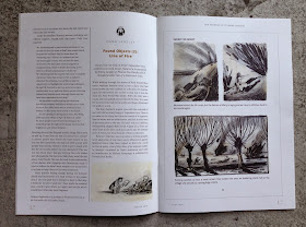
This article is written by Emma Langley of Phoenix Yard Books and is based on her presentation made at the St Bride Conference on book design in September 2013.
 
Illustrator, Stephane Barroux discovered a diary of a French soldier serving in the First World War that was being thrown away. With great ingenuity, he took the diary to his studio and illustrated the soldiers words which resulted as a striking graphic novel (titled: Line of Fire) extracts of which are shown in this article... 
The last entry was 100 years ago today, 12th September 1914.
 
It is not known what happened to the soldier.
http://www.phoenixyardbooks.com/
http://www.barroux.info/
There are many other interesting features in the publication, including this comprehensive article written by Dave Farey in the first of a two part article about the typeface Times New Roman and The Times newspaper itself.
The publication is designed by Simon Loxley and is published by the Friends of St Brides. Printing is sponsored by Principal Colour. The journal is a 40pp self cover, 190x265mm Portrait, saddle stitched and is printed on Brand X FSC 115gsm.

The cover price is £7.00, although as I've mentioned previously on this blog, it's worth mentioning that this publication is free to friends of St Bride - so why not look into joining - might be cheaper than just buying the books and does a bit to help preserve the history of the industry for future generations.

http://www.sbf.org.uk/
http://www.principalcolour.co.uk/
Posted by Justin Hobson 12.09.2014

Wednesday, 10 September 2014

The Bristol Coffee Map

The Bristol Coffee Map is a project instigated by Bristol based Studio Baum ...produced in celebration of coffee, Bristol and the art of print design.
The studio worked with a team of coffee aficionados over 9 months touring Bristol’s cafés and meeting the city’s talented baristas. The final result is this beautifully produced piece of tactile print.
The size of the map is 350x487mm folding down to175x122mm. It is produced on CRUSH, Coffee 120gsm from FAVINI, made using up to 15% residues from agro-industrial processes, recycled fibres and FSC fibres. Read more about Crush here: http://www.favini.com/graphic_specialities/en/crush-prd-26.php
The map itself is printed offset litho in silver with an overprint silk-screened in turquoise. The project is illustrated in by a local Bristol illustrator Naomi Wilkinson - illustrations are just superb.

Design and production is by Sam Baum at Studio Baum. You can read more about it here:
Print is by Zone Graphics, based in Paddock Wood in Kent.
 
http://studiobaum.com/
http://www.naomiwilkinson.co.uk/
www.zonegraphics.co.uk
Posted by Justin Hobson 10.09.2014

Monday, 8 September 2014

From Q to M – three centuries of typewriter art

There is a talk at the St Brides Foundation which should be absolutely superb and you should know about!

Barrie Tullett is Senior Lecturer in Graphic Design at the Lincoln School of Art and Design, and cofounder of The Caseroom Press, an independent publisher of artists' books based in Lincoln and Edinburgh. As a freelance graphic designer, his clients have included Canongate Books, Princeton University Press and Penguin Books, amongst others. He has recently published a book titled "Typewriter Art: A Modern Anthology" and he will guide the audience through three centuries of typewriter art
Image courtesy of Laurence King
Special guest Keira Rathbone will be live typing throughout the evening demonstrating how this most rigorous and unforgiving of machines still inspires today. Keira Rathbone’s unique art explores the often forgotten creative tool the typewriter. Her works involve using a typewriter as a drawing and mark making instrument, a discipline that has evolved over a ten year period to create works as stunningly complex as they are beautiful and absorbing. Works and performances are developed from many sources; live events, people and architecture prove that the typewriter is a valid and provocative medium that challenges our perceptions of technology and the creative process.
Image courtesy of Laurence King
Copies of Typewriter Art: A Modern Anthology by Barrie Tullet, published by Laurence King, will be available to purchase on the evening at £19.95 each.
Image courtesy of Laurence King
The talk is on Wednesday 24 September 2014 at 7pm

Don't put it off - book a ticket now - Tickets £15.00 • Friends of St Bride Library £12.50 • Students (bring NUS card) £10.00
You can book your ticket here:
 
Posted by Justin Hobson 08.09.2014

Thursday, 4 September 2014

American Trilogy Invitation

This is the beautiful invitation for the private view of the Ernesto Cánovas exhibition held at the Halcyon gallery in April. I previously wrote about the catalogue for the exhibition on this blog: http://justinsamazingworldatfennerpaper.blogspot.co.uk/2014/06/american-trilogy-by-ernesto-canovas-at.html
This shows the thickness
Size is A5, portrait and is a single card (2pp) made by printing and then duplexing our Omnia 280gsm  to make 560gsm - which is around 800micron thick - a truly substantial invitation! The front of the invitation is printed CMYK with a section of the artwork titled 'Rudolph Territory'. The reverse is printed offset litho in special gold plus black.
One of the main things to mention about the front of the invite is that the image area (below) is over-printed with a gloss UV varnish. (...just worth pointing out that Omnia is one of the very few papers with an uncoated look and feel that you can successfully UV varnish on to with one pass and it looks excellent). It also reflects the look feel of the actual artwork itself.
The gloss varnish also accentuates the artist's injection of vivid colour which features throughout his work.
The invitation is designed and produced at the Halcyon Gallery. Designer of the invitation (and catalogue) is Alfie Hunter.

Printing is by Leicester based Greenshires with Richard Dalby handling the project. Beautifully printed and finished, the UV varnish looks great - a really well produced piece.


Posted by Justin Hobson 04.09.2014