Tuesday, 26 October 2021

ASOS BLACK / PUMA

This is the launch literature for the first collaborative ASOS BLACK x PUMA collection. The collection is designed by John Mooney and the garments include t-shirts, technical jackets, tailored shirting together with backpacks and accessories.

Photographer, Jamie Morgan was commissioned to work on a series of portraits for use in both press, online and print literature. The models featured are young street artists pulled together from around the UK.
This project has an unusual format. Size is A5 (210x148mm) portrait and content is 24pp but it forms one long concertina (12 panels). On each end a piece of 1500micron Greyboard is mounted, forming the front and back covers. The front cover is silkscreened in black only. The long concertina, which is over 1.7 metres long, is formed by one join, hidden on the reverse of the concertina.
To engage with the street artist look and feel, a recycled, "urban" type paper was required although this is a little at odds with the Jamie Morgan's amazing images! The paper selected is our Redeem 100% Recycled in 240gsm which is a natural looking recycled product, but as you can see from these images, it prints amazingly! ...although that's in no small part due to the quality of original and the printer. The 240gsm weight, creased perfectly, allowing the pages to flow well without being too stiff and rigid.
Design and production is by Asos. Project manager is Ash Durrant, the Creative manager is Vassili Kouznetsov and the senior designer on the project is Jenna Murray. Print and finishing is by Push Print.
https://www.asos.com/
Posted by Justin Hobson 26.10.2021

Friday, 22 October 2021

The Modern House - postcard set

Established by Albert Hill and Matt Gibberd, The Modern House is the UK’s foremost estate agency, only selling modernist and contemporary architecture for over a decade.
"Selling Britain's Finest Modern Architecture" showing four properties in the format of a concertina postcard book.
  
The format is a 12pp A6 concertina. Flat size is 148x634mm, folding to 148x105mm. The concertina folds into a pre-creased 3mm spine. Printed CMYK offset litho and the cards are perforated.
The concertina is printed on Redeem 100% Recycled 315gsm, which prints beautifully and fits with the modernist, utilitarian architecture.
showing how the concertina folds into the spine
The superbly creased 3mm spine. It's touches such as this - good creasing - that make all the difference to a project like this:
Click on image to enlarge & see perforation
...and the other thing that shouldn't be overlooked is the perforations. As you can see from this picture, perforations can look great, even beautiful. These perfs. only look this good because the designer took the time to explain what he wanted to the printer. There are a selection of different perforation "bars" available at print finishers - so do ask a printer to get samples and to show you different types. If you don't convey your expectations to the printer, then they'll generally use the perforating bar that's on the machine and you may be disappointed.

Art direction and design is by Field Projects. Print production is by Michael Keyworth at Key Printers.
Posted by Justin Hobson 22.10.2021

Wednesday, 20 October 2021

International Print Day 2021

Today is the day! October 20th is International Print Day 2021 which is the eighth IPD to date and will once again trend the planet through 24 hours of social media sharing. 
The idea is that the global print community will use social media to network, exchange knowledge and information, and proclaim their love for print and the people that make it possible by following and sharing using the hashtag #IPD21. Last year’s event generated on Twitter 384 Contributors / 3,735 Tweets / 18,297,446 Impressions and on Instagram 148 posts / 119 Contributors / 250 Comments / 2,835 Likes / 146,300 Impressions. The theme this year is #PrintAgain. It represents the revival of print in the marketing mix.

Print legend Frank Romano is involved and is live for a Project Peacock event. Below is the IPD poster produced by Craig Bower at Design That Rocks  

Navigator Paper has listed some 2021 trends for print, which I think are of interest...
"To celebrate, we take a look at the dynamics at work in the industry, how it has been affected by the coronavirus pandemic, and the trends set to shake up the global printing sector in 2021" 

1# Challenging global economic conditions: even before coronavirus. 
2# Post-coronavirus the market is struggling 
3# On-shoring and right-shoring as the pandemic disrupts supply chain 
4# The packaging market continues to thrive 
5# Creative marketers are returning to print 
6# Asia Pacific is expected to be the fastest-growing market 
7# The need to innovate 
8# The transition to digital print continues 
9# Metal is set to overtake plastic as the 3D printing material

You can read the whole article HERE

Enjoy the day ...and get busy with the hashtag on social media #IPD21 #PrintAgain

https://internationalprintday.org/
Posted by Justin Hobson 20.10.21

Tuesday, 19 October 2021

Paper price news...

An article written by Jo Francis, published today in Printweek about the recent increase in paper costs...
The fact is that all paper grades are increasing in price, which is very bad news if/when you are trying to convince a client to commit to printing.

You can read the article HERE

Posted by Justin Hobson 19.10.2021

Thursday, 14 October 2021

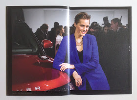
JLR Editors Club

This is a piece of literature produced for Jaguar Land Rover PR and press department. The publication embodies all the core values that JLR stand for and consequently is produced to a very high specification.
The brochure comes in a slipcase/pocket, which together with the 4pp cover is made using Plike Black 330gsm from Cordenons. Size of the brochure is 240x168mm, portrait.  
The slipcase and cover is hot foil blocked in silver foil and the edges are gilded in silver, which does look exquisite.
The 40pp text is printed on our Omnia 120gsm offset litho - and it is printed wall to wall, solid black, CMYK images plus a special silver - all the type is printed in silver.
Click on images to enlarge
In line with the quality look and feel of the brochure, the biding is Singer sewing, which is totally characteristic for this brand.
Click on images to enlarge
The reproduction on the Omnia is magnificent, the CMYK, the solids and the silver which looks metallic, as you can see from the image below.
Art direction and design of the catalogue is by Imagination. Graphic designer on the project is Amish Shah  (www.work-in-process.eu). This is an exquisitely produced brochure which conveys exactly the right look and feel of luxury. Print is by Identity, based in Paddock Wood.
Posted by Justin Hobson 14.10.2021

Monday, 11 October 2021

St. Barth Map

Sibarth, is one of the largest villa rental companies on the exclusive Caribbean island of St. BarthKesselsKramer, who have studios in Amsterdam, London and Los Angeles conducted a total rebrand. KK developed a strategy based on the fact that Sibarth were the first villa company established on the island, and the only one run exclusively by people who live on St. Barth. KK emphasised this with a new campaign theme: 'Our Island. Your Way', new logo, website, editorial content and films. 
As part of the print collateral, they produced this map of the island... 
Click on images to enlarge
The finished size of the map is 160x120mm, which folds out to 320x480mm. It is not a regular map-fold, as you can see from the picture above, after folding up the front cover, you are faced with two 60mm flaps which meet in the middle, which neatly leads you into the content...
Below shows the inside of the map laid out flat.
Below shows the outside, with the map of Gustavia, the capital, on the right hand side.
Click on images to enlarge
The map is beautifully illustrated by French illustrator Cassandre Montoriol.

The paper used is our Alga Carta from FAVINI chosen because it was in keeping with the sustainable concerns of the island. Alga Carta is manufactured partly using algae harvested from the fragile marine areas, combined with recycled and FSC certified fibres. Algae blooms in abundance in certain areas, clogging up the flow of water in lagoons and endangering the eco-balance of the area.
The map is printed on Alga Carta, White 120gsm and the 53mm wide 'belly-band on 160gsm. If you aren't familiar with Alga Carta, the specs of Alga are actually visible in the sheet as you can see in the detail below:
Design is by KesselsKramer, London and the Art Director is Tash Ingall and producer is Tialda Lublink. It is printed offset litho by Park Communications in London and my thanks to Gareth John for sending me file copies.

www.sibarth.com
Posted by Justin Hobson 11.10.2021

Wednesday, 6 October 2021

'Until the Last Oak Falls'

Today a Kickstarter project was launched which is well worth a look and is worthy of your support...
Adrian Fisk is a photographer/film-maker; his work has featured in the world’s top current-affairs periodicals and he works for top advertising, design and PR agencies and major international brands. He spent five years documenting youth counter-culture against the 1990s socio-political backdrop of environmental protests, illegal raves and anti-globalization. 'Until the Last Oak Falls' contains a collection of powerful, compelling and important photographs, many never seen before, that he made documenting the early days of the British direct action environmental movement from 1995 - 1999.
An essay written by Jay Griffiths (author of Why Rebel) will feature facsimiles of printed protest ephemera from the 90’s. The book will be 160pp and the size is 170mm wide by 240mm high. This format ensures minimal paper wastage and a maximum page size from industry standard paper sheets. You can read lots more about the project HERE.
Design is by Zoë Bather and Linda Byrne.

Launched today with a £16,000 goal ...it's only with your support that this book will happen. Go on - you know you want to!

Sunday, 3 October 2021

Jobs from the past - Number 143

Regular followers of this blog will know that my first post of every month is a "job from the past" so that I can show some of the really good projects from years gone by and this is from 2014.

The Big Book Bonanza - 2014
This is the  'The Big Book Bonanza' catalogue which showcases the new Autumn releases from HarperCollins publishers. Throughout the publication are wonderful psychedelic Kaleidoscope style illustrations by Emily Forgot. 
Size of the catalogue is 210mm square, saddle stitched. It is printed on our Omnia - 4pp cover on 320gsm and 32pp text on 150gsm.
Click on images to enlarge
The choice of material for this job was important, the reason being that the strong illustrations on the divider pages meant that it had to print solids really well but there's also lots of great commissioned photography included, so it was important to have a material which worked for both without compromising either and as I hope these pictures show, it looks really good.
Click on images to enlarge
The other very good reason that Omnia was chosen was the use of metallic gold pantone 'special' ink. On most traditional uncoated papers, metallics can look flat and with gold can just look a bit brown, but as I hope the below image demonstrates, metallic gold really does look metallic on Omnia.
Design and art direction is by Zoë Bather.

The catalogues are printed offset litho in four colour process plus metallic gold special. Print production was handled by Alan Mountain at Forward Print (sales@forward-print.com)

www.harpercollins.co.uk
www.zoebather.co.uk
http://www.emilyforgot.co.uk/
Posted by Justin Hobson 03.10.2021

Friday, 1 October 2021

No Time to Die

Unless you are a hermit, you could not have missed the fact that the new James Bond film, No Time to Die was released in the UK yesterday. The release has been delayed for 15 months due to the global pandemic.

What better time to review these superb invitations produced for Skyfall, which as you will read below, was also a movie put on hold, although that was due to the financial recession...

SKYFALL 2012

The James Bond franchise is a global phenomenon and one which over the years has made those involved in the production and marketing a lot of money. However many people may not remember that due to the recession, Bond film number 23 (as Skyfall was then known) was put on hold in 2010 due to lack of cash. Having originally meant to be released in 2011, it was eventually released in October 2012.

Film Premieres of this scale demand lavish and expensive invitations and collateral. In quality terms they must live up to and possibly exceed, the expectations of the forthcoming film.
Below is a small 4pp wallet (with pocket) which is 180mmx107mm, printed offset litho in CMYK plus a gold special colour on Omnia 280gsm with the ticket printed CMYK and hot foil blocked in metallic gold foil on Omnia 280gsm duplexed to 560gsm.  
Click on images to enlarge
The ticket is also hot foil blocked on the reverse.
The launch of this type of film requires several events and these represent tickets for the screenings at The Royal Albert Hall, the Odeon Leicester Square and the after show party at the Tate. As you will notice from the reverse of the wallet (below) the litho printed gold actually looks gold! ..this is a feature of Omnia and where is scores over ordinary uncoated papers.
Below is the ticket for the Odeon Leicester Square which is 99x210mm, Landscape.
The ticket is printed in CMYK plus gloss black foil, which you can hopefully see in the picture below.
This ticket which is also printed on Omnia 280gsm is mounted on our Sumo 2000microns which makes the invitation 2.5mm thick!
Printing is by Identity Print, based in Paddock Wood, Kent and they made a superb job of it - colour reproduction and solids are superb - the hot foil blocking is perfectly executed (Identity are one of the few printers to have hot foil blocking facilities 'in-house')

http://www.identityprint.co.uk/
http://www.007.com/
Posted by Justin Hobson 01.10.2021