Friday 20 March 2015

Cutler and Gross

Cutler and Gross is a distinctly British eyewear brand, founded in 1969 by Graham Cutler and Tony Gross, who met at optometry school in Northampton. This idiosyncratic eyewear brand has been at the forefront of the optical fashion for the past 40 years.

This look-book for the Autumn Winter collection is a beautifully produced piece of literature, which has some gorgeous design cues, including the three hole-sewn binding.
Size of the brochure is A4 (297x210mm). It has a 4pp cover with a 16pp text. It is printed on Omnia 200gsm cover and 120gsm text. Omnia gives the uncoated. tactile feel but reproduces the fine detail of the glasses and the flesh tones superbly. Printed offset litho in CMYK.
Centre spread showing three hole sewn binding
There is lots of plain unprinted paper in the design, which gives the whole publication a lovely feeling of space - very uncluttered.
Below is the detailing of the three hole sewn binding.
And here is something that I hope will demonstrate the tactile nature of Omnia - the below detail image is where you can see the visible, natural texture of the paper and the way it reproduces images superbly.
click to enlarge
Design and art direction is by Exposure. Creative director is Robin Ek. Photographer is Marius W Hansen. Print production is by Principal Colour. 
 
Posted by Justin Hobson 20.03.2015

Tuesday 17 March 2015

What is ...Sapphire Treatment?

What is ...Number 15
Regular followers of this blog will know that in the middle of the month, I publish a "What is ....? post. The article covers various aspects of paper, printing and finishing in greater depth. However, many of these subjects are complex, so these posts are only intended to be a brief introduction to the topic.

What is ...Sapphire Treatment?
This is something I often get asked about so hopefully this post will serve to de-mystify the subject for readers!

Indigo was founded by Benny Landa in Israel and in 1993 they launched the first Indigo digital printing press (the Indigo E-print 1000). It took many years to take a hold in the digital print market as it was up against very established competitors such as Xerox.

However, it works in a totally different way to the other toner based printers and in fact is an 'offset' process which is similar to offset litho.
I first saw an Indigo press when I visited DRUPA (a printing and graphic arts fair held in Germany) in 1995. I picked up the print examples and still have the original sales brochure!
The print result further improved with subsequent models and became an industry leader in digital quality print. In 2001 Hewlett Packard (HP) purchased Indigo and the press manufacturer became known as the HP Indigo. There has been much investment and many new models including the game-changing B2 format press...
http://justinsamazingworldatfennerpaper.blogspot.co.uk/2012/03/hp-indigo-unveils-b2.html

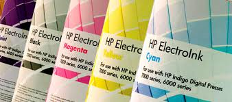
Unlike other digital printing methods an Indigo press uses an ElectroInk which contains charged pigmented particles in a liquid carrier. Like other digital printing technologies, such as toner, ElectroInk enables digital printing by electrically controlling the location of the print particles. However, unlike other digital technologies, Indigo is still an 'offset' process where the ink is transferred from the plate onto a blanket and then onto the paper substrate http://www8.hp.com/h20195/v2/GetPDF.aspx%2F4AA3-9326EEW.pdf

At the time when the Indigo press was first launched, the majority of papers were produced for offset litho or for dry toner. The results were a little hit or miss, although better for coated papers and the problem was that the ink was coming off and caused a particular problem around folded areas. To get round this problem 'Sapphire Treatment' was developed. This is a polymer-based solution which is coated on the sheet before the printing process. It provides a 'key' between the surface of the paper and the ElectroInk that binds the ink to the paper and maximizes ink adhesion. This 'treatment' or 'coating' is applied as a pre-coat before the paper is printed.

Image Courtesy of POSCO Inc
http://www.poscoinc.com/default.aspx
It is a clear, colourless, odourless liquid, so it isn't something that particularly lends itself to exciting images! ...it literally comes in large containers and drums such as pictured here. So the next best thing is to show you the type of coating machine that applies this type of coating. Below is an example of a dedicated coating machine but coating can also be achieved on an adapted offset litho press.
The image below shows the detail of the machine, which is a series of rollers which evenly spreads the liquid coating.
So basically, pretty much any paper can be treated/coated to make it suitable for printing on an HPIndigo press ...so who does the coating?

Some paper merchants have their own coating facilities (as we do at Fenner Paper) ...however our coater is not suitable for mass production, so larger batches are sent to specialist coating companies. One such company, called ACCEL, is based in the Midlands and is an HP Indigo Authorised Media Treatment Centre. They coat for many merchants and printers for the HP Indigo sheetfed market.
http://www.acceluk.com/

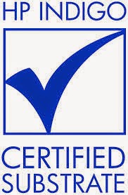
However it is important that you don't think that everything printed using this technology needs treating! There are nearly 4000 media, which are certified substrates (papers and plastics) -made by mills and manufacturers which are ready to print on an HP Indigo with no additional treatment. The chemicals have been added at the manufacturing stage at the mill and the products have been successfully tested and approved by HP Indigo certification centres at the Rochester Institute of Technology and in Singapore. At Fenner Paper, we carry some products which are 'HP Indigo ready' such as Stardream and Shiro Echo. However, even with 4000 approved products that still doesn't cover all the materials that people would like to use, which is why having the ability to pre-coat using sapphire treatment is essential to making the digital printing offer, truly flexible.

I understand that to many people this will seem like a tediously technical, boring subject. However, as digital printing becomes more prevalent in the industry, it's a good idea to have an understanding of some of the issues. Below are further links that you might find useful.

http://www8.hp.com/uk/en/commercial-printers/indigo-presses/overview.html
http://www.acceluk.com/
http://www.michelman.com/Printing-%26-Packaging/Digital-Printing/HP-Indigo-Solutions/

Posted by Justin Hobson 17.03.2015

Friday 13 March 2015

Discover better - Green Park

...just the cover makes the difference!

Here's a project that is exceptional, because of the way the cover is used to add to the quality and feel of the whole project.

Green Park is a business park located close to Reading.  Managed by Oxford properties, Green Park extends across 195 acres of landscaped parkland encouraging biodiversity. More than 50 bird species have been ‘twitched’ there, while Longwater Lake, a 1,200 freshwater lake bisecting the site is home to an abundance of fish and invertebrates. All Green Park buildings have solid ‘green’ credentials and there is a 120 metre wind turbine designed by Foster + Partners generating 2.3 megawatts of power annually.
This publication is to promote the development for Oxford properties and has a deliberately 'notebookey' look and feel. The size is 252x190mm, portrait and is perfect bound with an 8mm spine.  The cover is printed on Colorset Lime 270gsm ( ...which is 100% recycled - in line with the development's eco credentials) and is hot foil blocked in matt white foil.
The cover has a tactile, engaging, notebook feel, it features two bound ribbon bookmarks, rounded corners and a pocket on the inside back cover.
The below image shows the capacity pocket on the inside back cover, complete with 'thumbcut' - beautiful detailing.
This image shows the way that the pocket is also round cornered. Excellent.
The 80pp text is digitally printed on an uncoated sheet, as the budget dictated, although there was a subsequent run which was litho printed and section sewn. The cover gives it a quality feel and keeps it miles away from the naff "glossy" brochures which are often produced for property companies - the cover sets the tone and feel for the whole publication
Another lovely detail is the grey elasticated band which goes round the whole book, attached on the back cover and looks great.
Below image shows the detail of the rivet and where the elasticated loop attached on the outside back cover, which is also hot foil blocked.
Design is by Purpose and the design director on the project is Lee Manning. Production was managed by Jim Campbell.

Print is by Boss based in West London - incidentally they are one of the few printers who have hot foil blocking 'in house'.

http://www.greenpark.co.uk/
http://www.purpose.co.uk/
https://www.bossprint.com/
Posted by Justin Hobson 13.03.2015

Wednesday 11 March 2015

Take a ticket to a Wedding...

Here are some stunning invitations produced for a wedding, which took place just last month.
Designed in the style of a boarding card, they are printed letterpress on our Plexus 350gsm board, which is a natural, brown coloured board. They are very simply printed letterpress in one colour (black) and are die cut and perforated.
 
Click on the images to enlarge:
Design, print and production is by the lovely Evgenia Kochkina at Stoneberry Press in Edinburgh. The studio does really innovative Letterpress work on interesting materials.

Have a look here and see what else they do....
http://stoneberrypress.co.uk/
Posted by Justin Hobson 11.03.2015

Monday 9 March 2015

Ladybird By Design - a talk at St Brides

Now who hasn't got a soft spot for Ladybird books? - well certainly those of us who are a certain age! A new book titled Ladybird By Design has just been published last week by Penguin and the author, Lawrence Zeegen, is giving a talk at St Brides in London on Tuesday 24th March.
Lawrence Zeegen is the Dean of the School of Design at London College of Communication and Professor of Illustration at the University of the Arts, London.
For one hundred years, Ladybird books have delighted children, their parents, grandparents and teachers alike, taking readers on a journey of discovery and enlightenment. Affordable and accessible, Ladybird books hold a significant and affectionate place in the collective psyche of the nation, conjuring up, through written word and illustration, life in Britain in more innocent times. The success of Ladybird was as much due to clever format and compelling design, as it was the quality of the writing, presenting a portrait of the time through the use of specifically commissioned illustration. Unparalleled in their perfectly observed attention to detail and unique sense of place, Ladybird’s full-colour, full-page illustrations were often created by well-known illustrators such as Charles Tunnicliffe, Harry Wingfield, Martin Aitchison, Eric Winter, Robert Lumley, John Berry and Robert Ayton.
Lawrence Zeegen has co-curated an exhibition at the De La Warr Pavilion in Bexhill which opened in January and portrays a unique slice of Britain’s social and design history, as seen through the eyes of Ladybird. http://www.dlwp.com/event/ladybird-by-design

Tickets are just £15.00 (concessions available). Great value and you can book here:
http://www.eventbrite.co.uk/e/ladybird-by-design-tickets-15299349767?aff=erelexporg

Don't be a stranger to these events, grab a ticket, go along and stimulate the grey matter ...!
http://www.sbf.org.uk/events/ladybird-by-design

Photographs: © Ladybird Books Ltd
Posted by Justin Hobson 09.03.2015

Friday 6 March 2015

Hello Handsome!

Here's a cracking new range of Father's Day cards from independent greeting card publisher Blue Eyed Sun. The 'Hello Handsome' range cards are all 160mm square and are sold through the trade to card shops and retailers ...so they are in the shops now!

The cards are printed CMYK, offset litho on our Rib-Tone, 2 sided which is a natural unbleached brown 'kraft' shade with a feint rib and a 100% recycled inner board.
One of the interesting things about Rib-Tone is that although it is a brown shade, it provides a very neutral background for what is printed on it and therefore is one of the few substrates that seems obvious yet, almost becomes invisible and doesn't interfere with the design.
The cards are designed and published by Blue Eyed Sun. Design is by Jo Corner. The cards are printed by Graphite Creative who are based in St Albans.

Blue Eyed Sun is an award winning greeting card company based in Brighton established fifteen years ago. They specialise in handmade and high end design-led cards, which are now sold around the world by some of the best know retailers including Harrods, John Lewis etc.

Joint founder and managing director Jeremy Corner is a leading figure in the greeting card world. He is instrumental within the 'Ladder Club' which helps aspiring greeting card publishers and is on the council of the Greeting Card Association (GCA). He is a real advocate for the industry ...and he still finds time to be a regular blogger! http://www.blueeyedsun.co.uk/blog

www.blueeyedsun.co.uk
Posted by Justin Hobson 06.03.2015

Tuesday 3 March 2015

Jobs from the past - Number 65

Regular followers of this blog will know that my first post of every month is a "job from the past" so that I can show some of the really good work from years gone by...

My|Your|Our Spitalfields - 2004
Bostock and Pollitt designed the identity and marketing material for the Spitalfields retail development in London. The resulting identity keeps the name of the area, in combination with the strapline My|Your|Our Spitalfields. The project incorporated hoardings and literature, including this brochure.

The design of the brochure and identity is heavily influenced by the Huguenot silk weaving community, who were immigrants to the area after their exodus from France and their cultural influences had a profound impact on the area which is still evident in the locality today.
Click on images to enlarge
As you will be able to see from the image, the design is based on a sewn/cloth/cross-stitch feel. The binding is 'side-sewn' with a red thread, which compliments the design beautifully. Size of the brochure is 245x175mm, portrait with a 36pp text. 
The remarkable feature of this brochure is the cover. Ideally a cloth feel was required on the cover and the designer didn't want to use a linen embossed paper which would have a 'faux' feel. So they looked at bookcloths, however that would have meant only a limited number of processes could be used (silkscreen/foil etc). Readers may not be aware but we, at Fenner Paper, do a very unusual product called Flaxprint Litho Printable Bookcloth. It is a genuine bookcloth which is litho printable. This cover is printed offset litho in CMYK with the 'sand' colour being printed as a special. However, a bookcloth is only one sided, usually with a paper reverse, so it can be mounted onto board to form a casebound cover or slipcase. Because this is a limp bound publication with a soft cover, the solution was to duplex the Flaxprint , back to back, so the 'cloth' appears on both the outside and inside covers. The result looks and feels absolutely amazing.
Flaxprint 74lb cover, really is an amazing product. As far as I am aware this is the only genuine bookcloth (as opposed to paper) which is litho printable and offers amazing versatility. Having the ability to print an image and solid colours on a casebound book on a genuine cloth, rather than a paper alternative, offers a huge range of possibilities. In comparison with paper, a cloth is virtually indestructable! ...which is why it has been used in bookbiding for hundreds of years, The below image shows the close detail of the weave and print detail.
Design is by Bostock and Pollitt, senior designer on the project was Pat Glover. Photography is by John Spinks. The exceptional print and finishing is by Gavin Martin.

I know the images do not do this project justice but hopefully I have given some insight to the project and cover in words. If you are not familiar with Flaxprint and would like a sample, please get in touch.

http://www.bostockandpollitt.com/
http://www.eastphotographic.com/#/artists/johnspinks/
http://www.gavinmartincolournet.co.uk/
Posted by Justin Hobson 03.03.2015