Friday 10 July 2015

MCU SS2015

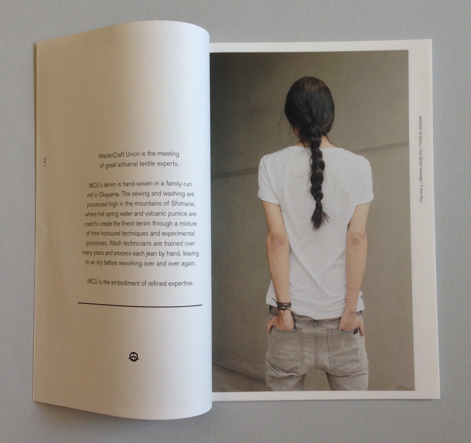
This is the lookbook for Spring|Summer 2015 collection for clothing brand MasterCraft Union. The collection majors on hand-woven denim from a family-run mill in Okayama and is finished in the mountains of Shimane. This season they have introduced MCU Paper Denim, which is constructed of exclusive fabric, using traditionally milled Japanese paper within the weave of the denim!
The whole publication (making this a 'self-cover') is printed on our Offenbach Bible 60gsm, the lightweight paper works with the Japanese heritage associated with the brand. The size is just sub A5 (210x145mm) portrait.

The text of the whole book is 'French Folded' - this is where the folded edges are on the foredge of the book, as in the picture below:
Click on images to enlarge
As a result of choosing Offenbach Bible 60gsm, this piece of literature feels totally special - a fantastic piece of print reproduction and print finishing. It has 22pp or printed sides (which I would normally describe as 22 x 4pp french folded sections) - this actually makes 44pp but because the other side is unprinted and the open ends are bound, therefore each 4pp = 2pp. It's a bit tricky but if you think about it, it makes sense. French folding with a material like Offenbach Bible feels fantastic because the weight of the material lets the pages flop and flow beautifully, as you can see from the spreads below
 ...you can see the way the text pages rolling and flopping over, flowing superbly.
The binding is 'stab stitching'. This is where the staple (or wire) stabs through the whole text of the publication, unlike saddle stitching, where the staple goes through the spine and turns over in the centre spread. Below shows the stab stitched spine.
Another lovely touch is the white wire used for the staples:
Art direction and design is by JJ Marshall Associates. Creative Director is Jethro Marshall.

Excellent print and finishing is by Principal Colour.
Posted by Justin Hobson 10.07.2015

Thursday 9 July 2015

Daily Observations

Last week, I was invited to a private view for photographer Mark Sanders at Protein Studios in EC2. Curated by Studio Small, the occasion also celebrated their tenth birthday. Daily Observations is an exhibition drawn from images from the daily diary of Mark Sanders, which has been compressed to just 45 images for this show. 
 
Many of the actual diaries are out on display in cases.
Hard to believe that it was ten years ago that David Hitner and Guy Marshall joined forces to start their own studio and this was a great way to celebrate.   
...and of course I must mention one of the sponsors, which was another paper company! Antalis generously donated the paper for the 48pp exhibition publication (below), but sadly no one from Antalis turned up!
The book has been beautifully printed by Team Impression in Leeds and has been finished in true notebook style with an embossed cover, round corners, section sewing and pasted end papers. The superb finishing is by Diamond Print Services.

http://marksanders.co.uk/
http://www.studiosmall.com/
http://www.team-impression.com/
http://darling-creative.com/mark-sanders-3/
Posted by Justin Hobson 09.07.2015

Tuesday 7 July 2015

Finchtail - Tablet Stand

It's rare that I get to write an article that covers both product design, identity and packaging design. The Finchtail Tablet Stand is the brainchild of Martin Woodhouse. Having come up with the concept, Martin developed the stand, which is manufactured out of corrugated cardboard - the idea being cheap to buy and sustainably made - which is in stark contrast to the sleek glass and metal technology that it’s designed to support.

Here is the actual product:
...and this is how it supports a tablet:
Martin approached Exeter based design studio Believe in to consult on the identity, branding and packaging and below is the end result:
The size of the pack is 83x138x7mm. The outer carton is produced using our Colorset, Deep Orange 270gsm, a 100% recycled board in keeping with the sustainable aims of the product. The mill that makes Colorset has the 'Blue Angel' certification for this product, which is one of the most recognised and highly regarded environmental labels recognised throughout Europe.The box is UV Litho printed in two colours, black and white, as you can see from the images the UV litho white has worked very well indeed.
http://www.believein.net/Believe in, created a hieroglyph identity for Finchtail, which can be applied to this and future products. Below is an image showing the product and the supporting collateral:
The carton has been superbly designed and beautifully produced. It has been well scored, creased and perforated. Perfectly square and just right - zip perf is perfection!
Product design and innovation is is by Martin Woodhouse at Finchtail. Brand creation and packaging design is by Believe in. Creative director is Blair Thomson.
 
The Tablet Stand is available for retail distribution and if you want to pick one up, you can find it for sale at the Design Museum shop.
 
 Posted by Justin Hobson 07.07.2015

Friday 3 July 2015

Ravensbourne BA (Hons) 2015 Show

Yesterday evening I was invited to the Ravensbourne show, which was held in the grand exhibition space at Mother in the Biscuit Building, London E2.
It was a really well laid out show with a good spread of work covering editorial design, exhibition, information design etc, etc.
 
It should go without saying that the work appeared of a high standard and the graduates were exceptionally personable and eager to show and talk about their work.
...and as well as the beer, they even had personalised baked biscuits which were on the bar!
Thanks to course leader, Maaike van Neck for inviting me.

www.youhavefound.us
www.ravensbournegraphicdesign.com
www.ravensbourne.ac.uk
Posted by Justin Hobson 03.07.2015

Thursday 2 July 2015

Jobs from the past - Number 69

Regular followers of this blog will know that my first post of every month is a "job from the past" so that I can show some of the really good work from years gone by...

Darren Regnier - Photographer - 1999
Click on images to enlarge
This is self promotional piece for London based photographer Darren Regnier. It's a well designed, simple, beautifully produced piece of print with high impact. The finished size is A6 (148x105mm) folding out to a 594x420mm poster.

The images used are simply stunning and another factor which is almost impossible to convey is that it's been printed on our Offenbach Bible 40gsm. It is superbly light an has a great "rattle" which it's just not possible to convey in pictures.
 Folding out to...
One of the things that is of interest, is that this piece was printed offset litho in just one colour - yes that's a halftone or monotone reproduction. Most people would expect this to have been produced out of four colour process.
 ...and rather than being printed as a special, the press was set up to print black and a "dollop" of process blue ink was added into the ink ducts, while the designer passed the job (I know, because I remember him telling me!)
Above shows the very restrained design element. Just says, what needs to be said. One of the things I particularly remember about this project was when I opened my small box of file copies - on opening, I was confronted by a "Warholesque" image, which I have recreated below: 
Design is by Andrew Collier who is a freelance designer based in London. I believe Darren Regnier is now a teacher. This promotional piece just looks and feels fantastic. - over the years, no one I've shown it to has failed to be impressed!
Print was offset litho by The House Of Naylor, one of the last printers based in Clerkenwell. They became Forme print but they are no longer in existence.
Posted by Justin Hobson 02.07.2015

Tuesday 30 June 2015

Baines & Fricker

Established in 2011, Baines&Fricker design and make furniture and accessories for the modern home and contract sector. Products are designed and made from their Brighton workshop using British materials wherever possible.

The swing tags for the furniture and accessories have been designed and produced by Emily Macaulay at Stanley James Press, a "Brighton based design company, specialising in the design and production of printed goods"

Photograph by Curtis James http://www.thisisbeyondwork.com/
The swing tags have been produced in just one colour on our Flora Betulla 350gsm and then punched and strung with a coloured skein.
Detail showing the stringing:
Click on image to enlarge
For those not familiar with Flora, it is a 50% recycled paper (and FSC accredited) with natural, deliberately visible, inclusions and fibres. It comes in nine different shades and has a character all of it's own! Below is detail showing the surface an inclusions:
Click on image to enlarge
This project is a superb example of choosing the correct stock for the job, adding minimal print processes and a lovely touch, such as the skein. A wonderful, simple, quality result. 

Design, Print and production by Stanley James Press

http://www.bainesandfricker.net/index.html
http://www.stanleyjamespress.com/
Posted by Justin Hobson 30.06.2015

Thursday 25 June 2015

Johnson Banks 21 years #4

To mark their 21st birthday, Johnson Banks has produced a series of four brochures. Johnson Banks was established in 1992 and is now a studio which has an international reputation.  Previously I have written about 'Blue Chip and Commercial projects' 'Charity and Not for Profit' and 'Education and Government', so this is the last of the series.
I'm writing about each of the four brochures individually. This post is about 'the Cultural side'.  As you can see from the projects below, there is a fantastic body of work for museums and galleries, including the Science Museum, the V&A, BFI  and the promotional work for Parc de La Villette, a cultural park in North East Paris with whom JB worked with over a nine year period.
Posters for Parc de La Villette, a cultural park in North East Paris. showing work over a nine year period
Size of the publication is 148mm square with a 4pp cover with a 32pp text and is perfect bound. It is printed on our StarFine White 300gsm and 150gsm. The spine is 3-4mm thick. As you can hopefully see from these images, the printed result on this StarFine uncoated text & cover paper is superb. The whole project is all printed digitally on an HP Indigo press by Pureprint - simply a stunning printed result.
Outside back cover
StarFine is not a 'digital' paper but it has been "sapphire treated". This treatment is a pre-coat and is often applied to more unusual papers and provides a "key" so that the inks (different to litho inks) adhere to the paper surface. If you would like to know more, you can read about it here:
http://justinsamazingworldatfennerpaper.blogspot.co.uk/2015/03/what-is-sapphire-treatment.html
This project doesn't have a 'digital' look and feel like many digitally printed projects in part, due to the materials chosen.

Creative director is Michael Johnson, designers on the project being Kath Tudball and Julia Woollams.
Posted by Justin Hobson 25.06.2015