Friday 6 November 2015

Stranger

This project is an entire book printed on transparent paper! Stranger is a beautiful book of photographs by Magnum photographer Olivia Arthur.

Here are the words about the project, from the publisher, Fishbar:
On 8th April 1961 the MV Dara, a ship carrying passengers between India, Pakistan and the Gulf, sank just off the port of Dubai. An estimated 238 people lost their lives.
Some bodies were never found and relatives of the missing continue to this day to search for their loved ones. Stranger, a new project by photographer Olivia Arthur, imagines a survivor returning to Dubai fifty years later, and what they would see. Through photographs and small anecdotes, the viewer is taken on a journey through a city that is both awe-inspiring and alienating. A city which has grown at breath-taking pace from a population of 90,0000 in the 1960s to over 2 million in the current day, and continues to draw people from all over the world with its promise of riches.

The backbone of the project is the story of the shipwreck, transporting the viewer back and forth in history and acting as a reminder of the fragility and skin-deep nature of Dubai.

Reflecting this fragility and suggesting the feelings of loneliness and disorientation often experienced by residents of Dubai, the book is printed on transparent paper. The result is that the layered images fade in and out of view, interspersed with quotes, memories, and images of the shipwreck itself.
Click on images to enlarge
This is the second published book for Magnum photographer Olivia Arthur and is the result of a residency of the artist in Dubai in 2014.
Concept and book design is by London based designer, Melanie Mues. In her words: "The book is printed entirely on transparent paper, juxtaposing images directly with the help of the show-through. The viewing experience is more like a film or a slide show, supporting the sense of loosing orientation and chronology of events." The book is printed offset litho in CMYK and is section sewn and casebound with a hard cover.
The paper chosen is ZANDERS Spectral White, 100gsm which is from the Reflex Paper Mill in Germany, who also make the ZANDERS Zeta range. Spectral  was chosen for it's uniformity of translucency and high whiteness.
 
The project was recently reviewed on the Grafik site:  http://www.grafik.net/category/case-study/unbroken-view
 
Stranger is printed by Belgian printer, Die Keure, based in Bruges. They are one of the most renowned book printers in Europe and print for many of the high end publishers in Europe.
 
Posted by Justin Hobson 06.11.2015

Wednesday 4 November 2015

RE Masters Exhibition

The Masters is a series of annual exhibitions established by the Royal Society of Painter-Printmakers focusing on a particular branch of printmaking and this year's exhibition, curated by Angie Lewin RE, is devoted to works that employ any relief printmaking techniques. The Royal Society of Painter-Printmakers (RE) was founded as the Society of Painter Etchers and Engravers in 1880. It was established to counter the Royal Academy’s then refusal to recognise printmaking as a creative rather than a merely reproductive art. All Members are elected on merit, based on the quality of their work alone, in a tradition reaching back over a hundred years

I was pleased to be invited to the opening and private view of the exhibition, yesterday evening, at Bankside Gallery (next door to Tate Modern). I've not been to Bankside Gallery before but it is a lovely space and is also home to the Royal Watercolour Society.
The exhibition (which is free) runs from 3rd -15th  November 2015 and the relief printmaking techniques utilised includes: woodcuts, metalcuts, linocuts, wood engraving, relief etching, block press, and even potato prints. Any print that has a relief printmaking technique as a primary technique is eligible.
All sorts of relief printing are eligible for entry including this pair of shoes (below). This work is titled 'Gender is a Social Construct' and is a laser cut linoprint by Clare Harding.
Fenner Paper sponsored one of the prizes awarded on the evening. The prize was awarded to Charles Shearer for Edgelands, pictured below, printed as a relief card print.
I would thoroughly recomend a visit to this charming gallery to see this amazingly diverse range of work - many works are also available to purchase at very reasonable prices. The exhibition runs from 3rd -15th November 2015.

http://www.re-printmakers.com/
http://www.banksidegallery.com/
http://charlesshearer.artistsathome.net/
Posted by Justin Hobson 04.11.2015

Monday 2 November 2015

Jobs from the past - Number 73

Regular followers of this blog will know that my first post of every month is a "job from the past" so that I can show some of the really good work from years gone by...

Unless you are a hermit without contact with people or media, it could not have escaped your attention that last week the new James Bond adventure SPECTRE hit the big screen. So, I thought what better time than to review the invitations from the last James Bond film, Skyfall.

SKYFALL 2012
The James Bond franchise is a global phenomenon and one which over the years has made those involved in the production and marketing a lot of money. However many people may not remember that due to the recession, Bond film number 23 (as Skyfall was then known) was put on hold in 2010 due to lack of cash. Having originally meant to be released in 2011, it was eventually released in October 2012.

Film Premieres of this scale demand lavish and expensive invitations and collateral. In quality terms they must live up to and possibly exceed, the expectations of the forthcoming film.
Below is a small 4pp wallet (with pocket) which is 180mmx107mm, printed offset litho in CMYK plus a gold special colour on Omnia 280gsm with the ticket printed CMYK and hot foil blocked in metallic gold foil on Omnia 280gsm duplexed to 560gsm.  
Click on images to enlarge
The ticket is also hot foil blocked on the reverse.
The launch of this type of film requires several events and these represent tickets for the screenings at The Royal Albert Hall, the Odeon Leicester Square and the after show party at the Tate. As you will notice from the reverse of the wallet (below) the litho printed gold actually looks gold! ..this is a feature of Omnia and where is scores over ordinary uncoated papers.
Below is the ticket for the Odeon Leicester Square which is 99x210mm, Landscape.
The ticket is printed in CMYK plus gloss black foil, which you can hopefully see in the picture below.
This ticket which is also printed on Omnia 280gsm is mounted on our Vale Board 2000microns which makes the invitation 2.5mm thick!
Printing is by Identity, based in Paddock Wood, Kent and they made a superb job of it - colour reproduction and solids are superb - the hot foil blocking is perfectly executed (Identity are one of the few printers to have hot foil blocking facilities 'in-house')


SPECTRE invitation
...and what of the invitations for the new Bond film, Spectre? Well I can't say too much about them just now, although Identity Print have produced them (pictured right) and there's also a generous amount of fine hot foil blocking - it will have to wait for another post...


http://www.identityprint.co.uk/
http://www.007.com/
Posted by Justin Hobson 02.11.2015

Thursday 29 October 2015

New ZANDERS ZETA swatch

The ZANDERS ZETA range should need no introduction - it is Europe's market leading paper for business. As regular readers of this blog will know, following the abrupt closure of the PaperlinX group (Robert Horne, Howard Smith and PaperCo) earlier this year, Fenner Paper took over UK distribution for the Zanders Zeta range.
 
We now have a lovely new swatch (230mm square) which shows the entire mill range:
5 COLOURS - 5 SURFACES - 7 WEIGHTS
 
If you would like one of the new swatches, please email me: justin@fennerpaper.co.uk
The below picture shows the swatch open which has colour and embossing chips together with a waterfall of papers in each of the weights...
Like most prestigious letterhead papers, there is a watermark in the paper (see below), which in the case of ZETA is rather subtle. It is worth mentioning that with the ZETA range, most items are also available un-watermarked.
Zeta watermark in the Zeta Hammer Embossed finish
Below image shows the different shades and substances in the range.
There are five surface finishes in the range including Smooth and Wove and three embossed finishes in Hammer, Linen and Micro. The range encompasses whites and light shades in a wide variety of sizes and weights as well as matching envelopes in DL, C5 and C4.

ZETA can be printed using offset litho, hot foil blocking, engraving, thermography and is guaranteed up to 150gsm for laser printing, colour copying and inkjet printing.

These fine papers are manufactured at the Reflex Paper mill in the town of Düren in Germany, which was founded in 1857 and the mill also produces transparent papers, label papers and artists papers. All ZETA products are made from Chlorine Free pulp (ECF) and carry the Forest Stewardship Council (FSC) certification

If you would like one of the new swatches, please email me: justin@fennerpaper.co.uk
 
Posted by Justin Hobson 29.10.2015

Tuesday 27 October 2015

Cinnamon bun week on Colorset

Nordic Bakery is a Scandinavian-style café founded in London in 2007. There are now three beautifully designed cafés around London, offering simple Nordic bakery products in a peaceful, simple, well designed environment. Aside from the food, the Nordic Bakery pays attention to all aspects of design. As their website states: "We have selected timeless and authentic design pieces for serving our food and drink. The tableware and furniture are designed by iconic Nordic designers, such as Kaj Franck, Alvar Aalto and Ilmari Tapiovaara".

I've written about their simple and effective use of our Colorset before on this blog, but they have recently produced these new posters on Colorset Deep Orange 270gsm, for this month's Cinnamon Bun Week - sounds yummy!

The superbly executed typographic design is by Supergroup Studios, based in Helsinki and London. Creative directors are Jaakko Tuomivaara and Roy Haapakoski. Supergroup have worked with Nordic Bakery since the beginning and have developed their brand in all areas, including packaging for their retail products.   
Photography: Marianna Wahlsten

The previous A2 prints on our Colorset 100% Recycled 270gsm, have been one colour for each café. Dorset Street is on Tuscan Brown, New Cavendish Street on Crimson and Golden Square on Indigo.

The prints are silkscreen printed in two colours by Dan Holliday at The Mangle Press (known locally as "Dan the Mangle"!)

www.nordicbakery.com
www.supergroupstudios.com
www.danholliday.com
Posted by Justin Hobson 27.10..2015

Monday 26 October 2015

Justin becomes a Freeman...

The Worshipful Company of Stationers and Newspaper Makers is a City Livery Company; so named because of the distinctive clothing (or livery) entitled to be worn by the original craftsmen practising their trade as members of a guild. The Stationers' originally dates from 1403 and in 1557 it was awarded a Royal Charter becoming a Livery Company.

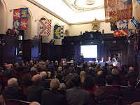
Last Monday, along with four other candidates, I was admitted to the Freedom of the Company at a ceremony in the Court Room at Stationers' Hall.

After the Freedom Ceremony, there was a further "cloathing" where Dr Vinton Cerf (VP of Google) accepted Honorary Freedom and Livery of the company and Lord Hague of Richmond and Mr Keith Nelson Wallach were also cloathed by the Master.
Above shows Vint Cerf accepting the Freedom and Livery. Regular readers of this blog may remember that I wrote earlier in the year about his concerns about "the digital dark ages", a subject which he spoke eloquently about on Monday, after he was presented with his award. http://justinsamazingworldatfennerpaper.blogspot.co.uk/2015/02/will-we-be-able-to-see-our-digital.html

I would like to thank my sponsors Margaret Willes and Martin Randall. Together with the other new Freeman, we were invited for Lunch, which was a very grand affair with over 230 guests.
After Lunch, there were speeches by both Lord Hague and the Master .
You may have noted that the Master is a lady. Helen Esmonde is the first lady Master, it only took 612 years! Yet as the Clerk of the company, William Alden, reminded us in his speech on Monday, Stationers are no strangers to change.


The Stationers' have a very impressive hall in Ave Maria Lane, close to St Paul's. The original hall was destroyed in the Great Fire of London and the current hall was completed in 1673 and is Grade 1 listed. It is a wonderful venue and is hired out to organisations for corporate events, meetings and weddings. In fact Stationers' Hall won 'Best Livery Hall' at the London Venue Awards which took place only two weeks ago.
Stationers' Hall
A little bit of history...
How it all began: 600 years ago most craftsmen in London were itinerant. However the manuscript writers and illuminators decided to concentrate their efforts and set up stalls or ‘stations’ around St Paul’s Cathedral. Because of this they were given the nickname ‘Stationers’ and this was the obvious choice of name for the guild they established in 1403

When printing came to England in the late 15th century, the Stationers had the good sense to embrace it and have continued to adapt to the many changes in the Communications and Content industries ever since. The technology may have changed from pen and inks to print and on-line links but the name has always remained the same.


The present day...
Today the Company has over 900 members, the vast majority of whom are senior executives in the complete range of trades within the Communications and Content industries, from paper, print, publishing, packaging, office products, newspapers, broadcasting and online media. Membership is drawn from across the UK and increasingly throughout the world and now includes major companies as well as individual members.The Company uses Stationers’ Hall for the purpose for which it was built all those years ago: to bring together the major players in our industries so that they can enjoy each other’s company, learn from one another, swap ideas and together develop strategies for the future of industries that are vital to global economic growth. Activities range from formal dinners, informal lunches, lectures, seminars and intimate round-table sessions to online reports and discussion fora. The care and maintenance of the historic and important archives is another important feature of the Stationers' guardianship for future generations.

Charity and Education...
The Company’s involvement in training and education began around 1557 when ‘Apprenticeship Indentures’ were drawn up by the Company and Printing Houses were obliged to present their apprentices at Stationers’ Hall, for the fee of sixpence, during their first year. Today, through the Stationers' Foundation they support a Secondary School (Stationers' Crown Woods Academy) in South London as well as Saturday Schools, and a variety of Bursaries, Scholarships and awards.

You can read more about the Stationers' online or you can speak to me! https://stationers.org/
Posted by Justin Hobson 26.10.2015

Friday 23 October 2015

Regent Porto Montenegro Penthouses Floorplans

Porto Montenegro is being developed as the Mediterranean’s most comprehensive yacht marina. Along with the berths, there are five private residential buildings with a total of 228 apartments.

These are the floorplans for the Penthouses which form part of the collateral produced for the marina. The flat size is 525x750mmfolding down to 175x250mm.
Click on images to enlarge
The plans are concertina folded as you can see from the birds eye view below:
Folding out to the full flat size of 525x750mm (18pp)
Click on images to enlarge
The floorplans are printed on our Shiro Echo, White 80gsm which 100% recycled and FSC accredited. It is perfect as a material to print these plans on - almost conjuring up a "blue-print" type feel and rattle, They are printed offset litho and are hot foil blocked in metallic gold foil. Below is a detail of the foiling:
Another thing to note is the absence of a "crows foot" on the folds - this is because it was concertina folded. As you can see from the image below - nice clean, crisp folds and no ugly creasing.
You can read more about "Crow's feet" here:
http://justinsamazingworldatfennerpaper.blogspot.co.uk/2014/04/what-is-number-4.html

The floorplans are just one of the items in the pack of promotional literature which makes up a whole collection of collateral (below) for the exclusive Regent Porto Montenegro apartments.
Art direction and design is by London branding agency &Smith. Creative Directors are Rachel Smith and Dan Bernstein. Print and production is by Gavin Martin Colournet.

www.portomontenegro.com
www.andsmithdesign.com
http://www.gavinmartincolournet.co.uk/
Posted by Justin Hobson 23.10.2015