Tuesday 6 March 2018

Industry

Although titled Industry, Yves Marchand and Romain Meffre’s photographs are a dedicated study of the human story. These images are evidence of our footprint on the earth, they document the relics we leave behind from our endeavours, the shape of the past, the feel of history, an impression of an era on our minds, the ghosts of men, modernist shapes rising out of the ground that were once beacons of technological achievement, testaments to our advancement. Now these cathedrals of industry lay shattered, broken and forgotten, tombs to man’s hubris, a reminder that nothing lasts forever, a reminder that we all will perish and rot one day.

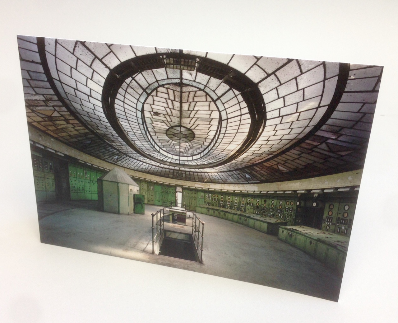
This is the invitation to the private view of the exhibition held at the Tristan Hoare Gallery in September. The front of the invitation is an image from the exhibition photographed by Yves Marchand and Romain Meffre and shows Control Room, Kelenfold Power Station, Budapest, Hungary 2012.
Click on images to enlarge
The size of the invitation is A5 (148x210mm), Landscape and is printed Offset Litho. The invitation is printed on our Omnia 320gsm and is triplexed (to 960gsm) making it over 1.5mm thick. The use of Omnia means that the image has reproduced faithfully, as you can see from the detail image below, however the invitation still has an uncoated tactile feel.
The below image shows the 1.5mm thickness...
Click on images to enlarge
You can read more about the work and the exhibition here: http://tristanhoaregallery.co.uk/exhibitions/industry/

Printing is by Paul Martin at Jigsaw Colour printers, based in Bermondsey in South London

http://tristanhoaregallery.co.uk/
http://www.jigsawcolour.co.uk/
Posted by Justin Hobson 06.03.2018

Friday 2 March 2018

Jobs from the past - Number 101

Regular followers of this blog will know that my first post of every month is a "job from the past" so that I can show some of the really good work from years gone by. Here is a project from eight years ago...

Bally A/W 2010 collaboration with CSM
In 2009 BALLY tasked fifteen students from Central Saint Martins to submit designs for women's footwear. Challenged to create designs with high editorial value while maintaining Bally's heritage of exquisite craftsmanship. The selected students would have their work developed at the brand's workshops in Switzerland and Italy. 

This is the mailer piece produced to showcase the selected designs by Estefania Cortes Hawker, William Hendry Charles Youssef. 
Click on images to enlarge
It is an 8pp concertina format, size145x215mm, folding out to 580mmx215mm. Below shows a birds eye view of the format...
The publication is printed on our Marazion Ultra 90gsm. This is a lightweight paper with a matt coating but which has an amazing bulk, tactile feel and excellent opacity for 90gsm. It feels just right for this project, because it just flops and sits nice and flat.
Click on images to enlarge
The below image shows both sides spread out side by side...
The material is perfectly chosen with the Marazion Ultra having a lightweight, matt look and feel but with the images reproducing beautifully with great clarity and detail as you can see from the detail image below...
Design and art direction is by the in house creative team at Bally. Print is by Push printers based in Bermondsey, London.

http://www.push-print.co.uk/
Posted by Justin Hobson 02.03.2018

Tuesday 27 February 2018

Kingwood

Finchatton was founded in 2001 by founders Andrew Dunn and Alex Michelin. Their aim was to create the most exceptional homes in the world. They have since designed, managed and financed over 60 major development projects around the world, and completed over 75 private commissions.
 
Kingwood is a development of ten apartments in the heart of Knightsbridge, facing south over the gardens of Hans Place. The building has been completely rebuilt and immaculately designed by Finchatton. This wonderful book has been produced to show the development, the surrounding area and the wonderful interiors.
The size of the book is 345x245mm, portrait. It is case-bound and covered in a deep blue bookcloth which is hot foil blocked in metallic silver foil and beautifully debossed with a leaf design around the front and back cover.
The book begins with these lovely printed end-papers...
...followed by exterior images of the building:
The text is printed on our Omnia, White 150gsm throughout and is printed offset litho, beautifully.
The striking commissioned photography has reproduced brilliantly on the Omnia whilst not losing the tactility and natural uncoated feel that was required. The look and feel is a confident, beautifully crafted piece of literature, certainly not some "glossy property brochure"!
A cool grey solid is used throughout the book for the sections where the floorplans appear and these sections incorporate throw-outs...
...a throw-out to the right
...throw out to both right and left
The Omnia has worked brilliantly, in reproducing the exterior and interior photography.
As one might expect, the book is 'section sewn' and below you can see what a neat and tidy example this is:
The book has 86pp plus an additional six 'throw-outs'
The spine measures 15mm.
Birds eye view showing the ribbon and the section sewing plus you can see how many throw outs there are, but it has been very well bound, so it doesn't upset the balance of the book in the spine.
The excellent print, repro and finishing is by Gavin Martin Colournet, based in London.

https://www.finchatton.com/
http://www.gavinmartincolournet.co.uk/
Posted by Justin Hobson 27.02.2018

Saturday 24 February 2018

PRS for Music

The  Performing Right Society, now PRS for Music, was founded in 1914 to collect fees for live performances of sheet music. They are now a society of around 11,000 songwriters, composers and music publishers, representing their rights and by licensing.

PRS for Music pays royalties to members when their work is performed, broadcast, streamed, downloaded, reproduced, played in public or used in film and TV.

This brochure has been produced to explain the organisation, the way it works and give examples with case studies.
The size of the publication is 160x225mm, landscape and is perfect bound. The 4pp cover is on Marazion Ultra 250gsm and the 38pp text is on 135gsm.
Click on images to enlarge
Marazion Ultra was chosen mainly because of it's matt flatness. The vast majority of the text is dominated by the wonderful illustrations by Tane Williams and therefore to work in sympathy with illustrations, this wonderfully matt paper was chosen. This would reproduce the artworks well without a glossiness which can often detract from the images. Marazion Ultra is a simple but effective choice of materials.
Click on images to enlarge

The 38pp text is printed offset litho on our Marazion Ultra 135gsm, which is a bulky sheet and gives the publication a spine of 4mm, although as you can see from the below image it flows really nicely.
Design is by Cai and Kyn, a studio based in Epsom in Surrey. The superb illustrations are by Tane Williams

Print and production is by Richline based in London with Darren Risley handling the production.

https://www.prsformusic.com/
http://www.caiandkyn.co.uk/
http://www.richline.co.uk/
Posted by Justin Hobson 24.02.2018

Tuesday 20 February 2018

Grey Goose Alpine Cabins

Grey Goose vodka partnered with Radio Rooftop at ME London, to run a spectacular winter experience: Three luxuriously Alpine Cabins overlooking the London skyline together with a range of specially created Grey Goose Cocktails.
 
This is the piece of literature produced to promote the experience and to also list the exclusive cocktails.  
Click on images to enlarge
The 6pp invitation is 220x145mm, portrait and is printed on our Omnia 320gsm, which is a very bulky board with a subtle, natural texture and tactile surface. Reproduction is superb and the reproduction of the wooden cabin planks reproduced on the outside, feels wonderfully tactile.
The invitation has been digitally printed on an HP Indigo press. The inside colours are strong and punchy and the invite has a matt, tactile look and feel - in fact I can honestly say, every bit as good as litho! Although Omnia was never originally developed for digital, we now keep it as a stock item with "sapphire treatment". This treatment is often applied to more unusual papers and provides a "key" so that the inks (which are different to litho inks) work on the paper surface. The great thing is the job just doesn't look and feel like a 'digital' job.

I must also mention two other aspects of the production. The cover is beautifully hot foil blocked (the printers, Ashwyk, have got hot foiling machinery in house)
Click on images to enlarge
...and it is also beautifully finished, well creased which means it folds well, sits square and folds flat too.
Creative direction and design is by London based branding agency Ragged Edge.
 
Print and finishing is by Essex based printers, Ashwyk. Thanks to Joe de Wykerslooth for giving me some file copies.
 
Posted by Justin Hobson 20.02.2018

Friday 16 February 2018

In the Black...

Many of you may know that here at Fenner Paper we have one of the largest range of black papers and boards on the market. I wrote about our black ranges back in 2014 when we had over thirty items and we now have over forty different black stock items!
This is the new swatch which includes the latest addition to our range of blacks - BLACKGOLD. The new range of black papers is an intense, deep black. The range is produced without the use of Carbon Black pigment which makes it particularly suitable for hot foil blocking.
Below shows the detail of the new Blackgold, which is available in 120, 190, 290, 340 and 380gsm. All items are available in 720x1020mm (B1)
The surface of Blackgold has been treated to make it more fingermark resistant and more scratch resistant ...that's not to say you can't mark it, it is just more resistant than some other materials!
 
Blackgold joins our other black range, which we have been stocking for many years called NOTTURNO. This range is available in eleven different weights! 90, 110, 140, 170, 200, 250, 300, 350, 390, 450, 700gsm.
 The swatch is about A5 size with a 30mm spine.
 
If you would like one of these new swatches, please get in contact with me and I shall send you one with great pleasure! justin@fennerpaper.co.uk

www.gruppocordenons.com
Posted by Justin Hobson 16.02.2018

Tuesday 13 February 2018

Honest Burgers

When Tom Barton and Phil Eles set up their burger business, they had a single goal: do fresh, high-quality British burgers and do them well. Since establishing the first Honest Burgers in Brixton Market in 2011, they've stayed true to that goal. They have now opened their own butchery so they can make the burgers they'd always dreamed of - their way, from scratch. 

They now have 25 restaurants in London and the regions, plus a field kitchen for festivals and events. Their focus is on British produce and a simple menu using the freshest ingredients and the best (British) beef.

Honest Burgers have just produced this lovely little publication to explain how their burgers are sourced and made ...and let's not forget the chips - so the title is quite simply Meat & Potatoes.
The size of the booklet is 148x105mm, portrait and is saddle stitched. It has a 4pp cover and a 24pp text.
In keeping with the simplicity of the ingredients, it is produced using quality materials with minimal processes, being printed offset litho in just one colour.

Opening spread:
The combination of materials used is as follows. The 4pp cover is on Flora Tabacco 240gsm, the majority of the text is on our Redeem 100% Recycled 100gsm with an extra 4pp section on Flora Tabacco 100gsm. The whole job is printed in a special dark green Pantone and the solids look pretty amazing.... 
The spread below shows the Flora Tabacco 100gsm on the left and Redeem 100% Recycled 100gsm on the right.
If you are not familiar with Redeem 100% Recycled, the paper is at best, off white and 100% recycled and 100gsm, so the feel that the paper exudes is one of simplicity and purposefulness.
Inside back spread:
The combination of materials is just right, sitting nice and flat. The danger is that if the materials are too heavy, it becomes too springy but this is just right.
Flora, is a part recycled text and cover paper with a deliberately recycled look and feel with specks and inclusions, so it looks deliberately flecky and specky. Flora is produced with 30% post consumer de-inked waste, together with 60% of virgin FSC pulp 10% cotton fibres, which gives the paper a wonderful tactile feel. See the image below to see the detail...
Print and finishing is by Push Print based in London. Printed offset litho in just one colour. Graphic design is by Connie Barton at Studio Connie.

You can see an electronic version of the publication here but it's not the same as having it in your hand!

A superb example of a really well considered publication where the design, materials and processes are just right for the end client. They are appearing on the tables of every Honest Burger restaurant, so you can get a chance to look at a copy right now, while having a great burger.

https://www.honestburgers.co.uk/
https://www.studioconnie.com/
Posted by Justin Hobson 13.02.2018