Thursday 21 November 2019

25 sculptures in 5 dimensions

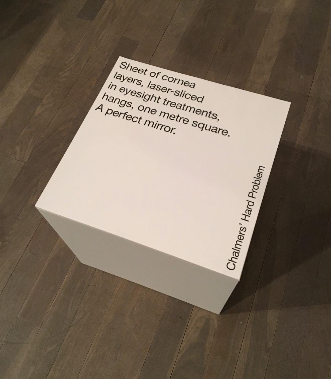
The installation ‘Twenty-five sculptures in five dimensions’ manifested for one night only this week on Tuesday 19th November in the Swiss Church, Covent Garden. The exhibition is conceived and sculpted by poet Tom Sharp, designed by Studio Sutherl&, soundtracked by Tony-nominated composer Alex Baranowski, with an introductory essay by art writer and curator Anna Souter. In a high-ceilinged environment of contemplation the guests experienced twenty-five sculptures. They exist between the four dimensions of thirty syllables and the fifth dimension of your mind.
Words about the exhibition are as follows... "Each sculpture is made from four dimensions of thirty syllables – a five syllable title and five further lines of five syllables – combined with the material of your imagination. The sculptures do not exist without your consciousness and these sculptures are about your consciousness. How language shapes it. How distinct it is from the blood and mess of your body. Whether it is a fundamental of the universe or a materialistic phenomenon destined one day to be recreated by IBM. What art’s role in exploring consciousness is. How we create an unnatural division between our minds and the many minds of nature." 
Each of the sculptures is made from a pillar of paper - made up using sheets of our Sixties paper in 60gsm. SIXTIES is a new paper which has a similar translucency as a tracing paper - but it feels like a normal paper! … you can see the translucency in the image below:
There is also a catalogue produced using the same Sixties paper
There is an introductory essay by art writer and curator Anna Souter, placing the work in an art historical context. The catalogue is five inches square (127mm sqaure), with five Helvetica Neue 55 type sizes and is singer sewn, as you can see below...
The books are produced in a limited edition of 200.
Design is by Studio Sutherl& and the print of both the sheets and the book is by Boss Print and are printed offset litho in just one colour throughout.

https://www.poetrybytomsharp.com/collection/twentyfivesculptures
http://studio-sutherland.co.uk/
https://www.bossprint.com/
Posted by Justin Hobson 21.11.19

Wednesday 20 November 2019

SUMO ...now in colours!

I'm sure many of you will remember that two years ago we launched  SUMO a heavyweight, thick board from FAVINI (from Italy, not Japan!) in black and white only. The range consists of a whopping 1mm, 1.5mm, 2mm and 3mm ...seriously chunky!
The range has now been extended to include a small range of colours - five new shades all available in 1mm thick and below is the new swatch:
...here are the five new shades, all in 1.0mm
The below image shows the massive thickness of the SUMO board.
To promote the new boards, Favini produced a promotional game called KAMIZUMO which you can see in the image below...
Below you can see the 4pp folder (produced on Sumo 3mm) with the cut out creatures.
...and you can see from the image below the exquisite routing which forms the creases
...and which forms the perfect 45degree angle fold below
In fact this project won a Red Dot award which you can read about here:
https://www.favini.com/en/press-release/favini-kamizumo-the-award-winning-creative-project/

If you would like samples, please drop me an email: Justin@fennerpaper.co.uk

http://www.favini.com/gs/en/fine-papers/sumo/features-applications/
Posted by Justin Hobson 20.11.2019

Thursday 14 November 2019

Pergraphica at St Brides

Yesterday evening,  I jointly hosted a small event together with Mondi, the manufacturer of our new Pergraphica range of text and cover papers. We invited a small group of designers from a variety of different studios to spend the evening in the print workshop at the St Bride Foundation. There were about twenty of us in all and the evening started with an introduction about the Pergraphica range by Isabel Bernd (below) from Mondi.
We then moved to the Letterpress workshop and were given a history and briefing by the technicians, Bob, Barry and Andrew.
Then everyone was encouraged to have a go at inking up and printing...
For those not familiar with the St Bride Foundation, it was established in 1891 to fulfil social needs in the Fleet Street printing area. Facilities included a library, baths and a swimming pool (as hygiene was poor) and a printing school which was the forerunner of the LCP. Nowadays, this historic building houses a world renowned printing library with a large letterpress collection, a community theatre space, a bar, print workshop, conference rooms.

Everyone had a go at  lino-cutting, Andrew had selected the letter E from a Pouchet engraved alphabet which was divided into 16 pieces which were individually cut by different people over the course of the evening.
...just look at the concentration!
When each of the panels was finished they were assembled and put on a proofing press, as you can see below:
...and here is Andrew Long with the first print:
...and here's the finished result:
Thanks to Mondi for sponsoring the event and for providing the Pergraphica paper used throughout the evening.

My personal thanks to all the staff and friends at the St Bride Foundation with special thanks to Bob Richardson, Mick Clayton, Andrew Long and Barry who made the evening really good fun.

www.sbf.org.uk
https://www.mymondi.net/ufp/en/brand-group/pergraphica
Posted by Justin Hobson 14.11.2019

Monday 11 November 2019

CSM Shifts

Since 2018, Boyle&Perks has been working with Central Saint Martins to create a visual language for the College. Designed to fit within the parameters of the existing branding for UAL, the resulting scheme uses typography, a colour palette and visual system to bring both cohesion but also the flexibility to represent the diverse creative community within the College walls.

A few weeks ago I received the below item in the post...
What a wonderful surprise! Enclosed are a couple of posters produced to demonstrate the new visual language, one in red
...and one in black
The posters are A2 (420x594mm) size and are simply, but beautifully, hot foil blocked on our Colorset Lemon 120gsm. They really do look amazing.

The following article explains about the development of the new visual language...

“The last thing we wanted to do was create another typeface,” confesses Elaine Perks, “then we went full circle because we came to the realisation that it was the only way to create something distinct within the constraints of the overarching UAL branding. It was the opportunity to create something that is anarchic, unpredictable and characterful within that system.” To achieve this unpredictability, the designers alighted on randomised typefaces that shift so the same word appears differently each time it’s written out. Colophon Foundry had just completed a randomised project so Boyle&Perks challenged them to create a typeface that could encompass Central Saint Martins’ past, present and future all at once. “They wanted a design that would be dynamic, changing every time you used it, but to celebrate these pillars of Central Saint Martins: the past (the incredibly rich heritage and history), the present (the students there now) and the future (which is obviously very ambiguous). That’s what we thought was really challenging, these three moments that are quantifiable, in some sense, but open to interpretation,” says Edd Harrington of Colophon Foundry.

You can read more about the project here:
https://www.arts.ac.uk/colleges/central-saint-martins/stories/changing-typeface

The hot foiling was done by Dorset based printer, Dayfold and below is an image showing the magnesium hot foil blocking die...
...and for interest, you can see the way the new visual identity is being utilised in the picture below:
My grateful thanks to Bill and Elaine for sending me the the wonderful hot foiled posters and it's great to see the fulfillment of a project which has taken well over a year to complete and which has received universal approval in the design world with DesignWeek describing the identity as “boisterous, anarchic and unpredictable”

https://www.arts.ac.uk/colleges/central-saint-martins
http://boyleperks.com/
https://www.colophon-foundry.org/
https://www.dayfold.com/
Posted by Justin Hobson 11.11.2019

Thursday 7 November 2019

Honest Burgers Collectors Cards

When Tom and Phil set up Honest Burgers in Brixton in 2011, they had a single goal: do fresh, high-quality British burgers and do them well. Since then, they've stayed true to that goal and even opened their own butchery. Honest Burgers now have 36 restaurants throughout the UK, plus a field kitchen for festivals and events.

Honest Burgers produce beautifully designed print items - not lavish, just functional, well considered and produced - and sometimes quirky! ...like the wonderful Meat & Potatoes publication that I wrote about here.

Last year they produced a set of 14 "Collectors Cards" which are based on the old cigarette cards that used to be included with packs of cigarettes and which were avidly collected. Cigarette cards are still highly collectable with a record $2,8 million paid for a single extremely rare card back in 2007 - here's hoping these cards will be so collectable!
Click on images to enlarge
The size of these cards is really quite small at 68mm x 37mm and you can see the scale with a regular size ballpoint pen in the image below....
I was asked to supply a board which was similar to the card used in the production of these original cards. This meant finding a board which was coated on one side, but not too high white, with an uncoated cream reverse with a tactile feel. The other thing is that the board is not too heavy, the cards were originally quite flimsy and not like the majority of "flicky" solid boards produced today.

The board we supplied is Milana Graphic [1 sided] in 200gsm and I hope you can see from the detail image below, both sides of the card...
The cards are printed offset litho. Graphic design is by Connie Barton at Studio Connie.

Yet another excellent example of a really well considered piece of print where the design, materials and processes are just right.

https://www.honestburgers.co.uk/
https://www.studioconnie.com/
Posted by Justin Hobson 07.11..2019

Monday 4 November 2019

Jobs from the past - Number 121

Regular followers of this blog will know that my first post of every month is a "job from the past" so that I can show some of the really good work from years gone by. 

Modern Art Oxford 2016
KALEIDOSCOPE

In 2016, Modern Art Oxford celebrated 50 years as an internationally acclaimed powerhouse of contemporary visual culture. KALEIDOSCOPE was a year long series of interlinking exhibitions, performances and events, presenting an unmissable opportunity to reflect on some of the great moments in Modern Art Oxford’s history.

The following items formed part of a suite of literature designed and produced by Fraser Muggeridge Studio for the series which ran throughout the whole year...
The 8pp concertina leaflets are A5 size and are printed on Shiro Echo, White 120gsm. The below image shows a birds eye view of the leaflet.
The leaflets are printed offset lithoin CMYK, although the "Invisible Present" included the use of a pantone gold.
Above shows the leaflets spread flat and the image below shows the reverse side...
The below image shows the gold printed on the "Invisible Present" leaflet, and as you can see the Gold looks really gold, rather than a brown!

All the publications are printed on our Shiro Echo, White which is 100% Recycled and also carries the FSC Recycled classification. Shiro Echo is available in two shades; there is a white shade (which is a natural/off white) and a Bright White shade.
There are also notebooks, which are also A5 portrait, saddle stitched with a 4pp cover on Shiro Echo White 300gsm with 44, unprinted text pages on 80gsm.
The books are saddle stitched with copper wire - very nice...
The private view cards are A6 size, printed on Shiro Echo White 300gsm.
As you can see the finishing is excellent, as you can see from the image below...
Concept and design is by Fraser Muggeridge Studio. Printing and finishing is by Holywell Press who are based in Oxford.

Posted by Justin Hobson 04.11.2019