Friday, 25 February 2011

Max Lamb - The Vermiculated Ashlar

Photo by Philip Sinden
Last year, for the first time, the London Design Festival worked with HSBC Private Bank both as sponsor and collaborator. The partnership included a design commission: a one-off piece of design for the bank's St James's office which was unveiled at the V&A during the Festival.

British designer Max Lamb won the competion to carry out the commission. Inspired by the castings gallery at the V&A, he created a cast replica of part of the Bank's central office at 78, St James' Street, Lamb then hand-carved the piece using a hammer and chisel into a the shape of a bench.

The piece is called the Vermiculated Ashlar.

Pentagram were commissioned to produce a piece of literature documenting the project in words and images.  
 
The end result is a book of 150x200mm, portrait with a 4pp cover and a 52pp text. The cover is debossed with the original patterning from the casting taken from the building and used to create the piece. Although it's very obvious on the cover, it's quite hard to photograph but the pic below hopefully gives the idea:
The cover material used is Neptune Unique SoftWhite 250gsm and the text alternates in sections between Neptune Unique SoftWhite 155gsm and Colorset Light Grey 120gsm, two quite different papers which work in juxtaposition given the rough and smooth nature of the architectural piece itself.

The project was printed by Gavin Martin (with Gary Bird officiating!) and as you can see here, they've made a beautiful job of it. 

Partner in charge of the project at Pentagram was Domenic Lippa and the designer was Jeremy Kunze. Thanks to Jez for sending me a file copy and a nice note.

http://maxlamb.org/
http://www.pentagram.com/
http://www.gavinmartin.co.uk/


Posted by Justin Hobson 25.02.2011

Thursday, 24 February 2011

Open Books 1

Yesterday evening I went to a private view at the Royal College of Art of an exhibition and book launch. The subject: To exhibit and to show the book

The aim of Open Books is to collect and highlight some initiatives which opens up minds and give cause for reflection.


“This is a book about exhibitions. The exhibitions are about books. They are also exhibitions about exhibitions of books. This unstable series of relations between form & content & between subject & object unfolds further in many of the books on show in the exhibition Open books. This book about books & about exhibitions about books results in endless repetition. It is a self-reflexive structure playing with infinity. That is why it remains open.”

The picture below shows the exhibition area (sans people!):
...and here is the actual publication, edited and produced by Sophie Demay and Charlotte Cheetham, designed by Sophie Demay and Lola Halifa -Legrand. The book is wiro-bound with a red wire and is 190x135mm, portrait. It is printed in 1 colour on a Risograph machine by Hato Press. The materials used are our Colorset Suede, Indigo 270gsm and a wide selection of our other text materials (the beauty of wiro means that you can use many different materials without being limited by producing in 4pp sections).
 
...and here we all are having a jolly time at the viewing!

The project was sponsored by Laurence King Publishing.

http://www.open-books.tumblr.com/
http://www.rca.ac.uk/
http://www.hatopress.net/
http://www.laurenceking.com/
Posted by Justin Hobson 24.02.2011

Tuesday, 22 February 2011

Harvey Nichols SS2011

This is the new Spring/Summer lookbook for upmarket retailer Harvey Nichols. In many ways this could be described as being a fairly "conventional" piece of literature, in so far as it is A4 Portrait and that the 24pp text is printed on a fairly typical printers "house" silk. However, there are some features which makes it a really excellent and unusual piece.
The 4pp cover is printed in 1 colour Litho, in silver, on Colorset Dark Grey 270gsm and this is covered in a dustjacket. The dustacket is printed in one side only on our Clervaux 1 sided 110gsm, which is an uncoated material with two sides, a smooth and a rough side. The jacket is cut 25mm short on the head allowing the "real" cover to be seen.
The design of the jacket has Women's fashion on the front and Men's fashion on the reverse. Below shows the inside of the jacket, inside front cover and page 1 of text...
The print and finishing is by Pureprint - and they've achieved an excellent result with the litho silver on the cover (above).

Art direction and design is by Jonathan at Studio-Baron. The job has a look and feel of real quality without it being either too lavish or "over the top"! Thanks to Jonathan for sending me a copy and a lovely note...
Posted by Justin Hobson 21.02.2011

Monday, 21 February 2011

Caruso St John Architects - Invitation

Just when you've written about one invitation on Offenbach Bible (see below), another one turns up as well!
This is an A1 folded to A4 invitation for Architects, Caruso St John, celebrating twenty years in practice.
Reproduced on the front of the invitation is a painting from the National Gallery titled "Landscape with Cephalus and Procris Reunited by Diana" by Claude Lorrain, 1645, painted when he was 45 years old. John Constable described Claude as "the most perfect landscape painter the world ever saw", and declared that in Claude’s landscape "all is lovely – all amiable – all is amenity and repose; the calm sunshine of the heart". What architect wouldn't want to be associated with such an accolade?
The invitation folds out showing thumbnails of a variety of their work over the last twenty years and printed on the reverse of the numbnail is the name of each project. Being printed on Offenbach Bible 60gsm, which has the lightweight feel and a little show through, it is possible to match up the pics with the titles.
The invitation was designed by John Morgan Studio. It was printed and finished by Gavin Martin Associates.
...and thanks to Michael for the note and for sending me a copy.

Posted by Justin Hobson 23.02.2011

Thursday, 17 February 2011

Macallan Invitation

This is a really beautifully designed and well executed invitation. It's been a difficult one to photograph, so you'll have to go with my description!
This invitation, from Scotch whisky manufacturer Macallan is to a VIP viewing of a exhibition titled "Masters of Photography: A Journey". Albert Watson (awarded the prestigious Royal Photographic Society’s 2010 Centenary Medal) was invited by The Macallan to weave a visual narrative of the long and romantic journey beginning in the bewitching forests of Spain (where the oak for sherry barrels is grown) and ending at The Macallan’s spiritual home in Scotland.

Sitting by the envelope in the picture above, it might look like a fairly standard invitation but it is anything but ordinary.

The finished size of the invitation (as you see it below) is 140x175mm. The printed card is 128x163mm but as you can see from the picture below, it is held in place with two angled die cuts...
...and as you can see below, the card is held into a large format print, folding out to 420x525mm.
The photographic print is printed on our lovely Offenbach Bible 60gsm with the 'mono' image being reproduced in CMYK. The card insert is on Matrisse 250gsm, simply printed in black only and hot foil blocked in silver.

Design is by BOB Design and the designer on the project is Tom Green.

Print, foiling and hand finishing was done by Robert Young at R.Young & Son ...and we (at Fenner Paper) made the bespoke black envelopes (160x195mm) out of Notturno 140gsm.

Thirty-six individually customised bottles of The Macallan dating from 1946, were produced for the project. Each bottle is paired with a signed, one-off, specially commissioned Watson platinum print and will be sold at a reserve price of £10,000! At the private view were David Bailey, Bianca Jagger and Mary McCartney but sadly Justin Hobson was unable to make the event. The exhibition is now touring around the world.

http://www.themacallan.com/
http://www.bobdesign.co.uk/
http://www.ryoungprint.com/
Posted by Justin Hobson 17.02.2011

Tuesday, 15 February 2011

Eye 78 - Seven colour marathon!

There's a post which Simon Esterson has recently put on the Eye Blog which is well worth reading. Written by Eye editor John L. Walters, it is one of those rare pieces of writing which actually describes the production of a piece of print in a very real and understandable way. It mainly focuses on the lengths that were taken at Pureprint to reproduce the cover for Eye 78, which is a detail of a Joost Grootens map, using the same colours as on the original book  Atlas Of The New Dutch Water Line.  

...also about the section on our Colorset Solar 120gsm which printed in colour in this issue (that's colour onto coloured paper if you get what I mean!)

Anyway, I'm not going to say anymore about it except that it is well worth a read... 

Posted by Justin Hobson 15.02.2011

Friday, 11 February 2011

See Opposite

This is the latest example of Pentagram's superb holiday mailings from the festive season of 2010. These pieces are never really “cards”! Pentagram mailings typically involve puzzles or another kind of visual diversion and this is no exception.


This year’s booklet features a series of antigrams illustrated with shadowy silhouettes. An antigram is a rare type of anagram. The object of the exercise is to discover a word or words that are the opposite of those printed using the same letters. The antigrams can be worked out with the help of a clue and the illustrations. The above and below pics show the illustration with the clue, Stargazers. The Antigram is No More Stars. The answer is Astronomers. Frustratingly clever!

 ...and this is the page with the answers:
The books are A6 landscape 148x105mm with an 8pp cover and a 28pp text. The paper chosen is Modigliani which is a feltmarked paper with a texture reminiscent of a watercolour paper. The cover was produced using Modigliani Nero 200gsm and the text on Modigliani Neve 145gsm. It has been beautifully printed in two colours (pantone specials) by Gavin Martin. Cover is hot foil blocked with a matt white foil. Another lovely feature is the "plate sinking" which is where a panel in the printed areas on the right hand pages have been de-bossed and not forgetting the singer sewing in black thread through the spine.
All in all, a beatifully produced job. Creative director on the project is Angus Hyland and the designer is Fabian Herrmann. Print production was handled by Gary Bird at Gavin Martin.

http://www.pentagram.com/
http://www.gavinmartin.co.uk/
Posted by Justin Hobson 11.02.2011

Wednesday, 9 February 2011

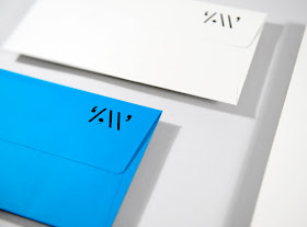
Zoe Williams Stationery

This is a lovely suite of stationery designed for writer and journalist Zoe Williams. The 'Z W' logo, is cleverly constructed from punctuation marks.
The stationery is hot foil blocked in gloss black foil only and has been beautifully done by IST Printing Services - based in Ayrshire - they do some lovely stuff - well worth having a look at their site: http://www.istprintingservices.co.uk/
Due to the colour pallette chosen, this stationery incorporates our lovely Colorset (100% Recycled) and a different (and much more expensive!) coloured paper stock from another paper merchant based in Hull (...guess who, guess what?) but they compliment themselves perfectly!

The clever and thoughtful design is by Maddison Graphic based in Ely.

http://www.maddisongraphic.com/
http://www.istprintingservices.co.uk/
Posted by Justin Hobson 09.02.2011

Monday, 7 February 2011

Big Questions...

At the end of last year, King’s College London launched a worldwide development campaign with a sub-brand developed by Johnson Banks called "World questions King's answers".

Rather than the traditional donations campaign, this project poses a series of questions that the world faces, such as How do we cope with an ever-ageing population? What will it take to eradicate poverty? Why can’t we find better treatments for cancer?

The campaign aims to raise funds for new posts and programmes, build new facilities and create new student opportunities across the campuses. Johnson Banks developed a multi-channel campaign, including a booklet, leaflets and gift forms (and they also did a very nice badge!) 
The main booklet is A6 portrait (105x148mm) with a 4pp cover and 16pp text, saddle stitched. Because of the vibrant colours chosen, the material chosen for the job is Omnia (280gsm and 120gsm) which meant that a vibrant punchy result was achieved...
The printed literature demonstrates a well executed project, excellent print and reproduction and finishing on what on the face of it looks to be quite a simple job. But what you might not have spotted is that those white borders around the edge of the solids is only 5mm - you only have to be 1mm out on the finishing on this A6 size piece, for this job to look poor and the copies sent to me are all spot on. Print is by Cantate in Battersea and thanks to Jason Maclaren at Cantate for sending me file copies.

http://www.kcl.ac.uk/
http://www.johnsonbanks.co.uk/
http://www.cantate.biz/
Posted by Justin Hobson 07.02.2011