Thursday, 28 September 2017

National Poetry Day 2017

Today is National Poetry Day! The annual celebration that inspires people throughout the UK to enjoy, discover and share poems.

National Poetry Day was founded in 1994 by the charity Forward Arts Foundation and today it enjoys the support of the BBC, Arts Council England, the Royal Mail and leading literary and cultural organisations, alongside booksellers, publishers, libraries and schools.

...so what better day to write about a wonderful new poetry book, which just happens to be printed on our paper!
Tom Sharp is Creative Director, copywriter, co-founder of The Beautiful Meme,  a Fellow of The Royal Society of Arts ...and Tom is also a poet! This is his latest publication titled 'English Pan'.
This is a 32pp publication which is 215x153mm, portrait and is singer sewn using black thread. It is printed in just one colour throughout.
There are twelve poems in the publication, all written by Tom Sharp. The superb illustrations are by Shaun Campbell.
The paper used for the 28pp text is our Neptune Unique Softwhite 120gsm, which is an uncoated off-white, smooth (yet tactile) text and cover paper - just the right material for black type to look brilliant on.
The 'cover' however, is a different matter and is actually on a brand new material in our range called SIXTIES and is 60gsm. It is a fine quality, similar to our Offenbach Bible in many ways but with one major difference - unlike a genuine bible paper which has a high opacity, this new paper has the same translucency as a tracing paper - but it feels like a normal paper! ...as I hope you can see from the picture below:
Wonderful use of a material for a cover - unexpectedly lightweight, covering up; yet revealing the title and it works superbly with the singer sewing:
Each one is hand numbered and a limited edition of 100 and my thanks to Tom for sparing me a copy.
The design is by the studio at The Beautiful Meme. Print and finishing is by Kingsbury Press.

Posted by Justin Hobson 28.09.2017

Tuesday, 26 September 2017

Punchline Tag

I first met Erika Rennel Björkman when she was working at Pentagram in John Rushworth's team back in the mid nineties (I know that's quite a long time ago now!). Even though Erika returned to Sweden with her young family we have still stayed in touch and she now lives and works in Stockholm.
Here is her range of her quirky and original "Punchline Tags" which combine a gift tag and greeting in a unique self-standing concertina card - and I think they're great (...they aren't even on our paper and I still think they're great!)
Erika now has an on-line shop here and you can read more about them here:

http://punchlinetag.tictail.com/
Posted by Justin Hobson 26.09.2017

Friday, 22 September 2017

Manufactory

Yesterday, I popped into Old Spitalfields Market to an event that is part of the London Design Festival 2017. For this event Kingston School of Art’s Design Departments has migrate en-masse to the old market. They've reshaped the metal stalls as makerspaces and are inviting in locals, visitors, schools and businesses to re-imagine the Market together. It is Kingston's first whole-School event run by tutors, students and recent graduates and it runs 21–23 September at Old Spitalfields Market - so you can still catch it now - on today and on Saturday.
...and why should you go? Because there are 31 activities including live Signwriting (by Josh Hallam Holden who I met and is a very nice guy) to making chairs out of rubbish, a scribe and the wonderfully named Megatron.
Of particular interest is the "Paper-Print-Bind" section run by tutors Rose Gridneff, Andrew Haslam and Simon Goode.
Using waste card and paper collected from the Market itself, you can experience the process of book production from start to finish—through paper making, letterpress printing, and bookbinding.

Here is Simon Goode demonstrating handmade papermaking:
 ...and here is a visitor participating - she is actually couching (pronounced ‘coo-ching’) which is the term papermakers use to describe transferring a newly formed sheet of paper from the mould to the drying felts, which serves to remove the moisture:
 ...and a finished sheet of paper that I made!
Below is Andy Haslam printing on the Farley proofing press
...and Simon Goode getting visitors involved in book-making
These processes were historically prevalent in this area of the city - particularly towards Clerkenwell and are now used in the workshops at Kingston School of Art. Working with pre-digital processes gives their students a deeper understanding of materiality within graphic design. Well done to Kieran O'Connor for all his hard work co-ordinating the event.

..and a quick plug for the paper! the A2 size 'maps' are riso printed on our Redeem 100% Recycled 80gsm - lovely.
Why not go along today or tomorrow and have a go and connect to these traditional, locally significant methods of making, and take away your very own sketchbook in which to develop ideas for a productive future for Spitalfields!

www.manufactory.works
Posted by Justin Hobson 22.09.2017

Wednesday, 20 September 2017

The Bristol

The Doyle Collection is a carefully curated collection of eight Irish family-owned luxury and urban hotels. Each hotel has a strong identity that is closely connected to its location. Set in the city's vibrant harbourside, The Bristol’s contemporary exterior overlooks the busy harbour. With 187 well appointed guest rooms and suites, this is a wonderfully luxurious hotel.
Branding agency, Brave New World  undertook an extensive re-branding exercise of the parent brand and of each individual hotel. The work included everything from strategy to interior design, website, high-profile advertising campaigns and the literature for each hotel.
Click on images to enlarge
The size of the brochure is 260x185mm, portrait and is saddle stitched. The cover is printed on an uncoated 300gsm board. 
The brochure is saddle stitched using three stitches:
The text material chosen was our Omnia, which would beautifully reproduce the photography with the rich interiors and exteriors superbly  ...and it looks wonderful! The 20pp text is on Omnia White 150gsm, printed offset litho in CMYK throughout.
Click on images to enlarge
Image reproduction is paramount but it was also important that the publication also projected the tactility of the interiors and in the image below the detail of the wedding venue and the reproduction of the fine voile used on the chairs. An ordinary feeling silk or gloss coated paper wasn't an option, so Omnia fitted the bill perfectly.
Omnia is a very bulky paper but with a 20pp text and the saddle stitching, it lays nice and flat allowing each spread to be enjoyed without 'fighting' against the binding.
Branding and creative direction is by Brave New World. The designer on this project is Caroline King. Print by 21 Colour, based in Glasgow.

https://www.doylecollection.com/hotels/the-bristol-hotel
http://bravenewworld.co/
http://www.21colour.co.uk/
http://www.carolinelking.com/
Posted by Justin Hobson 20.09.2017

Thursday, 14 September 2017

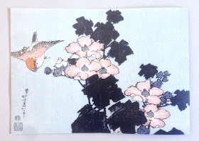
Beyond the Great Wave

Katsushika Hokusai (1760–1849) is widely regarded as one of Japan’s most famous and influential artists. He produced works of astonishing quality right up until his death at the age of 90. This new exhibition held this Summer at the British Museum covers the period of the last 30 years of Hokusai’s life – a time when he produced some of his most memorable masterpieces. The exhibition was a phenomenal success resulting in most tickets being sold out.

These are the private view invitations produced for the launch of the exhibition in May. The two invitations are both 8pp, A5 portrait and feature Hokusai’s artwork.

This invitation is printed on our Omnia 320gsm, which is a very bulky board with a subtle, natural texture and tactile surface. Reproduction is superb with the all the detail retained in the images. 
The images as reproduced on each of the invitations:

Click on images to enlarge
Below show the invitations laid out flat, front and back
Click on images to enlarge
Below is a birds eye view of the invitation:
One thing that I must point out here is just how amazing the black solid on Omnia looks - a real dense, even black solid - nice and even.
Design is by the in-house team at the British Museum, headed by Ann Lumley.

The invitation is printed by Park Lane Press. It is printed offset litho but Park Lane print using a 'waterless' process that eliminates the water or dampening system used in conventional printing. The specialist plates allow the printed dot to be held more securely preventing any unwanted movement of ink and minimising dot gain to create a sharper image in ultra fine definition. They are one of the very few printers who champion the use of this waterless process.

Posted by Justin Hobson 14.09.2017

Tuesday, 12 September 2017

Surfers against Sewage - Plastic Free Coastlines

https://www.sas.org.uk/Surfers Against Sewage is widely recognised as one of the UK’s leading marine conservation charities. Surfers Against Sewage today deals with a wide spectrum of marine conservation issues from marine litter to climate change.

Established in 1990 by people (originally surfers) who were sick of seeing sewage in the sea and on beaches.  It was their direct contact with the ocean and sadly the chronic sewage pollution of the time that was the visceral driving force behind the emerging organisation, something that remains strong to this day. However marine plastic pollution and climate change are now the new issues of concern.

This literature has been produced to accompany their PLASTIC FREE COASTLINES campaign. There are two pieces of literature, a 'Community Toolkit' booklet and a 'Individual Action Plan' broadsheet.
The paper used is our Favini SHIRO Alga Carta, Bianco, chosen because it was in keeping with the sustainable nature of the project, because it is manufactured partly using algae harvested from the Venice lagoon, combined with recycled and FSC certified fibres. Algae blooms at the end of Summer in the Venice lagoon as the warm water combines with pollution and must be harvested to maintain the lagoon's eco-balance. 
The Community Toolkit booklet is A6 size (148x105mm). It has a 4pp cover printed on 300gsm and 44pp text on 120gsm.
Printed offset litho in two colours (red and black)
If you aren't familiar with Shiro Alga Carta, the specs of Alga are actually visible in the sheet as you can see in the detail below:
Click on images to enlarge
The 'Individual Action Plan' document is an A5 broadsheet format which folds out to A3, again printed in two colours, offset Litho.
Above is A5 (210x148mm) folding out to below:
...which then opens out to the below (A3)
The below image shows both sides of the broadsheet open:
Design of the literature is by Cornish based studio Leap. Matt Hocking, principal at Leap got FAVINI interested in the project, so that they sponsored the paper ...and it's worth remembering that the money to produce these publications is all raised by SAS members.

The publication is printed by St Austell Printing Company in Cornwall chosen as they have excellent sustainable credentials, print using vegetable inks and as they are close by to Leap and SAS, it keeps the carbon footprint down too!

https://www.sas.org.uk/
Posted by Justin Hobson 12.09.2017