Showing posts with label Alexis Burgess. Show all posts

Tuesday, 4 January 2022

Jobs from the past - Number 146

Regular followers of this blog will know that my first post of every month is a "job from the past" so that I can show some of the really good work from years gone by...

Nougat Preview S/S 2005
This is one of those simple pieces of print which is just exquisite. It is the preview piece produced to excite fashion buyers and to let them know at which fashion shows around the globe they will be showing the new collection. From that point of view, it can simply be described as a piece of 'direct mail' but that term is generally applied in a derogatory way and really doesn't do justice to this project.
It is simply a 6pp creased and folded card. Deceptively square, it's actually 150x140mm, portrait. It is printed in one colour on the outside and CMYK on the inside.
So what is it exactly that I find so special about this job? It was one of the first ever pieces to use Omnia and what is amazing is the way it feels so beautifully tactile and uncoated and then the way it reveals the amazing images inside. The outside cover is a continuous vignette as a halftone going from 0 to 100%. This is ingenious as it graduates in a crisp even way across the front cover - the even-ness in part, due to the way the Omnia prints and retains the integrity of the monotone.
The cover opens to reveal part of a stunning image plus reversed out type on a great solid, which is, of course, the continued solid from the front and back cover. Printed on Omnia White 280gsm.
 ...and then opening the right hand page reveals the image in all it's glory:
Below you can see the way the continuous vignette works from Zero to 100% 
 and here is a detail showing the subtlety of the tint:
This project together with the Nougat look-books at this time were designed by BOB Design. The creative partners at BOB were Alexis Burgess, Mireille Burkhardt and Kieran O'Connor. Lexi now runs his own studio in East London, Burgess Studio.

The excellent printing was by Principal Colour based in Paddock Wood in Kent. It's also worth pointing out that this job isn't "sealed, varnished or coated" in any way and this is the main reason that it feels so good - you can actually feel the paper and the ink. Since the time this was printed (2005) there has been a trend to install presses with coaters and most pieces of printed literature are smeared with a coating or sealer which (although making the printer's lives easier) betrays the feel of the paper ...and (what a lot of printers fail to mention) it discolours with age - now that's definitely something worth thinking about!

http://www.nougatlondon.co.uk/
www.bobdesign.co.uk
www.burgess-studio.co.uk
www.principalcolour.co.uk
Posted by Justin Hobson 04.01.2022

Friday, 25 September 2015

ESPA life at Gleneagles


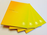
The Gleneagles Hotel is set in 850 acres in the heart of Scotland. Aside from the international reputation as one of the foremost golf resorts, there is a luxurious Spa.  This beautifully produced piece of literature is available for guests to see the treatments offered. The brochure conveys the luxury and subtlety of both the space and the experience.
Click on images to enlarge
Below shows inside front cover spread with hot foil blocked emblem in metallic gold foil on inside front cover
Detail showing hot foil blocked logo:
Size is 210x148mm, portrait and is section sewn. The paper used is our StarFine Natural White 300gsm for the cover and 150gsm for the 40pp text. The uncoated paper is a subtle, neutral, white which perfectly suits the imagery and typography in the publication. The images have reproduced superbly, even with some of the dark interior shots.
The publication is superbly printed offset litho in four colour process plus hot foil blocking on four areas. The spine width is 5mm.
Art direction and design is by London based Burgess Studio. Creative director is Alexis Burgess. Senior designer on the project is Tom Green. Printing is by Glasgow based 21 Colour.

http://www.gleneagles.com/
www.espa.com
http://burgess-studio.co.uk/
http://www.21colour.co.uk/
Posted by Justin Hobson 25.09.2015

Thursday, 28 August 2014

Your Story Starts Here...

Writer’s Notes is a notebook for writers, containing ‘advice on how to write well from the experts at the Ministry of Stories’. The book was initially commissioned by The Story conference, as a gift to their guests. It is now available for sale in the Hoxton Street Monster Supplies Shop.

The 'experts' who wrote the advice reproduced on the dividers are aged between 9 and 13, and their notes are printed on eight asymmetric dividers throughout the notebook. Here's a bit about the Ministry of Stories:
The Ministry of Stories is a charity that aims to inspire young people through creative writing. Founded by Nick Hornby, Lucy Macnab and Ben Payne, and operating out of the Hoxton Street Monster Supplies shop, they run workshops and provide one to one mentoring to local children.
The finished size of the notebooks is A5 portrait and they are wiro-bound. The covers are 'French folded' (to give a double thickness) on our Flora Betulla 240gsm, which gives it a deliberately 'exercise book/notebook' feel. The eight dividers are all printed (both sides) on different colours of  Colorset 270gsm, distributed throughout 90pp of ruled pages.
Design and production was handled by Burgess Studio. You can read more about the project here:
http://burgess-studio.co.uk/projects/your-story-starts-here/#showhide-info.
Creative director is Alexis Burgess and the designer on the project is Ed Cornish.
This is a truly fantastic piece of printed literature - it has a real WOW factor!

As a charitable organisation, the budget was limited which meant the project was a labour of love which included some of the printing being done in-house! Guillotine cutting and wiro-binding handled by Dash Finishers based in Croydon.

www.thestory.org.uk
www.ministryofstories.org
www.burgess-studio.co.uk
www.dashfinishers.co.uk
Posted by Justin Hobson 27.08.2014

Monday, 4 August 2014

Jobs from the past - Number 58

Regular followers of this blog will know that my first post of every month is a "job from the past" so that I can show some of the really good work from years gone by...

Nougat Preview S/S 2005
This is one of those simple pieces of print which is just exquisite. It is the preview piece produced to excite fashion buyers and to let them know at which fashion shows around the globe they will be showing the new collection. From that point of view, it can simply be described as a piece of 'direct mail' but that term is generally applied in a derogatory way and really doesn't do justice to this project.
It is simply a 6pp creased and folded card. Deceptively square, it's actually 150x140mm, portrait. It is printed in one colour on the outside and CMYK on the inside.
So what is it exactly that I find so special about this job? It was one of the first ever pieces to use Omnia and what is amazing is the way it feels so beautifully tactile and uncoated and then the way it reveals the amazing images inside. The outside cover is a continuous vignette as a halftone going from 0 to 100%. This is ingenious as it graduates in a crisp even way across the front cover - the even-ness in part, due to the way the Omnia prints and retains the integrity of the monotone.
The cover opens to reveal part of a stunning image plus reversed out type on a great solid, which is, of course, the continued solid from the front and back cover. Printed on Omnia White 280gsm.
 ...and then opening the right hand page reveals the image in all it's glory:
Below you can see the way the continuous vignette works from Zero to 100% 
 and here is a detail showing the subtlety of the tint:
This project together with the Nougat look-books at this time were designed by BOB Design. The creative partners at BOB were Alexis Burgess, Mireille Burkhardt and Kieran O'Connor. Lexi now runs his own studio in East London, Burgess Studio.

The excellent printing was by Principal Colour based in Paddock Wood in Kent. It's also worth pointing out that this job isn't "sealed, varnished or coated" in any way and this is the main reason that it feels so good - you can actually feel the paper and the ink. Since the time this was printed (2005) there has been a trend to install presses with coaters and most pieces of printed literature are smeared with a coating or sealer which (although making the printer's lives easier) betrays the feel of the paper ...and (what a lot of printers fail to mention) it discolours with age - now that's definitely something worth thinking about!

http://www.nougatlondon.co.uk/
www.bobdesign.co.uk
www.burgess-studio.co.uk
www.principalcolour.co.uk
Posted by Justin Hobson 04.08.2014