Friday, 29 November 2019

British Book Design & Production Awards 2019

Last week,  I was lucky enough to be at the British Book Design and Production Awards which is hosted and run by the British Printing Industries Federation (BPIF) at the Landmark Hotel in  Marylebone. A very lavish and swish occasion.
I was kindly invited by Fenton Smith and Bonnie Lo from London print company BOSS, who were shortlisted for a number of awards.
 
On arrival, the nominated entries were all out on display and it was a truly wonderful array of books and catalogues. 
 ...a gathering of over 200 people from the world of publishing, print and design - and a few paper people in there as well! Here I am with my industry colleague, Charlotte Harvey from Antalis.
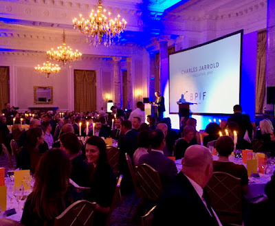
Once seated in the grand dining room, the evening was opened by Charles Jarrold, Chief Executive of the BPIF...
It was particularly lovely that a project which I was involved with won the category for "Limited Edition & Fine Binding" The project is titled "Paper Dolls" by artist Hormazd Nariewella. It is designed by Ornan Rotem  and published by Concentric Editions and Sylph Editions and it was beautifully printed by Boss Print on our Gardapat 13, Kiara 135gsm 
 ...and here is the team that made the book possible, collecting the award on stage, collecting the award from the compere Konnie Huq.
 Here is a sneak preview of the book (which I write about another time)…
Here is Bonnie from Boss with the artist Hormazd Nariewella:
Boss went on to win a further three awards, including the grand finale award "Best British Book" for North Northwest designed by Les Welch, pictured below with Fenton Smith from Boss:
Congratulation to all the finalists and award winners. You can read more about the entries and the winners here: https://www.britishbookawards.org/winners-2019/

It was a great evening - good company and food and my thanks go to Boss Print for inviting me and it was great meeting up with many other old friends on the table too.

Posted by Justin Hobson 29.11.2019

Wednesday, 27 November 2019

The Brunswick Prison Camp Map Printers

Next week, there is a wonderful opportunity to hear a talk at the St Bride Foundation about a fascinating subject...
This is the little-known story of how a clandestine press was made and run by a group of industrious British prisoners of war in a German camp (Oflag-79) in order to mass produce escape maps, towards the end of the second world war.
With Mark Evans’ knowledge of his father’s experiences as a prisoner in the camp and Ken Burnley’s life in printing, together they will bring this incredible story to life and shed light on the background, context and the circumstances in how these maps – all to scale and printed in three or four colours – were produced in secret, including the technicalities of their hand-made press, making of inks and printing.
Mark Evans is an artist, sculptor and trained stonemason; son of Brunswick Prison Camp map printer, Philip Radcliffe-Evans. Ken Burnley is a compositor and letterpress printer.
 
The talk is next Tuesday, 3rd December and tickets are a bargain at £12.50 and are available here.
 
Posted by Justin Hobson 27.11.2019

Monday, 25 November 2019

Suntory Craft Cocktails

Founded in 1899, Shinjiro Torii built the House of Suntory with a singular vision: to craft quintessentially Japanese spirits that would suit the delicate palate of his people. Suntory Whisky Toki creates a blended Japanese whisky that is both ground-breaking and timeless. Roku Gin is the first gin from Japan's legendary Suntory, made using six Japanese botanicals that provide a whistle-stop tour of the four seasons. Haku is the premium Japanese craft vodka from the House of Suntory. Made with 100% Japanese white rice, the name Haku means "white" in Japanese.
These craft cocktail menus are A5 (210x148mm) size. The paper chosen is our Modigliani, Candido 260gsm which reflects the tactile, natural subject matter. Modigliani Candido 260gsm - it is a feltmarked paper with a texture reminiscent of a watercolour paper and the finished result is superb...
Click on images to enlarge
...and what you probably wouldn't be able to guess is that these cards have been digitally.printed! They are printed by McAllister Litho in Glasgow using their Konica Minolta bizhub digital press.
Click on images to enlarge
Above, you can see the detail image showing the texture of the paper. This is one of those projects where just choosing the right material that works with the subject and imagery makes these A5 cards a 'stand out piece of print'.

Posted by Justin Hobson 25.11.2019

Thursday, 21 November 2019

25 sculptures in 5 dimensions

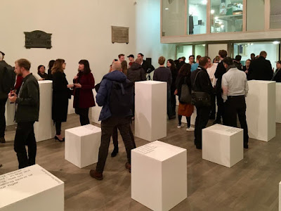
The installation ‘Twenty-five sculptures in five dimensions’ manifested for one night only this week on Tuesday 19th November in the Swiss Church, Covent Garden. The exhibition is conceived and sculpted by poet Tom Sharp, designed by Studio Sutherl&, soundtracked by Tony-nominated composer Alex Baranowski, with an introductory essay by art writer and curator Anna Souter. In a high-ceilinged environment of contemplation the guests experienced twenty-five sculptures. They exist between the four dimensions of thirty syllables and the fifth dimension of your mind.
Words about the exhibition are as follows... "Each sculpture is made from four dimensions of thirty syllables – a five syllable title and five further lines of five syllables – combined with the material of your imagination. The sculptures do not exist without your consciousness and these sculptures are about your consciousness. How language shapes it. How distinct it is from the blood and mess of your body. Whether it is a fundamental of the universe or a materialistic phenomenon destined one day to be recreated by IBM. What art’s role in exploring consciousness is. How we create an unnatural division between our minds and the many minds of nature." 
Each of the sculptures is made from a pillar of paper - made up using sheets of our Sixties paper in 60gsm. SIXTIES is a new paper which has a similar translucency as a tracing paper - but it feels like a normal paper! … you can see the translucency in the image below:
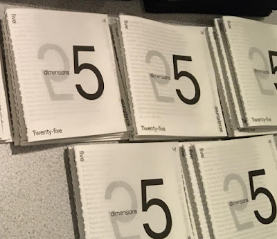
There is also a catalogue produced using the same Sixties paper
There is an introductory essay by art writer and curator Anna Souter, placing the work in an art historical context. The catalogue is five inches square (127mm sqaure), with five Helvetica Neue 55 type sizes and is singer sewn, as you can see below...
The books are produced in a limited edition of 200.
Design is by Studio Sutherl& and the print of both the sheets and the book is by Boss Print and are printed offset litho in just one colour throughout.

https://www.poetrybytomsharp.com/collection/twentyfivesculptures
http://studio-sutherland.co.uk/
https://www.bossprint.com/
Posted by Justin Hobson 21.11.19

Wednesday, 20 November 2019

SUMO ...now in colours!

I'm sure many of you will remember that two years ago we launched  SUMO a heavyweight, thick board from FAVINI (from Italy, not Japan!) in black and white only. The range consists of a whopping 1mm, 1.5mm, 2mm and 3mm ...seriously chunky!
The range has now been extended to include a small range of colours - five new shades all available in 1mm thick and below is the new swatch:
...here are the five new shades, all in 1.0mm
The below image shows the massive thickness of the SUMO board.
To promote the new boards, Favini produced a promotional game called KAMIZUMO which you can see in the image below...
Below you can see the 4pp folder (produced on Sumo 3mm) with the cut out creatures.
...and you can see from the image below the exquisite routing which forms the creases
...and which forms the perfect 45degree angle fold below
In fact this project won a Red Dot award which you can read about here:
https://www.favini.com/en/press-release/favini-kamizumo-the-award-winning-creative-project/

If you would like samples, please drop me an email: Justin@fennerpaper.co.uk

http://www.favini.com/gs/en/fine-papers/sumo/features-applications/
Posted by Justin Hobson 20.11.2019

Thursday, 14 November 2019

Pergraphica at St Brides

Yesterday evening,  I jointly hosted a small event together with Mondi, the manufacturer of our new Pergraphica range of text and cover papers. We invited a small group of designers from a variety of different studios to spend the evening in the print workshop at the St Bride Foundation. There were about twenty of us in all and the evening started with an introduction about the Pergraphica range by Isabel Bernd (below) from Mondi.
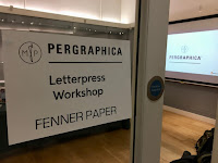
We then moved to the Letterpress workshop and were given a history and briefing by the technicians, Bob, Barry and Andrew.
Then everyone was encouraged to have a go at inking up and printing...
For those not familiar with the St Bride Foundation, it was established in 1891 to fulfil social needs in the Fleet Street printing area. Facilities included a library, baths and a swimming pool (as hygiene was poor) and a printing school which was the forerunner of the LCP. Nowadays, this historic building houses a world renowned printing library with a large letterpress collection, a community theatre space, a bar, print workshop, conference rooms.

Everyone had a go at  lino-cutting, Andrew had selected the letter E from a Pouchet engraved alphabet which was divided into 16 pieces which were individually cut by different people over the course of the evening.
...just look at the concentration!
When each of the panels was finished they were assembled and put on a proofing press, as you can see below:
...and here is Andrew Long with the first print:
...and here's the finished result:
Thanks to Mondi for sponsoring the event and for providing the Pergraphica paper used throughout the evening.

My personal thanks to all the staff and friends at the St Bride Foundation with special thanks to Bob Richardson, Mick Clayton, Andrew Long and Barry who made the evening really good fun.

www.sbf.org.uk
https://www.mymondi.net/ufp/en/brand-group/pergraphica
Posted by Justin Hobson 14.11.2019
Monday, 11 November 2019

CSM Shifts

Since 2018, Boyle&Perks has been working with Central Saint Martins to create a visual language for the College. Designed to fit within the parameters of the existing branding for UAL, the resulting scheme uses typography, a colour palette and visual system to bring both cohesion but also the flexibility to represent the diverse creative community within the College walls.

A few weeks ago I received the below item in the post...
What a wonderful surprise! Enclosed are a couple of posters produced to demonstrate the new visual language, one in red
...and one in black
The posters are A2 (420x594mm) size and are simply, but beautifully, hot foil blocked on our Colorset Lemon 120gsm. They really do look amazing.

The following article explains about the development of the new visual language...

“The last thing we wanted to do was create another typeface,” confesses Elaine Perks, “then we went full circle because we came to the realisation that it was the only way to create something distinct within the constraints of the overarching UAL branding. It was the opportunity to create something that is anarchic, unpredictable and characterful within that system.” To achieve this unpredictability, the designers alighted on randomised typefaces that shift so the same word appears differently each time it’s written out. Colophon Foundry had just completed a randomised project so Boyle&Perks challenged them to create a typeface that could encompass Central Saint Martins’ past, present and future all at once. “They wanted a design that would be dynamic, changing every time you used it, but to celebrate these pillars of Central Saint Martins: the past (the incredibly rich heritage and history), the present (the students there now) and the future (which is obviously very ambiguous). That’s what we thought was really challenging, these three moments that are quantifiable, in some sense, but open to interpretation,” says Edd Harrington of Colophon Foundry.

You can read more about the project here:
https://www.arts.ac.uk/colleges/central-saint-martins/stories/changing-typeface

The hot foiling was done by Dorset based printer, Dayfold and below is an image showing the magnesium hot foil blocking die...
...and for interest, you can see the way the new visual identity is being utilised in the picture below:
My grateful thanks to Bill and Elaine for sending me the the wonderful hot foiled posters and it's great to see the fulfillment of a project which has taken well over a year to complete and which has received universal approval in the design world with DesignWeek describing the identity as “boisterous, anarchic and unpredictable”

https://www.arts.ac.uk/colleges/central-saint-martins
http://boyleperks.com/
https://www.colophon-foundry.org/
https://www.dayfold.com/
Posted by Justin Hobson 11.11.2019