Saturday, 30 March 2019

ArjoWiggins - news update

Back in January I wrote about the situation at ArjoWiggins, which had placed five of it's manufacturing mills into administration. There are three paper mills in France employing over 900 people and two mills in the UK plus other subsidiaries employing over 600 people and I wrote about the situation in the beginning of the year here.

Yesterday, there was a ruling by the court in France, who had the final decision on the offers that had been made by the various interested parties interested in buying the business or parts of the business.

Unfortunately the outcome is far from positive. The largest mill in Bessé-sur-Braye (Sarthe), which employs over 550 employees is to be closed. The various offers and recovery plans were unable to raise the necessary capital (15 million Euros was needed) and therefore must now close. Amongst others, the mill makes Cocoon, Cyclus, Maine, Satimat and Chromomat.
The Greenfield recycled pulp mill (Château-Thierry) has been sold to the German tissue producer Wepa and apparently all 75 jobs are to be saved.

The French court approved the plan for the takeover of the Le Bourray mill, located in Saint-Mars-la-Brière, by a local company CGMP which is a manufacturer of towels, tablecloths, paper rolls and is a long time customer of the mill. The good news is that they will retain over 100 of the original 260 employees, however the mill will cease production of all graphical papers which also includes part of the Cyclus range.

So will this mean the end of Cyclus? In terms of the manufacturing, the mills are closing, so that is that; but the chances are that some company will buy the Cyclus brand and keep it on the market. In fact Cyclus has only been made at these French mills since 2012! Cyclus was originally conceived in the mid 1990's at a Danish paper mill called Dalum, which was bought by ArjoWiggins in 2007 and subsequently closed by them after transferring production to their mills in France with the loss of 260 Danish jobs, which I wrote about here.

This recent news shows what a bad state the paper manufacturing world is in. The combination of decreasing demand and higher energy and raw material costs including both pulp and chemicals means that all manufacturers are having a rough time.

So what of ArjoWiggins Creative Papers in the UK with paper mills at Stoneywood (Scotland) and Chartham (Kent)? Apparently the administrators are conducting due diligence with a "preferred bidder" however it is worth remembering that this was the case with the French mills up to last week. Stoneywood makes ranges such as Keaycolour, Curious, Olin, Popset, Conqueror etc and Chartham makes translucent (tracing paper). I can't make a guess as to whether the mills will survive; certainly it is a matter of record that a multi million pound investment is needed for a new power plant at the Stoneywood mill which has just under 500 employees. ArjoWiggins also owns a mill in Quzhou (China) where they make the same tracing paper products (reputedly much cheaper) so although the brands certainly have value, who knows if the banks will support a bidder looking to buy these mills.

Antalis is a separate listed company but a majority shareholding is held by Sequana (the holding company which own ArjoWiggins). However on 21st March, Sequana filed for bankruptcy to protect themselves and to give them time to "restructure" the Antalis shareholding (this means selling shares to anyone else other than Sequana). How will this go? Given the fact that it was only in 2017 that Antalis had to withdraw their 'junk bond' offering to the market due to lack on interest, so maybe things don't look so good. David Hunter (MD of Antalis) has been making positive statements about the future of Antalis as you might expect.

You can read more following these links here...
https://www.printweek.com/print-week/news/1167297/largest-french-arjo-mill-to-liquidate-as-two-more-sold-on
https://www.printweek.com/print-week/news/1167209/arjo-admin-reports-reveal-full-scope-of-debt
https://www.printweek.com/print-week/news/1167220/antalis-md-speaks-out-on-sequana-arjo-situation
With thanks to Printweek.
Posted by Justin Hobson 30.03.2019

Tuesday, 26 March 2019

Hotel Amigo

Hotel Amigo is an elegant hotel set among the cobbled streets of Brussels, just around the corner from the beautiful Grand Place. Close to Brussels' financial district and within easy walking distance of the antiques district of Le Sablon, The illustrious hotel is decorated with Belgian accents, reflecting the city’s history and heritage, and many of the rooms and suites have been recently refurbished by interior designer, Olga Polizzi.

This the brochure for the hotel, which follows the new branding by Pentagram.

Size of the brochure is 266x204mm, portrait and is saddle stitched. The cover is an unusual format as there is an 8pp cover with 140mm wide flaps and there is an outer jacket, only 210mm high, also with 140mm flaps. It is the first time I've seen this combination and the effect is superb...
Click on images to enlarge
The materials used for the covers is our Dali range, which is a 'felt-marked' paper with a linear effect and a natural, tactile feel. If you click on the image below, you will be able to see the texture in the paper.
Click on images to enlarge
The cover is on Dali Nero 200gsm and is hot foil blocked in matt white and copper foil. The jacket is printed on Dali, Candido, 160gsm and is litho printed in CMYK on one side only.
The 16pp text is printed offset litho on our Marazion Ultra 135gsm, chosen because of it's dead matt flatness which would reproduce the interior images well without a glossiness which would detract from the classic look and feel of the hotel.
The brochure has a beautiful, quality feel and flows in the hand superbly. The combination of photography, materials and quality print makes this a wonderful piece of print.
Design is by Pentagram. The excellent print, repro and finishing is by Gavin Martin Colournet, based in London.


https://www.roccofortehotels.com/hotels-and-resorts/hotel-amigo/
https://www.pentagram.com/
https://www.gavinmartincolournet.co.uk/
Posted by Justin Hobson 26.03.2019

Thursday, 21 March 2019

Caroline Baker

Just the cover makes the difference! I've written on this blog about many projects where the cover "makes the difference" and this is just one of those projects.

Caroline Baker is a company offering property development and family office services and this is a sales and credentials brochure. The cover is printed on one of our new Colorset shades - Charcoal in 350gsm.
Brochure size is 240x170mm, portrait. The outside cover is simply (but beautifully) hot foil blocked in matt white foil.
The inside front and back cover is also hot foil blocked in gloss clear foil.
Another quality element is the three hole sewn binding, which is superbly done and which Identity Printers actually do in-house.
Print and hot foiling is by Identity Print, based in Paddock Wood with Paul Martin handling the project.

www.carolinebaker.co.uk
http://www.identityprint.co.uk/
Posted by Justin Hobson 21.03.2019
Monday, 18 March 2019

Letterpress on Shiro

A few weeks ago I received an email with some pictures of a letterpress printed invitation from designer Joe Hales on our Shiro Echo, saying "thought you might like to know it prints wonderfully in metal!"
The invitations were printed at Kingston University, where they have newly cast Univers in all composition sizes. The technician who helped Joe print them is Freddy Williams. 
The 99x210mm invitation is printed on our Shiro Echo, White 160gsm. The private view invite was sent out with an A2 poster which was folded to A5.
Shiro Echo, White is a natural shade recycled paper made from 100% Post Consumer Waste (PCW) and carries FSC accreditation. 
Thanks to Joe for sharing.

https://royaldrawingschool.org/lectures-events/sargy-mann-late-paintings/
www.joehales.co.uk
Posted by Justin Hobson 18.03.2019

Friday, 15 March 2019

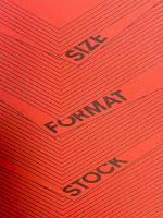
Size | Format | Stock is 10 years old!

The publication Size|Format|Stock was first published ten years ago. This is the booklet that I wrote in collaboration with Zoë Bather at Studio8. Originally written to leave with students after I've given a talk, it has since become a firm favourite with many graphic designers both in the UK and abroad.

The 2019 edition is the fifth printing and in total I've printed and distributed over 30,000 copies! ..through colleges, by post and also through Grafik and Eye Magazine.
The booklet is A5 portrait saddle stitched with a 4pp cover on Colorset, Chilli 120gsm and a 16pp text printed on Offenbach Bible 60gsm.
If you would like a copy, just email me and I'll pop one in the post to you: justin@fennerpaper.co.uk

Posted by Justin Hobson 15.03.2019

Tuesday, 12 March 2019

Charleston Press No 1

Nestled in the South Downs, Charleston was the country meeting place for the writers, painters and thinkers known as the Bloomsbury group. Now run by the Charleston Trust, the house is an excellent museum and visitor attraction, presented to look as it did when the family lived here in the 1950's. The walled garden was created by the artists Vanessa Bell and Duncan Grant to designs by Roger Fry and features Mediterranean influences with plants chosen for their intense colour and silver foliage. These became the subject of many works over their long residence at Charleston.

Charleston Press is a new publication published by the Charleston Trust and includes includes newly commissioned essays exploring the themes, artists and stories of the exhibitions and programmes at Charleston, as well as articles marking important Bloomsbury anniversaries and events.
For this first issue, there are two different cover designs.
Size is 220x170mm, portrait and is perfect bound. The publication has an 8pp 'dustjacket' around the cover as you can see from the birdseye image below...
The below image shows the book (with the magenta cover) out of the dustjacket plus the wrap-around belly-band.
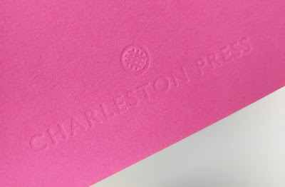
The 4pp cover is produced on our Colorset (100% Recycled) Magenta, 270gsm and is unprinted, being simply, but beautifully, embossed. 
Click on images to enlarge
The 84pp text is printed on our Omnia 120gsm. The reason that Omnia was chosen is because it would beautifully reproduce the wide variety of different media, the artworks, solid colours and dark photography and most importantly feel special - with the reproduction that you would expect on a silk or gloss but with a natural tactile uncoated feel.
...note the solid colours, not a special, made out of CMYK.
Charleston is hosting the first museum display of Vanessa Bell and Duncan Grant’s Famous Women Dinner Service since it was created for Kenneth Clarke in 1932. After this the plates disappeared from public view and their whereabouts were unknown until very recently. The plates were created by Bell and Grant when they lived at Charleston and each plate depicts one famous woman, featuring figures as various as the Queen of Sheba, Sappho, Nell Gwynn, Emily Brontë and Elizabeth I. You can read more about the Dinner Service HERE.
Click on images to enlarge
Below image shows the 6mm spine, the perfect binding. The jacket is printed on Omnia 150gsm.
The wrap around bellyband (70mm high) is printed on our Sixties, 60gsm and because of the translucency, the background images show through.
...you can see the level of show through in the detail image below.
The reproduction on the Omnia is just something else, the level of detail and reproduction is superb as you can see the image below.
The publication is designed by Playne Design who have studios in London and Hastings. Creative Director is Clare Playne with production is handled by Simon Hack. Print production is by Pureprint. This is just an excellent example of a beautifully designed and well executed piece of print, entirely right for the subject.

The publication is available for sale HERE

https://www.charleston.org.uk/
http://www.playnedesign.co.uk/
https://www.pureprint.com/
Posted by Justin Hobson 12.03.2019

Thursday, 7 March 2019

Progress? On the evolution of Arabic type

Next week, the Justin Howes Memorial Lecture is being delivered by Titus Nemeth at the St Bride Foundation.

The history of typography is also a history of technologies. As the means of multiplying texts evolved through time, different tools left distinct marks on letterforms. This dynamic accelerated from the late nineteenth century, as technological developments began to radically change the making and setting of type. At increasingly shorter intervals new machines and techniques shaped how text was represented and multiplied. Arabic typography is no exception to this, but its history is shorter.

Only when in the West, print was industrialised began Muslim printers to use letterpress printing on a large scale. In consequence, the mechanisation of Arabic typography occurred at an earlier evolutionary stage, lending machinery a key role in its development.
In this talk Titus, discusses this history from the perspective of progress: He will present key moments and contributions, consider drivers and motivations, and query if and how new technologies really did result in advances for Arabic typography.
Titus Nemeth is a type-designer and typographer with a special interest in the Arabic script. An alumnus of the Department of Typography and Graphic Communication at Reading, Titus has pursued an independent career for over ten years. He has taught in France (ESAD Amiens), Morocco (ESAV Marrakesh), Qatar (VCUQ), and the UK (Reading). His doctoral research formed the foundation for Arabic Type-Making in the Machine Age, recently published with Brill Publishers.
The talk is next Thursday, 14 March 2019 from 7–9pm at the St Bride Foundation. Tickets are a bargain at £8–12.50 - this is a fascinating subject, why not go and stimulate the grey matter!
You can book tickets HERE

https://www.sbf.org.uk/whats-on/view/the-justin-howes-memorial-lecture-progress-on-the-evolution-of-arabic-type/
Posted by Justin Hobson 07.03.2019