Tuesday, 29 November 2016

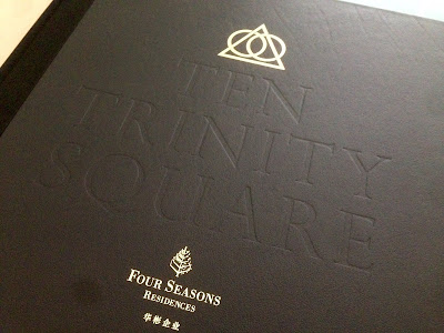
Ten Trinity Square - Book II

This is one of a pair of books produced for a development called Ten Trinity Square. I wrote about the other book in October here. This is one of London’s landmark buildings overlooking the Thames at Tower Hill. Built over a century ago to house the Port of London Authority, it has now been re-developed by the Reignwood Group as an exclusive arrangement of residences, a luxury hotel and private club, all in association with Four Seasons. 

This book explains about the history of the area, the city and the people who have influenced the region throughout history. The pair of books have been produced to be on display in the atrium of the building on a specially made plinth designed by Daniel Weil of Pentagram.

These are the largest books to have ever appeared on this blog and is probably the most impressive I have ever had the pleasure of handling! The size of the book is 615mm square, yep that's right, well over half a metre! As a result, it's more than a bit tricky to photograph, so my apologies - click on the images to bring them up to a better size.
To give a sense of scale, the book is pictured with a 30cm ruler and pencil. The book is casebound and is covered in black Saffiano, which is first grade calf leather with a classical grain. The cover is embossed and hot foil blocked in metallic gold foil.
The book has 92pages, all printed on Omnia White 200gsm. Omnia is a very bulky paper and that's what a project like this needed, with the size of each page being over half a square metre! 
The image reproduction throughout the publication is simply wonderful with both the four colour images, the cool grey pantone special and solid blacks looking great.
Click on images to enlarge
The bookblock (just the pages) itself is 13mm thick. Below is a detail showing the ribbon.
To give a better sense of scale, below is an image with a full size 70cl bottle of wine by the book, which gives you some idea...
Below is a detail showing the spine. The book is 'quarter bound' with cloth around the spine. Don't forget, the spine you are looking at is 35mm! Rather than using a bookbinding grade greyboard, the internal structure of the case is supported with a material called Promolyte. This is a lightweight alloy which was used to increase the strength, stability and integrity of this huge leather cover.
Hot foil blocking on the black Saffiano leather is superlative.

Brand identity for the whole project, including this book, is by Pentagram. Design is by John Rushworth and Joe Stephenson. You can see more about the whole project here: http://www.pentagram.com/#/projects/121368

Original photography is by Richard Bryant. CGI's by Hayes Davidson and AB Concept.


Printing is by Gavin Martin Colournet. It is a stupendous book with stunning production values and it has been produced impeccably. If I was saying anything other than that, then the whole reason for producing this staggering publication to appear on display in the building, would be null and void. Together with the other book, this pair of books make the most stunning books ever!

http://www.tentrinitysquare.com/
http://www.reignwood.com/
http://www.pentagram.com/
http://www.gavinmartincolournet.co.uk/
Posted by Justin Hobson 29.11.2016
Friday, 25 November 2016

New Flora Swatch

We have a brand new A5 swatch for our Flora range manufactured by Cordenons in Italy. If you aren't familiar with Flora, it is a part recycled text and cover paper with a deliberately recycled look and feel with specks and inclusions, so it looks deliberately flecky and specky. Flora is produced with 30% post consumer de-inked waste, together with 60% of virgin FSC pulp and with the "secret" ingredient of 10% of cotton fibres, which gives the paper a wonderful tactile feel.
All the shades have the specks and inclusions with the exception of the Gardenia shade which is a "clean" neutral white shade. The range consists of nine shades in total including Anice, Giglio, Avorio, Tabacco, Noce, Gardenia and three new shades...
Click on image to enlarge
...which are lovely new deeper shades: Crusca, Canella and Ginepro
Below shows the detail of the natural, deliberately visible, inclusions and fibres - this paper has a character all of it's own!
It really is a lovely range. Muted natural colours and excellent printability. Here are some previous projects which have used Flora to great effect:
http://justinsamazingworldatfennerpaper.blogspot.co.uk/2015/06/baines-fricker.html
http://justinsamazingworldatfennerpaper.blogspot.co.uk/2014/08/lower-mill-estate.html

If you would like one of the new swatches, just email: justin@fennerpaper.co.uk

http://www.gruppocordenons.com/en/home.html
http://www.cordenons.co.uk/
Posted by Justin Hobson 25.11.2016

Wednesday, 23 November 2016

Mapping Progress

http://www.bioregional.com/Bioregional was founded in 1994 by Sue Riddlestone and Pooran Desai, two environmental activists and campaigners based in Sutton, South London who were keen to found practical green and sustainable initiatives. From small beginnings it has grown into an organisation which has founded several green enterprises, influences the sustainability of many thousands of new homes and works with global businesses to make their operations and strategy more sustainable.

This publication is their 2015-2016 annual review, titled "Mapping Progress"
 
The finished size is 295x170mm, and it is a broadsheet format folding out to a flat size of 850x590mm. It folds down to reveal the below...
 ...and then it concertina's out as you can see in the image below:
As one might expect from and environmental organisation, there are sustainable facets to the production of this report. To start with, it is printed on our Redeem 100% Recycled 100gsm. The paper is a neutral white shade which really works with the images whilst also giving a 'nod' to the look and feel of a map, reproduced one side. It is printed offset litho and the whole job is just printed on one sheet of paper, with no binding, making this about as environmentally friendly (from a production point of view) as you can get.

Below are the images showing the flat size on both sides:
Click on images to enlarge
 
Design is by London based design company William Joseph and the creative director on the project is Stéphane Harrison. Print is by Pureprint.

...and thank you to Julia Hawkins at Bioregional for sending me copies of the report and the lovely note!
Posted by Justin Hobson 23.11.2016

Friday, 18 November 2016

Linklaters Invitation

This is one of the most stupendous invitations to have appeared on this blog! The event is the Capital Markets Reception hosted by the legal firm Linklaters this month. The reception was held in the glamorous surroundings of the Claridge's Ballroom.


Titled with Shakespeare's erudite words "All the World's a Stage", the invitation is a genuinely theatrical production...
The invitation is a two part production - an invitation in a pocket. The finished size of the invite is A5 (210x148mm) with the black inner cards being 206x144mm, so they slip in nice and easily.
The red slipcase is produced using our Flockage Bright Red 400gsm, perfectly replicating red velvet theatre curtains. The inner invitation is on Colorplan Ebony 540gsm ( ...from the other well known, Hull based paper merchant!).
For those of you which are not familiar with this product, it is a flocked board which feels like a velvety cloth/material to the touch but which remarkably you can actually "flatten" the pile by use of a  "heat de-boss". In this case the shape of the curtains is not printed, it is "heat de-bossed" which creates the effect below:
...and it is then hot foil blocked in gold metallic foil - just look at the details on the tassels.
Below is a detail of the reverse of the slipcase, which shows what is described as the "nap" which is the pile found on velvet - just like the curtains in a theatre!
Concept and design is by GM Toucari, a London based legal communications agency. Project director is Gary Clark.

The superb execution of the project is by Benwells. They produced all the foiling and finishing - all of which is superlative. Paul Haslam at Benwells oversaw the project and thanks to Paul for sending me the samples

http://www.linklaters.com/
http://gmtoucari.com/
http://www.benwells.co.uk/
Posted by Justin Hobson 18.11.2016

Wednesday, 16 November 2016

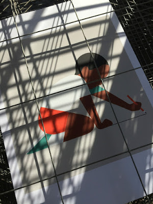
Draw a line

This is a recent collection of prints produced by Harvey Lloyd Screenprint for British graphic artist and illustrator, Adrian Johnson. His work is known for his economical, highly crafted graphic work an his working process all derives from obsessively drawing and re-drawing on paper, breaking down ideas and concepts into their purest form.
Size of the prints is 400x360mm, portrait. They are six-colour screen prints and are printed on our Matrisse 200gsm. Matrisse is a tactile uncoated white board with a high bulk and is perfect for silkscreen work.
You can see and read more about the project here:  http://www.adrianjohnson.co.uk/#/draw-a-line/
Adrian Johnson relentlessly aspires to seek balance between simplicity and sophistication, he is reductionist at heart. In October he gave a talk and workshop at the Apple Store on Regent Street, London about distilling ideas and images through reduction. In his words... "I'll be working with iPad Pro and Apple Pencil to help illustrate how my working process involves taking on board a plethora of information, and how I reduce this information into 'simple yet sophisticated' illustration and graphic art". 
Adrian Johnson's work has been exhibited in London, New York, Los Angeles, and Tokyo. He lives and works in Copenhagen, Denmark.
The prints are produced in an edition of 25 copies. and have been beautifully printed by Harvey Lloyd Screenprint, who are based in Wadhurst, East Sussex.

http://www.adrianjohnson.co.uk/
http://harveylloydscreens.co.uk/
Posted by Justin Hobson 16.11.2016

Monday, 14 November 2016

Cooper Associates

Cooper Associates is an award winning mortgage advisory firm based in the South West. The group also combines Cooper Associates Wealth Management and Cooper Associates Accountants offering accountancy services to clients.

This brochure is for the whole group and was designed by Maidstone based design studio, Project 64.

The size of the brochure is A4 (297x210mm) portrait and is saddle stitched. The cover is striking with the image of a skeleton of a leaf, reproduced by thermography in a subtle off white shade...
...which hopefully you can see in more detail here: 
It is printed on our StarFine White, with a 4pp cover on 350gsm and 8pp text on 150gsm, giving the publication a weighty, quality feel. StarFine is an uncoated paper and as the images show, image reproduction is excellent. The solid blue and photographic images look stunning - a great amount of detail for an uncoated paper, colours are bright and vivid. Printed CMYK, offset litho, throughout.
The below image is the inside back cover - no text, just the image, which conveys a sense of space without information being crammed into every nook and cranny...
Below is a detail showing the "read-over", which is where one page meets another in the spine and I think this is spot on:
Here are two further images showing the striking cover, where the leaf skeleton covers both the front and back cover.
If you would like to read more about Thermography, you can do so here: http://justinsamazingworldatfennerpaper.blogspot.co.uk/2014/02/what-is-number-2.html
Print, including the Thermography, is by Paddock Wood based printer Typecast Colour.

Literature design (and the stationery and Website) is by Kent based consultancy Project 64. Design director on the project is Claire Hobbs.

http://www.cooperassociatesltd.com/
http://www.project64.co.uk/
http://www.typecast.co.uk/
Posted by Justin Hobson 14.11.2016