Friday, 28 January 2022

2022 Calendar using Creative Print

I have been given a number of these individual calendars for the readers of this blog. They are available on a first come first serve basis, so if you would like a copy, please email me justin@fennerpaper.co.uk ...but you'll have to hurry!
The theme of this year's calendar is our seas and the sea life that inhabit our oceans. This calendar was conceived by the creative heads of advertising agency LMF based in Thüringen. Produced in collaboration with Quedlinburg DRUCK GmbH (printer) Koehler Greiz GmbH & Co KG (Paper) and Druckerei Erdenberger (UV print/finishing).
Size of the calendar is 810x 280mm is wiro-bound at the head and has 14 leaves, one for each month plus an introduction page and cover.
The calendar is printed on Creative Print, Diamond 210gsm, which is a 100% Recycled paper which we launched on World Environment Day in 2019. The range also is accredited with the "Blue Angel" environmental mark - which is fact the oldest environmental ecolabel, first awarded in 1978.
The print result is absolutely superb on this 100% recycled paper - with my limited photography skills I have tried to show the range of UV print finishes, with glitter, high build, textured and matt finishes...
Click on images to enlarge
Summary page showing all the months...
Click on images to enlarge
They are available on a first come first serve basis, so if you would like a copy, please email me justin@fennerpaper.co.uk ...but you'll have to hurry!

https://www.l-m-f.de/home.html#!home
Posted by Justin Hobson 28.01.2022

Tuesday, 25 January 2022

Paper shortages and increasing prices...

Here is some important background information from the print and paper industry...

In this interesting article published in Printweek today, they report on statistics by Intergraf who are to the Brussels-based umbrella organisation for European national printing industry associations (including the BPIF in the UK). They report "the situation is so acute that in some member countries 40% of the paper needed from mid-February cannot be obtained" 

I wrote an article on this blog in September about paper shortages. Now, as then, there are many reasons for the current supply issues. Last year, over a million tonnes of coated commercial and publication papermaking capacity was taken out of the market by StoraEnso (announced in 2018) with machines being converted to pulp and flexible packaging. Pulp prices have also increased sharply and energy prices have gone stratospheric!
Also, last year two StoraEnso mills in Kvarnsveden and Veitsiluoto mills ceased production (a further million tonnes of graphical paper production out of the market) and Zanders also stopped production - and these are just the ones I can recall!

...and to cap it all there is a a long running strike by the Finnish Paperworkers Union joined recently by UK workers too.

This is not just a European problem, it is a global phenomenon. Bloomberg has reported that shortages in the USA resulted in 100 million catalogues not being printed for the Christmas season.

So, it is hardly surprising that there are shortages, so please remember to discuss projects well ahead of time, otherwise you may be disappointed!

You can read the full PrintWeek article here... 
Posted by Justin Hobson 25.01.2022

Thursday, 20 January 2022

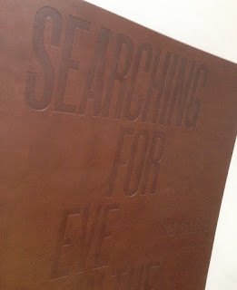
Searching for Eve in the American West

This is an catalogue for an exhibition of work by Maryam Eisler titled "Searching For Eve in the American West".

Eisler photographed female models within the desert surrounds. As the academic, editor and writer Anthony Downey has written in his essay in the exhibition’s accompanying catalogue, this approach ‘answered the need to understand the discombobulating landscape through the reassuring presence of human figures. In its isolated and sparsely inhabited environs, the region is perhaps almost too much to experience on one’s own.’ Eisler is not the first photographer to be inspired by this wild landscape – others include Ansel Adams and Edward Weston. Indeed, a statement made by Weston might equally apply to Eisler’s inspiration: ‘The camera should be used for a recording of life, for rendering the very substance and quintessence of the things itself, whether it be polished steel or palpitating flesh.'
The size of the catalogue is 395x260mm, portrait. The binding is a hybrid mixture of "swiss binding" and singer sewing, so the text is bound and glued to the inside back cover, enabling the text to sit nice and flat.
 
Detail showing the cloth tape along the spine: 
Introduction by Maryam Eisler, followed by an Essay by Anthony Downey:
The 44pp text is printed on our Omnia 150gsm which gives it that dead matt, tactile feel but with great reproduction. All printed offset litho throughout. The piece has a fantastic feel - solid flat areas of colour work amazingly well - it is difficult for me to say too much more about it - see the images below, they speak for the job...
A wonderful collection of solid colours, all printed as specials
The images are printed in two blacks (as duotones) plus a yellow special integrated with the image, the result of which is superb, as I hope you can tell from the images....
...and here we go for a bit of a plug!  - As you can see from the above images above, there is lots of colour and images with dark areas - loads of ink going down and it looks great on the Omnia, reproducing flat colours superbly whilst retaining that all important detail in the dark areas (in my opinion- but I would say that wouldn't I?)
Centre Spread with the singer sewn binding:
Detail of singer sewn threads:

Catalogue design is by Roger Fawcett-Tang of Struktur Design. It is beautifully printed and finished by Boss Print.
 
https://www.maryameisler.com/
http://www.struktur.co.uk/
https://www.bossprint.com/
Posted by Justin Hobson 20.01.2022

Wednesday, 12 January 2022

Goal 09

#TOGETHERBAND is a global movement, uniting us all to share commitment to the 17 Sustainable Development Goals (SDGs) announced by the United Nations in 2015. These SDG's are an urgent call for action by all countries - developed and developing.
Ethically made and sustainably sourced, each #TOGETHERBAND represents a different goal and 100% of the proceeds are donated. #TOGETHERBAND is the brainchild of British luxury sustainable brand BOTTLETOP, co-founded by Cameron Saul and Oliver Wayman, There are 17 friendship bracelets representative of each goal and everyone is invited to choose the goal that matters most to them and share it with someone important to them - How? Well, with every friendship bracelet purchase, you receive a second band to give someone close to you, helping spread the word...
This is the clever and beautifully designed packaging that contains the two bands. There is a slipcase in which there are two angled boxes held tight. Overall size of the slipcase is 80 x 80 x 20mm.
The angled boxes are fastened with a tuck flap, opening out as the below image...
...and then revealing the band itself:
Underneath the band is a 14pp information leaflet 70mm square folding out to 70 x 490mm.
The paper and board chosen for the wrap/boxes is our Shiro Echo, Bright White 300gsm, from Favini, which is 100% recycled, FSC accredited and carbon balanced. You can read more about Shiro Echo here. The leaflet is printed on Shiro Echo, Bright White 90gsm. As you can see from the images, the solid is superbly printed and the board has cut and creased beautifully.
Print and production is by Identity Printers with Paul Winter handling the project and they are just gorgeous - colours are bright and solids are superb, all printed Offset Litho

Posted by Justin Hobson 12.01.2022

Tuesday, 4 January 2022

Jobs from the past - Number 146

Regular followers of this blog will know that my first post of every month is a "job from the past" so that I can show some of the really good work from years gone by...

Nougat Preview S/S 2005
This is one of those simple pieces of print which is just exquisite. It is the preview piece produced to excite fashion buyers and to let them know at which fashion shows around the globe they will be showing the new collection. From that point of view, it can simply be described as a piece of 'direct mail' but that term is generally applied in a derogatory way and really doesn't do justice to this project.
It is simply a 6pp creased and folded card. Deceptively square, it's actually 150x140mm, portrait. It is printed in one colour on the outside and CMYK on the inside.
So what is it exactly that I find so special about this job? It was one of the first ever pieces to use Omnia and what is amazing is the way it feels so beautifully tactile and uncoated and then the way it reveals the amazing images inside. The outside cover is a continuous vignette as a halftone going from 0 to 100%. This is ingenious as it graduates in a crisp even way across the front cover - the even-ness in part, due to the way the Omnia prints and retains the integrity of the monotone.
The cover opens to reveal part of a stunning image plus reversed out type on a great solid, which is, of course, the continued solid from the front and back cover. Printed on Omnia White 280gsm.
 ...and then opening the right hand page reveals the image in all it's glory:
Below you can see the way the continuous vignette works from Zero to 100% 
 and here is a detail showing the subtlety of the tint:
This project together with the Nougat look-books at this time were designed by BOB Design. The creative partners at BOB were Alexis Burgess, Mireille Burkhardt and Kieran O'Connor. Lexi now runs his own studio in East London, Burgess Studio.

The excellent printing was by Principal Colour based in Paddock Wood in Kent. It's also worth pointing out that this job isn't "sealed, varnished or coated" in any way and this is the main reason that it feels so good - you can actually feel the paper and the ink. Since the time this was printed (2005) there has been a trend to install presses with coaters and most pieces of printed literature are smeared with a coating or sealer which (although making the printer's lives easier) betrays the feel of the paper ...and (what a lot of printers fail to mention) it discolours with age - now that's definitely something worth thinking about!

http://www.nougatlondon.co.uk/
www.bobdesign.co.uk
www.burgess-studio.co.uk
www.principalcolour.co.uk
Posted by Justin Hobson 04.01.2022