Showing posts with label DG3. Show all posts

Tuesday, 18 December 2018

Panettone Wrap

This is a lovely project which was produced last year at Christmas time. I received a call from Richard Davey at London based printer Leycol, who asked if we could supply a 60gsm in a red and black paper. We discussed the project further and it turned out that paper was to be printed with a metallic gold text and sent to Italy to wrap the traditional Panettone cake for sale in the Wildwood Deli.

Unfortunately I couldn't find a readily available red/black 60gsm stock paper available from one of our supplying mills and the quantity wasn't enough for a 'mill making',  so I suggested that he could successfully print a solid colour onto our Offenbach Bible 60gsm and the metallic gold text with excellent results. I sent Richard a printed sample of a McQ project to show how well a solid could work.  
The sheets were printed on a B1 Heidelberg offset litho press, in a solid pantone (not panettone colours!) colour plus a metallic gold and as you can see, the paper has printed beautifully. The size of the finished sheets are 550x750mm.
Not only does Offenbach Bible print beautifully, it also is very strong and "scrunches" beatifully! making it ideal for this type of wrapping, where a tissue paper (which you wouldn't be able to Litho Print) would actiually not be strong enough ...and here is the finished packaged article
Couldn't resist trying a slice!
Thanks to Richard Davey for giving us the opportunity to be involved with this very tasty project!

http://www.leycol.com/
Posted by Justin Hobson 18.12.2018

Thursday, 2 November 2017

Jobs from the past - Number 97

Regular followers of this blog will know that my first post of every month is a "job from the past" so that I can show some of the really good work from years gone by...

Design for Life - DixonBaxi 2004
DixonBaxi is the studio established by Simon Dixon and Aporva Baxi in 2001. Having both worked at Attik, they set up their new studio as a partnership, to be just the two of them, working without the trappings of a large agency. Throughout the 2000's, they consistently delivered exciting and innovative design, art direction and branding, predominately for television. Their work for MTV, SciFi Channel, Five and Formula One was high profile and lauded within the industry.

Rather than produce big flashy studio brochure, the two partners deliberately produced a modest portfolio piece to show the work that they had recently produced for clients with a title reflecting their philosophy: design for life
The size is A6 (105x148mm) landscape and is perfect bound with a lovely, neat, square 4mm spine. The cover is printed on StarFine 200gsm, printed in the bright magenta.
The text is made up using "French-folded" sections on Offenbach Bible 50gsm which gives it a sensational light feel and flows beautifully in the hand. 'French Folding' is where the folded edges are on the fore-edge of the book, as in the picture below:
Of course 'french - folding' uses more paper - in fact double the amount! - so this job is actually in conventional terms a 64pp text, which is actually 32x 4pp French folded sections, so in actuality its 128pp! ...but of course it's on 50gsm, so it's only a 4mm spine.
The spreads are sublime, the information pages printed in solid magenta and the project with images from their projects over the previous three years...
Bearing in mind much of the imagery used is from RGB screen grabs, the reproduction is really good, below is the work for MTV...
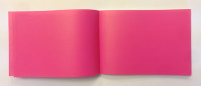
...and on an introduction spread, no words or image at all - just magenta space!
...you can see the way the text pages rolling and flopping over, flowing superbly.
It was printed offset litho by FS Moore in London and they really made a superb job of it. Richard Davey handled the project and he is now Sales Director at DG3/Leycol.

Design is, of course, by DixonBaxi. Simon and Aporva absolutely loved the finished piece and Simon was kind enough to send me file copies and a handwritten note...
DixonBaxi are now a much larger agency with 30 staff, still headed by Simon and Aporva, so sadly as is the way with bigger studios I no longer have regular contact with the two founders but it's great to have played a small part in the studio's development and history.

http://dixonbaxi.com/
http://www.leycol.com/
Posted by Justin Hobson 02.11.2017

Monday, 28 January 2013

JAZZ FM

Hold onto your hats! ...this is simply my favourite job from last year - I've been keeping it up my sleeve, so I can write about it at length, so here goes...
This piece of printed literature is an LP sized brochure in a record sleeve, produced for UK based radio station Jazz FM and is a promotional piece of print, aimed at potential advertisers and clients. The mono photography, many from the 1950's by Bob Willoughby and Wiliam Ellis, is beautifully combined with printed metallics (gold & silver) with dense black and surprisingly vivid flat colours.
Brochure (r/h) sliding into sleeve (l/h)

Front cover of brochure

Feast your eyes on the spreads below and then you can read all about it....
The brochure is 305mm square, saddle stitched with a 4pp cover on Omnia 200gsm and a 36pp text on Marazion Ultra 90gsm. The 313mm square sleeve is printed on our Mandricote Cream Back [1 sided] 300gsm. All these materials just work together beautifully. The Mandricote has exactly the right feel for the sleeve (and is a similar material to what would have been used for sleeves, back in the day!) and prints the metallic gold superbly. The whole brochure relies on a lightweight feel to be saddle stitched, maintain the right flow and to slip easily into the sleeve and this is where the Omnia 200gsm cover and lightweight text on 90gsm just works. Printed in CMYK, offset litho, plus special gold and silver.

Design and art direction is by Matt Willey. Described as "sumptuous" by John L. Waters, editor of Eye magazine, who also explains that the two main display typefaces are Engravers and Timmons, a display font drawn by Willey himself (and named after jazz pianist Bobby Timmons).
http://www.eyemagazine.com/blog/post/jazz-in-print

The superb print, production and finishing was handled by John McCormick at printers DG3 Europe, who are a global company with offices in most corners of the world, although this project was handled by the London office.

So why's it my favorite piece from 2012? Few designers (these days) get the opportunity to work with the record sleeve format which was once a pre-eminent format in "popular design" Design for vinyl singles and LP's was a large part of the graphics industry from the 1940's up to 1990's providing a visual narrative of the time but has sadly all but disappeared. By selecting this format, combined with superb art direction and typography, Matt has created a truly stunning piece of literature.

...and if an accolade from me wasn't enough (just kidding) it's been selected by the judges to receive the  “Certificate of Typographic Excellence” by the Type Directors Club, and will also be shown at the 59th Awards Exhibition in New York. Recognition, well deserved.

www.mattwilley.co.uk
www.jazzbodyandsoul.co.uk
http://tdc.org/
http://www.eyemagazine.com/blog/post/jazz-in-print
www.dg3.com
Posted by Justin Hobson 28.01.2013