Showing posts with label Saddle Stitched. Show all posts

Thursday, 11 January 2024

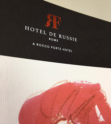
Hotel de Russie - Rome

Located between two of Rome’s most picturesque piazzas, Piazza di Spagna and Piazza del Popolo, Hotel de Russie is one of the Eternal City’s most prestigious luxury hotels. An enduring favourite of artists and writers, stars and politicians, Hotel de Russie was dubbed “paradise on earth” by French poet Jean Cocteau in 1917. The hotel incorporates a stunning Mediterranean tiered Secret Garden, with rose bushes, orange trees and mature pine.

This the brochure for the hotel, which follows the new brand identity for Rocco Forte Hotels, created by Pentagram.
Size of the brochure is 266 x 204mm, portrait and is saddle stitched. The cover is an unusual format as there is an 8pp cover with 140mm wide flaps and there is an outer jacket, only 210mm high, also with 140mm flaps. It is the first time I've seen this combination and the effect is superb...
Click on images to enlarge
The materials used for the covers is our Dali range, which is a 'felt-marked' paper with a linear effect and a natural, tactile feel. If you click on the image below, you will be able to see the texture in the paper.
Click on images to enlarge
The cover is on Dali Nero 200gsm and is hot foil blocked in matt white and copper foil. The jacket is printed on Dali, Candido, 160gsm and is litho printed in CMYK on one side only.
Click on images to enlarge
The 16pp text is printed offset litho on our Marazion Ultra 135gsm, chosen because of it's dead matt flatness which would reproduce the interior images well without a glossiness which would detract from the classic look and feel of the hotel.
click on images to enlarge
The brochure has a beautiful, quality feel and flows in the hand superbly. The combination of photography, materials and quality print makes this a wonderful piece of print.
Design is by Pentagram. The excellent print, repro and finishing is by Gavin Martin Colournet, based in London.

https://www.roccofortehotels.com/hotels-and-resorts/hotel-de-russie/
https://www.pentagram.com/ 
https://www.gavinmartincolournet.co.uk/
Posted by Justin Hobson 11.01.2024

Thursday, 7 September 2023

Radisson Blu Edwardian

The Radisson Blu Edwardian hotel in Manchester is set inside the historic Free Trade Hall, one of the city’s oldest and most iconic buildings, and is known for its musical past. The hotel has 263 luxurious rooms and suites and many of the suites are named after some of the artists that appeared at the venue before it was a hotel.

This brochure is about these "Signature Suites" and the facilities that the have to offer.
The format is A5 Landscape and is printed on our Omnia. It is an 8pp self cover printed on Omnia White 200gsm. A "self-cover" format is usually more economical as it can all be printed on one sheet, whereas if there is a different text and cover weight, they have to be printed on separate sheets.
Omnia is a very bulky paper so as just an 8pp saddle stitched, the 200gsm weight works really well.
Click on images to enlarge
Printed offset litho in CMYK throughout.
Image reproduction is paramount but it was also important that the publication also projected the tactility of the interiors and in the image below the detail of the bar area.  An ordinary feeling silk or gloss coated paper wasn't an option, so Omnia fitted the bill perfectly.
The outside front and back covers are hot foil blocked in silver foil.
Printing is by Stuart Van Den Bergh at Intaglio Communications based in London.

https://www.radissonblu-edwardian.com/manchester-hotel-gb-m2-5gp/gbmanche
http://www.intaglioltd.co.uk/
Posted by Justin Hobson 07.01.2023

Friday, 2 June 2023

Jobs from the past - Number 163

Regular followers of this blog will know that my first post of every month is a "job from the past" so that I can show some of the really good work from years gone by and this one is from 2012...

Ally Capellino Lookbook - Spring/Summer 2012

This is a beautiful lookbook for British fashion designer, Ally Capellino. With a worlwide reputation for fashion, the brand now focuses on luxury acessories. There are now also two Ally Capellino stores on opposite sides of London, in the East End’s Calvert Avenue and Portobello Road in the West.

Size of the publication is 163x225mm, portrait, saddle stitched. It is made up using a 4pp cover on uncoated with a 32pp text of our Omnia 120gsm which is just simply stunning with the images used.

Reproduction of the close up images showing the detail of all the leather and stitching is fantastic.
 
Photography is by Agnes Lloyd-Platt. Print by Ambrose Press.
 
Posted by Justin Hobson 02.06.2023

Wednesday, 7 December 2022

Hawkins Brown Literature

This is a suite of brochures for Hawkins Brown, an internationally-renowned award winning practice of over 200 architects, interior designers, urban designers and researchers. Design is by Shoreditch based studio, Huddle.

The size of the publication is 310x230mm, portrait and is saddle stitched. It has a 4pp cover on 280gsm and a 28pp text on 120gsm, all printed on our Omnia. As you can see from the image above, it looks like there are four separate brochures, however they are all the same brochure, just featuring different covers ...and this is what Huddle say about the covers:
"The covers of the new practice brochures break with convention by featuring ‘abstract’ close-ups of structural elements of Hawkins\Brown projects, reflecting how the practice does things differently. And because each brochure’s colour picks up on a colour from its image, the secondary colour palette is in effect infinite, yet is a flexible, coherent and distinctive asset for the practice."
Click on images to enlarge
As you can see from the above images above and below, inside there are lots of colour images and solids throughout - and it just looks (and feels!) just beautiful on the Omnia - no mottle - just gorgeously even, solid areas. The four colour images look amazingly detailed and vibrant.
Click on images to enlarge
Of course, the solid colours used on the front covers, wrap around to the back cover giving a satisfying display of rich tones.
Creative Director is Louise Desborough. Lead designer on the project is Tom Ward, together with Mike Bone and the account handler is Nicole Posner. The superlative print is by Leycol handled by Richard Davey.


Posted by Justin Hobson 07.12.2022

Tuesday, 24 May 2022

The Bristol Hotel

The Doyle Collection is a carefully curated collection of eight Irish family-owned luxury and urban hotels. Each hotel has a strong identity that is closely connected to its location. Set in the city's vibrant harbourside, The Bristol’s contemporary exterior overlooks the busy harbour. With 187 well appointed guest rooms and suites, this is a wonderfully luxurious hotel.
Branding agency, Brave New World  undertook an extensive re-branding exercise of the parent brand and of each individual hotel. The work included everything from strategy to interior design, website, high-profile advertising campaigns and the literature for each hotel.
Click on images to enlarge
The size of the brochure is 260x185mm, portrait and is saddle stitched. The cover is printed on an uncoated 300gsm board. 
The brochure is saddle stitched using three stitches:
The text material chosen was our Omnia, which would beautifully reproduce the photography with the rich interiors and exteriors superbly  ...and it looks wonderful! The 20pp text is on Omnia White 150gsm, printed offset litho in CMYK throughout.
Click on images to enlarge
Image reproduction is paramount but it was also important that the publication also projected the tactility of the interiors and in the image below the detail of the wedding venue and the reproduction of the fine voile used on the chairs. An ordinary feeling silk or gloss coated paper wasn't an option, so Omnia fitted the bill perfectly.
Omnia is a very bulky paper but with a 20pp text and the saddle stitching, it lays nice and flat allowing each spread to be enjoyed without 'fighting' against the binding.
Branding and creative direction is by Brave New World. The designer on this project is Caroline King. 

https://www.doylecollection.com/hotels/the-bristol-hotel
https://bravenewworldgroup.com/
http://www.carolinelking.com/
Posted by Justin Hobson 24.05.2022

Thursday, 26 August 2021

Graphic Lines

Founded in 2015 by Mark Leeds and Duncan Johnson c-ll-ct-v-ly is a London based Design and Research studio working in all media and especially editorial and moving image. As a studio project. they publish these limited edition magazines, using unpublished, reordered, remade, refound or newly created artworks. They are a quick-fire collaboration between the studio and a range of creatives ...an easy consumed, visual hit.
Graphic Lines is Number 10 by Iain Follett. Iain is based in Leicester and is Design Director at design agency Six. In 2015 he started the @mintneverhinged feed on instagram to showcase his collection of Graphic Stamps. From the exposure of the Instagram feed he collaborated with Blair Thomson (@graphilately and Creative Director at Believe In) and Unit Editions on a book called Graphic Stamps showcasing the best from their collections.
Mint Never Hinged came off the back of years spent collecting design ephemera. Way before I set up @mintneverhinged I had painstakingly been collecting and researching stamp design in order to archive the forgotten and unknown designers behind them and to put out a publication of my own on the subject matter. However in 2015 we were approached by Unit Editions to publish a book on our collections and being big admirers of Unit Editions, Tony Brook and Adrian Shaughnessy we couldn’t resist. Even that book, as full as it is, merely scratches the surface of the collection as a whole. Iain Follett
Size is A5 (210x148mm) portrait, saddle stitched. It has a 4pp cover, cut short at 105mm width with a 16pp text and a 4pp insert which is full height but 75mm wide.
The text is not a straightforward 16pp, the centre spread is actually a 8pp, which is stitched in but folds up as you can see above and below...
The cover is printed on our Colorset Solar 120gsm in black only. Text is printed on Gardapat 13 Kiara 150gsm. For readers not familiar with GardaPat 13, it's a fully coated paper but it really does have a dead flat MATT surface. There are many papers on the market which profess to be matt - some which incorporate the word matt in the name, but aren't! Apart from the high quality matt surface, this paper has an extraordinarily high bulk - this 150gsm text with a thickness of 195mics. If you would like to read more about the bulk, you can read it here.
The insert sheet (above image) is printed on Offenbach Bible 80gsm.
All materials are digitally printed using an HP Indigo digital press and the results are superb, beautifully showing the artworks. As many readers will know, many materials have to be "Sapphire Treated" to work successfully on HP Indigo presses, however both the text (Gardapat 13) and insert (Offenbach Bible 80gsm) are both printed without sapphire treatment ..and it's superb!
Printing and finishing, including the lovely white wire used on the saddle stitches (above) is by WithPrint who are based outside Bristol in Rooksbridge.
Concept and Design is by Mark Leeds and Ellie Rose. Font used is Neue Haas Grotesk from Commercial Type

Posted by Justin Hobson 26.08.2021