The Home Office Project
2005
This is quite simply one of the most stunning books that it has ever been my pleasure to have been involved with. The subject is the development of the new Home Office building which was built on a government site in Marsham Street, SW1 between 2002 and 2005. The project was a large PFI initiative and the architect on the project was Sir Terry Farrell. The book documents all aspects of the development from the history, the consortium, the construction workers, the artists etc.
Size of the book is 245x265mm. It is (just) landscape in format, has 218pp text and is section sewn and casebound. The book is printed entirely on our Omnia 120gsm with the exception of the endpapers. One of the reasons that Omnia was chosen was because of the desired use of gloss UV varnish, even on the cover (below).
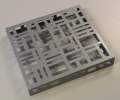
The book is presented in a solid steel slipcase.
As you can see from the following spreads, there is a wide variety of imagery used which all looks stunning. Gloss UV varnish is used sparingly and to great effect. The text on Omnia gives the book a special, tactile feel, miles away from the highly polished result that it would be on a coated paper and it has a rich, tactile, engaging feel.
...an occasional surprise, includes a gatefold
...the comic strip illustrations looks superb
Text printed pantone solid silver plus gloss UV varnish
Example of where Gloss UV varnish is used to great effect.
The cover is printed on Omnia, is matt laminated and has a gloss UV varnish. It is then mounted over a foam lined greyboard making a padded cover - feels springy and is just lovely. Hopefully the pictures below give you an idea:
Headband and ribbon are nice touches and finish it off beautifully.
Artist Liam Gillick worked with Farrell and designed the 'brise-soleil', literally a sun-break, which adorns the main entrance. The design is reflected in the steel slipcase produced for the book, produced by AR Engineering - it's very heavy!
Art direction and design is by Stimulate. Creative director was Stuart Cronin. Stuart has since moved on to his new company Vanilla Pod. There is a long list of photography credits, too long to list here, but the majority is by photographer Marcus Robinson. Scanning is by Bayeux and retouching by Tough Little Graphic.
Print was handled by Steve Lincoln at Principal Colour based in Paddock Wood in Kent. Steve has since retired, but Principal Colour are still going strong. The reproduction, print, binding et al is superb and looks just as good today as when it was produced eight years ago.
Posted by Justin Hobson 04.12.2013


