Showing posts with label Alan Dye. Show all posts

Friday, 21 October 2016

40 years of posters, circulars & talks...

Yesterday evening I was privileged to have been invited to the Typographic Circle 40th Anniversary exhibition, celebration and party!

TypoCircle, as it is usually referred to, was formed in 1976 to bring together anyone with an interest in type and typography. They stage a variety of type and typography related events including a series of diverse monthly lectures by well-known industry speakers, and the annual New York Type Directors Club exhibition. The list of previous speakers have included Alan Kitching, Stefan Sagmeister, Mike Dempsey, Ken Garland, Studio8, Erik Spiekermann, MadeThought, Michael Johnson, Anthony Burrill, Michael Wolff, Sir John Hegarty… to name just a few.  This event also launched the new logo (above) designed by NB: Studio and Studio Sutherl& and made by Bruno Maag.

Besides being serious about type, they are a very sociable organisation with a reputation for staging enjoyable events and this was certainly one of them!
The exhibition was curated in a large part by NB:Studio, working with Studio Sutherl&, Jon Bateson and everyone on the small but dedicated committee. The exhibition features 40 years of TypoCircle posters and Circulars, as well as some incredible ephemera, diligently squirrelled away by past committee members for such an occasion as this.
The exhibition includes a selection of nineteen issues of Circular, the Typocircle publication which in recent times has been designed by Domenic Lippa, printed by Richard Davey on paper sponsored by GF Smith.
This gives you an idea of some of the posters that were on display - printed by Gavin Martin Colournet on paper sponsored by GF Smith.
A publication comprising of three parts has been produced to support the exhibition. Designed in collaboration by NB:Studio, Studio Sutherl& and Jon Bateson. The first section is written by Lynda Relph-Knight and Sallyanne Theodosiou. The second is dedicated to spreads from all of the Circulars produced by Domenic Lippa and his team at Pentagram. And the final section contains 40 individual posters from the TypoCircle archive.
Above is a picture of the book, together with with the poster (designed by Studio Sutherl&) also printed by Gavin Martin Colournet on Colorplan 175gsm sponsored by GF Smith. The superb orange tote bag is sponsored by Streamline. Copies of the book are available from Typocircle.

My thanks to the TypoCircle committee for inviting me. This small band of people need some serious recognition for their time, drive and dedication. They are... Chairman: Alan Dye | President: John Bateson | Honorary Secretary: Val Kildea | Vice Chairman: Louise Sloper |Treasurer: Sallyanne Theodosiou | Membership: Antony Long | Committee Members: Jon Checkley, Dominic Lippa, Jim Sutherland, Olly St John. All these people freely give their time for the benefit of others and must be admired.

I must also mention the Typocircle sponsors, without whom none of this would have been possible: JWT, GF Smith, Pentagram, Baseline Magazine, Magma, NB Studio, Gavin Martin Colournet, Wynkyn De Worde Society, Laurence King, Creative Review, Streamline, Studio Sutherl&.

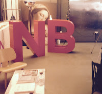
...and lastly, courtesy of Alan Dye at NB:Studio, here's a great picture of me with Kath Tudball from The Partners, in front of the TypoCircle logo inspired blackboard.

Membership of TypoCircle is open to anyone with an interest in type and typography, and there are no entry tests or examinations. As I have said many times on this blog before, it's very important to support organisations such as the TypoCircle and events such as this - why not get involved! ...individual membership is just £30.00!

The exhibition at the Protein Gallery, Shoreditch, runs until Sunday 23rd October, 10-5pm and entry is free.
https://www.typocircle.com/
Posted by Justin Hobson 21.10.2016

Friday, 20 November 2015

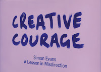
Creative Courage - A Lesson in Misdirection

Creative Courage is NB:Studio's mantra; a rallying cry, a touchstone, a catalyst. It’s also a platform for a series of talks, events and activities. Yesterday evening, I was invited to a Creative Courage talk at NB's Bankside studio which was being given by Simon Evans. Titled 'A lesson in Misdirection' , this wasn't just a talk, it was magic!

This is the fourth in the series of talks/events hosted by NB:Studio and it is a brilliant idea. These evening events stimulate new ideas, are great for staff, clients and suppliers alike and can bring a fresh perspective and thinking to a creative environment - in my opinion more studios should host events such as this.
Simon Evans was introduced by NB:Studio partner Nick Finney(above). Simon is a Theatre director, two time Close-up Magician of the year and National Theatre Magic Consultant amongst many other activities.
Click on images to enlarge
Simon gave his masterclass in 'misdirection' explaining how magicians make you look in the right place at the wrong time – or the wrong place at the right time! This was part lecture, part performance and mostly magic show!
It's given me some great ideas for shuffling swatches and making other paper companies sample books disappear - what an illusion that would be!

It was a magical evening and my thanks go to all at NB:Studio for inviting me and to Simon Evans for an extremely insightful talk and a wonderful performance.

http://www.creativecourage.co.uk/
http://www.nbstudio.co.uk/
http://www.the-department.co.uk/simon-evans/
Posted by Justin Hobson 20.11.2015

Thursday, 8 January 2015

The Story of Fundraising

More Partnership are experts in philanthropic fundraising. They help organisations which are typically charities, universities, museums and schools to be more effective in raising money. As the title of this book reveals, it is about stories, which as they say in the introduction, lie at the heart of persuasive fundraising.
The size of the book is 150mm square, which is a friendly and manageable size. The cover only contains a modest 24pp text (saddle stitched) but to make this more a more substantial piece of literature, it has our Kemikal Cotton White 1500microns mounted to the front and back cover. The spine has been left exposed by 15mm on the front and back cover as can be seen in the picture below.
The cover is on Colorset, 270gsm (100% Recycled) and the 24pp text is printed four colour offset litho and printed on our StarFine Natural White 150gsm.The text paper was chosen because it is a neutral white, uncoated paper, which works in harmony with the cover materials and the beautiful illustrations by Jenny Bowers (Peep Show Collective) which run throughout the book.
There are four different Colorset colours used - just by simply changing the colour of the board used, it suddenly makes a series!
The outside covers are simply silkscreened in one colour black. It works just beautifully on the Kemikal Cotton White which is 1.5mm thick!
The below picture shows the foredge and the overall thickness which is 6mm.
Design is by NB:Studio, where the Creative Directors are Nick Finney and Alan Dye. Designer on the project is Kirsty Whittaker.
 
It has been beautifully printed, silkscreened and finished by Absolute Ink who are based in East London. The cover was silkscreened by Bob Eight Pop, who are part of the Absolute Group.
 
Posted by Justin Hobson 08.01.2015

Thursday, 4 July 2013

Alan Fletcher Archive


© Martin Dunkerton 1992
If you aren't already aware of this, I think you'll find this pretty interesting. In the last month a new website archiving the work of Alan Fletcher has been put up. The site has been designed by Crescent Lodge and I asked Lynda Brockbank, the creative director to write a few words about the project:
 
The Alan Fletcher Archive website project began two years ago and was initiated by Alan’s daughter Raffaella with archivist Sarah Copplestone. The ‘soft’ launch on 31 May, was the moment when a rich mix of Alan’s work had been curated and digitised, important texts had been collected and commissioned, and the shop was ready to open. There’s still a vast collection, some of it unseen, that will continue to be added (some may yet be discovered), to build a living resource on Alan’s life, times and work. You can, of course, contact the Archive by email and also join the mailing list http://www.alanfletcherarchive.com/contact

The link to the new website is: http://www.alanfletcherarchive.com

Lynda remarked that it’s just wonderful to be able to look through all the amazing material in the archive and what a privilege it's been to work on the project.

...and I also have a small archive of my own! I have a set of ceramic desk accessories that Alan Fletcher designed for Time and Life in 1961 (bought in 2004 on the advice of a very sage Alan Dye from NB Studio ...thanks Alan)
 
...and I am the proud owner of a print that Alan gave me titled "a bouquet of flowers". I was at his studio one afternoon and had to rush off home as it was my anniversary that evening...
This new website is a brilliant resource and I look forward to seeing it grow and develop as more of the archive is uploaded.

http://www.alanfletcherarchive.com
http://www.crescentlodge.co.uk
Posted by Justin Hobson 04.07.2013