Showing posts with label BoylePerks. Show all posts

Thursday, 26 November 2020

Gold at the Heist Awards

The Heist Awards celebrate the best of excellence and innovation in education marketing. Established in 1990 by Havas Education, this year they celebrate the 30th year of the awards. Normally it is a live gala event held at a London hotel but this year the event held last week was a virtual ceremony.

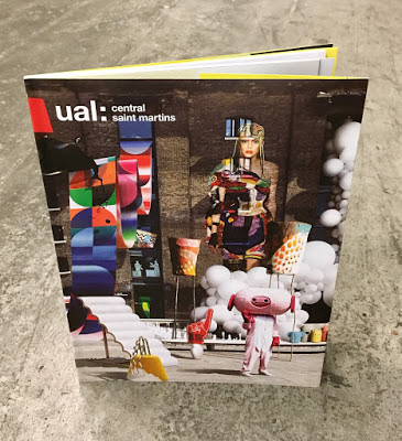
It was great to hear that Boyle & Perks won the Gold Award for the best specialist institution prospectus for their Guide to Central Saint Martins School of Art and Design.
The Judges comments are: “This entry pushed the boundaries of the genre effortlessly. The outstanding use of visuals conveys excitement and remains true to its brand throughout. An outstanding submission, well -written with a clear plan, well -executed and with strong ROI outcomes. Top work – others can learn much from it, the team should be very proud" 

I wrote about the previous year's prospectus, which featured Astralux on the cover HERE:
Design is by Boyle & Perks and congratulations on getting well deserved recognition for creating another excellent CSM prospectus. You can see all the winners HERE.

Posted by Justin Hobson 26.11.2020

Friday, 27 March 2020

Postgraduate Guide

I've written many posts on this blog which includes the phrase "...just the cover makes the difference!" The cover on this 2019 prospectus is just superb. It is printed offset litho on our Colorset Lemon 270gsm, in just one colour (Silver, Pantone 877) which is a photo composition of 28 works by CSM postgraduate students,  all laid out with the wonderful King's Cross building as the backdrop. The cover is also hot foil blocked.
The size of the publication is 240x164mm, portrait. The cover has 90mm flaps, which you can see in the birds eye picture below...
The below image shows the opening spread, with the 40pp text, printed on gloss art...
The cover is printed one colour offset litho in black on the inside cover. Below image shows 90mm flap folded out:
The cover is printed on Colorset Lemon 270gsm, a 100% recycled board. For those of you not familiar with this collection, Colorset now has 36 colours and all colours are available in 120, 270 and 350gsm. Below shows the outside cover, fully extended showing the photo-composition of all 28works... 
The 40pp text, printed offset litho on 100gsm coated gloss paper:
Below shows the detail of the hot foil blocking...
This is a superb piece of literature demonstrating that CSM is a world class arts and design college. Design is by Boyle & Perks but was produced last year before the launch of the new CSM Shifts (...also by Boyle & Perks!)

Print is by Pureprint, printed offset Litho throughout in CMYK with the cover printed in just silver and black.

https://www.arts.ac.uk/colleges/central-saint-martins
http://boyleperks.com/
https://www.pureprint.com/
Posted by Justin Hobson 27.03.2020

Monday, 11 November 2019

CSM Shifts

Since 2018, Boyle&Perks has been working with Central Saint Martins to create a visual language for the College. Designed to fit within the parameters of the existing branding for UAL, the resulting scheme uses typography, a colour palette and visual system to bring both cohesion but also the flexibility to represent the diverse creative community within the College walls.

A few weeks ago I received the below item in the post...
What a wonderful surprise! Enclosed are a couple of posters produced to demonstrate the new visual language, one in red
...and one in black
The posters are A2 (420x594mm) size and are simply, but beautifully, hot foil blocked on our Colorset Lemon 120gsm. They really do look amazing.

The following article explains about the development of the new visual language...

“The last thing we wanted to do was create another typeface,” confesses Elaine Perks, “then we went full circle because we came to the realisation that it was the only way to create something distinct within the constraints of the overarching UAL branding. It was the opportunity to create something that is anarchic, unpredictable and characterful within that system.” To achieve this unpredictability, the designers alighted on randomised typefaces that shift so the same word appears differently each time it’s written out. Colophon Foundry had just completed a randomised project so Boyle&Perks challenged them to create a typeface that could encompass Central Saint Martins’ past, present and future all at once. “They wanted a design that would be dynamic, changing every time you used it, but to celebrate these pillars of Central Saint Martins: the past (the incredibly rich heritage and history), the present (the students there now) and the future (which is obviously very ambiguous). That’s what we thought was really challenging, these three moments that are quantifiable, in some sense, but open to interpretation,” says Edd Harrington of Colophon Foundry.

You can read more about the project here:
https://www.arts.ac.uk/colleges/central-saint-martins/stories/changing-typeface

The hot foiling was done by Dorset based printer, Dayfold and below is an image showing the magnesium hot foil blocking die...
...and for interest, you can see the way the new visual identity is being utilised in the picture below:
My grateful thanks to Bill and Elaine for sending me the the wonderful hot foiled posters and it's great to see the fulfillment of a project which has taken well over a year to complete and which has received universal approval in the design world with DesignWeek describing the identity as “boisterous, anarchic and unpredictable”

https://www.arts.ac.uk/colleges/central-saint-martins
http://boyleperks.com/
https://www.colophon-foundry.org/
https://www.dayfold.com/
Posted by Justin Hobson 11.11.2019

Wednesday, 15 May 2019

CSM Guide 2019

I've written many posts on this blog which includes the phrase "...just the cover makes the difference!" The cover on this prospectus is simply perfect. It is printed on our Astralux, One sided 170gsm, with an amazing image which is a photo composition of 28 works by CSM students,  all laid out with the wonderful King's Cross building as the backdrop.
Click on images to enlarge
The size of the publication is 270x200mm, portrait. The cover has 100mm flaps, which you can see in the birds eye picture below...
The below image shows the opening spread, which shows the 92pp text, which is stepped and printed on a combination of recycled uncoated, gloss art and yellow tinted paper.
Above you can see the way the image wraps around the cover over to the flap - and this is where the real magic happens, because Astralux being a 'Cast Coated' paper it has a high gloss surface one side and is uncoated on the reverse, so you get the juxtaposition of the high gloss coated with the toothy uncoated reverse (printed yellow) as I hope you will be able to see in the image below...
The image below shows the cover in it's entirety, spread out
Click on images to enlarge
The job is PUR bound - a very neat job.
It is a superbly designed piece of literature which has to engage with young creative minds, demonstrate that CSM is a world class arts and design college whilst also satisfying the CSM Alumni! No easy task. Design is by Boyle & Perks.

The excellent print is by Pureprint. It is printed offset Litho throughout in CMYK plus the bright yellow printed as a pantone special.

https://www.arts.ac.uk/colleges/central-saint-martins
http://boyleperks.com/
https://www.pureprint.com/
http://www.favini.co.uk/
Posted by Justin Hobson 15.05.2019