Showing posts with label Astralux. Show all posts
Showing posts with label Astralux. Show all posts
Monday, 29 August 2022
Photo quality on Astralux
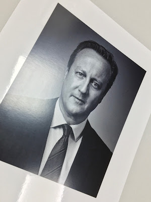
ASTRALUX is the market leading range of cast coated papers and boards produced in Italy by the Favini Crusinallo paper mill. 'Cast Coated' papers and boards have an extremely high gloss, reflective surface on one side with an uncoated reverse and is perfect for photographic reproductions.The photographs are for the former Prime Minister, David Cameron and are printed on Astralux 1 sided 350gsm. The size is 250x198mm. They are digitally printed in CMYK on a Ricoh 9200pro digital press.As you can see, it's a high gloss finish and a perfect result.
You can read more about Astralux HERE
Posted by Justin Hobson 29.08.2022
Labels:
Astralux,
David Cameron,
Favini,
Fenner Paper,
Justin Hobson
Thursday, 23 June 2022
Astralux Range Swatches
ASTRALUX is the market leading range of cast coated papers and boards produced in Italy by the Favini Crusinallo paper mill. 'Cast Coated' papers and boards have an extremely high gloss, reflective surface on one side with an uncoated reverse. The weight range is 80gsm - 350gsm in white and is also available in 27 shades (including metallics and pearlescents) and we have some beautiful swatches...
The swatch is A4, portrait and incorporates both the white and the colour range.The colours are displayed in a "chip" format which is an ideal format to see selection of shades:
...and there is even a printed sample.
If you would like one of the swatches, just let me know justin@fennerpaper.co.uk
http://www.favini.co.uk/
Posted by Justin Hobson 23.06.2022
Labels:
Astralux,
Cast Coated,
Cast coated paper,
Favini,
Fenner Paper,
Justin Hobson
Friday, 3 September 2021
Jobs from the past - Number 142
Regular followers of this blog will know that my first post of every month is a "job from the past" so that I can show some of the really good projects from years gone by and this is from 2009.
Misfits - Channel 4 November 2009
This is a promotional Zine produced by Channel 4 to promote their series called Misfits, which is about five young outsiders on Community Service who get caught in a strange storm and discover that they have developed superpowers. This Zine was published as a promotional item before the premier which was aired on Thursday 12th November 2009.I got a call from Alice Tonge at Channel 4 Creative who briefed me along with Keeley Pratt about the project wanted to produce a publication as close to a Zine as possible. The design and illustration can create the look but the materials are thing that clinch it!Size is 260 x 165mm and it has a 4pp cover and a 24pp text.Above you can see the high gloss cover - and this is where the Zine magic happens, because Astralux being a 'Cast Coated' paper it has a high gloss surface one side and is uncoated on the reverse, so you get the juxtaposition of the high gloss coated with the toothy uncoated reverse (printed purple) as I hope you will be able to see in the image below...The cover is printed on a lightweight 170gsm Astralux 1 sided. Inside front spread...
The text is printed in CMYK, offset litho on our Marazion Ultra 90gsm. This is a lightweight paper with a matt coating but which has an amazing bulk, tactile feel and excellent opacity for 90gsm. It feels just right for this project, reprocing the illustrations and flat cover with the zine look and feel...
The 24pp text just rolls and flops like a Zine would do on a lightweight paper This is the perfect facsimile of a Zine. It's one of those projects I look back on and feel that the end result hit the brief perfectly. Art direction and design is in house by 4 Creative with Alice Tonge as creative director and Keeley Pratt as producer. Print production is by Tag Worldwide and the print and finishing is by Principal Colour based in Paddock Wood, Kent.Posted by Justin Hobson .02.09.2021
Monday, 26 July 2021
Resonance 1
The Wapping Project is the creation of the Women's Playhouse Trust which was set up in 1981.Throughout the 80s and the early 90s WPT’s artistic policy was defined by the playwrights it commissioned, produced and published, predominantly at the Royal Court Theatre, London. In 1993 it began to mount work in one of London’s most beautiful, derelict buildings in the East End, the Wapping Hydraulic Power Station; it is at this point that it became known as The Wapping Project, and established a worldwide reputation. It was always described by its founder and director, Jules Wright, as an idea consistently in transition. I have written about projects from this period on this blog before.
You can see the black wire used for the staples in this image and you can see them on the outside in the below image. It's a superb detail, a small touch, which works with the hot foil blocking in gloss black foil and makes all the difference.Using the Offenbach Bible 60gsm means that the total thickness of the 48pp is only 2mm!
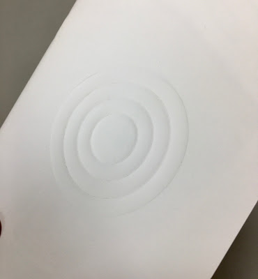
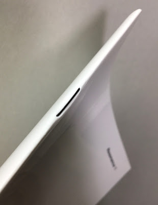
This publication titled 'Resonance 1' features an essay by Gareth Evans together with images by Berlin based photographer Karen Stuke.Size is 210x148mm (A5) portrait and is saddle stitched. The 4pp cover is printed on Astralux 1 sided 'cast coated' board, which is high gloss one side and uncoated reverse. The cover is debossed and hot foil blocked. The deboss on the front cover just draws you in... The below image is taken against the light, so you can see the high gloss...The 48pp text is printed on our Offenbach Bible 60gsm, which works beautifully. The publication is mainly text but these images by Karen Stuke are large format pinhole images that follow the journey of a Jewish child brought on a Kindertransport from Prague.
For interest the above right hand page is backed up by the image below, which demonstrates the excellent opacity.
Printed offset litho in CMYK, the 48pp text flops and flows beautifully in the hand... Mono image used for the centre spreadFor interest the above right hand page is backed up by the image below, which demonstrates the excellent opacity.
You can see the black wire used for the staples in this image and you can see them on the outside in the below image. It's a superb detail, a small touch, which works with the hot foil blocking in gloss black foil and makes all the difference.Using the Offenbach Bible 60gsm means that the total thickness of the 48pp is only 2mm!

Design is by Atelier Dyakova and the creative director is Sonya Dyakova. Printing is by Push and the printing on our Offenbach Bible 60gsm and the finishing is superb.
Posted by Justin Hobson 26.07.2021
Wednesday, 2 December 2020
Jobs from the past - Number 133
Regular followers of this blog will know that my first post of every month is a "job from the past" so that I can show some of the really good work from years gone by. Given the sad news this week that the Arcadia group has gone into administration, I thought I'd show you this superb project for Topman which is part of Arcadia.
Topman - Spring/Summer 2011
Topman is the Arcadia group's fashion conscious male brand and this piece of literature is produced to the very highest standard with superb art direction, photography and print reproduction - and a few little tricksy surprises lurk within as well!This lookbook is 350x280mm, portrait format which is just a lovely size - different (not uneconomical either) but just feels right for it's sub A3 and slightly squarer format.The piece has a 4pp cover and a 68pp text and is perfect bound.It is printed offset litho in CMYK throughout - colour reproduction is fantastic - solid flat areas of colour work amazingly well as do the mono images. The sense of space in the job is fantastic - the spread below has a completely blank page - an excellent unhurried piece of design for print. ...and here's for the surprise (well three of them actually). There are three smaller (310x230mm) right hand page "throw outs" with closer up detail shots. These are printed on our high gloss, one sided cast coated paper Astralux 115gsm. The images are printed on the gloss side (see below) and the uncoated reverse (see above pic) is printed in a flat solid cool grey.The below image shows the flat uncoated reverse side of the Astralux, printed grey over the high gloss face side with the CMYK images...The 68pp text is printed on our Omnia 120gsm which gives it that dead matt, tactile feel but with great reproduction - let the pictures do the talking...Below is the detail image showing the fantastic reproduction on the Omnia:For me, one of the joys of this piece of literature is the way it easily flows in the hand. Many designers will use a really heavy cover when producing a document with a substantial number of pages and this can cause disruption with the way the cover interacts with the text - it can be way too flicky! The cover of this job is 200gsm - it is on Omnia, which is a bulky material, but it is the perfect weight....and if that wasn't enough the whole book is inserted into a custom made capacity envelope, also made out of Omnia 200gsm.
Art Direction and design was by Gill Patchett who worked in-house at Arcadia. Production was by Stephanie Johnson. Photographer is Boo George with production at Streeters. Printing was by Ortek printers in Walsall. Gill very kindly sent me some file copies:So what are people doing now? Arcadia has gone bust this week. Sadly Ortek Printers went bust back in 2017. Gill Patchett is now a freelance Art director and Designer ...and Fenner Paper? yep, we're still here doing good stuff!
...and if you'd like to read my original post about this job from 2011 and see how my powers of description and prose have improved, you can read it HERE.
Posted by Justin Hobson 02.12.2020
Labels:
Arcadia,
Astralux,
Fenner Paper,
Gill Patchett,
hot foil blocking,
Justin Hobson,
Offset Litho,
Omnia,
Ortek,
Topman
Thursday, 26 November 2020
Gold at the Heist Awards
The Heist Awards celebrate the best of excellence and innovation in education marketing. Established in 1990 by Havas Education, this year they celebrate the 30th year of the awards. Normally it is a live gala event held at a London hotel but this year the event held last week was a virtual ceremony.
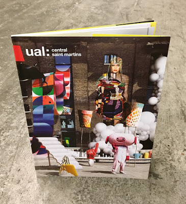
It was great to hear that Boyle & Perks won the Gold Award for the best specialist institution prospectus for their Guide to Central Saint Martins School of Art and Design.The Judges comments are: “This entry pushed the boundaries of the genre effortlessly. The outstanding use of visuals conveys excitement and remains true to its brand throughout. An outstanding submission, well -written with a clear plan, well -executed and with strong ROI outcomes. Top work – others can learn much from it, the team should be very proud"I wrote about the previous year's prospectus, which featured Astralux on the cover HERE:Design is by Boyle & Perks and congratulations on getting well deserved recognition for creating another excellent CSM prospectus. You can see all the winners HERE.
Tuesday, 28 January 2020
Typographic 71
This is the latest edition of Typographic, a journal published by ISTD (International Society of Typographic Designers) issue 71. This is a good read and there is always something in it to inspire, the content is entirely devoted to those practising typographic design, both past and present.
The contents include eight articles by/about: David Quay, Stephen Banham, Jim Northover, Cal Swann, Jared Patterson, Trevor Finnegan, Tony Pritchard, Nicole Phillips, Mike Daines. The Editorial Board is Jim Northover, Tony Pritchard, Caroline Roberts.Size is A4, portrait. The 4pp cover is printed offset litho, hot foil blocked and die cut on our Astralux Silver 250gsm. The die cut holes form the number 7, allowing the 2pp end-papers (which feature front and back) on Colorset Blush to show through. The number 71 on the cover was inspired by David Quay's typographic walk through Amsterdam which is one of the articles in the journal. Cover artwork is by Tony Pritchard.
 |
| Click on images to enlarge |
 |
| Click on images to enlarge |
The 32pp text is printed offset litho on Pergraphica High White, Rough 120gsm.
 |
| Click on images to enlarge |
 |
| Click on images to enlarge |
Design is by Miriam Brüggen who is based in Berlin and production is by Playne Design. It is beautifully printed, bound and finished by Empress Litho in London.
You can buy a copy of Typographic 71 on this link here.
However...
If you are a practising designer that cares about typographic standards and you aren't already an ISTD member, maybe you should think about joining - there are many benefits, this journal (free to members) is just one! - have a look http://www.istd.org.uk/ - it costs less than £10 per month and is excellent value.
www.istd.org.uk
https://www.empresslitho.com/
Posted by Justin Hobson 28.01.2020
Subscribe to:
Comments (Atom)


