 This is simply one of those really amazing projects which has lots of different features. It's a property brochure for an amazingly high specification building. The Wimpole Building was formerly the Western District Postal Office built in 1909. The redevelopment of the offices in the building retains the original Portland Stone façade which is an impressive frontage on Wimpole Street.
The book is an impressive 330x250mm and has a hard "case-bound" cover. On the front cover there is a high gloss white panel with a hot foil and emboss which is platesunk. Very beautiful. The cover is printed on a linear embossed covering paper.
The overall thickness of the book is 12mm thick
The material chosen for the text pages is our Omnia 150gsm. This material has a high bulk, required as effectively this is only a 28pp text. The photography has reproduced brilliantly on the Omnia, as has the beautiful flat pale mint, solids...
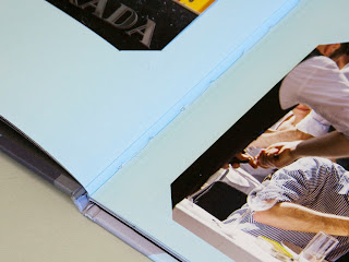
Above is the opening spread, showing the impressive façade. The picture below shows the spread which is one of the lovely features of this project. The pages are double thickness (folded back on themselves and glued) and in the die cut corner slots are individually inserted photographic prints, as in a traditional photograph album.
Close up to show inserted photographs:There are two spreads with the inserted photographs.
The remaining pages show the interior and exterior of the building from a variety of different angles.
Lovely grey flat solids for the floorplans, which also have two throw-outs.
Design is by Egelnick and Webb. Creative Directors are Toby Egelnick and Malcolm Webb. There are some beautiful touches, really high production values which make this a truly exquisite piece of literature. Royal London Asset Management, CBRE and Strutt & Parker commissioned Egelnick and Webb for the whole branding exercise, including the website and hoardings:http://www.egelnickandwebb.com/case-study/cbre/the-wimpole-building-website
Printing of the sales brochure is by Identity, based in Paddock Wood, Kent and they have made a superb job of it - colour reproduction is fantastic - the solids look amazing as do the colour images. The finishing with the inserted pictures and throw-outs is stunning.
Posted by Justin Hobson 29.01.2014


