Showing posts with label LandS printers. Show all posts

Wednesday, 4 June 2014

University of Portsmouth Graduate Show 2014

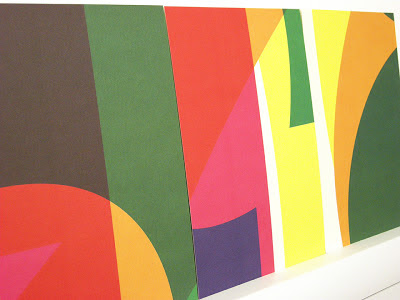
Last week, I had a lovely surprise when I opened my post to find not one but four posters for the University of Portsmouth graduate show!

The invitations and posters for the show are designed by Michael Harkins who is not only senior Lecturer but is also the course leader of the MA Graphic Design course.

He kindly wrote a few words about the project for me: The posters represent part of a wider identity for the Faculty of Creative and Cultural Industries 2014 Graduate Show. This celebrates the opening of a new building allowing all four schools of the Faculty to be housed in single creative campus. The brief was to create a single identity that would unify, whilst retaining individual identity for each of the schools. The theme was based on ‘bringing together’. Initially a bespoke typeface was created consisting of four elemental parts. Each of the schools are represented by one of the geometric shapes. When combined form the identity SHOW 2014.
The posters are all A1 size (841x594mm) and are printed offset litho in CMYK on one side only. The paper used is our Redeem 100% Recycled 130gsm, which has a neutral white shade and recycled tone. Here they are on display in the Eldon building.
There are also four A5 invitations, mirroring the design on the posters, which are printed on Redeem 100% Recycled 315gsm
Printing is by L&S Printing who are based in Worthing. Thanks to Mike for sending file copies and his kind note
The show is open all this week at the Eldon Building at University of Portsmouth, ending on Friday 6th June, so you'd better get done there quickly!
Posted by Justin Hobson 04.06.2014

Friday, 28 February 2014

CIA Calendar 2014

 
Mind of a child, Eye of an Artist 
This is the lovely 2014 desk calendar produced by the Central Illustration Agency (CIA). In September, a team of CIA illustrators held a children's workshop at the V&A Museum of Childhood in London. During the workshop each child was asked what they imagined the future might look like. These thoughts were then turned into briefs and sent out to their international network of illustrators!
 
A few weeks later, forty of those artists had created illustrative interpretations of those children’s thoughts and on 12th October they returned to the museum. Alongside those exhibited images, a dozen CIA illustrators took to the stage and created giant live artworks, accompanied by the children who had dreamt up those artists’ briefs and very much beholden to their unequivocal art direction.
 
During an extraordinary project, a child’s vision was realised by a professional artist and the results are presented on this lovely calendar  
Cover illustration: Jakob Hinrichs
 You can read more about the project here: http://www.centralillustration.com/projects/
Telegramme
Brian Grimwood
David Holmes
Le Gun

The 140mm square calendar is printed on Omnia Natural 120gsm, chosen so that it would have an uncoated look and feel but reproduce the wide and diverse illustrations superbly. The "tent card" (which is the commonly used term for the supporting cardboard frame) is made from a sturdy sheet of Trojan Whiteback 510gsm (below pic):
Production of the calendar was handled by Charlotte Hanlon. Printing and finishing is by L&S Printing based in Worthing, West Sussex.
 
Posted by Justin Hobson 28.02.2014

Thursday, 30 May 2013

Summer Show 2013


Now is the time when many readers of this blog will be receiving invitations to degree shows from all corners of the country. Here is a particularly lovely and inspired example for the University of Portsmouth.
Below is the A1 poster (841x594mm) printed in CMYK, one side only, on Redeem 100% Recycled 130gsm.
...then to make the invitations, the material on the run was changed to Redeem 100% Recycled 315gsm and the run completed. The reverse of the board was then printed in one colour forming 16 x A5 invitations with CMYK on the reverse of the invite - a smart idea! 
Reverse of the A5 Invitations
The design is by  Michael Harkins, who is a senior Lecturer in Graphic Design and the course leader of the MA Graphic Design at the University of Portsmouth. Given the complexity of the design, I asked Mike to write some words to explain the project:

Often my work plays with complex ideas found within the design problem itself, yet this is something for the viewer to find within the work, not something obvious initially.

The idea really came from thinking about 2013 as a number in itself. For many people the date could be seen as a portentous one, unlucky, lucky, superstitious etc. This led me to think about what it is when we read into numbers as individuals, we often bring our own meanings/readings.

The numbers within the date are also the first in the sequence of natural, ordinal or cardinal numbers. 2013 is also the first time these numbers appear together in a year date since 1320, so quite special in that sense. They also form the idea of a countdown 3,2,1,0 to the show. As in the ordered sequence 0123, we arrive at 3, the number of years students commit to their degree programmes, culminating in the show.

So really the numbers become celebratory and playful. The use of the CMYK adds to this idea of playfulness in terms of interaction of form and colour. It also gets us, the viewer to bring about our own readings of the numbers. 

The invitations extend the playfulness by dividing the colour composition into 16 parts, each one producing a unique composition in itself, something we take time to view, enjoy, contemplate.
Posters on display behind glass

Printing is by L&S Printing based in Worthing, West Sussex and a beautiful job they've made of it.

...and thanks to Mike for sending me some file copies and a note (written on the printed reverse of the A5 invitation):
The preview is tomorrow evening at the Eldon Building at University of Portsmouth and the show is open from 3-14 June.

Posted by Justin Hobson 30.05.2013

Tuesday, 7 June 2011

University of Portsmouth - Showtime 2011


Showtime 2011 Summer exhibition poster/identity

This is a lovely set of literature which forms the identity, invitation, posters and information about the shows. There is an A1 folding to A4 poster/invite printed on Offenbach Bible 50gsm and an A5 invitation card.

The design is by  Michael Harkins, who is a senior Lecturer in Graphic Design and the course leader of the MA Graphic Design at the University of Portsmouth. Given the complexity of the design, I asked Mike to write some words to explain the project:

"The identity of the poster etc. plays upon the polysemy of the word Showtime. Time to put on a show; The point in time that has arrived to show work; Showing the time that has been invested in work and study through the public exhibition.

Bespoke lettering/type was created that used the metaphor of the opening door as this was also a time of departure from study to the wider world etc. This also represented the number one of the individual and eleven for the year of the show. Show and 2011 are represented as time in the form of a digital clock-like composition.

The reverse of the poster uses an algorithm based upon the screen angles of the colours used to create unique 'interactions' representative of each students unique contribution in terms of time and the work they show.

The Offenbach Bible Paper 50gsm used, also allows the front and back of the poster to interact * showing through * connections at the individual level contributing to the whole.

Poster (Reverse)


Front of the A5 Invitation is printed on Redeem 100% Recycled 315gsm:

Printing is all by L&S Printing based in Worthing, West Sussex and a very nice job they've made of it.

...and thanks to Mike for sending me some file copies and a note (written on the reverse of the A5 invitation):
The show is on this week at the Eldon Building at University of Portsmouth - get down there now!

Posted by Justin Hobson 07.06.2011