Showing posts with label Paulus Dreibholz. Show all posts

Friday, 10 April 2015

CSM Short Courses Literature

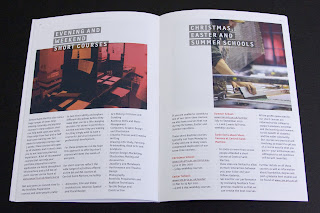
This is the printed literature produced to promote the Central St Martins short courses. These courses provide a way for students from all backgrounds to experience the Central Saint Martins style of study, which encourages pushing boundaries and challenging accepted norms. The courses are either in evenings, intensive holiday courses or online.

The publications consist of three items, a broadsheet, an A3 poster and A6 size cards.
Click on images to enlarge
The 12pp broadsheet is 594x630mm, folding to A4 size. It has the image one side and the listings on the reverse.
It is printed on our StarFine White 130gsm which is an uncoated paper with a good bulk and prints beautifully - as you can see from the image that is used there is a dense area of black on the bottom right hand side which looks good and solid, a nice dense black. The cards are printed on StarFine White, 300gsm.
Design is by Atelier Dreibholz. Paulus Dreibholz operates between his studios in London and Vienna working with clients throughout Europe, whilst also lecturing at University of Applied Arts in Vienna amongst others.

Print is by Principal Colour based in Paddock Wood in Kent.

http://www.csm.arts.ac.uk/
http://www.dreibholz.com/
http://www.principalcolour.co.uk/
Posted by Justin Hobson 10.04.2015

Thursday, 5 February 2015

The Jocelyn Herbert Archive

Baal by Bertolt Brecht. Illustration by Jocelyn Herbert
Wimbledon College of Arts is part of the University of the Arts London (UAL) and they hold archive material relating to film and theatre designs, as well as the Jocelyn Herbert Archive. Jocelyn Herbert (1917-2003) was a theatre and set designer, who worked within many theatre companies and she left a substantial amount of information on her work for different theatres including the Royal Court and National Theatre. The collection includes original costume and set designs, letters, masks, puppets, set mock-ups, photographs and notebooks.

This simple piece of literature has been produced to give information about the archive, research possibilities and the Jocelyn Herbert Award which is given bi-annually.
It is a simple 8pp, self cover, printed offset litho in two colour, black and a special orange. the images are reproduced as monotones/halftones Size is 225x160mm portrait. It is printed on our StarFine Natural White 100gsm, which gives the publication a light feel with a neutral white which works well with the mono images.
An interesting thing about this project is that the designer on the project Daniel McGhee, didn't want to saddle stitch - sometimes 8pp with a saddle stitch just feels a bit "leaflety"! He had previously seen some jobs which had glue along the spine and wondered how and if that could be done.
This process is usually called "seam glue" or sometime spine glue and can be done on literature with a small number of pages - generally only 8pp on an A4 size or up to 16pp on an A5. It is a machine process which runs a small seam of glue along the spine. The advantage is that there is no bulky stitch, which can sometimes look ugly but the disadvantage is that it makes the 'read-overs' virtually impossible as it takes about 5mm out of the spine. It is not an easy thing to photograph but hopefully these show it well enough
I've deliberately formed a crease, to give an idea of where the glue is hidden
Design is by Atelier Dreibholz and the creative director is Paulus Dreibholz. Designer on the project is Daniel McGhee and thanks to Daniel for the kind note and file copies.
Excellent print and finishing is by Robert Young at R.Young & Son in Croydon.

http://www.arts.ac.uk/study-at-ual/library-services/collections-and-archives/wimbledon/
http://www.dreibholz.com/
http://www.ryoungprint.com/
Posted by Justin Hobson 05.02.2015

Monday, 18 October 2010

ISTD Stammtisch - 13th October 2010

Talking Books was an event held last Wednesday hosted by the ISTD (International Society of Typographic Designers) at The Russian Club Studios in London E8 . It involved a series of short presentations by a variety of speakers talking about a book of their choice. The speakers included Ken Hollings, Fraser Muggeridge, Caroline Roberts, Gary Bird, Lucienne Roberts, Hana Tanimura, Gilmar Wendt and me! 

It was a great evening which was amazingly interesting and diverse both in terms of the people giving the presentations and the books that they spoke about. It was very oversubscibed  and I should guess there were at least 120 in the audience.
This is me doing my talk...
Afterwards everyone got a chance to handle the books that had been spoken about (with cotton gloves on, of course!)
I can't give a complete transcript of the evening as it  would take far too long. The speakers were all excellent (probably with the exception of me!) and in particular Lucienne Roberts who spoke so passionately and coherently about her book on Sister Corita and CSM MA student Hana Tanimura about our book buying and owning culture - she's writing her dissertation on this subject  All in all a really interesting evening.

And I guess you're asking "which book did Justin talk about"? Well, in some ways it isn't a book at all - it could almost be described as a "de-constructed" book, as it has no binding! It's a job for the NatWest Media Centre at Lords Cricket ground produced for Future systems by Cartlidge Levene in 1999. Unfortunately I haven't got time to write about it fully now but it will feature as one of my "Jobs from the Past" posts (which is the first post of every month). But for now, here's one picture of it so you get the idea!
Finally thanks to the ISTD for hosting and arranging the evening. I thing these events are excellent and I think that everyone who's practising in this creative industry should make an effort to get to this sort of event once in a while. Otherwise we all exist in our own little work bubble and often don't get exposed to what else is out there and different ideas and thinking. Special thanks to Belinda Magee and Paulus Dreibholz and all at ISTD. For next event, email to stammtisch@istd.org.uk.

http://www.istd.org.uk/
http://www.helveticcentre.ch/
Posted by Justin Hobson 18.10.2010

Monday, 23 August 2010

Central St Martins - 2010/2011 Course brochure

Here is a really excellent piece of literature, which I guess we would all hope for and expect as it's for Central St Martins.

There's also one thing in particular which I would like to point out [below]. The job size is 165x240mm which is an economical size to produce from a B1 sheet. It is printed on our StarFine White which is an uncoated with a good bulk but you wouldn't describe it either as toothy or smooth! It has a 4pp cover and only a 24pp text. Potentially this could have posed a problem, because a printed spine was considered important and part of the design brief but by using 130gsm  for the text it gave a 2.5-3.0mm spine width which is about the thinest that you can successfully perfect bind (and it's been very well finished with the 6 point, I think, type on the spine)

Now the thing that I have noticed about this piece and that I want to point out is that the cover is not as heavy as most people (that I speak to) would use - but it really, really works. It is only on 200gsm and the
point is that the relationship between the text and cover is perfect. It just flows and feels perfect in the hand. The cover doesn't feel cheap or insubstantial. Getting the relationship between the text and cover right can make or break the piece of literature -it's crucial - heavy covers do not always give a job a prestigious feel, often it makes a brochure unusable! ...so don't always reach for the 350gsm, just get the relationship right!
This piece is designed by Paulus Dreibholz who runs his studio in London and lectures at CSM and University of Applied Arts in Vienna amongst others.


Print is by Principal Colour.

http://www.csm.arts.ac.uk/
http://www.dreibholz.com/
http://www.principalcolour.co.uk/
Posted by Justin Hobson 23.08.2010

Friday, 13 November 2009

ISTD Awards 2009

I was lucky enough to go to the ISTD awards last Friday and it was a great evening. It was held at the Arts Club in London's Mayfair. As with all ISTD events, there is a real air of friendliness and fellowship, whether this is because there is always an international element, I don't know. I was seated at a table with people from Holland (http://www.studiovanson.com/) who were a great laugh.

The series of three posters below is the ISTD Awards 2009 Overall Winner by Paris based, Studio Apeloig (www.apeloig.com)

All award winners deserve congratulations, but in particular, there are some people who I must mention:

Cartlidge Levene for the wayfinding & environmental graphics for The Guardian building - (I know it's not on paper, but it's still fantastic work!) http://www.cartlidgelevene.co.uk/

Barrie Tullett and Philippa Wood who are lecturers at University of Lincoln and who run The Caseroom Press for The Ghost in the Fog (pictured left).

This is a book that only contains the corrections and alterations of the author.

Congratulations on their Premier award (by the way, it's printed on our Offenbach Bible 60gsm)


NB:Studio won a Certificate of Excellence for their series of House magazines for Soho House, the covers of which are below: http://www.nbstudio.co.uk/
...and the list goes on - The Chase for their marvellous woodblock letters made from chocolate, Studio 8 for FUTU magazine and Henrik and Scott from A2/SW/HK for a clutch of awards.
http://www.thechase.co.uk/

Here's a very cheerful looking Paulus M. Dreibholz, happy with his well deserved Certificate of Excellence for the poster for the Institute of Architecture in Vienna.

http://www.gaffadesign.com/


Malcolm Garrett (http://www.appliedinformationgroup.com/) and David Coates (http://www.tothepoint.co.uk/), lurking behind the scenes!

...and a prize for anyone who can guess which dark horse from the NB:Studio table this is (answers on a nice postcard please!)
It was an excellent evening which showed a fantastic array of international typographic excellence. It is REALLY important for our industry that we retain societies such as the ISTD and we must take every opportunity to try and encourage membership, thus ensuring their continued viability.

So if you aren't a member, have a look http://www.istd.org.uk/ - for less than £10 per month - this is good value!