Showing posts with label Principal Colour;. Show all posts

Thursday, 18 December 2014

Seasonal packaging on Stardream

This is not only a lovely, yummy, Christmas gift - it is also a wonderful printed example of packaging produced on our papers! Vincent design produced their very own limited edition selection box. Firstly, they sourced locally handmade chocolates from Sylvia and Terry based in Romney Marsh. Next, they had to design the custom packaging, which required a festive, seasonal look and feel.
However, because this was a limited run, litho printing was out of the question. As a result, the material chosen was our Stardream Quartz 285gsm which is HP Indigo ready. The beauty of this product is that it has a pearlescent, metallic shimmer but can be printed digitally to great effect and for short run lengths.
The lid was printed on the Stardream Quartz 285gsm. The box made up very cleverly, with the printed insert covering the joins and flaps on the inside of the lid. The unprinted base with the custom cut outs to hold the scrumptious confectionery is made from Stardream Sapphire, with Orion embossing in 285gsm.
The size of the box is 270 x 150x 45mm and is a nice sturdy little package. Print production is by Principal Colour based in Paddock Wood on their HPIndigo digital press.

With thanks to all at Vincent design for the yummy box ...and the chocolates as well!

www.vincentdesign.co.uk
www.sylviaandterry.com/
http://www.principalcolour.co.uk/
Posted by Justin Hobson 18.12.2014

Wednesday, 1 December 2010

Jobs from the past - Number 14

Followers of this blog will know that my first post of every month is a "job from the past" so that I can show some of the really good work from years gone by, so here's the last one for 2010...

NatWest Media Centre - media launch book - Future Systems

This job dates back to 1999. The design company was Cartlidge Levene. Art direction was by Ian Cartlidge and Adam Levene. This publication was produced for the media launch of the fantastically futuristic NatWest media centre at the MCC's Lords Cricket Ground in St John's Wood.

This is a remarkable job because it is perfectly deconstructed in the same way that the building itself was conceived and built. It was not built as a building but constructed at a boatyard, out of aluminium!

This was the 'book' that I spoke about at the ISTD stammtisch, back in October. http://justinsamazingworldatfennerpaper.blogspot.com/2010/10/istd-stammtisch-13th-october-2010.html

Future Systems was the architectural practice of the late Jan Kaplicky and Amanda Levete. The partnership designed some amazing and truly iconic buildings including Selfridges in Birmingham and the Enzo Ferrari Museum amongst many others.

The design of this publication could almost be described as a "de-constructed" book, as it has no binding! It is formed by the production of a 'case' which would normally form the cover of a hardback book. But this works more as a folder, holding in the two seperate and entirely unbound text sections. The size of the cover is 215x260mm portrait, the two text sections are 210x250mm.
Images are reproduced on gloss coated paper - our Millennium Real Art 115gsm 16pp self cover unbound - see below...
The text and some images reproduced in mono, printed on uncoated text paper, Formation Superfine 90gsm, also 16pp self cover, unbound but printed in one colour only - see below..
The hard case 'folder' was produced using Millennium Real Art with gloss lamination (inside and out) mounted onto 3 pieces of 2000micron greyboard with a 10mm gutter to form the 'hinge' and then punched out. I mentioned earlier that this publication somehow perfectly interprets the construction of the building and this is both in the visual sense and the literal sense ...the angle of the slit on the cover is exactly the same as the glazing on the front of the building which designed so the sun never reflects in the player's eyes - what a great piece of detailing!

The stunning photography is by Richard Davies. Print and superb finishing with amazing attention to detail was by Principal Colour.

http://www.future-systems.com/
http://www.cartlidgelevene.co.uk/
http://www.richarddavies.com/
http://www.principalcolour.co.uk/
Posted by Justin Hobson 01.12.2010

Monday, 23 August 2010

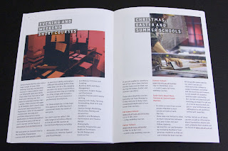
Central St Martins - 2010/2011 Course brochure

Here is a really excellent piece of literature, which I guess we would all hope for and expect as it's for Central St Martins.

There's also one thing in particular which I would like to point out [below]. The job size is 165x240mm which is an economical size to produce from a B1 sheet. It is printed on our StarFine White which is an uncoated with a good bulk but you wouldn't describe it either as toothy or smooth! It has a 4pp cover and only a 24pp text. Potentially this could have posed a problem, because a printed spine was considered important and part of the design brief but by using 130gsm  for the text it gave a 2.5-3.0mm spine width which is about the thinest that you can successfully perfect bind (and it's been very well finished with the 6 point, I think, type on the spine)

Now the thing that I have noticed about this piece and that I want to point out is that the cover is not as heavy as most people (that I speak to) would use - but it really, really works. It is only on 200gsm and the
point is that the relationship between the text and cover is perfect. It just flows and feels perfect in the hand. The cover doesn't feel cheap or insubstantial. Getting the relationship between the text and cover right can make or break the piece of literature -it's crucial - heavy covers do not always give a job a prestigious feel, often it makes a brochure unusable! ...so don't always reach for the 350gsm, just get the relationship right!
This piece is designed by Paulus Dreibholz who runs his studio in London and lectures at CSM and University of Applied Arts in Vienna amongst others.


Print is by Principal Colour.

http://www.csm.arts.ac.uk/
http://www.dreibholz.com/
http://www.principalcolour.co.uk/
Posted by Justin Hobson 23.08.2010

Tuesday, 3 August 2010

Jobs from the past - Number 11

Followers of this blog will know that my first post of every month is a "job from the past" so that I can show some of the really good work from years gone by and here's one from 1995.

Launch of the Albert Memorial Trust - March 22nd 1995
This was a job comissioned by English Heritage for the launch by Prince Charles of the Albert Memorial Trust to raise funds for the restoration of the Albert Memorial which is opposite the Royal Albert Hall in Hyde Park in London. Believe me, back in the early 1990's the memorial was in a shocking state and in dire need of serious repair.

This piece is a large "broadsheet" type format which is a sheet 840x590mm folding to make a 4pp of 420x590 which is then concertina folded down with three folds into four sections of 420x195mm and held together with a belly band.

...and this is the centre spread:
Now this job was produced on a sheet that we had only just introduced in 1994 called Redeem 100% Recycled, which I hope you'll have heard of by now! Back then it was new but had exactly the right look and feel to simulate an "aged" newsprint and slightly "blueprinty" type feel to work with the line illustrations. Printed in offset litho in two colours on 100gsm.

It's a large format job which has a huge impact, yet it folds down to a manageable size and was economical to produce - a really great use of material, print and format.
It was designed by Atelier Works. Lead Designer was John Powner working with senior designer Annabel Clements.

The job was printed by a company called Penshurst Press based in Tunbridge Wells. Sadly the company is no longer around. Alan Flack who was the "minder" that actually physically printed this job left Penshurst Press with Martin Darby to form their own printing company called Principal Colour and they are still based in Paddock Wood in Kent.
Posted by Justin Hobson 03.08.2010

Friday, 4 June 2010

Grace Kelly - Style Icon

Q: When is a leaflet, not a leaflet?
A: When it's designed and produced like this one.

I just received some file copies of the gallery guide for a Grace Kelly exhibition that's on at the V&A over the summer and it's just looks and feels great.

Ostentsively, this is a leaflet but this has been printed on Omnia 120gsm which means that rather than feeling like the vast majority of mass produced leaflets printed on a bit of 130gsm silk or gloss, this has real character and value.

Equally the design and the superbly chosen imagery, both mono and colour, really work to make this feel anything but a leaflet!
Design for the gallery guide, invitations and other collateral is by Nadine Fleischer.

Print is by Principal Colour.

Posted by Justin Hobson 04.06.2010

Tuesday, 11 May 2010

London Design Festival 2010

This is an invitation to a press conference in May announcing the plans for the 2010 London Design Fesitval.
The A4 size invitation (top left hand section of above) folds out to an A1 size poster (as above). It is printed on our Offenbach Bible 60gsm, which as regular readers of this blog will know, not only prints exceptionally well but folds beautifully and the paper has a lovely "rattle" in the hand. Perfect for a job like this. We also supplied bright red C4 envelopes for them to be sent out in.

Design is by Pentagram.
The designer is Beatrice Blumenthal from Domenic Lippa's team. Production by Kevin Purdy and print is by Principal Colour. Printed in two colours, black and red.
http://www.londondesignfestival.com/
http://www.pentagram.co.uk/
http://www.principalcolour.co.uk/

Thursday, 18 February 2010

Ultrabold No7

I have just received my copy of the Autumn edition of Ultrabold magazine, which is the Journal of the St Bride Library - if you don't know about St. Brides - see http://www.stbride.org/

In the past Fenner Paper have supported this publication (by supplying discounted material) although sadly this sponsorship has now come to an end. However this latest edition is certainly worth a mention.

The publication is designed by Simon Loxley and is published by the Friends of St Brides. In this issue, there is a very interesting article by Kath Tudball and Julia Woollams from Johnson Banks about the new "Save the Children" identity (spread below)
There is also a fascinating article about Yulia Brodsakya's designs using the rather forgotten art of "paper rolling" or "quilling" for The Guardian.

Print is sponsored by Principal Colour.
The journal is a 40pp self cover, 190x265mm Portrait and is printed on StarFine White 130gsm

It's worth mentioning that this publication is free to friends of St Bride - so why not look into joining - might be cheaper than just buying the books!

http://www.stbride.org/
http://www.johnsonbanks.co.uk/
http://www.artyulia.com/
http://www.principalcolour.co.uk/

Tuesday, 16 February 2010

Mantisworld Ethical T Shirts

Now to many of you this might look like a normal saddle stitched lookbook, but as with most of the projects I work on there's a bit more to it!

Astroman (a design company based in London) wanted a "tactile" material that had more of an uncoated feel but that wouldn't let down the brightness of the colours. The factory that makes these clothes is in the shadow of Mount Kilimanjaro in Africa and they use 100% certified organic cotton and are a pioneer in ethical manufacturing. The reproduction of the vivid African colours was an important part of the brief. Importantly this catalogue is mailed out internationally, so postal weight was an overidding consideration.

The eventual choice of materials combined the tactile Omnia as a cover but only in 200gsm (which is very bulky) with our lightweight Marazion Ultra in 90gsm which might sound very light but it works extremely well and also means that an extra saving could be made because it could be saddle stitched as opposed to perfect bound.

Here are some spreads:
The job is 4pp cover with a 72pp text and the size is 200x260mm and for your interest, the job weighed just over 200grams which kept it well within the desired postage band.
Print was by Principal Colour.
Designed by Astroman. Creative Director on the project was Doug Hurcombe. Designer on the project was Katerina Karamallaki and thank you for the lovely note...