Showing posts with label PrintSmith. Show all posts

Friday, 13 May 2022

Amazing Cocktail Menu!

Today is World Cocktail Day! ...so what better day than to show you this amazing cocktail menu, which is a stunning piece of paper engineering:
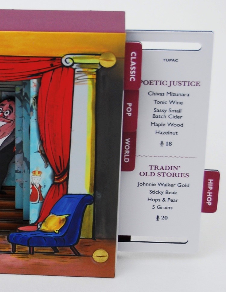
This menu for Scarfes Bar is a highly memorable and interactive piece, featuring 14 music-inspired cocktails.

The menu was illustrated by Gerald Scarfe and based around a Victorian toy theatre with a back drop and moveable wings depicting an empty Scarfes bar. Different types of music are listed on tabs on both sides.
As you pull a tab that relates to a particular genres, so a musician or exponent of that genre glides across the stage into the bar – and the appropriate cocktails are revealed, as you can see below...
The size of the menu is 175x230mm (plus the 10mm tab). The menu is constructed from paper covered over board and each of the menu cards is paper mounted onto our Sumo Black 1mm thick board and the menu pages are held by just four brass binding posts which move along punched slots.
Designed is by Rivington Bye who work with many premium brands, principally in the hospitality sector.

Printing and production is by Fenton Smith at PrintSmith and I can't stress just how well produced this construction is, it really is superb.

What a great day for a cocktail...! https://www.daysoftheyear.com/days/world-cocktail-day/

Posted by Justin Hobson 13.05.2022

Friday, 30 July 2021

Diamond Dolls

Diamond Dolls is an artist book by Hormazd Narielwalla, co-published by Concentric Editions and EMH Arts, London. It takes the form of a limited edition (300 copies) made as an artist’s book in 3 Acts.
Diamond Dolls is a sumptuous artist’s book that originates from a sequence of Hormazd Narielwalla’s highly distinctive paper collages. The below image shows the front cover...

Conceived as a sculptural object in three parts and designed to stand like a series of shoji screens, the original collages are printed front and back to reveal the ‘artifice’ of cutting and pasting involved in their construction, while the foiling of paper edges and details of de-bossed abstract patterns, gives the opening and arranging of the book a tactile and performative quality.
Thirty six images carry a running motif of Bowie’s ‘Ziggy Stardust’ persona, each of which is defined by elaborate, decorative costuming. Cipher-like, the figures reference the Japanese gender-fluid traditions of kabuki and onnagata, which influenced Bowie in his approach to challenging conventions about sexuality.
The books are litho printed by PrintSmith on our Omnia 200gsm. Omnia was chosen for it's dead flat matt characteristics plus a tactile feel but as you can see, with great colour reproduction. PrintSmith printed this project using their expanded colour gamut process, which makes for the super bright colour rendition of the works along with super sharp detail, which as you can see from these images is amazing.
The concertina folded pages are printed front and back to reveal the of cutting and pasting of the original construction, below shows a detail...
The finished size of each three books is 240x165mm, portrait and each book is a 28pp concertina. The below image shows how the pages fold over as a conventional book, when folded up.
The full extent of the long concertina...
This superb book is currently being exhibited at the Eagle Gallery in Farringdon Road (until 7th August), the picture below, shows the book (and the slipcase) at the exhibition.
There is also an installation in the window at Essie Carpets on Piccadilly.
This is a truly stunning piece of work and has been exceptionally well received in the artworld. A superb piece of print and finishing by Fenton at PrintSmith. Thanks to Hormazd Narielwalla, EMH Arts and PrintSmith for the images.

Friday, 20 November 2020

PEEL Limited Edition Book

‘PEEL’ is an exploration of self-identity. As a reaction to the scrutiny young people undergo through social media, Marksteen Adamson created the PEEL programme which works with groups of young people and uses photography and poetry to help them explore their identity and who they are rather than just focussing on what they look like. Social media, self-expression and self-identity present growing problems for young people, and there is growing evidence that this pressure is contributing more and more to mental health issues.
Launched in 2017, the project is the culmination of a three-year study, that has acted as the foundation and prototype for the training programme. The PEEL project has been developed into curriculum based resources to enable educators and service providers to run the programme.
This limited edition book comprises 30 studies, each with their own unique poem and photographic portrait and containing the latest statistics. Size is A5 (210x148mm) portrait has 114pp of text (plus the throw outs) in a 'casebound' cover and section sewn binding.
Click on images to enlarge
The amazing thing about this book is that each of the 30 case studies is printed across a right handed 'throw out' in the book.
The book is printed Offset Litho on GardaPat 13, Klassica 115gsm. For readers not familiar with GardaPat 13, it's a fully coated paper but it really does have a dead flat MATT surface. There are many papers on the market which profess to be matt - some which incorporate the word matt in the name, but aren't! Apart from the high quality matt surface, this paper has an extraordinarily high bulk (thickness).
It is hard to describe the 'dead flat' mattness that is a characteristic of this coated paper but the print result is totally flat as you might see in the below images...
Click on images to enlarge
Gardapat Klassica is a pale ivory shade and is perfect for colour reproduction as well as the solid colour and metallic gold used for the statistic section...
The reproduction and printing is excellent and does the superb photography justice, however the feature that is most amazing about this book is the attention to detail in the binding - it is simply incredible.
If you look at the above image showing the foredge of the book, it looks perfectly even, in fact it's flawless - but then consider that 30pages of this book are throwouts! It is points of a millimetre perfect!

The inside sewing is perfect as you can see in the image below...
...and the spine is equally as perfect.
Marksteen Adamson is co-founder of Cheltenham marketing and brand agency ASHA. Design of the book is by the team at ASHA with designers Scott McGuffie, Simon Dryland, Emily Kane and Hannah Mapleston.

The superb print and even more exceptional binding is by Fenton at PrintSmith. A truly amazing piece of print and binding.

https://www.printsmith.uk/
Posted by Justin Hobson 20.11.2020

Thursday, 21 November 2019

25 sculptures in 5 dimensions

The installation ‘Twenty-five sculptures in five dimensions’ manifested for one night only this week on Tuesday 19th November in the Swiss Church, Covent Garden. The exhibition is conceived and sculpted by poet Tom Sharp, designed by Studio Sutherl&, soundtracked by Tony-nominated composer Alex Baranowski, with an introductory essay by art writer and curator Anna Souter. In a high-ceilinged environment of contemplation the guests experienced twenty-five sculptures. They exist between the four dimensions of thirty syllables and the fifth dimension of your mind.
Words about the exhibition are as follows... "Each sculpture is made from four dimensions of thirty syllables – a five syllable title and five further lines of five syllables – combined with the material of your imagination. The sculptures do not exist without your consciousness and these sculptures are about your consciousness. How language shapes it. How distinct it is from the blood and mess of your body. Whether it is a fundamental of the universe or a materialistic phenomenon destined one day to be recreated by IBM. What art’s role in exploring consciousness is. How we create an unnatural division between our minds and the many minds of nature." 
Each of the sculptures is made from a pillar of paper - made up using sheets of our Sixties paper in 60gsm. SIXTIES is a new paper which has a similar translucency as a tracing paper - but it feels like a normal paper! … you can see the translucency in the image below:
There is also a catalogue produced using the same Sixties paper
There is an introductory essay by art writer and curator Anna Souter, placing the work in an art historical context. The catalogue is five inches square (127mm sqaure), with five Helvetica Neue 55 type sizes and is singer sewn, as you can see below...
The books are produced in a limited edition of 200.
Design is by Studio Sutherl& and the print of both the sheets and the book is by PrintSmith and are printed offset litho in just one colour throughout.

https://www.poetrybytomsharp.com/collection/twentyfivesculptures
http://studio-sutherland.co.uk/
https://www.printsmith.uk/
Posted by Justin Hobson 21.11.19

Thursday, 12 July 2018

Searching for Eve...

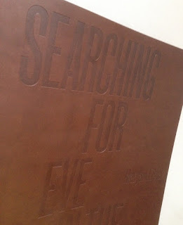
This is an catalogue for an exhibition of work by Maryam Eisler titled "Searching For Eve in the American West".
Eisler photographed female models within the desert surrounds. As the academic, editor and writer Anthony Downey has written in his essay in the exhibition’s accompanying catalogue, this approach ‘answered the need to understand the discombobulating landscape through the reassuring presence of human figures. In its isolated and sparsely inhabited environs, the region is perhaps almost too much to experience on one’s own.’ Eisler is not the first photographer to be inspired by this wild landscape – others include Ansel Adams and Edward Weston. Indeed, a statement made by Weston might equally apply to Eisler’s inspiration: ‘The camera should be used for a recording of life, for rendering the very substance and quintessence of the things itself, whether it be polished steel or palpitating flesh.'

Now this is already a pretty special project having won the category for the best catalogue design at the British Book Design and Production Awards last year
The size of the catalogue is 395x260mm, portrait. The binding is a hybrid mixture of "swiss binding" and singer sewing, so the text is bound and glued to the inside back cover, enabling the text to sit nice and flat.
 
Detail showing the cloth tape along the spine: 
Introduction by Maryam Eisler, followed by an Essay by Anthony Downey:
The 44pp text is printed on our Omnia 150gsm which gives it that dead matt, tactile feel but with great reproduction. All printed offset litho throughout. The piece has a fantastic feel - solid flat areas of colour work amazingly well - it is difficult for me to say too much more about it - see the images below, they speak for the job...
A wonderful collection of solid colours, all printed as specials
The images are printed in two blacks (as duotones) plus a yellow special integrated with the image, the result of which is superb, as I hope you can tell from the images....
...and here we go for a bit of a plug!  - As you can see from the above images above, there is lots of colour and images with dark areas - loads of ink going down and it looks great on the Omnia, reproducing flat colours superbly whilst retaining that all important detail in the dark areas (in my opinion- but I would say that wouldn't I?)
Centre Spread with the singer sewn binding:
Detail of singer sewn threads:

Catalogue design is by Roger Fawcett-Tang of Struktur Design. It is beautifully printed and finished by Printsmith who are based in Acton, West London ...interestingly they are one of the few printers I know of who have "singer sewing" in house!

As I mentioned it won the award for best catalogue at the BBD&PA awards, which you can read about here:

 
https://www.maryameisler.com/
http://www.struktur.co.uk/
https://www.printsmith.uk/
Posted by Justin Hobson 12.07.2018