Launched in 2017, the project is the culmination of a three-year study, that has acted as the foundation and prototype for the training programme.
The PEEL project has been developed into curriculum based resources to enable educators and service providers to run the programme.
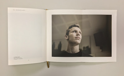
This limited edition book comprises 30 studies, each with their own unique poem and photographic portrait and containing the latest statistics. Size is A5 (210x148mm) portrait has 114pp of text (plus the throw outs) in a 'casebound' cover and section sewn binding.
https://www.printsmith.uk/
 |
| Click on images to enlarge |
The amazing thing about this book is that each of the 30 case studies is printed across a right handed 'throw out' in the book.The book is printed Offset Litho on GardaPat 13, Klassica 115gsm. For readers not familiar with GardaPat 13, it's a fully coated paper but it really does have a dead flat MATT surface. There are many papers on the market which profess to be matt - some which incorporate the word matt in the name, but aren't! Apart from the high quality matt surface, this paper has an extraordinarily high bulk (thickness).It is hard to describe the 'dead flat' mattness that is a characteristic of this coated paper but the print result is totally flat as you might see in the below images...
Gardapat Klassica is a pale ivory shade and is perfect for colour reproduction as well as the solid colour and metallic gold used for the statistic section...The reproduction and printing is excellent and does the superb photography justice, however the feature that is most amazing about this book is the attention to detail in the binding - it is simply incredible. |
| Click on images to enlarge |
If you look at the above image showing the foredge of the book, it looks perfectly even, in fact it's flawless - but then consider that 30pages of this book are throwouts! It is points of a millimetre perfect!
The inside sewing is perfect as you can see in the image below...
...and the spine is equally as perfect.
Marksteen Adamson is co-founder of Cheltenham marketing and brand agency ASHA. Design of the book is by the team at ASHA with designers Scott McGuffie, Simon Dryland, Emily Kane and Hannah Mapleston.
...and the spine is equally as perfect.
Marksteen Adamson is co-founder of Cheltenham marketing and brand agency ASHA. Design of the book is by the team at ASHA with designers Scott McGuffie, Simon Dryland, Emily Kane and Hannah Mapleston.
The superb print and even more exceptional binding is by Fenton at PrintSmith. A truly amazing piece of print and binding.
Posted by Justin Hobson 20.11.2020


