Showing posts with label Shiro Echo. Show all posts

Thursday, 14 November 2024

TIC CC

TIC CC is a UK brand of performance cycling clothing. Created for road athletes looking to achieve extraordinary things, their products are defined by the finest technical fabrics, hours of development and testing time, and a unique ‘peloton style’ aesthetic. The brand is also passionate in their commitment to sustainability...


Make responsibly — protect the irreplaceable! As riders we see it as our duty to do all we can to reduce the harm, protect the irreplaceable and make a positive difference. We are as passionate about ‘how we make’ as we are ‘what we make’
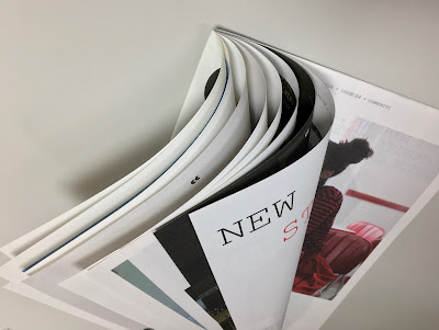
This is the printed promotional literature for their collection, used both as a mailer and sent out together with orders. The format is a 16pp, folded concertina, as you can see here...
The finished size is 240 x 170mm, folding out to 480 x 680mm.
Centre spread...
The idea for their photo shoot was based around the notion of ‘where we have been and where we are heading’. "We are more aware of the fragility of the world we live in based on our recent experiences of the pandemic. But tough challenges can lead to reflection, empowerment and renewed optimism. It’s the human spirit in action. The photography captures the optimism and sense of progression for the TICCC brand"

Fully extended spread...
Folding out to...
Click on images to enlarge
Be the Change - main spread
This promo represents their commitment to setting new industry standards for sustainability.

...and what about the paper? Well it has to be 100% recycled and our Shiro Echo, White in 100gsm was chosen, not just because it is recycled but it would handle the high density black CMYK coverage and the fluoro yellow would "pop" out!
...and it works beautifully.

Printing is by Identity Print in Paddock Wood and as I hope you can tell from the images, they have made a fantastic job. The solid black is amazing but still letting the images and the detail within them work. 
Creative direction and design is by TIC CC and Hugh Miller.

Interestingly, having spoken to the company founder, Andrew Monk, about the project, I learnt that this is their first piece of promotional print. As an online retailer, all their information is available online, but he increasingly regards print as an important way of getting their messaging and brand across, which is great news. After all, in this virtual world, there's nothing as immediate as something physical you can just pick up and read.

Posted by Justin Hobson 14.11.2024

Wednesday, 18 September 2024

CC4 - Community Clothing

Founded by British Fashion Designer Patrick Grant, Community Clothing is a social enterprise with a simple mission - to make excellent quality affordable clothes for men and women, to create great jobs for skilled workers and by doing this help to restore real pride in Britain’s textile communities. They do this by working with under utilised UK factories during their quiet periods, which is a great concept.

This is Community Clothing's look-book and catalogue CC4 and it is an absolutely superb publication, wonderful art direction, photography and printing. I wrote about the previous publication previously.
The size is 315x210mm, portrait and is a 32pp self cover which flops and rolls really nicely in the hand....
Click on images to enlarge
The publication is printed on our Shiro Echo, White 80gsm which is 100% Recycled and also carries the FSC Recycled classification. 

Shiro Echo is available in two shades; there is a white shade (which is a natural/off white) which is a bit like a newsprint/newspaper shade and a Bright White shade.
The publication is printed offset litho in CMYK throughout. The colour is bright and vibrant and the image reproduction is excellent as I hope you can see - bear in mind it's printed on an 80gsm 100% Recycled!
Below is a detail image which shows the excellent image quality - note the excellent fleshtone reproduction.
Click on images to enlarge
The below spread explains the mission and the locations in the UK where the 28 factories are located.
Design is by Moving Brands. Printing is by Principal Colour. A really superb piece of design and print.

Posted by Justin Hobson 18.09.2024

Wednesday, 4 September 2024

Jobs from the past - Number 178

Regular followers of this blog will know that my first post of every month is a "job from the past" so that I can show some of the really good work from years gone by - this project is from 2011, even though it is titled 2016!

Knight Frank - London 2016
This is a fascinating and beautifully produced book commissioned by leading international property consultancy, Knight Frank to visually communicate their predictions for London's commercial property market, in a project titled 'London 2016'.

Five years doesn't seen too far away, but the invitation to their September conference is worded as follows:
"In 2006, no one owned an iphone, Lehman Brothers' market capitalisation was $40 Billion and Bear Stearns' was $20 Billion, Iceland had a triple A credit rating, Twitter signed up it's 50th tweeter in July - think how different the world will be in five years time..."
(...that makes you think!)

Knight Frank commissioned London based agency YCN to produce the conference collateral, including this specially produced book to be given as a take-home pieces for select clients detailing the company's view of London in five years time.
The size of the book is 185x245mm, portrait. It is printed on SHIRO Echo, White (100% recycled) which has a "natural" off white shade and works well with the illustration and text. The book is made using two text weights 160gsm for the three throw-out pages and 100gsm for the main text made up of 45 "French Folded" sections.
The casebound book is covered in dark grey bookcloth and is hot foil blocked in silver.
All the text is "French Folded" as you can see below:
The creative team at YCN on the project is as follows:
Project Director: Alex Ostrowski
Art Direction & Design: Alex Hunting
The text features illustrations by Samuel Green and infographics by Chris Clarke
...and particularly remarkable (other than the paper, of course!) is that the job has been printed digitally by Pureprint on an HP Indigo press and the result is just superb. The solid colours alone compete with the quality achievable with offset litho. Simon Cooper at Pureprint handled the project.
 ...and a lovely touch is the rubber stamp used to personalise and number each of the 150 copies:
https://www.knightfrank.co.uk/
https://agency.ycnonline.com/
https://www.chris-clarke.co.uk/
https://www.pureprint.com/
Posted bu Justin Hobson 04.09.2024

Thursday, 18 January 2024

CC3

Founded by British Fashion Designer Patrick Grant, Community Clothing is a social enterprise with a simple mission - to make excellent quality affordable clothes for men and women, to create great jobs for skilled workers and by doing this help to restore real pride in Britain’s textile communities. They do this by working with under utilised UK factories during their quiet periods. What a wonderful concept.
This is Community Clothing's lookbook and catalogue and it is an absolutely superb publication, wonderful art direction, photography and printing.
 
The size is 330x230mm, portrait and is a 32pp self cover which flops and rolls really nicely in the hand....
The publication is printed on our Shiro Echo, White 90gsm which is 100% Recycled and also carries the FSC Recycled classification.

Shiro Echo is available in two shades; there is a white shade (which is a natural/off white) with a newspapery looks and feel and a Bright White shade too.
Centre spread is a map showing the locations in the UK where the factories are located.
Click on images to enlarge
 Solids look excellent
Below is a detail image which shows the excellent image quality - note the excellent fleshtone reproduction.
Very nicely finished too as you can see from the wire stitching
Design is by Moving Brands. Printing is by Principal Colour. A really superb piece of design and print.

https://communityclothing.co.uk/
https://www.movingbrands.com/
https://www.principalcolour.co.uk/
Posted by Justin Hobson 18.01.2024

Tuesday, 24 October 2023

Book of I

The Book of I is a notebook style publication produced for Accenture. It is an internal publication for employees to note their personal development. Size is 210x137mm portrait with a 4pp cover and 128pp text and is section sewn, the spine is 10mm thick. On the outside cover it is simply printed and blind embossed on an embossed cover from that well known "Hull-based" paper merchant!
Being an internal publication, it isn't appropriate to show you the inside text pages, suffice it to say the job is printed offset litho in just one colour with the majority of pages are just printed as lines...
...or squares
...or dots
 [Please excuse my fingers appearing]

The below image shows the very neatly sewn sections.
The 128pp text is printed on Shiro Echo, Bright White 120gsm, which is our 100% recycled paper with FSC accreditation.

Print and hot foiling is by Identity Print, based in Paddock Wood with Paul Martin handling the project.

https://www.identityprint.co.uk/
Posted by Justin Hobson 24.10.2023