Showing posts with label Tom Sharp. Show all posts

Friday, 11 September 2020

D&AD Awards 2020

Yesterday evening it was the D&AD awards, which this year, was an online affair. I've been fortunate to have been invited to the awards dinner a few times over the years and been on the table of those who have won yellow pencils for projects for which I've had input and they have been very memorable evenings!

Given the circumstances, the awards this year were very well executed and superbly presented by D&AD President Kate Stanners Saatchi & Saatchi Global CCO).
A phenomenal 618 pencils were awarded, including 384 Wood, 150 Graphite, 68 Yellow, and 4 elusive Black Pencils. One of the black pencils worthy of note was for typeface Universal Sans, a variable typeface that allows for an extensive range of customisation and unique variations produced by Family Type.

This year, many of the studios that I have worked with over the years, including Johnson Banks, NB Studio, Magpie, Osborne Ross and Here Design, to name but a few, have been nominated and won awards.

It's always lovely to have been involved with a project which has won an award and even better, a project which has won two awards...

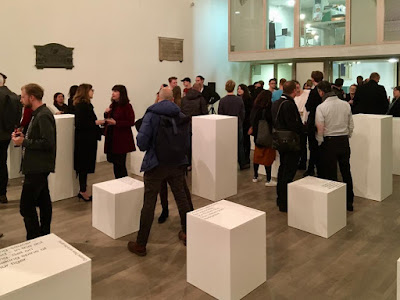
Twenty-five Sculptures In Five Dimensions was a self-promotional project for writer Tom Sharp. It was a demonstration of creativity within strict technical writing and design restraints, an experiment in reading and seeing, and an attempt at creating a sublime, meaningful experience with as few elements as possible.

I wrote about the actual event on my blog, last November  HERE.
Tom Sharp filled a high-ceilinged church in Covent Garden with 25 plinths. Each plinth held a text created to a strict format of five syllables per line, five lines plus a title. Each piece of writing described an original, imaginary object, so that any emotional response the reader had was because of the object they conjured up, rather than language manipulation.
The project was a collaboration with Studio Sutherl&. Tom Sharp and Jim Sutherland are the Creative Directors, writer is Tom Sharp and the designer is Rosey Trickett. The printed sheets were all printed on our wonderful Sixties paper and printed offset litho by Boss Print.

Yesterday evening this project was awarded a Graphite Pencil [Graphic Design] for Self Promotion and a Yellow Pencil [Graphic Design] for Writing for Graphic Design.

Congratulations to all participants in this year's awards. It has been a strange year, but life goes on and it's great to see that the creative industry is still producing and recognising great work, even in these unprecedented times.

You can watch the 2020 D&AD awards and check out the winners HERE

https://www.thepoetryofitall.com/
http://studio-sutherland.co.uk/
https://www.bossprint.com/
Posted by Justin Hobson 11.09.2020

Tuesday, 28 April 2020

The Weeping Cufflinks

This is the latest poetry publication from Tom Sharp and is described as "a capitalist folk-horror cautionary tale in the manner of a Jacobean pamphlet". It is designed and woodcut illustrated by Katherina Tudball. This is their third creative collaboration and a part of the Faery Fellers project.
Size is 230x145mm, portrait and is a 24pp self cover printed on our Redeem 100% Recycled 100gsm.
Click on images to enlarge
Below is centre spread. The binding is three hole sewn, in keeping with a style of binding that would have been familiar even in the 17th century ...before the invention of staples!
The below image shows the binding, using natural thread
Redeem 100% Recycled is a neutral white shade and is just perfect for this publication - many designers might have just used a cream paper, but this is just the right paper and really works superbly with the wonderful type and woodcut.
Detail of the woodcuts...
Click on images to enlarge
The below image shows the external image of the three hole sewing,
The printing, finishing and binding is by Boss Print who are based in Acton, West London. The edition is 1000 copies and you can buy a copy here.

https://www.thepoetryofitall.com/
https://www.faeryfellers.com/
https://www.bossprint.com/
Posted by Justin Hobson 28.04.2020

Thursday, 21 November 2019

25 sculptures in 5 dimensions

The installation ‘Twenty-five sculptures in five dimensions’ manifested for one night only this week on Tuesday 19th November in the Swiss Church, Covent Garden. The exhibition is conceived and sculpted by poet Tom Sharp, designed by Studio Sutherl&, soundtracked by Tony-nominated composer Alex Baranowski, with an introductory essay by art writer and curator Anna Souter. In a high-ceilinged environment of contemplation the guests experienced twenty-five sculptures. They exist between the four dimensions of thirty syllables and the fifth dimension of your mind.
Words about the exhibition are as follows... "Each sculpture is made from four dimensions of thirty syllables – a five syllable title and five further lines of five syllables – combined with the material of your imagination. The sculptures do not exist without your consciousness and these sculptures are about your consciousness. How language shapes it. How distinct it is from the blood and mess of your body. Whether it is a fundamental of the universe or a materialistic phenomenon destined one day to be recreated by IBM. What art’s role in exploring consciousness is. How we create an unnatural division between our minds and the many minds of nature." 
Each of the sculptures is made from a pillar of paper - made up using sheets of our Sixties paper in 60gsm. SIXTIES is a new paper which has a similar translucency as a tracing paper - but it feels like a normal paper! … you can see the translucency in the image below:
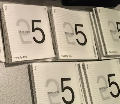
There is also a catalogue produced using the same Sixties paper
There is an introductory essay by art writer and curator Anna Souter, placing the work in an art historical context. The catalogue is five inches square (127mm sqaure), with five Helvetica Neue 55 type sizes and is singer sewn, as you can see below...
The books are produced in a limited edition of 200.
Design is by Studio Sutherl& and the print of both the sheets and the book is by Boss Print and are printed offset litho in just one colour throughout.

https://www.poetrybytomsharp.com/collection/twentyfivesculptures
http://studio-sutherland.co.uk/
https://www.bossprint.com/
Posted by Justin Hobson 21.11.19

Tuesday, 11 June 2019

Naomi's Poem

This project is a collaboration between Tom Sharp – poet, writer and founder of The Poetry of it all and Katherina Tudball, Creative Director at Superunion
In a limited edition of 200 copies, the publication confronts some cliff-edge health news Tom’s sister received in August last year. Through poetry, Tom began documenting the siblings’ emotional journey – as fears, nostalgia, regrets and love became the focus of their conversations.
The size of the book is 230x100mm, portrait.The only immediately readable type is the title and a short introduction on the inside front cover (above)
...as each section of the poem is bound within a French-folded text printed on our lightweight Offenbach Bible 60gsm, meaning that it is hidden from sight and requires the reader to tear the paper in order to read. Below you can see the torn pages revealing the poem.
Click on images to enlarge
‘Naomi’s Poem’, is a single epistolary poem in twelve sections, shared between brother and sister as part of a therapeutic creative conversation.

The text is made from 12x 4pp French folded sections. Below shows one unopened book and one with the torn pages...
Rich with drowning imagery, the poetry is set in 8pt Doves Type, the typeface famously lost under the waters of the Thames for 100 years before being rescued and accurately recreated by Robert Green.
The truly amazing binding is stitching that mirrors surgical patterns. As part of the design process, Katherina and Tom consulted with Fleur Oakes, Imperial College’s Vascular Surgery Department’s Lacemaker in Residence.
Click on images to enlarge
The printing, finishing and binding is by Boss Print who are based in West London and it is truly superb - yes, they managed to sew the book like this! The text is all printed on Offenbach Bible 60gsm and the cover is printed on Colorset Natural 270gsm

This is a highly personal project which has been produced in a truly amazing way. I am very grateful to have received my copy - No 172 of 200.

https://www.superunion.com/
https://www.thepoetryofitall.com/
https://www.bossprint.com/
Posted by Justin Hobson 11.06.2019

Thursday, 28 September 2017

National Poetry Day 2017

Today is National Poetry Day! The annual celebration that inspires people throughout the UK to enjoy, discover and share poems.

National Poetry Day was founded in 1994 by the charity Forward Arts Foundation and today it enjoys the support of the BBC, Arts Council England, the Royal Mail and leading literary and cultural organisations, alongside booksellers, publishers, libraries and schools.

...so what better day to write about a wonderful new poetry book, which just happens to be printed on our paper!
Tom Sharp is Creative Director, copywriter, co-founder of The Beautiful Meme,  a Fellow of The Royal Society of Arts ...and Tom is also a poet! This is his latest publication titled 'English Pan'.
This is a 32pp publication which is 215x153mm, portrait and is singer sewn using black thread. It is printed in just one colour throughout.
There are twelve poems in the publication, all written by Tom Sharp. The superb illustrations are by Shaun Campbell.
The paper used for the 28pp text is our Neptune Unique Softwhite 120gsm, which is an uncoated off-white, smooth (yet tactile) text and cover paper - just the right material for black type to look brilliant on.
The 'cover' however, is a different matter and is actually on a brand new material in our range called SIXTIES and is 60gsm. It is a fine quality, similar to our Offenbach Bible in many ways but with one major difference - unlike a genuine bible paper which has a high opacity, this new paper has the same translucency as a tracing paper - but it feels like a normal paper! ...as I hope you can see from the picture below:
Wonderful use of a material for a cover - unexpectedly lightweight, covering up; yet revealing the title and it works superbly with the singer sewing:
Each one is hand numbered and a limited edition of 100 and my thanks to Tom for sparing me a copy.
The design is by the studio at The Beautiful Meme. Print and finishing is by Kingsbury Press.

Posted by Justin Hobson 28.09.2017