Tuesday 12 June 2012

Pentagram is 40

Pentagram was founded 40 years ago today. On 12th June 1972,  Alan Fletcher, Colin Forbes, Theo Crosby, Kenneth Grange and Mervyn Kurlansky formed a new company called Pentagram in London. There are now 19 Pentagram partners working from five offices around the world and it is a thriving, multi-disciplinary, design business.

Over the years, I've been fortunate to have worked on some really beautiful projects with the Pentagram London office, a few of which appear on this blog. I've met and worked with some amazing people, including the late Alan Fletcher and been introduced to many designers who started their careers at Pentagram ( ...far too many to list!). I find the company an inspiration.

Happy 40th Birthday to Pentagram.

www.pentagram.com
Posted by Justin Hobson 12.06.2012

Monday 11 June 2012

Hincredible Hinglish

...nothing to do with our paper but I thought this was of interest!

I was sent a link about this project undertaken by Incredible India which is the Indian government tourist office.

They commissioned a typeface which is specifically designed so that you can tell the phoenetic sound of a Hindi character by looking at the corresponding Roman character superimposed on it. Hindi is written in the Devanagri script which has many more characters that the English alphabet, therefore this font cannot tell you how to read words as they are spelt in Hindi but it's aim is to demystify individual letters in its script and make India more approachable.

Interesting stuff ( ...I thought):


Personally I think this is lots of fun and a great experiment in typography.
Have a look for yourself:
http://www.thehinglishproject.com
Posted by Justin Hobson 11.06.2012

Friday 8 June 2012

Book - Wrap

Here's an interesting little project that I was able to help out with.

 This is Real Art has just published their first book under their new TiRA publishing imprint.

Shibuya by Adam Hinton is a limited edition photo book (500 copies) documenting Japanese commuters at the world's busiest station and intersection: Tokyo's Shibuya. A sequence of 29 portraits revealing both the misery and pressures involved in the daily commute. Case bound in soft grey cloth, the cover has a simple foil embossed graphic from the Japanese 'walk/don't walk' sign, along with the books title in katakana lettering.

Anyway, they wanted something lovely to wrap the book in and after I sent samples, decided that our Offenbach Bible in 40gsm had the right physical properties for folding whilst also having the right feel to go with a publication about Japan, which is a very paper conscious society.

The poster/wrap is printed with a halftone (monotone) image in Pantone 1795 on Offenbach Bible 40gsm. The image forms the inside of the wrap. The plain paper side (outside) which is left white is then stamped with a custom made rubber stamp.


Printing on the Offenbach Bible 40gsm (which isn't every printer's cup of tea!), was beautifully done by Robert Young at R.Young & Son, based in Croydon.
Paul Belford is Creative Director at This is Real Art and Martin Brown is Head of Design.

http://www.thisisrealart.com/products/view/3/adam-hinton/shibuya
http://www.thisisrealart.com

Posted by Justin Hobson 08.06.2012

Wednesday 6 June 2012

Jobs from the past - Number 32

Regular followers of this blog will know that my first post of every month is a "job from the past" so that I can show some of the really good work from years gone by...

The Fourth Estate Catalogue 
July-December 2003

The Fourth Estate is a publishers that many people will be familiar with. Founded by Victoria Barnsley in 1984, Fourth Estate built a reputation as one of the most innovative and eclectic imprints in the industry, with a reputation for publishing a wide variety of critically-acclaimed and beautifully-produced titles including many prize winning authors (Booker, Orange etc).

One of the things that made the Fourth Estate stand out from the crowd was their catalogues - they were simply amazing pieces of design and print! I was lucky enough to work on a few different catalogues in the late 90's and early 2000's. Every single one was different and brilliant. Good designers were comissioned, Bogue & Hopgood, Instinct, Rose Design, Frost, Neville Brody, Tom Hingston to name a few. In line with their reputation for publishing unconventional yet innovative titles, the design of the catalogue was equally eclectic.

This is one of the last catalogues I was involved with, designed by Tom Hingston Studio.
Here's the comment from Tom Hingston's website: "For our design of the Fourth Estate July-December 2003 catalogue we took inspiration from the aesthetic of an authors manuscript. This gave us the opportunity to explore the use of type as image, to illustrate each title in a way we felt appropriate for a books catalogue"
The size of the book is 150x215mm, portrait. It is casebound (hardback). The book is divided into two sections, new releases 1-32pp and the remainder 33-56pp. The papers used are both lightweight. The first section is of the catalogue is printed on Redeem 100% Recycled FTP 90gsm and the second section on Myriad Colours Yellow, 80gsm. End papers are on Episode IV 115gsm. The cover is covered with self coloured bookcloth and foiled (beautifully) in black foil.

Detail


Design director is Tom Hingston, designer on the project was Manuela Wyss.
The job was printed in two colours by Wisbech based printers Balding & Mansell, who are now sadly defunct.

Victoria Barnsley, founder of Fourth Estate, joined Harper Collins as CEO and Publisher in 2000 when it acquired her company ( ...she did well!). These distinctive publications continued to be commissioned and produced for a few years after becoming part of a larger group. Sadly (and I guess it was just a matter of time) the Fourth Estate became a section within the homogenised Harper Collins catalogue and the individual publications ceased.


Posted by Justin Hobson 06.06.2012

Thursday 31 May 2012

Preen Resort Invitation

Preen began life as a bijoux boutique on London's Portobello Road in 1996 and is now one of Britain's hippest labels. Design duo Justin Thornton and Thea Bregazzi count Kate Moss, Michelle Obama and Samantha Cameron among their customers. Their Resort 2012 collection is based on a Japanese references being hand-embroidered, block-printed onto silk, and knit into intarsia sweaters.

This is the invitation for the launch of the collection in London at the Club at the Ivy (very fancy!). It's not an easy one  photograph satisfactorily - it's worth clicking on the images to bring them up to scale. The size of the invitations is A5 (210x148mm) portrait. It is printed in two colours (offset litho) in red and black on our Flora Noce 240gsm. For those not familiar with Flora, it has a natural "rustic" feel and this shade is a light buff colour and it has small wood shives in the sheet. The Flora has then been mounted/pasted on our exceptionally thick Monoblack 1400mics to give the finished item a black edge.

It works really well, but is really hard to demonstrate in a photograph!

...and here is the pic which shows the black edge:

Design by Studio Thomson. Printing and the finishing (duplexing) is by Xtraprint based in London EC2.
...and thank you for the note, Mark.
Posted by Justin Hobson 31.05.2012

Wednesday 30 May 2012

Victoria Walmsley & Co...

Last week I popped in to see Victoria Walmsley, who recently left Blast, in her new East London studio. She shares space and collaborates with illustrator Owen Phillips and they are also members of  The Bread Collective.
Anyway, as you can see from the pic, they're very happy in their new studio space and I was happy when I was offered a mug of tea, which looked like they'd got in just for me (being six foot six!)
Thanks for the tea and best of luck with the new venture.

www.victoriawalmsley.co.uk
www.owenp.com
http://thedailybread.co.uk/
Posted by Justin Hobson 30.05.2012

Tuesday 29 May 2012

Portsmouth Summer Show 2012


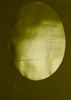
I can truly describe this project as pure Gold! This is the poster and invitation to the forthcoming University of Portsmouth, 2012 Summer Show. There is an A1 (594x820mm) poster on Colorset Solar 120gsm and an invitation (297x105mm) on Colorset Solar 270gsm. Both items are hot foil blocked only (no print) in two colours (metallic gold and pigmented white foil).
The design is by Michael Harkins, who is a senior Lecturer in Graphic Design and the course leader of the MA Graphic Design at the University of Portsmouth and I asked Mike to write some words to explain the project:

"The poster and identity for this year's Summer Show ties together many themes, as is usual in the work I produce. Firstly the show is the high point in the academic year, it is also the month where the sun reaches its zenith (in this part of the world at least), additionally we often refer to this month as 'Golden June'. This nicely fits in with the idea of the 'Gold Standard', especially this year being an olympic one, so there is a cultural echo here in the identity. This is a time of year when students are showing their best work, not for the sake of winning but completing. The circle also reflects the last element in the University logo (originally designed by Banks and Miles). This can also be interpreted as completing – leaving the University with achievement. Thus, on the poster the names of the courses within the circle have completed at this point in terms of the show. The gold foil and terrifically sunny Colorset Solar, also help to give a feeling of celebration and opulence in these somewhat austere times. Although in ethical terms, the production and paper were actually a cheaper alternative to printing at this size in two colour litho. There is also less waste in terms of make ready etc. with regards to the paper"


The foil blocking was produced at Reflections print finishers in London. Mike mentioned that Bill Fletcher at Reflections deserves a special thank you, as the job was not an easy one to produce due to the huge area of foil on the poster - it does look absolutely stunning.

The private view is this Friday (1st June) and is open for general viewing on Wednesday 6th - Wednesday 13th June at the Eldon Building at University of Portsmouth - you should go and you may see something golden!
Posted by Justin Hobson 29.05.2012