Showing posts with label Flora Betulla. Show all posts

Friday, 4 September 2015

New Flora swatch

We have a brand new swatch for our Flora range manufactured by Cordenons in Italy!
Click on images to enlarge
Flora is available in nine natural shades and it comes in a sensible range of weights: 100, 130, 240 and 350gsm (160gsm is also available from the mill).
For those not familiar with Flora, it is a part recycled paper (with FSC accreditation) with natural, deliberately visible, inclusions and fibres. It has a tactile, rough feel and has a character all of it's own! Below is detail showing the inclusions (and a pencil for scale!):
It really is a lovely range. Muted natural colours and excellent printability. Here are some previous projects which have used Flora to great effect:
http://justinsamazingworldatfennerpaper.blogspot.co.uk/2015/06/baines-fricker.html
http://justinsamazingworldatfennerpaper.blogspot.co.uk/2014/08/lower-mill-estate.html

If you would like one of the new swatches, just drop me an email: justin@fennerpaper.co.uk

http://www.gruppocordenons.com/en/home.html
http://www.cordenons.co.uk/
Posted by Justin Hobson 04.09.2015

Monday, 27 April 2015

Fieldwork literature

Last week I received a lovely little envelope in the post. Contained inside was a selection of printed items from  Emily Macaulay at Stanley James Press, a "Brighton based design company, specialising in the design and production of printed goods"
 
The items in the pack are pieces of printed literature for an organisation called Fieldwork.  Fieldwork is a company that does ethnographic research into people's working lives and they produced a pack to help assist with the collaborative part of their research.
 
There are two notebooks with covers on Flora Betulla 130gsm - covers are three hole sewn. There are business cards on Flora Betulla 350gsm. They are printed one colour letterpress and are beautifully produced. 
Below is an A5 form, printed on Flora Betulla 130gsm ...but there is a lovely touch...
in the top left hand side of the form, a lovely neat de-boss produced using their Adana letterpress:
 
Stanley James Press describe themselves as follows: We enjoy designing and making real things, physical things that you can hold in your hands. We mainly make paper things like books, interesting mail-outs and portfolios. We can letterpress things, we design complicated fold out and pop up things. Most importantly we love a challenge and projects that make us consider how to make things differently.

Design, Print and production by Stanley James Press. Illustrations by Eliza Fricker

www.stanleyjamespress.com
Posted by Justin Hobson 27.04.2015

Tuesday, 24 June 2014

Around the World

‘Around the World’ is a set of six A3 prints by Tom Love. These screen prints are reproductions of airline luggage tags from the 1950s, produced as striking pieces of wall art
Here are some words about the project, by the designer, Tom Love:

"My Around The World Series features six original airline tag designs. From such airlines as the iconic PANAM to Quantas, depicting the four corners of the world and celebrating the new found accessibility of foreign lands, which commercial airlines bought to the general public throughout the 1950s and beyond.

These designs symbolise the golden age of travel: where privileged passengers were whisked off on journeys around the world. Landing in exotic destinations, where they would encounter for the first time, exotic cultures and cuisine and incredible landmarks and landscapes; This indulgent and pioneering era of discovery and adventure has left behind these wonderful relics of an era gone by.
There is something very special about the designs of these tags. Now viewed in an entirely new context, decades since when they were originally tied around baggage handles and sent on their merry way through airport carousels. It's this strong sense of nostalgia and adventure, as well as their striking typography and graphic design that inspired me to start collecting them, and now to re-create and share them with you as over-sized pieces of art."
The project was successfully funded through Kickstarter and here's the original link:
https://www.kickstarter.com/projects/904917574/around-the-world-six-limited-edition-screen-prints
Tom Love is an accomplished designer who has worked with many of the top design agencies and is currently a senior designer at SalterBaxter. Tom has recently started producing his own limited editions and this is the third project he has completed, so far.

The prints have been screen-printed in 3 colours by Gary Parselle at Brighton based silkscreen studio, The Private Press, and these are the pictures from the studio when they were in the drying racks:
The paper chosen for the project is our Flora, Betulla in 350gsm. Flora is a recycled paper (and FSC accredited) with an overtly recycled look and feel - it has natural, deliberately visible inclusions and yet still prints beautifully. It truly enhances the look and feel of a project such as this where the visual look of the material makes a massive difference to the aged look of the finished piece
 
Thanks to Tom Love and Gary Parselle at the Private Press for sending me the images and giving me all the information.

...and you can buy these prints now, on the following link:
http://tomlovecreative.com/screen-prints/

Posted by Justin Hobson 24.06. 2014

Thursday, 28 March 2013

Chocolate Farm

Here's a chocolatey post for this eggy time of year!

It's only rarely that we get involved in packaging, as the vast majority of board used for packaging is very ordinary with lots of print and processes. Occasionally a lovely brief comes along, where a material is required to convey quality, yet have an understated look and feel and this is just one such project.
These lovely small boxes contain a 45gram block of handmade Chocolate from the Chocolate Farm which is made using only the finest natural ingredients.

The boxes are 80mm square with a 9mm capacity. They are made using our Flora Betulla 350gsm which is a part recycled FSC board which is off white with deliberate inclusions and specks. Each box is simply printed in one colour, offset litho and is hot foil blocked with metallic foil - each type of chocolate with a different colour foil:
By printing all the boxes up together on one sheet, the job is made more cost effective and the foiling only involves one die, just a change of foil colour, again making this cost effective. The boxes are then "die-cut" (same die for all three) and assembled by hand with the flaps affixed with a gold coloured self adhesive label.

Packaging and graphic design is by Isobel Bushell at Aardvark Illustration & Design, who also created the identity for Chocolate Farm.  Print is by Graphics and Print in Telford and the foiling is by Impact in Leicester.

...and thanks to Isobel for taking the time to send me samples of the bars and a lovely note:

Posted by Justin Hobson 28.03.2012

Thursday, 14 June 2012

make

Make is one of the UK's foremost architectural firms who have a host of awards and many iconic buildings to their credit.The practice was founded by Ken Shuttleworth in 2004 and now has studios based in London, Birmingham, Beijing, Hong Kong and offices in the Middle East.

Unusually, Make is a 100 per cent employee-owned organisation with each member of staff sharing in the profits each year which is interesting in a world which appears to be increasingly dominated by "celebrity" architects.

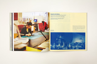
Each year, they produce an Annual which reviews and shows their work of the previous year and this year, I was fortunate enough to be involved with their eighth annual document, showing their work from 2011 and this publication really does show their work, beautifully.

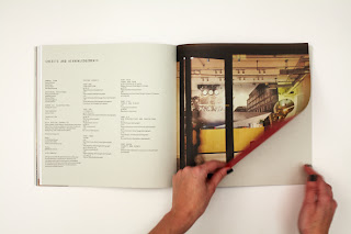
Size of the annual is 275mm square. It is "swiss bound" - if you don't know what that is, see the pic below. Basically the text is perfect bound with a strip of cloth binding tape. The text is attached to the inside back cover parallel with the spine, leaving the spine and cover free to open flat.

Inside spread showing "Swiss binding"
Thomas Clarkson Community College
7th Birthday Party
Fitzrovia development
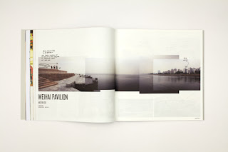
China sction - Weihai Pavilion
Camden Street Kiosk
Haringey Heartlands section
The Gateway Building
Private London residence
Credits pages

There are several interesting features about this job which are worthy of note. In total there are 140 text pages. The publication is divided into seven sections and there is a different paper used for each section. Most people who know me (reasonably well), know that I have a "three paper rule" so that no job should use more than three different materials ...unless there is a very good reason. This (in my opinion) is because if materials and weights change too much, the whole thing can lose flow and it can ultimately upset the reader. This piece uses six different materials (not all ours) and it really works!

The cover is on our Flora Betulla 350gsm which is printed CMYK and foiled in a matt white foil (the number 8). The other materials used of ours are Flora Betulla, 130gsm, Omnia 120gsm and most impressively of all, our Offenbach Bible 60gsm for the 24pp CHINA section which looks (and feels) amazing.

For the sake of balance, the other materials used (from other people!) are Heaven 42, 135gsm (from Scheufelen), Cyclus Offset 115gsm (ArjoWiggins) and Carnival Yellow 80gsm (Mohawk?)

It was designed and produced by Denise Ryan and Emily Chicken at Make and thank you for sending me a copy and your lovely note:
 
Printing and binding is by Graspo, based in Zlín, Czech  Republic.

www.makearchitects.com
http://www.graspo.com
Posted by Justin Hobson 14.06.2012