Showing posts with label Swiss Binding. Show all posts

Friday, 1 July 2022

Jobs from the past - Number 152

Regular followers of this blog will know that my first post of every month is a "job from the past" so that I can show some of the really good work from years gone by...

New Brook Buildings 2010

Here is a job which that just exudes fantastic quality of both print and finishing (oh, and of course a pinch of all right design as well!). The project is a brochure for a property called New Brook Buildings.

Size is 240x330mm. Key points of interest is the fantastic de-bossing on the front cover (which if you enlarge the pic below, you should be able to see). It is also "swiss-bound" (explanation below) and the text is stepped with divider pages (printed with mono imagery).
Below pic shows the Swiss binding. For those that are unfamiliar with this type of binding, it is essentially a section sewn or perfect bound binding method which has a "lip" of about 15/20mm of cloth wrapped around the spine. The cloth covered spine is stuck flat on the reverse of the text block with a strip of glue into a 4pp cover with a "freestanding" spine which means that the cover (which can often be very springy with normal adhesive binding) sits very flat.
Click on images to enlarge
The text is stepped and is very tricky from a production point of view, especially with this type of binding. This has been done exceptionally well.
Below is the opening spread - inside front cover on left, stepped text on right.
The paper used is our Omnia - 320gsm on the cover and 120gsm for the text. The reason that Omnia was chosen is because it would beautifully reproduce the photography with the rich imagery of locations, the solid reds and detailed images. Of course the most important thing is for the publication to be special - with the reproduction that you would expect on a silk or gloss but with a natural tactile uncoated feel. Some of the spreads below: 
Design is by London design agency dn&co who specialise in property branding. Creative Director was Ben Dale. It was printed by Push based in Bermondsey, who are sadly no longer in business.
Post by Justin Hobson 01.07.2022

Wednesday, 17 February 2021

The Sublime Feminine

Maryam Eisler is a London based photographer and author. Her photographic work, the crux of which is centred around the Sublime Feminine thematics, has been sought in different places and environmental spaces, a personal journey of sorts during which she has tried to trace and visually revitalize this energy, embodied in the female form, as set against the grandeur of nature. Eisler is represented by Tristan Hoare in London and Harper’s Books in New York.

The size of the book is 240x165mm, portrait. The 4pp limp cover, which is beautifully hot foil blocked, houses the 'swiss bound' text. 
Swiss Binding is where the text is mounted onto the inside back cover with the front cover and freestanding spine. The below image shows the inside front cover, inside spine and page one of text with the binding tape covering the spine.
There is an introduction by Maryam Eisler together with an essay by Hannah Barry.
The 100pp text is printed on our Omnia 150gsm which gives it that dead matt, tactile feel but with great reproduction. All printed offset litho throughout. The piece has a fantastic feel - solid flat areas of colour work amazingly well - it is difficult for me to say too much more about it - see the images below, they speak for the job...
Click on images to enlarge

The book is 'section sewn' - you can see the thread in this section break pictured below.
...and here we go for a bit of a plug! - As you can see from the images, there is lots of colour and images with dark areas - loads of ink going down and it looks great on the Omnia, reproducing flat colours superbly whilst retaining that all important detail in the dark areas (in my opinion- but I would say that wouldn't I?)
It goes without saying that the paper is just one aspect and if the quality of the images or the repro and the printing was not equally as superb, then the finished article would not be as amazing. The superlative printing is by Boss Print and you may remember reading on this blog that they won the category for the best catalogue design at the British Book Design and Production Awards in 2017 with another project for this same photographer. Below is a detail image showing the superb reproduction of the mono images.
The images are printed offset litho in two blacks (as a duotone) plus a yellow tint integrated with the images. The solid flat colours are all specials....
The section sewn and singer sewing makes the book flow easily in the hand.
Below image shows the detail of the section sewing. The Swiss Binding was completed in-house at Boss Print.
The book design is by Roger Fawcett-Tang of Struktur Design. It is beautifully printed and finished by Boss Print who are based in West London.

Monday, 5 October 2020

Jobs from the past - Number 131

Regular followers of this blog will know that my first post of every month is a "job from the past" so that I can show some of the really good work from years gone by and this publication is from 2014. 

67 Tufton Street SW1
Situated in the Smith Square conservation area, this Queen Anne style building was originally a Post Office and subsequently the UK Government’s Cabinet Office and a fine example of London’s architectural legacy. This office building was sympathetically restored and re-modelled to a plan by EPR Architects resulting in 22 luxury apartments.
This is the sales brochure produced to show the development, the surrounding area and the wonderful interiors. 
The size is 290 x 225mm, portrait, having a 4pp cover using a Buckram embossed chocolate brown cover board and is 'swiss bound'. The 56pp text is printed offset litho on our Omnia 150gsm. It is printed CMYK plus a metallic gold special and the result is absolutely superb.
The special pantone gold looks amazing ...really metallic and because Omnia is not smooth, it gives the feeling of something that is really metallic rather than something that is smooth and shiny.
Click on images to enlarge
The striking commissioned photography has reproduced brilliantly on the Omnia whilst not losing the tactility and natural uncoated feel that was required. The look and feel is a confident, beautifully crafted piece of literature, certainly not some "glossy property brochure"!
The swiss binding, still means that this brochure is made up using 'section sewn' signatures and above you can see the threads running across the inside spreads.
Click on images to enlarge
The metallic gold is used both as section dividers but also for the floorplan pages. The quality of reproduction of the interiors is wonderfully impressive with metallic fittings looking metallic and a photographic quality to the images.. 
The above and below images show the floorplans of the penthouse apartments.
The below image shows the Swiss binding. For those that are unfamiliar with this type of binding, it is essentially a section sewn or perfect bound binding method which has a "lip" of about 15/20mm of book-cloth wrapped around the spine. The cloth covered spine is stuck flat on the reverse of the text block with a strip of glue into a 4pp cover with a "freestanding" spine which means that the cover (which can often be very springy with normal adhesive binding) sits totally flat.
Branding for the development and the design of this amazing brochure is by London design agency The Ideas Factory under the leadership of Mark Wilkins. Designer on the brochure was Yafet Bisrat. Print production is by Push and it is superb. Both the "ink on paper" and the finishing/binding is amazing.

Posted by Justin Hobson 05.10.2020

Thursday, 12 July 2018

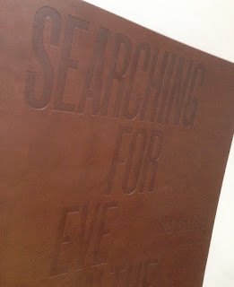
Searching for Eve...

This is an catalogue for an exhibition of work by Maryam Eisler titled "Searching For Eve in the American West".

Eisler photographed female models within the desert surrounds. As the academic, editor and writer Anthony Downey has written in his essay in the exhibition’s accompanying catalogue, this approach ‘answered the need to understand the discombobulating landscape through the reassuring presence of human figures. In its isolated and sparsely inhabited environs, the region is perhaps almost too much to experience on one’s own.’ Eisler is not the first photographer to be inspired by this wild landscape – others include Ansel Adams and Edward Weston. Indeed, a statement made by Weston might equally apply to Eisler’s inspiration: ‘The camera should be used for a recording of life, for rendering the very substance and quintessence of the things itself, whether it be polished steel or palpitating flesh.'

Now this is already a pretty special project having won the category for the best catalogue design at the British Book Design and Production Awards last year
The size of the catalogue is 395x260mm, portrait. The binding is a hybrid mixture of "swiss binding" and singer sewing, so the text is bound and glued to the inside back cover, enabling the text to sit nice and flat.
 
Detail showing the cloth tape along the spine: 
Introduction by Maryam Eisler, followed by an Essay by Anthony Downey:
The 44pp text is printed on our Omnia 150gsm which gives it that dead matt, tactile feel but with great reproduction. All printed offset litho throughout. The piece has a fantastic feel - solid flat areas of colour work amazingly well - it is difficult for me to say too much more about it - see the images below, they speak for the job...
A wonderful collection of solid colours, all printed as specials
The images are printed in two blacks (as duotones) plus a yellow special integrated with the image, the result of which is superb, as I hope you can tell from the images....
...and here we go for a bit of a plug!  - As you can see from the above images above, there is lots of colour and images with dark areas - loads of ink going down and it looks great on the Omnia, reproducing flat colours superbly whilst retaining that all important detail in the dark areas (in my opinion- but I would say that wouldn't I?)
Centre Spread with the singer sewn binding:
Detail of singer sewn threads:

Catalogue design is by Roger Fawcett-Tang of Struktur Design. It is beautifully printed and finished by Boss Print who are based in Acton, West London ...interestingly they are one of the few printers I know of who have "singer sewing" in house!

As I mentioned it won the award for best catalogue at the BBD&PA awards, which you can read about here:

 
https://www.maryameisler.com/
http://www.struktur.co.uk/
https://www.bossprint.com/
Posted by Justin Hobson 12.07.2018