Showing posts with label Jason MacLaren. Show all posts

Wednesday, 30 September 2020

De La Warr Events Guide

This is the Events Guide from last Autumn/Winter for the De La Warr Pavilion. The De La Warr pavilion is on the seafront in Bexhill in Sussex and is an iconic modernist building by the architects Erich Mendelsohn and Serge Chermayeff which opened in 1936. Following a major renovation in 2005, the pavilion hosts many shows, exhibitions and cultural events.
The finished size is 210x111mm, folding out to 420x553mm and is a 20pp concertina letter fold. Side view....
Below image shows the concertina folding...
This guide is printed on our StarFine White 130gsm which means that rather than feeling like the vast majority of mass produced leaflets printed on a bit of silk or gloss, this has real character and value. The design is such that the listings of the exhibitions, activities and events are all listed on one side (outside)
...with the inside being reserved for a full size image from the exhibition. The below image taken from the Renee So exhibition, Ancient and Modern.
The De La Warr identity and design (including the website) is by Playne Design who have studios in London and Hastings. Creative Director is Clare Playne. Print production is handled by Simon Hack. You can read more about the creation of the new identity here: https://playnedesign.co.uk/our-work/de-la-warr-pavilion/#branding-modernist-cultural-icon

The project is printed offset litho in CMYK by Empress Litho with Jason Maclaren handling the project - and my thanks to Jason for very kindly sending me some file copies.
https://www.dlwp.com/
Posted by Justin Hobson 30.09.2020

Wednesday, 6 May 2020

De La Warr Pavilion Summer Events Guide

This is last Summer's events guide for the De La Warr Pavilion. The De La Warr pavilion is on the seafront in Bexhill in Sussex and is an iconic modernist building by the architects Erich Mendelsohn and Serge Chermayeff which opened in 1936. Following a major renovation in 2005, the pavilion hosts many shows, exhibitions and cultural events. 
The finished size is 210x111mm, folding out to 420x553mm and is a 20pp concertina letter fold. Side view.... 
Click on images to enlarge
 Below image shows the concertina folding...
This guide is printed on our StarFine White 130gsm which means that rather than feeling like the vast majority of mass produced leaflets printed on a bit of silk or gloss, this has real character and value. The design is such that the listings of the exhibitions, activities and events are all listed on one side (outside)
Click on images to enlarge
 ...with the inside being reserved for a full size image from the exhibition. The below image taken from the HOW CHICAGO! exhibition.
Gladys Nilsson, A Cold Mouth 1968
The De La Warr identity and design (including the website) is by Playne Design who have studios in London and Hastings. Creative Director is Clare Playne. Print production is handled by Simon Hack. You can read more about the creation of the new identity here:
https://playnedesign.co.uk/our-work/de-la-warr-pavilion/#branding-modernist-cultural-icon

The project is printed offset litho in CMYK by Empress Litho with Jason Maclaren handling the project - and my thanks to Jason for very kindly sending me some file copies.
https://www.empresslitho.com/
Posted by Justin Hobson 06.05.2020


Friday, 26 April 2019

De La Warr Pavilion Events Guide

This is the latest events guide for the De La Warr Pavilion. The De La Warr pavilion is on the seafront in Bexhill in Sussex and is an iconic modernist building by the architects Erich Mendelsohn and Serge Chermayeff which opened in 1936. Following a major renovation in 2005, the pavilion hosts many shows, exhibitions and cultural events.
The finished size is 210x111mm, folding out to 420x553mm and is a 20pp concertina letter fold. Side view.... 
Click on images to enlarge
Below image shows the concertina folding...
This guide is printed on our StarFine White 130gsm which means that rather than feeling like the vast majority of mass produced leaflets printed on a bit of silk or gloss, this has real character and value. The design is such that the listings of the exhibitions, activities and events are all listed on one side (outside)
Click on images to enlarge
...with the inside being reserved for a full size image from the exhibition.
Lucy Orta , Procession Banners 1918-2018
The new De La Warr identity and design (including the website) is by Playne Design who have studios in London and Hastings. Creative Director is Clare Playne. Print production is handled by Simon Hack. You can read more about the creation of the new identity here:
https://playnedesign.co.uk/our-work/de-la-warr-pavilion/#branding-modernist-cultural-icon
 
The project is printed offset litho in CMYK by Empress Litho with Jason Maclaren handling the project - and my thanks to Jason for very kindly sending me some file copies.
http://www.playnedesign.co.uk/
https://www.empresslitho.com/
Posted by Justin Hobson 26.04.2019

Tuesday, 14 July 2015

Summer Club Cocktails

Dirty Martini  is an exclusive chain of seven London cocktail bars. As their name might suggest, they have a bespoke range of Martinis and signature cocktails.

The bars all have glamorous interiors and some of London’s best DJs regularly perform live sets at the bars.

This is the Summer Cocktails menu offering five exclusive and reasonably priced cocktails. The summer promotion is called Summerclub.

The simple 4pp menu is very simply printed in one colour, offset litho on our Stardream Gold 285gsm. Size is 160x90mm, portrait. Stardream is a mica coated board with a pearlescent/metallic finish.
Very kindly, Jason Maclaren at Cantate sent me file copies. I asked him to write a couple of paragraphs to explain the project...

"My client wanted to promote a drinks promotion and had no idea what paper to use, initially the brief was an ‘orange’ look, with black foil and a short text section. After looking at various finishes, combined with the problems in procuring material held at a paper mill in Italy (a 7 day delay) it was finally settled to use a more cost effective material called Stardream Gold, held in the UK by Fenner Paper ...and almost 60% cheaper than an alternative board from Bavaria!

A simple choice of paper adds gravitas to an important brand, this brand has used exquisite papers / finishes for its main menu. Having used fully oxidising inks, the sheets were movable 24 hours later allowing delivery 24 hours after this, in time for the launch. Having a knowledge of papers available, combined with simple planning, and simple technical research enabled a fast turnaround. It proves that relationships with your paper suppliers helps you to provide a solution for your clients."   Jason Maclaren, Cantate 
This is a project which is simple, from an "ink on paper" point of view has been well creased - something that is often overlooked. As you can see from the image below, a nice crisp well creased fold.
 
Print is by Cantate, a division of the John Good Group and thanks to Jason Maclaren at Cantate for sending me file copies and for his insight into the reasons for using this board.

http://www.cantatecommunications.com/
http://www.cordenons.co.uk/
Posted by Justin Hobson 14.07.2015

Monday, 16 February 2015

What is ...Embossed Paper?

What is ...Number 14
Regular followers of this blog will know that in the middle of the month, I publish a "What is ....? post. The article covers various aspects of paper, printing and finishing in greater depth. However, many of these subjects are complex, so these posts are only intended to be a brief introduction to the topic.
 
What is ...Embossed Paper?
One of the first things to clarify is that this post is about an all over embossed finish on a paper or board. This is more correctly described as paper 'graining' and also referred to as sheet embossing. This article is NOT about 'blind embossing' which is a print finishing process where specific area or areas of a sheet, such as a logo, is embossed. 
Below is an image of a board which has been grained with a linear finish embossing:
Graining/Embossing is a process in which a permanent pattern is put into the surface of the substrate by heavy pressure, generally from a patterned roller. The mark is made by the rollers literally crushing/smashing the paper fibres in the sheet. The process uses a piece of heavy machinery called an 'embossing calender', such as in the picture below:
A small diameter steel roll which is engraved with the pattern pairs up with a larger diameter compressed fibre backing roll (which has some 'give' unlike steel). The paper or board passes through a 'nip' between the two which imparts the pattern on the surface. The image below show the close up detail of an engraved roller with a linen/canvas pattern.
If a one sided effect is required (EG greeting cards or covers) the backing roll is left plain and the pattern is only apparent on one side. For a two sided effect or what is referred to as a 'through embossing' the two rolls are geared together and the metal roll is run against the fibre roll which forms an interlocking  male/female impression. The effect produces a pattern on the topside of the sheet and a reverse effect on the underside.
At one time, there were many 'trade embossers' or 'paper grainers' in the industrial world of print and it was mainly a process that was handled by these 'trade' companies. Some paper mills also invested in embossing equipment and larger tonnages were supplied ready embossed by the paper mill. Some paper merchants also bought machines.
 
These days there are relatively few 'trade embossers' around and many people think that embossed papers and boards ONLY come from the paper mill or (Hull based) paper merchant ...this is not so!
 
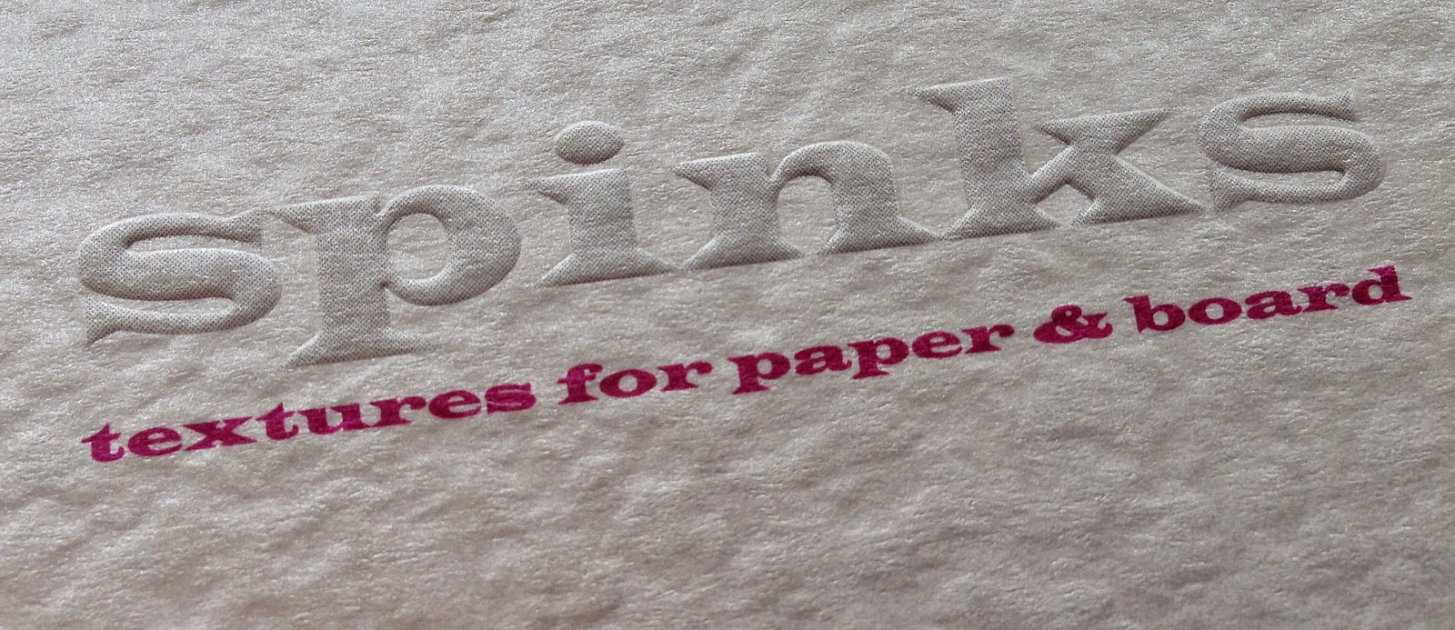
http://spinksembossers.co.uk/SPINKS is a trade embossers, based in Enfield, which has been graining paper since the 1960's and they very helpfully supplied the photographs and information for this article. They have a range of over fifteen standard finishes which can be applied to ANY paper.
There is another interesting factor to consider - it makes sense, from a printing point of view, to put ink onto a flat surface. So what we are suggesting here is to emboss sheets after printing! ...yes this has been common practice for years but has now largely been forgotten because paper companies have been too busy selling 'ready embossed' paper ranges! Problems associated with 'bottoming out the print' especially with uncoated substrates can be eliminated by embossing the printed sheets after printing. The below image shows a cover printed CMYK on a silk coated board which has then been sheet embossed.
 
So I now have an example of how this process was applied to a project in the real world. Jason Maclaren at Cantate (www.cantatecommunications.com) was briefed on a project to produce cocktail menus for Dirty Martini, a collection of London based cocktail bars. In order to keep within the budget, Jason supplied a self coloured, black 350gsm board into Spinks and had it 'grained' with their 'Seal' pattern . After graining, the board was then taken to a print finishers where it was 'blind debossed' with a diamond pattern and hot foil blocked with gold foil. As I hope you can see from the image below, it is a cracking result.
 

Colorset Crimson embossed
- click on image to enlarge
Hopefully this article will serve to demystify the process of graining or sheet embossing. It is possible to emboss virtually all paper and board and it's worth mentioning that our Colorset embosses very well indeed! Some papers with a very hard surface sometimes don't emboss that well but you can always request a sample to be produced.

 ...and don't forget, you can emboss paper after it has been printed - that really isn't rocket science!

Thanks to Gary Spinks and Rebecca Standley at SPINKS Embossers and to Jason Maclaren at Cantate for the interesting case study.

http://spinksembossers.co.uk/
www.cantatecommunications.com
Posted by Justin Hobson 16.02.2015

Tuesday, 11 November 2014

Guardian News & Media 2014 sustainability report

This is the printed summary of the Guardian News & Media sustainability report. The whole 2014 report is available online http://www.theguardian.com/sustainability but this is the printed report produced to give out to staff and partners.
The size of the report is 148mm square, saddle stitched and has a 4pp cover and 16pp text. The publication is printed on our Shiro Echo, Bright White which is 100% recycled and also carries FSC certification.
The report is beautifully illustrated by Laurent Cilluffo.
http://www.laurentcilluffo.com/
Design is by the in-house design team at The Guardian. Production handled by Leon Abrahams.

Print is by Cantate, a division of the John Good Group and thanks to Jason Maclaren at Cantate for sending me file copies.

www.theguardian.com/sustainability
http://www.laurentcilluffo.com/
http://www.cantatecommunications.com/
Posted by Justin Hobson 11.11..2014