Tuesday, 24 September 2024
You Look Very Nice by Joe Lycett
Friday, 24 March 2023
Like No Other
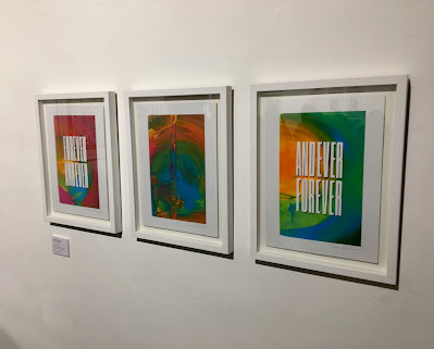
This distinctive body of work will be on display at Phoenix Art Space in Brighton (UK) from March 22 – April 9 2023. The collaboration is a unique coming together of handcrafted techniques, and combines mono-screen prints – inks hand painted directly onto the screen creating endlessly unique results – with hand cut paper designs, created by Owen in his signature graphic style. The designs celebrate light, colour, space and form, exploring themes of beauty in individuality, wonder in the everyday and finding perfection in imperfection. The spark of ‘Like No Other’ originated during the COVID lockdowns of 2020, where Owen suddenly found himself faced with the freedom to experiment with different approaches to his work. This included creating watercolour washes, exploring gradients and in turn, combining these with his hand-crafted paper artworks. This opportunity of exploration led to Owen reaching out to Harvey Lloyd to collaborate on a one-off piece, who in turn took the idea and evolved it into something completely new, creating an array of wonderful test prints and experiments inspired by Owen’s initial concept. Through this creative ‘call and response’, Harvey Lloyd helped grow this seed of an idea into an amazing array of printed possibilities. The exhibition tells a story of human connection and collaboration, stepping out of one’s comfort zone with the exchange of techniques and ideas, and the freedom that comes with embracing unexpected results.Owen’s papercut elements are created using the very same paper stock as the monoprints, which is our Matrisse 250gsm
Thursday, 3 November 2022
Jobs from the past - Number 156
Regular followers of this blog will know that my first post of every month is a "job from the past" so that I can show some of the really good work from years gone by and this one is from 2015...
 This is the promotional poster for Steve Oram's directorial feature debut, Aaaaaaaah! (that's eight "A's"). The film has been written and directed by Steve Oram and the cast includes Julian Barratt, Toyah Wilcox, Julian Rhind Tutt and Holli Dempsey.
This poster is A2 size (594x420mm) and is silk-screen printed in six colours, a combination of tonal work and solid colours - the zip is printed in shiny metallic silver. It is produced using our Colorset, Bright Red 270gsm.
The posters were printed to coincide with the film's premiere in Leicester Square as part of Frightfest 2015. More information on the film can be found at both the Rook Films and Lincoln Studios sites. You can see the trailer below...
There is a review of the film here: https://www.theguardian.com/film/2015/sep/10/aaaaaaaah-review-satire-of-beastly-behaviour
The prints were screen-printed by Gary Parselle at Brighton based silkscreen studio, The Private Press, and the above picture is from from the studio when they were in the drying rack.
Tuesday, 19 July 2022
Orla Kiely Ltd Editions...
Today is the hottest day ever in the UK apparently, so here is some hot news!
 Harvey Lloyd Screenprint is a silkscreen print studio based in the South East of England and their work has appeared on this blog many times over the years. Established 40 years ago, they produce work for some of the best names in the industry, Harvey Lloyd have gained a reputation for having artists at their studio and working together to produce their artworks.
The prints are produced in an edition of 100 copies. and have been beautifully printed by Harvey Lloyd Screenprint, who are based in Wadhurst, East Sussex.
https://orlakiely.com/
Tuesday, 5 July 2022
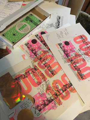
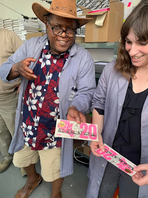
Banknotes printed on PaperWise
Tuesday, 1 March 2022
Jobs from the past - Number 148
 The Bristol Coffee Map is a project instigated by Bristol based Studio Baum ...produced in celebration of coffee, Bristol and the art of print design.
 |
| Click on images to enlarge |
Design and production is by Sam Baum at Studio Baum. You can read more about it here:
https://www.naomiwilkinson.co.uk/
http://www.zonegraphics.co.uk/
Wednesday, 23 February 2022
ARKET
 ARKET is a modern-day market offering essential products for men, women, children and the home. ARKET’s mission is to democratise quality through widely accessible, well-made, durable products, designed to be used and loved for a long time. ARKET opened its first store on Regent Street, London and this is the launch invitation...
Size of the invitation is 148x105mm, which is concertina folded out to a finished size of 592x420mm. Below is a birds eye view...
 |
| Click on images to enlarge |
First fold, which concertina's out to 148x420mm
 |
| Click on images to enlarge |
The below image shows how it looks with light behind it, although it was the subtlety of the matching white shade that was required and which works so beautifully on the finished piece...
Design is by Mathias Clottu Studio. Litho printing is by Xtraprint, silkscreen is by K2 Screen and it was concertina folded by ABS Finishers.
https://www.arket.com/
https://hmgroup.com/brands/arket.html
https://www.mathiasclottu.com/
Monday, 1 November 2021
Jobs from the past - Number 144
Heart of Glass - November 2002
 This is the private view invitation for an exhibition at the Crafts Council Gallery in London. The invitation is the the opening of an exhibition titled Heart of Glass, featuring work of the artists Jean-Michel Othoniel, Tony Oursler, Katy Schimert, Kiki Smith, Jan Vercruysse, Not Vital and Robin Winters.
  |
| Click on image to enlarge |
Design is by Andrew Collier, who works freelance in London.
As I recall the silkscreen printing was produced by Artomatic, who also ran a print boutique in Great Sutton Street EC1. Sadly they are no loger in existence. I wrote about Artomatic on this previous post here: http://justinsamazingworldatfennerpaper.blogspot.co.uk/2009/07/job-from-past.html
http://www.craftscouncil.org.uk/
Wednesday, 29 September 2021
Cabin Fever (3rd Wave)
Tuesday, 24 November 2020
New Sarah Boris artworks
Some news, hot off the press today...
 Harvey Lloyd Screenprint is a silkscreen print studio based in the South East of England and their work has appeared on this blog many times over the years. Established 40 years ago, they produce work for some of the best names in the industry, Harvey Lloyd have gained a reputation for having artists at their studio and working together to produce their artworks.
There are two new prints which are the result of their collaboration with artist and graphic designer Sarah Boris, One Step and Clover and here they are being printed...
Clover is printed in 4 colours and One step is printed in 3 colours. The size of both prints is 400mm square and here are the finished prints... |
| Click on images to enlarge |


