Showing posts with label Tate. Show all posts

Wednesday, 2 January 2019

Jobs from the past - Number 111

Regular followers of this blog will know that my first post of every month is a "job from the past" so that I can show some of the really good work from years gone by...

Turner Prize - Invitation 2006
Each year the Turner Prize jury shortlist four artists for an outstanding exhibition.The prize was first awarded in 1984, founded by a group called the Patrons of New Art under the directorship of Alan Bowness. They formed to encourage wider interest in contemporary art and assist the Tate in acquiring new works. The Turner Prize is awarded to a British artist although ‘British’ can mean an artist working primarily in Britain or an artist born in Britain working globally and the prize focuses on their recent developments in British art rather than a lifetime's achievement. 

This is the invitation to the award event - one of the hotest tickets in town for the art world. The award was being presented by Yoko Ono. The four nominated artists are Tomma Abts, Phil Collins, Mark Titchner and Rebecca Warren...
The invitation is a 6pp gatefold. The size is 230x140mm, portrait, folding out to 230x420mm. It is printed on our sturdy Omnia 320gsm.

During this period (2006/2007) all private view invitations produced for the Tate were produced on Omnia at the instigation of designer Melanie Mues. All the invitations featured an image of the work of the artist combined with a solid colour on the reverse - you can see many of the invitations on the link here. Omnia was chosen because it would reproduce the wide range of media superbly plus the solid would always look excellent. This invitation followed the style but as it was not possible to reproduce the work of four artists, the names are simply (and beautifully) hot foil blocked on the outside of the invitation, and this time the solid colour is a metallic amethyst ...and because metallic inks actually look metallic on Omnia, the result is superb.
The foiling is a multicolour, holographic foil, which I hope you can see from the image below, really does shimmer and change shade as it catches the light.
Birds eye view...
Detail of the holographic foil
...and that literally is it - simply printed offset Litho in one special metallic pantone shade, well creased, beautifully designed, superbly hot foil blocked and no images - what more can I say?

Designer is Melanie Mues. Production is by the graphic design department at the Tate. Print is by Push print in London.

http://www.muesdesign.com/
Posted by Justin Hobson 02.01.2019

Thursday, 20 April 2017

Thread

Thread is a studio specialising in design for a wide variety of clients from the art and cultural sector. Thread is the design studio of Michael Windsor-Ungureanu, who has previously worked at Tate Britain and Tate Modern. This is the second edition of his studio promotional brochure:
The format is A5 (210x148mm) portrait and is saddle stiitched. The 40pp text has a short cover, 150mm high which is centred head to foot.
There are three different coloured covers, all produced on Colorset - a mix of Ash, Lemon and Deep Orange, all printed in one special pantone (PMS 072U) blue. The "thread" design runs from the cover throughout the middle of the brochure.
Click on images to enlarge
The 40pp text is printed on StarFine Natural White 115gsm and shows the work that Thread has produced over the previous couple of years.
Click on images to enlarge
Starfine Natural White was chosen (because it prints well ...but that's a given!) mainly because of the neutral white shade which is not cream. Given the nature of the work, a stark bright white paper would not have worked with such a variety of art based subjects. Text is printed CMYK offset litho throughout.
Below shows a birds eye view of the publication
Design is by Michael Windsor-Ungureanu. Printing is by Bowmans based in Leeds and it's a very accomplished piece of print and finishing.

http://www.threaddesign.co.uk/
http://www.bowmans77.co.uk/
Posted by Justin Hobson 20.04.2017

Wednesday, 21 August 2013

Edvard Munch - The Modern Eye


This is a private view invitation for The Modern Eye, a major exhibition devoted to a reassessment of the works of the Norwegian painter Edvard Munch held at Tate Modern last year. The invitations which are printed on our Omnia 320gsm and which (as you can see) faithfully reproduces the detail and subtlety of Munch's work.

This invitation is a 4pp, portrait, A5 (210x148mm) format. Unlike the other Tate invitations featured on this blog, which are printed offset litho, this has been printed on an HP Indigo. The colours are strong and punchy and the whole invitation has a matt, tactile look and feel.

The inside of the invite is printed with a flat grey solid with black type. Again, the light grey solid is dead flat, tactile and looks great.
Designer at the Tate is Matt Mear. Print production is by James Parfitt at Westerham Premier, based in Paddock Wood in Kent.

http://www.tate.org.uk/
james@westerhampremier.co.uk
Posted by Justin Hobson 21.08.2013

Thursday, 16 February 2012

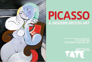
Picasso and Modern British Art

Pablo Picasso
The Three Dancers 1925
Tate © Succession Picasso/DACS 2011
This Monday I was invited to the press view of this major new exhition at Tate Britain. Unfortunately I was unable to go but it certainly requires a mention here...

"Picasso and Modern British Art explores his extensive legacy and influence on British art, how this played a role in the acceptance of modern art in Britain, alongside the fascinating story of Picasso’s lifelong connections to and affection for this country.

It brings together over 150 spectacular artworks, with over 60 stunning Picassos including sublime paintings from the most remarkable moments in his career, such as Weeping Woman 1937 and The Three Dancers 1925.

Picasso and Modern British Art is the first exhibition to trace Picasso’s rise in Britain as a figure of both controversy and celebrity. From his London visit in 1919, working on the scenery and costumes for Diaghilev’s ballet The Three Cornered Hat; to his post-war reputation and political appearances; leading up to the phenomenally successful 1960 Tate exhibition.

Full of beautiful and inspirational artworks, this exhibition is an unmissable treat and a fascinating insight into how British art became modern"
Pablo Picasso Nude Woman in a Red Armchair 1932
 © Succession Picasso/DACS, London 2011. Tate
The exhibition is on from today until 5th July 2012.
...and thanks to the Tate press office for inviting me.

www.tate.org.uk
Posted by Justin Hobson16.02.2012

Wednesday, 21 September 2011

The Way We Live Now - Terence Conran Part2

Photographer Neil Wilder
[John Parkinson Agency]
Yesterday evening I was pleased to have been invited to a talk/presentation /celebration for Sir Terence Conran. See previous post:
http://justinsamazingworldatfennerpaper.blogspot.com/2011/09/way-we-live-now-terence-conran.html

Deyan Sudjic, Fiona MacCarthy, Christopher Frayling and Stephen Bayley gave talks about Conran's life, inspiration and achievements. It was interesting, historical and inspirational - when you review someone's achievements in this way, it can leave one feeling a little lacking!

He has influenced virtually every area of design – furniture, textiles, retailing home furnishings, interiors, commercial environments, airport interiors, designing and running restaurants cafés, bars and hotels.
 
Conran says he has a fundamental aim – to produce useful things at a price that most people can afford. This maybe so, but what I found most interesting was Stephen Bayley's comment that whether it concerned food or design (and he explained the interconnection) that Conran cared for these three principles:
  • Materials
  • Execution
  • Details 
...maybe this is genuinely the route to intelligent design (and no, I don't think that sounds too pompous). It was fascinating too, that his interest in natural products mainly manifested itself in the use of wood - so I'm sure he has an appreciation of quality paper!
I also found interesting parallels with the piece I wrote recently about Robert Welch:
...and it was interesting that the piece I wrote about the late Rowley Atterbury, listed three past recipients of the Royal Society of Arts (RSA)  Bicentenary Medal: Terence Conran, Deyan Sudjic and Christopher Frayling, all people involved in this very evening...
http://justinsamazingworldatfennerpaper.blogspot.com/2011/03/rowley-atterbury-printer.html
sadly not a medal that I'll be receiving, but an interesting link between the past and the present.

I think talks/lectures/presentations like this are essential to go to. To hear dynamic people, to be inspired by recent history can surely only serve to enhance our daily working lives. I hope that the Design Museum and the Tate will do more of these events.
Thanks to Rose Dahlsen at The Tate for inviting me to come along.
Posted by Justin Hobson 21.09.2011

Friday, 16 September 2011

The Way We Live Now - Terence Conran


Terence Conran/1950's
Photo: Ray Williams
Terence Conran’s vision, energy and achievements have shaped the look of our world and influenced how we lead our lives. His drive to make good design part of our everyday life has arguably had more impact on popular culture than that of any other designer of his generation. As his 80th birthday approaches, the Design Museum in association with Tate Modern is hosting a talk to celebrate his achievements.

Chaired by Design Museum Director Deyan Sudjic, this evening of presentations and discussion draws together leading figures from the various worlds that Terence Conran’s parallel careers have influenced and informed. Fiona MacCarthy, Christopher Frayling and Stephen Bayley will each discuss an aspect of Conran’s way of seeing the world.

It's also worth mentioning that there is a Terence Conran exhibition at the Design Museum opening in November.

This event is on Tuesday 20 September, 6.30 - 8pm at TATE MODERN, Starr Auditorium, so hurry up!
See you there...
For more details, follow the links:
The Way We Live Now: An evening celebrating Terence Conran is on Tuesday 20 September 2011, 18.30–20.00
The Way We Live Now at the Design Museum is open 16 Nov 2011 – 4 March 2012
Posted by Justin Hobson 16.09.2011

Monday, 23 May 2011

Tate

Here are two quite different jobs produced by the Tate.

Firstly there is Tate Film with a publication for a series of films titled "oustider Films on India". This is a 210x148mm (A5) portrait, saddle stitched piece. The 4pp cover is printed on Astralux 250gsm cover which is a one sided "cast coated" material, being high gloss on the outside and uncoated on the inside. This has been combined with an 8pp text on our (NEW) Colorset White 160gsm which works exceptionally well with the uncoated reverse of the Astralux.
The second piece is for a family event at the Tate called "Animate Tate. It is a simple but effective piece of literature, being printed in three colours. Finished size is A5 with a 90mm flap which folds upwards. Printed on Colorset White 270gsm.
Print production on both items was by Newgate Concise based in Bermondsey.
Designer on both projects was Michael Windsor-Ungureanu who has recently left The Tate for pastures new and we wish him best wishes in his new position - and thanks for sending me copies and the nice note...
Re-posted by Justin Hobson 23.05.2011


Tuesday, 25 January 2011

Tate Britain Invitations

Following my post about the lovely Gauguin invitations last September for the private view at Tate Modern, here are two equally lovely private view invitations for Tate Britain. Rachel Whiteread Drawings and Eadweard Muybridge. Both were printed on our sturdy Omnia 320gsm and which (as you can see) faithfully reproduces the artists work and of course the solids... 
The invites are A5 size and 2pp. The above pics shows front and back. Designer is Michael Windsor-Ungureanu and the print production is by Push.

http://www.tate.org.uk/
Posted by Justin Hobson 25.01.2011

Thursday, 30 September 2010

It's Gauguin Day ...today!


Only if you were a hermit living in a remote cave could you have possibly missed the amazing amount of media coverage of the Gauguin exhibition at Tate Modern ...and it opens today!

If you were wondering if this was just a pleasant public information announcement, you'd be wrong! I thought I would use it as an opportunity to show the lovely private view invitations which were printed on our Omnia 320gsm and which (as you can see) faithfully reproduces Paul Gauguin's work!
The invites are A5 size and 2pp. The above pic shows front and back. Designer at the Tate is Michael Windsor-Ungureanu and the print production is by Push.

Original exhibition graphics, catalogue design and typeface by Why Not Asscociates.
http://www.whynotassociates.com/en/tate_gauguin/08.php
...now go and see the exhibition, I am.

http://www.tate.org.uk/
http://www.push-print.com/
http://www.whynotassociates.com/
Posted by Justin Hobson 30.09.2010

Wednesday, 1 September 2010

Jobs from the past - Number 12

Followers of this blog will know that my first post of every month is a "job from the past" so that I can show some of the really good work from years gone by and this one is only from last year!

Tate Britain Summer Party 2009 - Invitation

Arguably this is an invitation to one of the hotest tickets in town for the art world and normally coincides with the opening of an exhibition. Last year it was the opening of the Eva Rothschild exhibition.
The invitation was designed and produced by the design team at The Tate and is a simply stunning example of the design working perfectly with the material and the process (which in this instance is hot foil blocking) . The invitation is a 4pp landscape format and the size is 210x135mm. The material is our Flora Tabacco in 350gsm (manufactured by Cordenons in Italy) which is a very substantial board with a high bulk, an industrial look & feel and with deliberate "inclusions" or specs. This rough and ready looking material has been juxtaposed with some exceptionally fine hot foil blocking in a matt white foil - and it really is superbly done as you can see from the Tate logo and even more impressive if you look at the size of the BP logo (sponsors) on the inside front cover, it is absolutely minute but as you'll see if you enlarge it - it's perfect.
...and that literally is it - a well creased piece of board, beautifully designed, superbly hot foil blocked, no images and no print - what more can I say?

Designer on the project was Michael Windsor-Ungureanu.

Print production was by Push.

Posted by Justin Hobson 01.09.2010