Friday, 10 June 2016

Season Zine

Following on with the footballing theme, here is another project on the subject, which is also a stunning piece of design and print.

SEASON is a cross between a fashion magazine and a football zine. This new publication reveals the preferences and rituals of fashion and football fans. Their perspectives on the world’s most popular sport are explored in thoughtful and intimate ways, focusing on why these fans care and what they wear.
Featuring interviews, essays, photography and more from up-and-coming creatives, SEASON aims to kick off a dialogue acknowledging how modern football and fashion play into each other. Issue 1 is dedicated to 'The Female Fan'
Above image shows front cover and back cover

Size is 240x165mm, portrait (very economical format on a B1 press). It is a 72pp 'self cover' and is printed offset litho on our Redeem 100% Recycled 100gsm. The paper is a neutral white shade gives the publication a 'newspapery' feel which really works with the images and zine design.
Many of the spreads which are purely type work particularly well with the paper - the neutral white just works with black type superbly.
At 72pp it is at the limit of saddle stitching - only because it can get a bit "gappy" in the middle. In my opinion this is acceptable, but were the gap or gape to get much larger, I think it would start to look a bit ugly.
As it is, the zine just flows beautifully. Pages turn easily and is an excellent example where the design, the print and the paper work in synergy. It has a wonderful quality about it - a really interesting, well put together piece of literature.
Season is published by Felicia Pennant. The designer is Natalie Doto. Production and print is by Ricky Aldred at VR Print based in Tonbridge. Superb reproduction.

http://www.season-zine.com/
https://www.instagram.com/season_zine/
http://www.vrdigital.co.uk/
Posted by Justin Hobson 10.06.2016

Wednesday, 8 June 2016

Euro 2016 Planner

As many of you will know, the UEFA Euro 2016 Football championship begins this week on Friday.

...well yesterday morning, I had a lovely surprise as I received a smartly packaged postal tube, containing a beautiful planner for the Euros - a gift from Crispin Finn, a Kent based design and silkscreen studio.
Simply produced in their trademark red, white and blue (all of their personal work appears in just these three colours) it has been hand silkscreen printed in red and blue. A truly stunning, visually stimulating planner.
Click on images to enlarge
The size of the planner is 510x700mm and is silkscreen printed on our Matrisse 200gsm, which is a perfect weight. Matrisse is a tactile uncoated white board with a high bulk. Below is a detail showing close up of the all important group B...
Each of the posters is embossed with their Crispin Finn seal.
It looks far to nice to put on the wall and write on! ...but I will. Every good design studio should have one of these on the wall - and luckily you can, because they are available on the Crispin Finn website! You can buy one of these lovely planners for just £10 plus shipping - it's a bargain - but you'll have to be quick, the competition starts on Friday:

My thanks to Roger Kelly and Anna Fidalgo for sending it on over.
Posted by Justin Hobson 08.06.2016

Monday, 6 June 2016

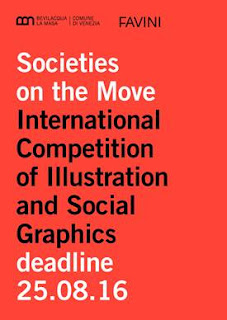
Launch of International competition....

The Istituzione Bevilacqua La Masa and Italian papermakers Favini have announced the International Competition of Illustration and Social Graphics “Societies on the Move” which aims to stimulate the artistic imagination of cosmopolitan and multi-ethnic views of our society.

Nowadays, the movement of people and populations imposes increasing challenges on contemporary society: the use of common resources and rights is challenged by new needs to share, while an active and informed citizenship is required with regard to the environment, consumer choices, and the dynamics of production and institutional processes.

The creation of future societies can also start from a vision. The call is aimed at graphic artists and illustrators, with no limit on age or nationality, and both individuals and groups can participate. Participants are asked to create an original illustration or a graphical interpretation of the theme indicated.

A qualified jury will select the best works to be printed and displayed to the public in an exhibition at the Galleria in Piazza San Marco of the Bevilacqua La Masa Institution in Venice, from 20 October to 20 November 2016.

Moreover, the winner will receive a cash prize!

The selected works and the winner will be featured in the catalogue dedicated to the exhibition. An important factor is that there is no entry fee. The entrants may optionally decide on which type of paper produced by Favini to print the image they submit, especially on the lines Crush and Remake, although this is not compulsory.

Entries will be assessed by a qualified jury made up of international experts in the field of illustration, arts and visual communication. The five jurors for the prize will be: Giorgio Camuffo, Cedar Lewisohn, Riccardo Falcinelli, Steven Guarnaccia, and Hamelin Associazione Culturale.

Favini will also identify twelve images, independently from the jury’s decision, to use to create a calendar for the year 2017.

The application deadline is 25th August 2016. The call to competition can be downloaded here:

It would be lovely to see some UK entries, so please go on and HAVE A GO ...!

Posted by Justin Hobson 06.06.2016

Thursday, 2 June 2016

Jobs from the past - Number 80

Regular followers of this blog will know that my first post of every month is a "job from the past" so that I can show some of the really good work from years gone by and here's one from 1996.

Fourth Estate Catalogue 
July-December 1998
  
The Fourth Estate is a publishers that many people will be familiar with. Founded by Victoria Barnsley in 1984, Fourth Estate built a reputation as one of the most innovative and eclectic imprints in the industry, with a reputation for publishing a wide variety of critically-acclaimed and beautifully-produced titles including many prize winning authors (Booker, Orange etc).

One of the things that made the Fourth Estate stand out from the crowd was their catalogues - they were simply amazing pieces of design and print! I was lucky enough to work on a few different catalogues in the late 90's and early 2000's. Every single one was different and brilliant. Good designers were commissioned, Bogue & Hopgood, Instinct, Pentagram, Rose Design, Frost, Neville Brody, Tom Hingston to name a few. In line with their reputation for publishing unconventional yet innovative titles, the design of the catalogue was equally eclectic.

This is a particularly distinctive catalogue, bound using a post and screw, using just coloured paper, printed letterpress in opaque white ink.
The size of the catalogue is 105x280mm and is either portrait or landscape depending on your point of view! Binding is simply by one brass post and screw fitting. The total thickness is 15mm.  
There are front and back covers, which are printed CMYK offset litho one side only, which were printed by Tadberry Evedale on our Avrowhite [1 sided] 325gsm
Click on images to enlarge
Back in those days, we didn't have our Colorset range, but it was a range of coloured papers that was required! I looked around various ranges and taking care to avoid some of the more expensive (and obvious) coloured text & cover papers on the market, I came up Rothmill. This was a coloured paper range made by the Tullis Russell mill in Scotland, who sadly closed last year. There are six different colours of Rothmill 280mics board used in the publication, one for each of the sections (fiction, non fiction etc)
You can see from these detail shots that the type printed in opaque white works ...but only just! It is a bit marginal. But the overall effect is great.


As you can see from the below picture the section printed on the Rothmill Mulberry (Non Fiction) is by far the most significant section in the catalogue.
Design and art direction is by Vince Frost. The text of the catalogue was set and letterpress printed by the House of Naylor on Saffron Hill in Clerkenwell.

So, where is everybody now?....
Victoria Barnsley, founder of Fourth Estate, joined Harper Collins as CEO and Publisher in 2000 when it acquired her company. These distinctive publications continued to be commissioned and produced for a few years after becoming part of a larger group. Sadly (and I guess it was just a matter of time) the Fourth Estate became a section within the Harper Collins specialist catalogue. She left Harper Collins in 2013.

The House of Naylor went into liquidation in the early 2000's re-emerging as The Letterpress House in Hemel Hempstead. Bill Naylor finally retired a about five years ago and the machinery dispersed (all going to good homes).

Vince Frost left for the sunnier climate of Australia just over fifteen years ago and runs Frost* in Sydney.

...and Fenner Paper? ...yep, we're still here!
Posted by Justin Hobson 02.06.2016

Tuesday, 31 May 2016

JLR Editors Club Brochure

This is a piece of literature produced for Jaguar Land Rover PR and press department. The publication embodies all the core values that JLR stand for and consequently is produced to a very high specification.
The brochure comes in a slipcase/pocket, which together with the 4pp cover is made using Plike Black 330gsm from Cordenons. Size of the brochure is 240x168mm, portrait.  
The slipcase and cover is hot foil blocked in silver foil and the edges are gilded in silver, which does look exquisite.
The 40pp text is printed on our Omnia 120gsm offset litho - and it is printed wall to wall, solid black, CMYK images plus a special silver - all the type is printed in silver.
In line with the quality look and feel of the brochure, the biding is Singer sewing, which is totally characteristic for this brand.
The reproduction on the Omnia is magnificent, the CMYK, the solids and the silver which looks metallic, as you can see from the image below.

Art direction and design of the catalogue is by Imagination. Graphic designer on the project is Amish Shah  (www.work-in-process.eu). This is an exquisitely produced brochure which conveys exactly the right look and feel of luxury. Print is by Identity, based in Paddock Wood.
Posted by Justin Hobson 31.05.2016

Friday, 27 May 2016

Peace Signs by Edward Barber

I was very pleased to be invited to the viewing of Edward Barber's exhibition 'Peace Signs' which opened at the Imperial War Museum contemporary space on Wednesday. Ed Barber is a photographic artist, specialising in images of people and their relationship to space and environment. He is best known for his portraiture, through major projects such as All Dressed Up, In the City and Resolve. He is one of the few photographers to have their work displayed and in the collection of the National Portrait Gallery. He is also a designer, curator and teacher, and was formerly Subject Director for Fashion Photography at the London College of Fashion.
Ed recorded major protests staged at key sites such as RAF/USAF Greenham Common, Westminster, Trafalgar Square and the City of London. The body of work is a unique social document of mass popular protest in late twentieth century Britain which has rarely been seen in public since it was first published in 1984.
Peace Signs, Barber’s collected body of work, was originally taken to attract media attention to the anti-nuclear movement. The exhibition explores these protests as multi-generational and distinctly British forms of self-expression. Illuminating the activists’ humour and creativity, these images create a social record of both individual and collective responses to war. The photographs capture hand-rendered signs, banners, badges, clothing, make-up and costumes, and illustrate the often overlooked role of performance theatre, folk art and fashion at peace camps and demonstrations.
The display, with the background painted in 'nuclear' yellow, offers a fresh interpretation of the images, the photographs are contextualised by a graphic installation entitled Mind Map of Anti-Nuclear Protest, created by Danielle Inga and Edward Barber specifically for this exhibition. The Mind Map traces his contemporary re-evaluation of the events he captured in the 1980s - see below pic. Unfortunately my picture doesn't do justice - so you'll have to go and see it for yourself! The exhibition runs until 4th September.
http://edwardbarber.net/
http://concreteed.blogspot.co.uk/
Posted by Justin Hobson 27.05.2016

Wednesday, 25 May 2016

The Graphic Lexicon Poster Series

At the D&AD awards last Thursday, this project was awarded a wooden pencil. This series of posters has been created using the 'running sheets' from the sections of a book produced by Jim Sutherland. The book is called The Graphic Lexicon and is a celebration of the stories – fact and folklore – behind English words, symbols and punctuation.
I shall write about the book in a future post, suffice to say that it is just printed in two colours, offset litho. For these posters, the title was overprinted (in red) on one side of each section - hiding and highlighting parts of the words - the result in some instances, being the creation of new words. The results were not contrived, they are all happy accidents!
Click on images to enlarge
The paper used in the book and consequently the posters is Shiro Echo, White 100gsm (100% Recycled) which has just the right neutral shade of white for a book.
Printed Offset Litho in two colours with a further one colour overprint by Boss Print who are based in Acton, London.
I've only reproduced a few here, in total, it is a series of twelve posters.. You can read more about the project here: http://studio-sutherland.co.uk/projects/the-graphic-lexicon

www.dandad.org
http://studio-sutherland.co.uk/
https://www.bossprint.com/
Posted by Justin Hobson 25.05.2016