Showing posts with label Pergraphica. Show all posts

Thursday, 3 March 2022

Ukraine - Make a difference NOW!

I'm sure most of us working in the graphic arts industry, whether a designer, printer or paperperson have wondered if there is anything positive that we can do to help with the Ukrainian-Russian war ...well now there is!

An article appeared in PrintWeek yesterday which highlights a global paper manufacturer who is still producing paper in Russia. The company is called Mondi and are one of the largest paper and packaging companies in the world with manufacturing facilities and offices all around the world including facilities in Russia which employ 5,300 people.

In my opinion we should all be putting Mondi under pressure to suspend production in Russia. It is only by large corporates like Mondi (turnover £5.5 Billion!) exerting pressure such as this on the  Russian Government that could make a difference. It will affect the Russian economy and also get more people in Russia talking about the situation.

I have been racking my brains as to any contribution that I can make to this struggle and here (thanks to PrintWeek) there is something that all of us in the graphic arts can do!

Firstly, please email the CEO and Chairman of the Mondi Group (who I believe are both based in their Surrey headquarters) 

CEO is: andrew.king@mondigroup.com 

Chairman is: philip.yea@mondigroup.com

Jenny Hampshire is the Company Secretary and is listed as the Governance contact: jenny.hampshire@mondigroup.com

https://www.mondigroup.com/en/

Please email these people - get everyone you know to email them asking them "as a global leader in paper and packaging we ask you to demonstrate real leadership and suspend production at your sites in Russia" Flood their email boxes - PLEASE

Please use twitter, facebook, instagram and whatever social media you can to get the message across.

Secondly you can boycott Mondi products. Stop buying, specifying or using any Mondi products until they suspend their activities in Russia. In printing/graphics you may be familiar with their brands Color Copy, Nautilus Recycled and Pergraphica. Color Copy is the largest brand used in offices and copy shops and seen everywhere.

If you are a printer - tell your paper merchant you won't be buying a Mondi product until they have suspended operations in Russia. If you are a designer or project manager, make sure you don't specify any of their products. If you are in packaging, make sure that packaging is not being supplied by Mondi. Antalis is one of the large Mondi distributors in the UK.

This is something we can all do which might just help a bit - it won't take much time to do ...and if you don't think you've got time, just imagine you've heard gunfire outside your window - that's what it's like for those poor people in Ukraine right now, so spend 5 minutes of your time and send some emails - it might just make a difference.

You can read the story in PrintWeek here: https://www.printweek.com/news/article/mondi-updates-on-ukraine-russia

Please note: I have nothing against Mondi. This is not personal. We have worked with Mondi in the past and they are a very nice company to work with - but they are in the situation where they can make a difference, so we must tell them!

UPDATE on 4th March - article in The Times https://www.thetimes.co.uk/article/c1855f14-9afd-11ec-8194-a993851c15ba?shareToken=84ac5bf545ddd88bda72c70ddc58cda3

Posted by Justin Hobson 03.03.2022

PS - for comparison, there is another global paper company called StoraEnso (interestingly some people consider Stora Enso to be the oldest limited liability company in the world having been incorporated in 1288!). Stora Enso is stopping all production and sales in Russia until further notice due to the ongoing invasion in Ukraine. Good for them! You can read more HERE

Tuesday, 20 July 2021

PMC Notes #12

Based in London’s Bedford Square, the Paul Mellon Centre for Studies in British Art is an educational charity that champions new ways of understanding British art history and culture. The Centre was founded in 1970 by the art collector and philanthropist Paul Mellon. It is part of Yale University and a partner to the Yale Centre for British Art. 

PMC Notes is the the Centre's newsletter...
Size is A5, 210x148mm portrait and is saddle stitched. 4pp cover and 28pp text.
It is printed on our Pergraphica Natural Rough, 150gsm for the cover and 100gsm for the text. The natural shade is just perfect to work with the style of publication and images used.
As you can see above, the lightweight materials flow really well in the hand and as you can see in the image below, the centre spread with a really heavy CMYK image, which has printed superbly.
The below image shows the superbly finished saddle stitching, nice neat and flat...
Design is by Baillie Card and Harriet Fisher. Printing is by Principal Colour with Steve Kirkham handling the project. A really superb piece of design and print. 

http://www.principalcolour.co.uk/

Posted by Justin Hobson 20.07.2021

Monday, 5 July 2021

Hackney Winter Night Shelter R&A

Each winter, Hackney Winter Night Shelter (HWNS) provides food, shelter and a warm welcome to homeless people in Hackney. They help get their guests out of homelessness and into homes. A project of Hackney Doorways, HWNS is a grassroots project run by volunteers from Hackney churches and the local community providing a meal and a bed for homeless people at 13 different venues around Hackney.

This is their annual report for the latest financial year...
The size of the publication is 225x152mm, portrait and is a 24pp, self cover, on our Pergraphica Smooth, High White 150gsm. The design uses bold, solid colours made out of CMYK...
Click on images to enlarge
As you can see from the images above and below, there is lots of colour and images with CMYK dark areas - loads of ink going down and it looks great, reproducing images and solid colours superbly.
The self cover format on 150gsm flows really nicely in the hand.
Unlike many of the publications featured on this blog, which are printed offset litho, this has been digitally printed on an HP Indigo press. The colours are strong and punchy and the whole publication has a matt, tactile look and feel - in fact I can honestly say, every bit as good as litho!
The job is beautifully finished and saddle stitched.
Creative Director is Louise Desborough at Loud Creative. The job was printed and finished by digital print company Typecast Colour, based in Paddock Wood, Kent. 

 Posted by Justin Hobson 05.07..2021

Friday, 4 June 2021

UEFA Euro 2020 is now Euro 2021!

With the delayed Euro 2020 football championship fast approaching, I’m pleased to show you our fabulous wallchart...
Click on images to enlarge
Hosted by 11 countries in 11 cities, the tournament was postponed due to the pandemic but rescheduled with the opening match on June 11th. England are among the favourites to win the tournament and are playing all three matches at Wembley, which will no doubt increase the excitement surrounding the current side. 
This beautifully designed typographic wallchart is by David Coates, who also happens to be a member of the ISTD board (International Society of Typographic Designers) and my thanks to Dave for making it all happen - a perfect way to combine his love of type and football!  As you can see, it's already up on the wall in our office.

The wallcharts are printed by Zone Graphics on our lovely Pergraphica range from Mondi - Pergraphica Classic, Rough 120gsm. The size is 880 x 315mm. Typeface used is Foundry Context by The Foundry Types.
We have sent out a number of these wallcharts to our football loving design clients, but if you want to make absolutely sure you get a copy, you can email me justin@fennerpaper.co.uk
Posted by Justin Hobson 04.06.2021

Monday, 8 March 2021

International Women's Day

What better day to show you this amazing poster celebrating Beatrice Warde, produced as part of the Collections and Collaborations event at the St Bride Foundation.

Beatrice Warde (1900 – 1969) was a writer and scholar of typography. As editor and publicity manager for the Monotype Corporation, she became influential in the male dominated world of typography and printing and is recognized one of the few internationally renowned women typographers.
Warde wrote what is often described as a manifesto "This is a Printing Office" which is one of the most well known pieces of writing about printing and typography.

The poster was created by illustrator and teacher Pam Smy together with book designer and lecturer Ness Wood (together with Maisie Paradise Shearring they make up Orange Beak Studio), 

The A2 (494x420mm) poster is printed offset Litho in CMYK on Pergraphica Smooth, Natural 120gsm. It is printed by Boss Print (as were all the posters for the event) who are based in London.

The event was organised by another amazing woman in design Becky Chilcott, without whom the event would never have happened. The good news is that you can still buy one of these posters and support the St Bride Foundation HERE.

Posted by Justin Hobson 08.03.2021

Monday, 21 December 2020

Pergraphica Calendar for 2021

We have a new 2021 'tent' calendar produced for the PERGRAPHICA® range of design papers. Pergaphica is a range of premium design produced in Austria by Mondi and features smooth and rough finishes in High White, Classic and Natural shades.
The size of the calendar is 310x150mm (flat size) and folds into a tent 112x150mm, held in place with a locking tab. 
Click on images to enlarge
The calendar is printed offset litho on Pergraphica, Natural Rough 240gsm. The below image shows the locking tab...
Fenner paper is pleased to be the UK stockist for Pergraphica. One fact that might be of interest is that we keep 120-300gsm in Short Grain B1 sheets - which can be very useful if you are looking for a specific grain direction.

If you would like one of these calendars to adorn your studio desk or more likely your home office! drop me an email and I'll pop one in the post: justin@fennerpaper.co.uk

Posted by Justin Hobson  21.12.2020

Monday, 19 October 2020

Catching Feels online launch

This Thursday, 22nd October at 2pm (BST), you can join us for the PERGRAPHICA® 'Catching Feels' online launch. This is the new lookbook for our PERGRAPHICA® range of uncoated papers manufactured by Mondi
Featuring contributors from the Adobe Stock Premium Collection, Catching Feels takes you on a sensory journey through six feelings, as emotive visuals are enhanced through different printing techniques and finishes on distinctive paper shades, adding depth to a creative vision. 

Learn about PERGRAPHICA®design papers as well as the printing and special finishing techniques applied in the book with the design, special finishing and paper experts that were involved in the project. 

Hear from the following speakers...
  • Zoe Truchy - Brand Manager for design papers with the paper making team at Mondi 
  • Karen Henderson - Customer Project Development Manager in the UK for Mondi
  • Matt Hornby – Sales Director of Foilco, the leading specialists for hot stamping foils. 
  • Cos Mingides - Founding Partner who leads the creative department at True. 

Fenner Paper is pleased to be the stockist for PERGRAPHICA® in the UK.

To join us on the online launch, you can register HERE
Posted by Justin Hobson 19.10.2020

Friday, 16 October 2020

Anthropologie in Spring

US fashion and lifestyle brand Anthropologie first opened its doors in Pennsylvania, in 1992 and now operates 229 stores worldwide, 11 of which are in the UK. Last April, they opened a new 2,898 sq ft store in the historic market town of Royal Tunbridge Wells, Kent. Set across four floors, the store is situated on the cobbled High Street just above the world renowned Pantiles.

For the opening of the new store, the Anthropologie windows and interior of the store were dressed in Spring time leaves which were all laser cut. We supplied our Pergraphica Classic White, Rough 240gsm which is our premium range of uncoated from Mondi – which was laser cut by Patternise and then hand-painted by Anthropologie’s window display team and the result is simply amazing - and plastic free!
Pergraphica was chosen after testing the board with the painting techniques at the studio and was selected from a range of other boards tested. Patternise are based in Ewhurst, Surrey, specialising in creative design and laser-cutting services. They work with a wide range of clients across the UK - managing large volume projects for major corporates and visual merchandisers to smaller projects for individuals and weddings. Patternise use state of the art laser cutters and they specialise in cutting “clean” materials such as fine papers, cards, and plastics.
Above is a detail image of the leaves. The shapes are produced using their "super pulsed" Trotec galvo system (GS1000), which enables extremely high-speed laser cutting and high volume paper finishing. Using this system they are able to cut many 1000's of sheets within very quick time-frames, which would be impossible with conventional lasers.

Posted by Justin Hobson 16.10.2020

Tuesday, 28 January 2020

Typographic 71

This is the latest edition of Typographic, a journal published by ISTD (International Society of Typographic Designers) issue 71. This is a good read and there is always something in it to inspire, the content is entirely devoted to those practising typographic design, both past and present.
The contents include eight articles by/about: David Quay, Stephen Banham, Jim Northover, Cal Swann, Jared Patterson, Trevor Finnegan, Tony Pritchard, Nicole Phillips, Mike Daines. The Editorial Board is Jim Northover, Tony Pritchard, Caroline Roberts.
Size is A4, portrait. The 4pp cover is printed offset litho, hot foil blocked and die cut on our Astralux Silver 250gsm. The die cut holes form the number 7, allowing the 2pp end-papers (which feature front and back) on Colorset Blush to show through. The number 71 on the cover was inspired by David Quay's typographic walk through Amsterdam which is one of the articles in the journal. Cover artwork is by Tony Pritchard.
Click on images to enlarge
The 32pp text is printed offset litho on Pergraphica High White, Rough 120gsm.
Click on images to enlarge
The colour images have reproduced excellently on the uncoated surface of the Pergraphica and the result is really superb...
Click on images to enlarge
The publication is section sewn and the book opens nicely and the pages lay quite flat. As you can see from the image below, how metallic the Astralux Silver looks on the cover...
Design is by Miriam Brüggen who is based in Berlin and production is by Playne Design. It is beautifully printed, bound and finished by Empress Litho in London.

You can buy a copy of Typographic 71 on this link here.

However...
If you are a practising designer that cares about typographic standards and you aren't already an ISTD member, maybe you should think about joining - there are many benefits, this journal (free to members) is just one! - have a look http://www.istd.org.uk/ - it costs less than £10 per month and is excellent value.

www.istd.org.uk
https://www.empresslitho.com/
Posted by Justin Hobson 28.01.2020

Thursday, 14 November 2019

Pergraphica at St Brides

Yesterday evening,  I jointly hosted a small event together with Mondi, the manufacturer of our new Pergraphica range of text and cover papers. We invited a small group of designers from a variety of different studios to spend the evening in the print workshop at the St Bride Foundation. There were about twenty of us in all and the evening started with an introduction about the Pergraphica range by Isabel Bernd (below) from Mondi.
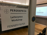
We then moved to the Letterpress workshop and were given a history and briefing by the technicians, Bob, Barry and Andrew.
Then everyone was encouraged to have a go at inking up and printing...
For those not familiar with the St Bride Foundation, it was established in 1891 to fulfil social needs in the Fleet Street printing area. Facilities included a library, baths and a swimming pool (as hygiene was poor) and a printing school which was the forerunner of the LCP. Nowadays, this historic building houses a world renowned printing library with a large letterpress collection, a community theatre space, a bar, print workshop, conference rooms.

Everyone had a go at  lino-cutting, Andrew had selected the letter E from a Pouchet engraved alphabet which was divided into 16 pieces which were individually cut by different people over the course of the evening.
...just look at the concentration!
When each of the panels was finished they were assembled and put on a proofing press, as you can see below:
...and here is Andrew Long with the first print:
...and here's the finished result:
Thanks to Mondi for sponsoring the event and for providing the Pergraphica paper used throughout the evening.

My personal thanks to all the staff and friends at the St Bride Foundation with special thanks to Bob Richardson, Mick Clayton, Andrew Long and Barry who made the evening really good fun.

www.sbf.org.uk
https://www.mymondi.net/ufp/en/brand-group/pergraphica
Posted by Justin Hobson 14.11.2019