Regular followers of this blog will know that my first post of every month is a "job from the past" so that I can show some of the really good work from years gone by...
 The Wapping Project
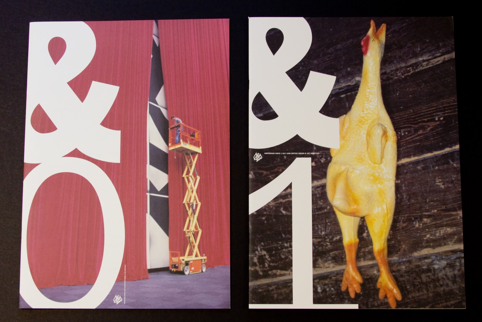
Diary - 2001
 The Wapping Project was, until recently, an arts project housed in the old Wapping Hydraulic Power Station (built 1890). The building originally housed steam operated boilers to generate electricity in the early days of electrification. The works was decommissioned and mothballed in 1977. The building was converted and reopened by the Womens Playhouse Trust (WPT) which is a charity and under the management of Jules Wright, it was opened as an arts centre in October 2000.
 The project included exhibition space in the basement and SHED54, where pieces of original equipment are still in place and a restaurant on the ground floor, called WAPPING FOOD, under head Chef Justin Aubrey.


It was printed offset litho by FS Moore in London. Richard Davey handled the project and he is now Sales Director at Leycol.
Sadly the building was sold to developers in 2013 and the project has subsequently closed - a great loss for London and the Wapping area.
http://www.thewappingproject.com/
www.atelierdyakova.com
http://www.frostdesign.com.au/
http://www.mooreprint.co.uk/
http://www.leycol.com/
Posted by Justin Hobson 02.12.2014